


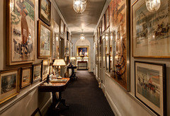
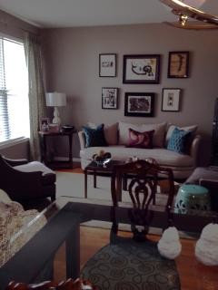
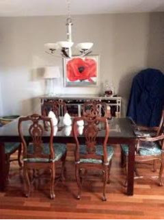
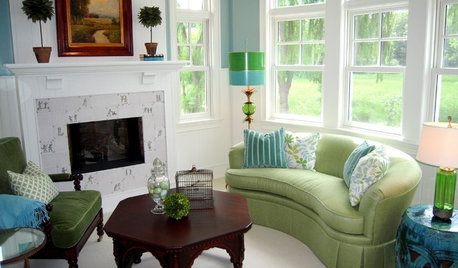
Do you match or coordinate your art?
User
10 years ago
Featured Answer
Sort by:Oldest
Comments (22)

crl_
10 years agoalex9179
10 years agoRelated Discussions
What Kind Of Art Work Do U Do?
Comments (31)For those who wish to knit or crochet, try starting with the larger needles. It makes the item go quickly. Big is anything over a size 15. Some needles are huge, almost broomstick size. I got into knitting a couple years ago, DD wanted a pancho for school. Panchos were just starting to get popular. I made it pretty fast, loose weave was pretty, so garment was light and not overly hot in school. Just a couple rectangles sewn together, so there was a point in front and back, head opening. I crocheted an edging with real fluffy yarn in a nice contrast color. Turned out well, she got lots of compliments on it. If you use synthetices, you can run it thru the washer. Wool FEELS so nice, but does take extra care and summer storage for moth prevention. For kids, synthetics are the way to go, keep clean easily. I also crochet, actually prefer it. But finding a large hook, size S, made it fun crocheting rugs with strips of old cloth. I have made a number of rugs now, and they are fast to do, wash wonderfully. I just hang them on a lawn chair to dry on the porch. I just make the pattern up as I go along. I have squares and ovals, all about 36" x 24". Seems to be a good lap size, bigger is harder to handle and heavy. Sizes will fit well in front of the sink, bathroom shower, back door for the dog to lay on. I might put a piece of no-slip stuff under it, to keep rug still on a vinyl or wood floor. So if you are considering doing knitting or crochet, try just doing some easy squares, in a large size like 36"x36", using a big hook or pair of needles. You might want the needles with a string between the ends, easier to use with wider knit projects. Knitting is just back and forth, so the string/cable needles are very handy with bigger pieces. You only need to know one stitch to start, get good at it, to finish the piece. I did some with knit on one side, purl on the other. Really basic, but pretty with nice yarn. Pieces that size or slightly longer, can make lap robes, baby afghans, or be put together for a larger sized afghan. Really go quickly to finish. I tend to watch TV when working, don't need a lot of attention to project with only one stitch on each side, just keep doing the same thing. Other good, fast projects are hats. They can go quickly, done in a couple days or less. Can be done knitted or crocheted flat, then sew the edges together to be round. I consider myself a beginning knitter and crochet person. Only have a couple stitches in my skill list, but you can do a lot with just basics. Very fun to produce an object, rug, hat, with these basics. I HAVE learned to do cables this winter, so am moving up the skill levels. Cables are surprisingly easy! Now on to learning to do pattern reading! My SIL was making scarves a couple years ago, just one stitch. Now she does FANCY socks, lookes almost embroidered. Needles are so tiny, that she can do pictures on the socks. Huge jump in skill, just trying new stuff. I think she keeps all her socks, wears them to show off! As well she should, they are amazing. The knee socks shown above, are very attractive. I will try some one of these days! I am planning to work on mittens first though. We can always use mittens around here. Have to get the thumb part down. Maybe then I will be ready for sock heels and 4 needles like my mother does them. I do some painting of items used in the gardens. Stepping stone enhancement, coloring some statues, ironwork that I have around. Not really original stuff, not the artist. Painting is a winter thing, too busy in summer. Also do some sewing, with fancy pillowcases being an inspiration this year. LOTS of elaborate lace trim, which is fun to look at on colored cases. Make good gifts at Christmas and other occassions. I am using the few inches left over as trim on a case for the couch pillow. Just many kinds of lace on a piece of material, to be used as an accent piece. Kind of fun doing fancy, after using the sewing to mostly repair work clothing. Made some tank tops for DD, all the kids need a lot of them to layer. I had the material, she chose the colors she wanted. I will be letting her do the next ones, pinning neck and arms takes all the time. Then she can make more when she wants them. About an hour each shirt. Rolling knife is a big time saver there. We used her purchased shirts as patterns, just cut around them, so they were just the right style and sizing. I don't want any clothing to look "homemade" because no one will wear it. My "Arty" skills come out in putting things together, some designing talents, not a pictoral art skill. I did a lot of picture framing over winter to get the art stuff up on the walls. We had gathered quite a lot, not hung it before. Priced getting it professionally matted and framed. ACKK!! The PRICES THEY WANTED!! I checked out mat cutters and got one, bought some frames to do it myself. That was fun, picking matting colors, cutting the mats, double layers or fancy cutting, framing it up. Very satisfying to see them all finished up. Those who have seen the walls of pictures, like it too. Good thing Art can cover a lot of talent and skills!...See MoreWhat's hidden in your sink base? A mess or state of art work?
Comments (21)I don't have a functioning camera right now to make an electronic photo file, but will remark that it is easiest inside a nice cabinet to use combinations of pex tubing and push to connect fittings such as Sharkbite brand (among many others) to avoid sweat soldering damage. All that is needed is a means to cut the pex to a clean flat end. Mistakes are easily remedied by using a different size piece of pex. Adapters exist to go from the pex to the fitting that dangling faucet hoses use. 3/8 poly line along with John Guest type push to connect fittings will be good for RO lines or such. Pex and poly are at their limit when used for pressurized water at boiling temperatures, so the hot water source in the house needs to be under some form of temperature control. A boiler type of water heater with potential for overshoot to 220 or so would be a risk in my view without a working moderator (required anyway by code). Some water chemistries tend to degrade the modulator so that needs to be kept in mind. My primary sink cabinet base includes garbage disposal and DWV plumbing, stand pipe for dishwasher hose, hot/cold feed for main faucet and to moderating valve for dishwasher (gets mix of hot and cold). Also there is the touch faucet control box, the fiber-optic garbage disposal control box, and quad electrical outlet. RO connection to both hot and cold sides of a pull-down faucet are present. All of the plumbing is mounted on stand-offs on the back or side walls of the cabinet base. kas...See MoreDo you put as much thought into your art and accessories as your rug?
Comments (40)"Nobody looks at rugs." They do at my house. Maybe that's because I spend as much time choosing them as choosing art ;) And in looking at my rugs, just as in looking at my art, people see something of my history and who I am. The rugs say that I've spent time in the Middle East and the Indian sub-continent, that I like tribal art, and that I'm not afraid to hang rugs and "rug-like objects" on my walls as art as well as place them underfoot. The art says I've got eclectic taste, like different materials and media, and do not buy art as decor. Some of the first things I bought, over 40 years ago, have been in homes on four continents and there's always been a place for them because they're important to me. Same goes for the "accessories" (and I confess, I'm no minimalist!) I love the shapes and workmanship of a lot of Islamic things - trays, water jugs, even a chapati container. But I've also got a couple of beautiful bowls inlaid with mother of pearl from Fiji, some Greek ceramics, Murano glass, a framed piece of a Hindu temple door, and a Haida carving from my native BC. Essentially, these are the story of my life. None of my things were expensive or are particularly valuable - but they matter to me more than the most perfect Persian silk carpet or the most expensive oil painting because I can tell a story about each one of them....See MoreI'll show you mine, if you'll show me yours...... ART WORK that is!
Comments (70)I tried to post and found all my air-dropped files were in a format that would not post. Will have to find time to redo them. But my art is so different -- some "fine" and a lot of contemporary and folk art. This was the only one that worked and I took it down towait, but in case I don't make it back (I am behind on an 8 week course and trying to get caught up) -- this will be my one contribution. This is titled Angels from Above and was painted in response to the attack on 9/11. It hangs in my LR where I have an Americana folk piece, a new still life that may not have found its permanent home and some other contemporary art. It's an eclectic grouping with the link being rich saturated colors. The sofa is midnight velvet and the chairs are natural linen, both treated as neutrals. The background is an inset above the mantle that was painted for another painting when this was in DR. It isn't terrible with the painting, but were painted the walls and now I want to pick a new color for the inset and different painting....See Morechispa
10 years agoUser
10 years agoineffablespace
10 years agoFun2BHere
10 years agoalex9179
10 years agojoaniepoanie
10 years agoluckygal
10 years ago
Oakley
10 years agoUser
10 years agoalex9179
10 years ago
tinam61
10 years agoUser
10 years agoMmmbeeer
10 years agoineffablespace
10 years agoUser
10 years agojerseygirl_1
10 years ago
kitschykitch
10 years agoedie_thiel
10 years agosloedjinn
10 years ago
Related Stories
DECORATING GUIDESThe Art of Mix-and-Match Style
The creative interior: Here's how to get that perfectly unpredictable look just right
Full Story
KITCHEN DESIGNCountertop and Backsplash: Making the Perfect Match
Zero in on a kitchen combo you'll love with these strategies and great countertop-backsplash mixes for inspiration
Full Story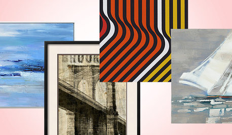
SHOP HOUZZShop Houzz: Art to Match Your Style
Creative pieces that will speak to your heart and top off your room’s style
Full Story0
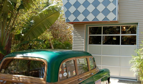
FUN HOUZZAre These Cars a Perfect Match for Their Homes?
Shift gears to the driveway or garage and see if you appreciate these pairings as much as we do — then share your own ideal match
Full Story
KITCHEN CABINETSKitchen Confidential: 7 Ways to Mix and Match Cabinet Colors
Can't decide on a specific color or stain for your kitchen cabinets? You don't have to choose just one
Full Story
FURNITURECreative Ways to Mix and Match Your Sofas and Chairs
Pull together a personalized living room look with these ideas for combining colors, prints, textures and shapes
Full Story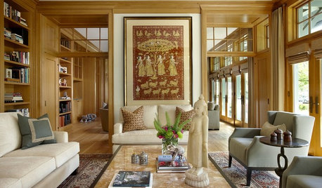
COLOR11 Terrific Paint Color Matches for Wood Details
Pair your wood trim and cabinets with the right shade of wall paint to bring out the beauty in both
Full Story
GREAT DESIGNERSCan You Match These Faces With Their Famous Designs?
Architects' portraits are less familiar than their iconic designs, but take a good look — you might see a connection
Full Story
HOUZZ TOURSMy Houzz: Vintage Furnishings With Stories to Match
A photographer and a musician make their 600-square-foot Seattle apartment their home with carefully curated secondhand finds
Full StorySponsored
Leading Interior Designers in Columbus, Ohio & Ponte Vedra, Florida


User