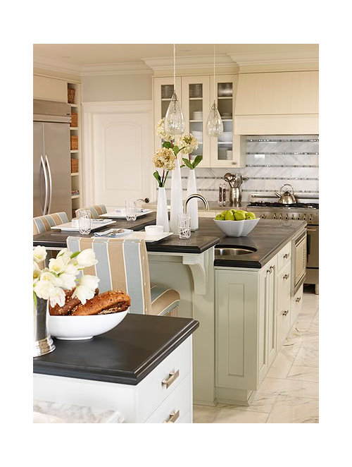
Finally decided on backsplash...please help with layout
amysrq
14 years ago
Related Stories

LIFEHow to Decide on a New Town
These considerations will help you evaluate a region and a neighborhood, so you can make the right move
Full Story
MOST POPULAR7 Ways to Design Your Kitchen to Help You Lose Weight
In his new book, Slim by Design, eating-behavior expert Brian Wansink shows us how to get our kitchens working better
Full Story
ORGANIZINGGet the Organizing Help You Need (Finally!)
Imagine having your closet whipped into shape by someone else. That’s the power of working with a pro
Full Story
COLORPaint-Picking Help and Secrets From a Color Expert
Advice for wall and trim colors, what to always do before committing and the one paint feature you should completely ignore
Full Story
ORGANIZINGDo It for the Kids! A Few Routines Help a Home Run More Smoothly
Not a Naturally Organized person? These tips can help you tackle the onslaught of papers, meals, laundry — and even help you find your keys
Full Story
KITCHEN DESIGNHere's Help for Your Next Appliance Shopping Trip
It may be time to think about your appliances in a new way. These guides can help you set up your kitchen for how you like to cook
Full Story
UNIVERSAL DESIGNMy Houzz: Universal Design Helps an 8-Year-Old Feel at Home
An innovative sensory room, wide doors and hallways, and other thoughtful design moves make this Canadian home work for the whole family
Full Story
HOME OFFICESQuiet, Please! How to Cut Noise Pollution at Home
Leaf blowers, trucks or noisy neighbors driving you berserk? These sound-reduction strategies can help you hush things up
Full Story
CURB APPEAL7 Questions to Help You Pick the Right Front-Yard Fence
Get over the hurdle of choosing a fence design by considering your needs, your home’s architecture and more
Full StorySponsored
Columbus Area's Luxury Design Build Firm | 17x Best of Houzz Winner!





rjr220
honeysucklevine
Related Discussions
Help Getting to a Final Final Layout - So Close!
Q
Please help me decide on my final layout
Q
Help with deciding a small kitchen layout
Q
Need help deciding kitchen/dining layout
Q
amysrqOriginal Author
karinl
honeysucklevine
amysrqOriginal Author
malhgold
amysrqOriginal Author
amysrqOriginal Author
onelady1dog2girls
mahatmacat1
rjr220
amysrqOriginal Author
mahatmacat1