


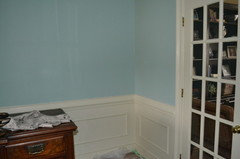
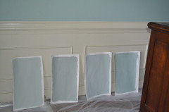
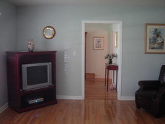
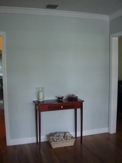
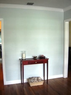
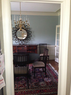
Benjamin Moore Wythe Blue fail
honeybasil
11 years ago
Featured Answer
Sort by:Oldest
Comments (80)

Vertise
11 years agohoneybasil
11 years agoRelated Discussions
All about Wythe Blue / the properties of color
Comments (12)For instance, should I have gone with a more saturated color, like Wythe in my bedroom due to its poor lighting? First, I'd wonder if you could do something to improve the lighting situation. I know it's not always feasible to do that tho. Sometimes time and budget only allow for paint. More saturated, less muted colors are often a good pairing with light that is dim, not robust. If it feels to you that the quality of light is a bit one-dimensional, or flat, or seemingly has a quality to it that just isn't very *full*, then it can be a good idea to add a wall color to the atmosphere that is the opposite of all those things -- like you stated, 'more saturated'. More saturated can help bust thru the dimness or grayed quality of light and deliver more color to the eye. But you don't want vivid either. :-) You want to try to strike the right balance between the light and the colorfulness or chroma in the paint color. One popular tip (that I like to dismiss) is to choose a paint chip that you like and then 'go one up'. Supposedly, that tip is meant to help you avoid choosing wall colors that are too dark, too colorful, just too much in general. The 'going one up' tip is meant to address the fact that wall colors grow more intense as they cover more area. This example is a good reason why tips like that don't work. In the case of poor lighting, 'going one up' on the strip probably isn't the best fit because more value, more color is the better partner for poorly lit rooms. Would a warmer color have been a better choice in a poorly lit room? Maybe. Maybe not. Since I'm on the topic of tips today, :-D, another one is to align the cool and warm sides of a color wheel with a compass. Meaning the cool side of the color wheel lines up with south and the warm side of the wheel lines up with north. Warm colors are suppose to be the better fit for cool, low light. Cool colors are suppose to go with warm, intense light. Like the other color tip, this north/warm and south/cool color tip has flaws too. A poorly lit room is still going to be a poorly lit room whether it's painted a warm color or a cool color. What changes with color temperature is mood and *feel* in the space. So if you think a warmer wall color would improve your perception of how your poorly lit room would feel, function, and fit with the other elements in the room then a warmer color would have been the better choice. The flip side to that is someone else might perceive the cooler color with the poor light as restful, calm, serene and maybe even more cohesive with the room's contents. So, the warmer and cooler thing is really more about aligning color with desired mood, function, expectations, and color tolerance than it is about trying to manage the quality of light into something that it isn't. Because you're not going to be successful managing the quality of light into something it isn't just by painting the walls -- poorly lit is going to stay that way until you buy more lamps or change window treatments, etc. The subject of paring a dark wall color with poor light is another part of the discussion but not directly relative to you question so I'll skip that and move on. What accents colors will make my walls appear less gray and either more blue or more green? That's the easier question of the bunch. Juxtaposing color that is opposite or complementary to blue and green should help coax out from the gray a sense of more blue or green. Complementary colors would be oranges and reds. If you think about it, Acid green or chartreuse is opposite in a sense too. That kind of vibrant accent color would be opposite the neutralized grayed aspect of Quietude. Opposite and complementary is not exclusive to the level of contrast that is hue, like blue-orange, green-red. Vibrant juxtaposed to dull is a level of color contrast that's available to you to use as well -- and it could very well work to help you feel like some of the grayness of Quietude has been balanced out....See MoreSo . . . Wythe Blue is not blue?
Comments (7)Seriously? A tree service?? Anyway, we just painted our laundry and office Wythe Blue (with Palladian on the ceilings). I find it to be a soft aqua. It's definitely not just green though. But that's how it's always been touted...a blue green. I love it. If you want more blue and less green, have you looked at Beach Glass?...See MoreThe daily nag: spelling Wythe Blue
Comments (130)1. The hanging jaw has made its way into acting, too. It drives me nuts. Do these actors think that leaving their mouths open and their jaws slack gives them expression? Interesting that Californian, which was once referred to as a "regionless accent," is now becoming its own variety. The rest of the country is homogenizing. 2. For a fascinating read on the development of English and its varieties, formerly known as dialects, see Baugh and Cable, A History of the English Language, if you haven't already read it. 3. See also, Eats, Shoots & Leaves, even with its lousy editing. 4. Does anyone recall the BBC (maybe PBS?) documentary about English--done in the eighties? Included rap, pubs in Cornwall, etc.?...See MoreBM Wythe Blue or Kennsington Green or????
Comments (10)Another color that caught my eye is Behr Green Meets Blue, but it appears perhaps a smidge too dark for such a small space. Any ideas for something similar but lighter? https://www.homedepot.com/p/BEHR-ULTRA-1-qt-S430-4-Green-Meets-Blue-Extra-Durable-Flat-Interior-Paint-Primer-172404/313064753#overlay BM Beach Glass also looked promising, but looks very grey on the paint chip. Does it read more of a color on the walls?...See Morebronwynsmom
11 years agohoneybasil
11 years agobronwynsmom
11 years agoprill
11 years agohoneybasil
11 years agobronwynsmom
11 years agohoneybasil
11 years agolizzie_grow
11 years agohoneybasil
11 years agohoneybasil
11 years agohoneybasil
11 years agoKevinMP
11 years agopatricianat
11 years agohoneybasil
11 years ago
enduring
11 years ago
gsciencechick
11 years agoTmnca
11 years agohlove
11 years agonosoccermom
11 years ago
cozyfarmhouse
11 years agoenduring
11 years agohoneybasil
11 years agolizzie_grow
11 years agofripper
11 years agocozyfarmhouse
11 years agojimandanne_mi
11 years agoaggierose
11 years agopatty_cakes
11 years agohoneybasil
11 years agobusybee3
11 years agorunninginplace
11 years agonosoccermom
11 years agohoneybasil
11 years agokimberlyrkb
11 years agogeogirl1
11 years agolizzie_grow
11 years agohoneybasil
11 years agojockewing
11 years agokaren.iz
11 years agohoneybasil
11 years agovsalzmann
11 years agohoneybasil
11 years agohoneybasil
11 years agohoneybasil
11 years agohoneybasil
11 years agoVertise
11 years agoenduring
11 years agolizzie_grow
11 years ago


Related Stories
KITCHEN DESIGN2012 Color Trends: Blues for the Kitchen and Bath
Watery hues, indigo and denim tones relax, refine and rejuvenate your space
Full Story
COLORColor of the Week: Watery Blue Is Summer's Best Hue
See how to bring the soothing colors of the sea into your home
Full Story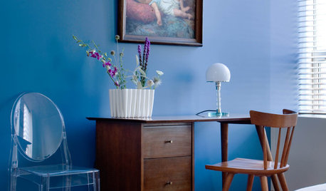
TURQUOISEHow to Pick the Right Blue Paint
Periwinkle, Turquoise, Midnight or Sky? Here's Help Choosing the Blue for You
Full Story
DECORATING GUIDESColor Guide: How to Use Light Blue
Whether you call it powder, sky or baby blue, this ultratraditional color lends fresh-faced appeal
Full Story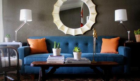
DECORATING GUIDESHot Color Combo: Cool Blues and Warm Brass
It's trending all over, but navy or royal blue with brass or gold just also might become a new classic pairing
Full Story
COLOR9 Dark Wall Colors to Suit Your Mood
Tired of light and airy? Try dark and moody for a change; you may be surprised by the moods these colors inspire
Full Story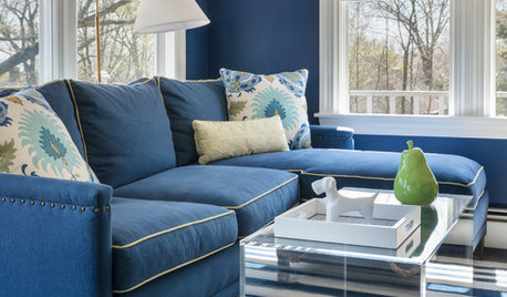
LIVING ROOMSRoom of the Day: Nautical Chic Brings the Cozy to a Family Room
A hardworking room multitasks as a comfy gathering spot and home office in a onetime sea captain’s home
Full Story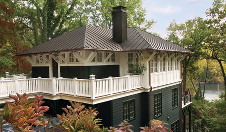
HOUZZ QUIZHouzz Quiz: What Color Should You Paint Your House?
Is white right? Maybe dark blue-gray? Take our quiz to find out which color is best for you and your home
Full Story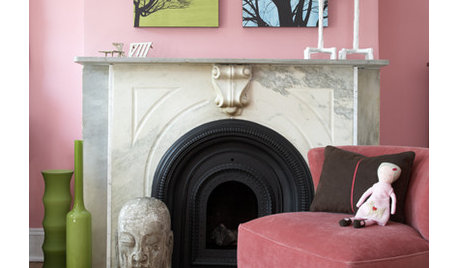
COLORPretty Pink Color Schemes, Subtle to Sensational
How do we love pink? Let us count the ways: soft, sassy, with chartreuse and electric blue and, yes, even red ...
Full Story
ROOM OF THE DAYRoom of the Day: Going Less Formal in an Oceanfront Home
Navy blues, grays and creams respect the view while pops of green and gold add surprise in this Vancouver living space
Full Story


lazydaisynot