


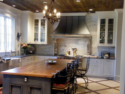
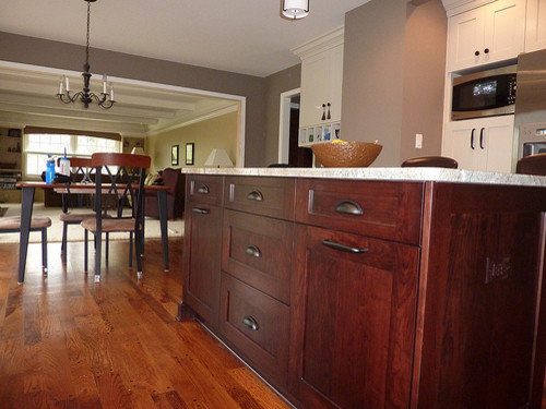
help finalize color scheme? lots of pix
huango
12 years ago


Sort by:Oldest
Comments (21)
Related Stories
MOST POPULAR7 Ways Cats Help You Decorate
Furry felines add to our decor in so many ways. These just scratch the surface
Full Story
WINTER GARDENINGHow to Help Your Trees Weather a Storm
Seeing trees safely through winter storms means choosing the right species, siting them carefully and paying attention during the tempests
Full Story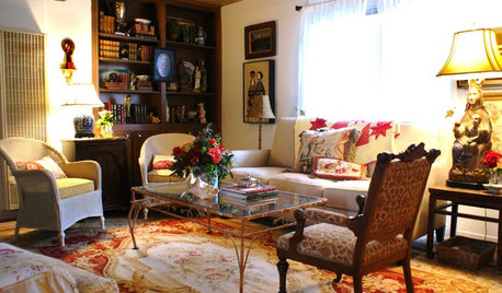
DECLUTTERINGDownsizing Help: Choosing What Furniture to Leave Behind
What to take, what to buy, how to make your favorite furniture fit ... get some answers from a homeowner who scaled way down
Full Story
PRODUCT PICKSGuest Picks: Help Your Home Blossom With Floral Decor
Sprinkle hints of spring around your rooms with fabrics, wall coverings and more that recall nature's charms
Full Story
KITCHEN DESIGNKey Measurements to Help You Design Your Kitchen
Get the ideal kitchen setup by understanding spatial relationships, building dimensions and work zones
Full Story
SELLING YOUR HOUSE5 Savvy Fixes to Help Your Home Sell
Get the maximum return on your spruce-up dollars by putting your money in the areas buyers care most about
Full Story
SELLING YOUR HOUSEHelp for Selling Your Home Faster — and Maybe for More
Prep your home properly before you put it on the market. Learn what tasks are worth the money and the best pros for the jobs
Full Story
EXTERIORSHelp! What Color Should I Paint My House Exterior?
Real homeowners get real help in choosing paint palettes. Bonus: 3 tips for everyone on picking exterior colors
Full Story
COLORPick-a-Paint Help: How to Create a Whole-House Color Palette
Don't be daunted. With these strategies, building a cohesive palette for your entire home is less difficult than it seems
Full Story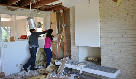
REMODELING GUIDESWisdom to Help Your Relationship Survive a Remodel
Spend less time patching up partnerships and more time spackling and sanding with this insight from a Houzz remodeling survey
Full Story


catlover5
christine40
Related Discussions
And the rains finally came (lots of Pix)
Q
Finally Done with my dragonfly stack-n-whack! (pix)
Q
Opinions: Trying to complete my decisions...lots of pix!
Q
Need help with area rugs please! (lots of pix)
Q
CEFreeman
herbflavor
mama goose_gw zn6OH
rhome410
marcolo
rhome410
aokat15
User
marcolo
huangoOriginal Author
huangoOriginal Author
rhome410
User
CEFreeman
huangoOriginal Author
rhome410
lavender_lass
rosie
huangoOriginal Author