


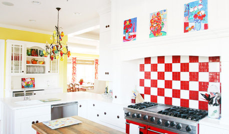
Red samples for bathroom (pic heavy)
User
13 years ago
Sort by:Oldest
Comments (75)
Related Stories
DECORATING GUIDESColor Guide: How to Work With Red
Sizzling or sedate, red is not for the timid. Here's how to use its boldness to make your rooms come alive
Full Story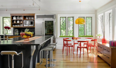
COLOR10 Reasons to Fall in Love With Red Dining Chairs
The sexy color sits surprisingly well with many kinds of tables: modern and rustic, indoor and out, high-end and low-budget
Full Story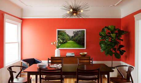
ROOM OF THE DAYRoom of the Day: Bright Red Dining Room Glows in Fog City
Mist can put a damper on the mood in San Francisco, but this lively room fires up the energy
Full Story
BATHROOM DESIGNBathroom Countertops 101: The Top Surface Materials
Explore the pros and cons of 7 popular bathroom countertop materials
Full Story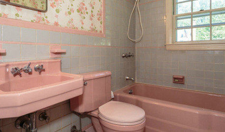
BATHROOM COLOR8 Ways to Spruce Up an Older Bathroom (Without Remodeling)
Mint tiles got you feeling blue? Don’t demolish — distract the eye by updating small details
Full Story
BLACKCooking With Color: When to Use Black in the Kitchen
Consider sampling Caviar or Cracked Pepper on your kitchen walls or cabinets for richness and impact
Full Story
DECORATING GUIDESPaint Color Ideas: 7 Bright Ways With Yellow and Orange
Go with the glow. These sample palettes and room examples show you how to work with two of the happiest hues around
Full Story
Call for DIY Projects: Show Us What You've Got!
Share a Pic of Your Handiwork with the Houzz Community
Full Story
WOODWoodipedia: Make a Solid Choice With Oak
Forget those low-end products of old. Red and white oak today are beautiful, versatile and relatively inexpensive
Full Story
BATHROOM DESIGN14 Design Tips to Know Before Remodeling Your Bathroom
Learn a few tried and true design tricks to prevent headaches during your next bathroom project
Full StorySponsored
Industry Leading Interior Designers & Decorators in Franklin County


Kathleen McGuire
UserOriginal Author
Related Discussions
Finished Bathroom Pics (two bathrooms!)--very pic heavy
Q
Bathroom Reveal, Thanks to the Bathroom and Remodel Forums! (pic
Q
suggestions for my bathroom remodel please (pics included)
Q
Help Me Plan a Tiny Half Bathroom (With Pics)
Q
Sophie Ingerslew
peaches12345
busybee3
UserOriginal Author
Sophie Ingerslew
User
Valerie Noronha
tinam61
User
User
rindy96
UserOriginal Author
bama12
UserOriginal Author
UserOriginal Author
les917
johnsmith_2010
Oakley
peaches12345
Kathleen McGuire
tinam61
msrose
alex9179
UserOriginal Author
User
sandra_zone6
sonaliagrawal
UserOriginal Author
crescent50
Oakley
User
User
Sophie Ingerslew
scanmike
patty_cakes
WendyB 5A/MA
UserOriginal Author
Sophie Ingerslew
tinam61
Kathleen McGuire
msrose
User
UserOriginal Author
Sophie Ingerslew
UserOriginal Author
Sophie Ingerslew
UserOriginal Author
Oakley