


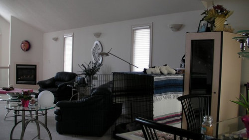
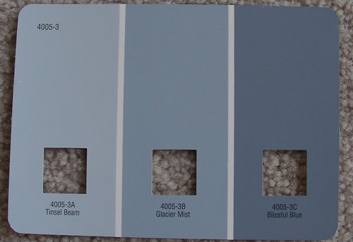
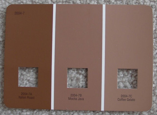
Opinions on paint colors? *pics*
cruzmisl
13 years ago

Sort by:Oldest
Comments (20)
Related Stories

DECORATING GUIDESNo Neutral Ground? Why the Color Camps Are So Opinionated
Can't we all just get along when it comes to color versus neutrals?
Full Story
WALL TREATMENTSExpert Opinion: What’s Next for the Feature Wall?
Designers look beyond painted accent walls to wallpaper, layered artwork, paneling and more
Full Story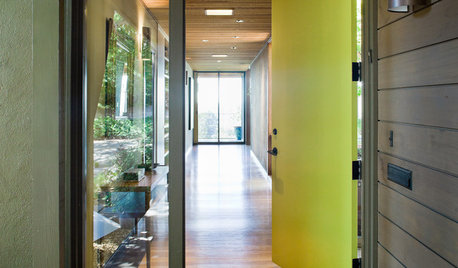
CURB APPEAL5 Bright Palettes for Front Doors
Splash bold green, blue, orange or red on your front door, then balance it with a more restrained hue on the rest of the house
Full Story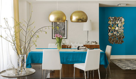
COLORBest Uses for the Boho Blue Color of 2015
PPG Pittsburgh Paints’ Color of the Year is a bold bohemian blue best used in small doses
Full Story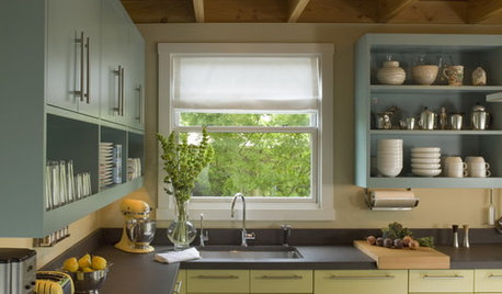
MOST POPULAR8 Great Kitchen Cabinet Color Palettes
Make your kitchen uniquely yours with painted cabinetry. Here's how (and what) to paint them
Full Story
EXTERIORSHelp! What Color Should I Paint My House Exterior?
Real homeowners get real help in choosing paint palettes. Bonus: 3 tips for everyone on picking exterior colors
Full Story
COLORColor of the Year: Off-White Is On Trend for 2016
See why four paint brands have chosen a shade of white as their hot hue for the new year
Full Story
WHITEHow to Pick the Right White Paint
White is white, right? Not quite. See 8 white paint picks for 8 very different effects
Full Story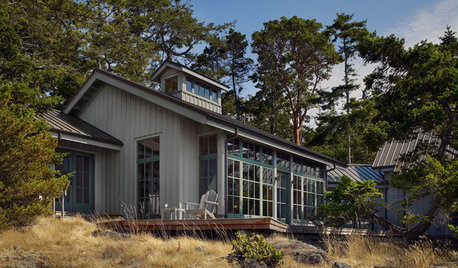
EXTERIOR COLORWhen to Paint Your Home Gray
This perfectly neutral and highly versatile color can create subtle distinctions among exterior architectural elements or stand on its own
Full Story
COLORPick-a-Paint Help: 11 Ways to Mine Your World for Colors
Color, color everywhere. Discover the paint palettes that are there for the taking in nature, shops and anywhere else you roam
Full Story


yayagal
User
Related Discussions
Quick! I need your opinions on this paint choice! (Pics)
Q
Pics of reno'd beach cottage-- paint colors! LONG, lots of pics!
Q
Need few opinions on outdoor fan color *pic*
Q
Opinions on paint colors?
Q
cruzmislOriginal Author
yayagal
jessicaml
cruzmislOriginal Author
les917
User
cruzmislOriginal Author
kristinekr
cruzmislOriginal Author
bh401
kristinekr
cruzmislOriginal Author
avesmor
User
cruzmislOriginal Author
User
Oakley
cruzmislOriginal Author