


Do you think Warm or Cool when decorating?
vampiressrn
14 years ago
Sort by:Oldest
Comments (18)
Related Stories
DECORATING GUIDESConfident Color: When to Use Cool and Warm Hues
Change the Mood of a Room With Colors that Advance or Recede
Full Story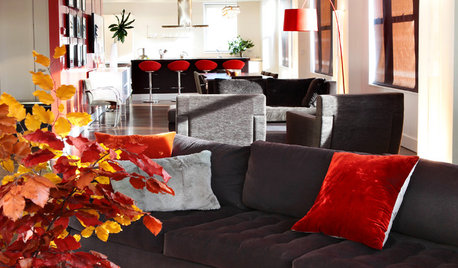
DECORATING GUIDESDecorating for Fall When It Still Feels Like Summer
Even if sandals and shorts are your year-round attire, you can still subtly dress your home for autumn
Full Story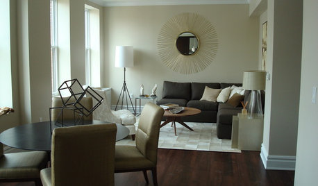
LIFEWhen Your Tastes Clash: How to Design and Decorate as a Couple
Want to keep the peace? Work with both of your styles when remodeling, decorating or building new, for a home that feels right to all
Full Story
SELLING YOUR HOUSEHow to Decorate for the Holidays When Your Home Is for Sale
You can make your home appealing to potential buyers and still celebrate the season. Here are 7 tips to keep in mind
Full Story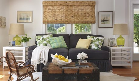
DECORATING GUIDESHow to Decorate When You're Starting Out or Starting Over
No need to feel overwhelmed. Our step-by-step decorating guide can help you put together a home look you'll love
Full Story
DECORATING GUIDESBudget Decorator: How to Save When You Don’t DIY
You don’t have to be crafty to decorate your home inexpensively. Here are other ways to stretch your design dollars
Full Story
HOUZZ TOURSHouzz Tour: Global Decor Warms a Spanish Revival Bungalow
Inviting and eclectic, this Northern California home brims with pieces from around the world that come together in a harmonious style
Full Story
DECORATING GUIDESColor of the Week: Decorating With Warm Gray
Tired of tan? Getting gloomy from cool gray? Make warm gray your new go-to neutral
Full Story
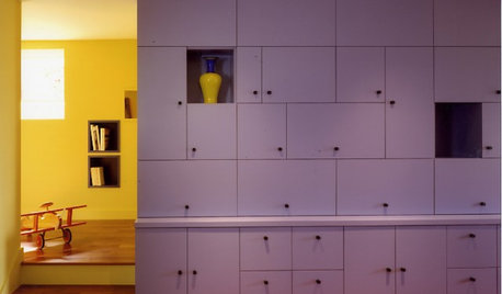
EXTERIOR COLORWhen to Paint Your Home Yellow
Be a cheer leader with this color that captures the sun and radiates a warm welcome
Full Story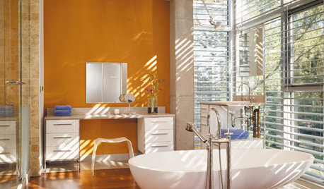
COLORBathed in Color: When to Use Bold Orange in the Bath
Orange you glad this warm and happy color can energize the place where you start your day?
Full Story


andreadeg
sandra_zone6
Related Discussions
Warm versus cool decor - your experience?
Q
Do you consider resale value when you decorate?
Q
How are your trees doing at cool and warm temps indoors?
Q
How do I marry cool and warm to be cohesive in home update?
Q
vampiressrnOriginal Author
runninginplace
Oakley
sis3
htnspz
patty_cakes
igloochic
zeebee
alexandra_marie
holleygarden Zone 8, East Texas
Bumblebeez SC Zone 7
susieq07
jerseygirl_1
User
teacats
Oakley