


Benjamin Moore Paint Finish Question
outsideplaying_gw
10 years ago
Featured Answer
Sort by:Oldest
Comments (8)

cat_mom
10 years ago
outsideplaying_gw
10 years agoRelated Discussions
satin question - Kelly Moore vs Benjamin Moore
Comments (2)There is no universal definition for sheens that all companies use, so it's unlikely the sheen will be the same. The real question is if you need a high sheen for the kitchen anyway. Old school thinking was that kitchens and baths always had to have a high sheen. With the advent of higher performance matte and eggshell finishes from many paint companies, this is no longer the case. I painted my kitchen and bathroom with Aura matte 4 years ago, both still look like the day I painted them in spite of heavy use for both. Never met anyone that wants their walls shiny - no need to go there unless you happen to be the exception to the rule....See MoreBenjamin Moore paint question
Comments (63)Well, I bought a quart of Revere Pewter, and one of Gossamer by Pratt & Lambert...just a tad deeper than the Feather Gray, as well as a test quart of Sherwin Wms Requisite Gray--the pretty one from Ttodd's old bedroom pictures. They are all so close. Seriously close. The Requisite Gray has the same depth as Revere Pewter, just maybe one slight tad more gray. The Gossamer is almost a match for Revere Pewter. So, now I've determined that what I need is something just a little warmer, and perhaps a shade darker. If you saw my living room right now, you wouldn't even know what to think. I've splotched a dozen things. All walls are painted. Just not the same!! Red...See MoreBenjamin Moore Exterior Paint Question
Comments (4)We just bought Regal Select from our BM paint store. The salesman said no need to pay for Aura, the Regal would do the job very well....See MoreBenjamin Moore’s white opulence paint color
Comments (75)It has been a while since the last activity on this thread, and I felt it might be beneficial to give my updated perspective on White Opulence #879 from Benjamin Moore as a paint color for main areas. Having lived with this color for a bit longer now since my last comment, I am beginning to understand how tightly it regulates what other colors can be placed with it for anyone who cares about a homogeneous scheme and also how undeniable the pink tone can be when applied over large surface areas. White Opulence is a tint of red, but it is so light that in ample daylight or under bright white lighting it can "read" as white. In average daylight, it produces a whisper-light pink hue. The effect of this is magnified the larger the area that is covered by it. Using this color on the walls in the main space of a large, open-plan layout with high ceilings, for example, will imbue the area with a light, yet undeniable, pale pink cast in average lighting. It would be a good idea to prepare not only yourself but also any other significant users of the space of the pink tinge before selecting this color because some people truly dislike pink, and it is courteous to work with all regular users of spaces during design planning to try to ensure no one will be overly uncomfortable with the final effect. One thing that hasn't been discussed is how White Opulence can cast a peach tone under warmer lighting colors, especially in the absence of any compensating daylight, meaning nighttime in most home spaces. If peach is a color you want to avoid and you utilize warm lighting -- that is, progressively orange-tinged the further under a 4000K color temperature you go -- then this is a paint color to avoid. The general recommendation is that 4000K is quite cool for home environments, so if you don't know what color temperature your home lighting is, you can probably assume it is warmer than 4000K if you selected average bulbs from your home supplies provider. White Opulence as a red-based white was an attractive choice for my main space because I already had a red accent in a permanent finish and personally prefer the fresh look that a red-white lends versus common alternate choices for main area wall colors like yellow-based beiges or blue-based grays. The problem is that so many home goods available are manufactured in colors that go with beige and gray wall colors rather than the faint red-white of White Opulence that color coordination requires more work than may be expected. Of course, you could decorate using pure white items, but what you really need are options for whisper pink basics which are hard to find. Adding stronger pink or red items is not always the solution either because you cannot feasibly fill the room with accents; you need some basics that blend with the wall tone. Then there is the issue of coordinating White Opulence with colors for auxiliary rooms if you wish to have some variety throughout the home while still maintaining the feel that all of the home's colors work together. Most blues coordinate with White Opulence, but if you have already used red accents in rooms painted with White Opulence, then red is challenging to pair with blue in most instances unless it is a dark, cool blue like navy. Where this has been a dilemma for me has been my hallway colors connecting the main open space to the bedrooms which are all different pastels. The color plan I have will work, and I'll enjoy the variety of colors that I have been able to make flow together, but to be honest, at times I have wondered how much easier the design process might have been if I had picked plain white for the main space. White is the ultimate neutral some might say. At the very least, a basic white for the main area would have given me more freedom in selecting fabrics and other home products for the main space as well as coordinating colors for other rooms. It is all too easy to second-guess decisions that will affect your life long-term. I am using Benjamin Moore's durable Aura formula in a satin finish, so I expect the new White Opulence paint will last decades. Had I selected a plain white or yellow- or blue-based off white, I might be back on this very forum wishing I had gone with White Opulence to add appeal beyond the standard choices. I hope this is helpful to anyone still considering this color....See More
still_lynnski
10 years agocat_mom
10 years agooutsideplaying_gw
10 years ago
enduring
10 years agoraehelen
10 years ago
Related Stories

COLORBenjamin Moore Floats Breath of Fresh Air as Its Color of 2014
Touted as a new neutral, this baby blue can stand on its own or support bolder colors. Here's how to use it
Full Story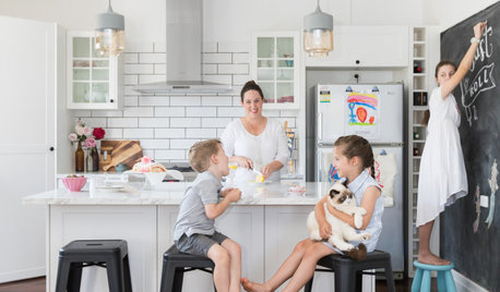
FEEL-GOOD HOMEThe Question That Can Make You Love Your Home More
Change your relationship with your house for the better by focusing on the answer to something designers often ask
Full Story

COLORBest Ways to Use the Neutral Green Color of 2015
Benjamin Moore’s Color of the Year is soft and natural
Full Story

5 Questions for Design Stars
Add Your Ideas for Outdoor Storage, Cheering Up a Fireplace and More
Full Story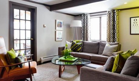
LIVING ROOMSCurtains, Please: See Our Contest Winner's Finished Dream Living Room
Check out the gorgeously designed and furnished new space now that the paint is dry and all the pieces are in place
Full Story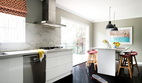
FLOORS11 Distinctive Finishes for Original Floorboards
Whether you go for glossy, painted or matte boards, make your wood floor the star
Full Story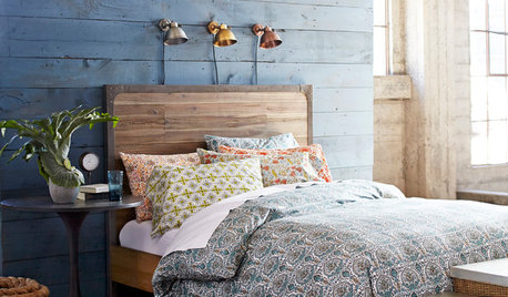
BEDROOMSHouzz Quiz: What Color Should You Paint Your Bedroom Walls?
Cool and soothing, or warm and spicy? Answer these questions and learn what hue is right for you
Full Story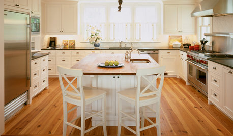
KITCHEN DESIGN3 Steps to Choosing Kitchen Finishes Wisely
Lost your way in the field of options for countertop and cabinet finishes? This advice will put your kitchen renovation back on track
Full StorySponsored


enduring