


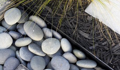
Another example of using texture and line in the garden
bahia
12 years ago
Sort by:Oldest
Comments (8)
Related Stories
GARDENING AND LANDSCAPINGGarden Design Essentials: Texture
A delight to touch and see, landscapes with texture use dimension and definition to create pleasing design contrasts
Full Story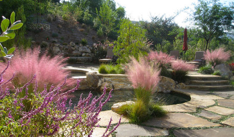
GRASSES10 Ways to Use Ornamental Grasses in the Landscape
These low-maintenance plants can add beauty, texture and privacy to any size garden
Full Story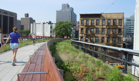
GARDENING AND LANDSCAPINGGarden Inspiration From New York's New High Line
See how to add some urban chic to your own stretch of green
Full Story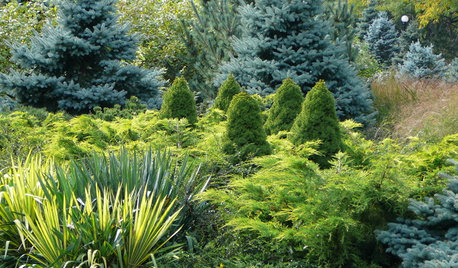
PLANTING IDEASDesigning With Conifers: Layers of Texture for Your Garden
Sharp and prickly or fine like ferns, richly textured conifers bring unexpected interest to the landscape
Full Story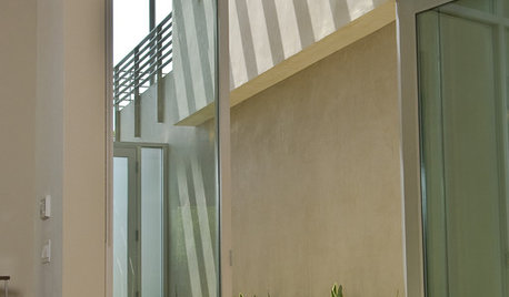
LANDSCAPE DESIGNSoften Modern Landscape Lines With Plants
Use foliage and flowers to break up stark geometry and add life to modern landscapes
Full Story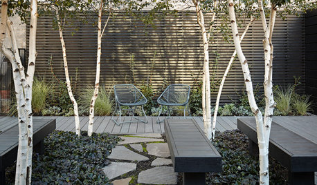
LANDSCAPE DESIGN5 Ways to Use Trees to Create a Sensational Garden Space
Trees define spaces in multiple ways and bring a layer of shade and intrigue to the landscape
Full Story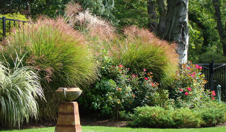
LANDSCAPE DESIGNThe 7 Best Plant Types for Creating Privacy and How to Use Them
Follow these tips for using different kinds of plants as living privacy screens
Full Story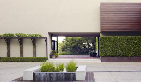
LANDSCAPE DESIGNGeometric Designs Keep Plants in Line
Structure your landscape with strips and blocks for simplicity and a crisp, contemporary look
Full Story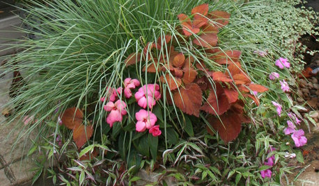
CONTAINER GARDENSContainer Garden Basics: Mix Textures to Catch the Eye
A mix of textures makes for potted gardens where each plant has a special role to play
Full Story
inkognito
bahiaOriginal Author
Related Discussions
Another example:the difference between men & women in remodeling.
Q
Another example of dumbing down?
Q
Straight lines vs curved lines in gardens
Q
Examples of bad garden design--I need them!
Q
stevega
bahiaOriginal Author
inkognito
bahiaOriginal Author
bahiaOriginal Author
stevega