


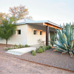
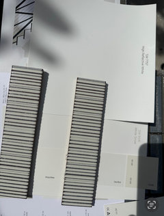
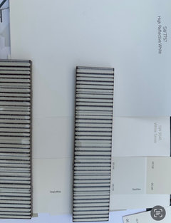
I need a good shade of white. Any suggestions?
Paul F.
last year
last modified: last year

Featured Answer
Sort by:Oldest
Comments (52)

Paul F.
last yearRelated Discussions
Need a good dwarf red Japanese maple- any suggestions?
Comments (5)Hard to come up with a non-weeping form that will stay narrow enough for you :-) I'd suggest 'Red Pygmy' or 'Beni Otake'. You could also try something like 'Fireglow', 'Oregon Sunset or 'Sara D' but all will eventually grow taller and wider than you wish and I'd not recommend pruning to maintain a set size....See MoreAny suggestions for a good Northeast Mix for overseeding?
Comments (1)Check out seedsuperstore.com...See MoreI need suggestions for blooming plants to use in heavy shade area.
Comments (8)Many of the Coral bells (Heuchera) or Foamflower/Heucherellas should appreciate your pine-friendly soil. Hybrids have a variety of foliage colors, though not all are as equally robust (in our alkaline clay, anyway). Some coral bells have a nice long bloom while others don't flower much (at all?). Believe the Heucherellas flower better, but I don't have any experience with these yet - hopefully someone else will comment or more can be found on the Huechera forum. Caladium is another worth considering for shade color - annual in most of the state unless dug up....See MoreI am looking for a good online tile visualizer, any suggestions?
Comments (2)IKEA cabinets (Ringholt uppers (glossy white) and bodarp base (grey-green). Oceana quartz countertops. Cloe green horizontal running bond subway for backsplash about 14 inches up....See MorePaul F.
last yearPaul F.
last yearPaul F.
last year PROPaul F. thanked Celery. Visualization, Rendering images
Paul F.
last yearlast modified: last yearPaul F.
last yearPaul F.
last yearlast modified: last yearPaul F.
last yearPaul F.
last yearlast modified: last yearPaul F.
last yearPaul F.
last yearPaul F.
last yearlast modified: last yearPaul F.
last yearPaul F.
last yearPaul F.
12 months agoPaul F.
12 months agoPaul F.
10 months agolast modified: 10 months agoPaul F.
10 months agoPaul F.
10 months agoPaul F.
10 months agoPaul F.
10 months agolast modified: 10 months agoPaul F.
10 months ago


Related Stories
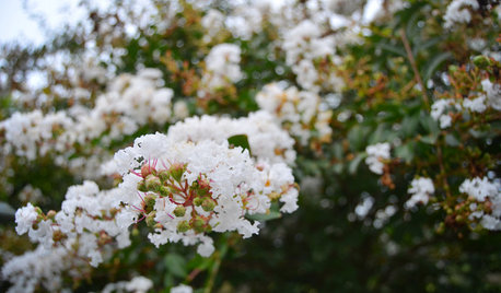
GARDENING GUIDESBrighten Any Garden With White Crape Myrtle
A terrific supporting player to other plants, white crape myrtle can help a walkway or other parts of a landscape gleam
Full Story
LANDSCAPE DESIGNGood Fences, Good Neighbors — and Good Views
See-through vertical fencing connects a yard with its surroundings while keeping children and pets safely inside
Full Story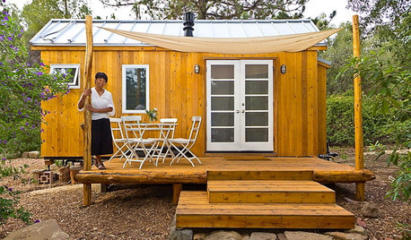
LIFEYou Said It: ‘Just Because I’m Tiny Doesn’t Mean I Don’t Go Big’
Changing things up with space, color and paint dominated the design conversations this week
Full Story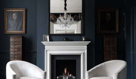
COLORDiscover White’s Surprising Power to Energize Every Room
Using white in different ways gives you limitless options for light, color and creativity
Full Story
MOST POPULARMust-Try Color Combo: White With Warm Off-White
Avoid going too traditional and too clean by introducing an off-white palette that brings a touch of warmth and elegance
Full Story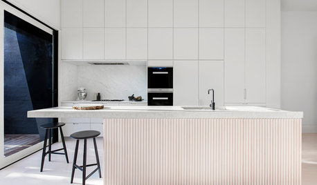
HOMES AROUND THE WORLDHouzz Tour: A White-on-White Home Radiates Scandinavian Charm
Pale woods, black accents and an abundance of white shine in this Australian-Swedish family’s renovated row house
Full Story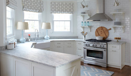
KITCHEN DESIGNHow to Keep Your White Kitchen White
Sure, white kitchens are beautiful — when they’re sparkling clean. Here’s how to keep them that way
Full Story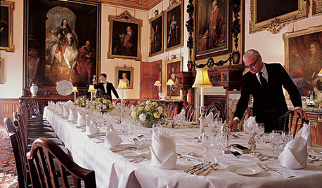
FUN HOUZZEverything I Need to Know About Decorating I Learned from Downton Abbey
Mind your manors with these 10 decorating tips from the PBS series, returning on January 5
Full Story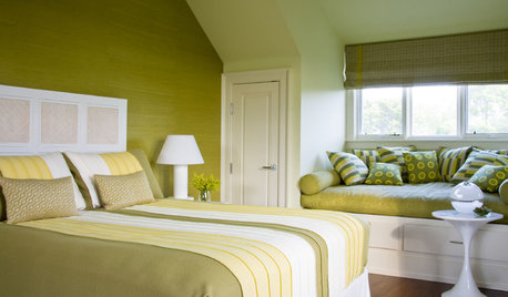
DECORATING GUIDESI'll Have the Same: How to Design With Monochromatic Color
Indulge the eye, offer a break from visual chaos and make decorating easier with single-color rooms in any shade you like
Full Story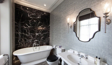
BATHROOM DESIGNWhite Toilet, Black Lid: Trending in a Bathroom Near You
Contrast is king with this look for the bath — and it works with any style you can think of
Full Story


HALLETT & Co.