


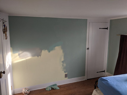
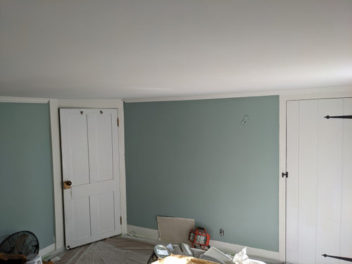
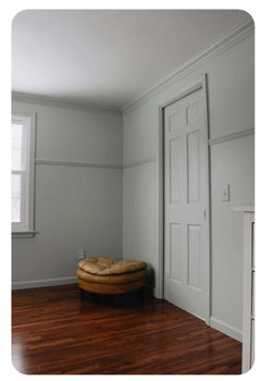
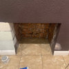
Small room - very low ceiling - color help needed
Newold Home
last year


Featured Answer
Sort by:Oldest
Comments (8)
Related Discussions
Water as thermal mass for a very small low tunnel/cold frame
Comments (8)SalmanBah- In a climate like yours, the main issue is killing the plants from too much heat. I live in a climate where the summer, outdoor temperatures only get to about 25C, but, even with venting, the greenhouse can easily get to 45C...which is a threat to many plants. In your country, you could get to much higher temperatures if the greenhouse was not well-designed. I don't have firsthand knowledge of greenhouses in Bahrain, but any greenhouse you would build there should have: 1) automatic roof vent openers, 2) one or more large volume fans operating on a thermostat, 3) a misting system on an automatic timer; and 4) shade cloth on the roof. What size greenhouse are you talking about, and what would you want to grow in it?...See MoreAsymmetrical window placement, low ceiling, small room. Need help
Comments (13)Olychick - I LOVE the screen idea! That is one I have not seen or thought of. I can't do it though, because the outlets behind the bed are needed for the mechanical beds, and like 1929spanish pointed out, I would loose valuable space at the foot of the bed. I still love the idea though, and will be looking to see if I can find a screen that I like, that would look good flat against the wall, maybe with cutouts for the outlets at the bottom. Missy-I have never even thought about using shutters. I'm not sure if I would like them since I can't mount them on the inside of the window frame. They would have to be mounted on the casing, and I'm not sure about that. But I will consider it cause I am being open minded to any and all suggestions. Oh, and no I can't put the bed on another wall. I could put the bed on the north wall, but then the closet door on the east wall would always be bumping into the nightstand. Annie, I tried putting our bed in the corner and it just didn't look right. My room is just to small for that. Good idea though. Soccermom - I love all the pictures, thank you. I have seen several of them before. The ones with the curtains going across the back of the bed is what I think I am going to shoot for. If I was doing beautiful custom drapes, then I would do them across the back wall. I am too cheap though, and I am a OCD clean freak, so I must have washable drapes. I am going to use cheap white cotton tie top drapes from pottery barn. I think those would look kind of cheesy going across the whole back wall. I plan on painting the walls a pale blue, or light gray, maybe a light blue green. Undecided on paint and such right now. Ideally, my room would be bigger and symmetric, but its not, so I must work with what I have and not let what I don't have drive me crazy. Junco - I think I'm leaning towards the half canopy. Like you said, it solves more than one problem. Thank you all for the ideas. I will definitely be trying a few things out....See MoreSmall room - very low ceiling - color help needed
Comments (34)@dh an absolute labor of love! Your house sounds like ours - old and beautiful transformed to...ugh. The previous owner bought it in 1990 and didn't update a thing except to add some bright pinky peach paint with a mauve rug. That was only one room but his "style" permeated the house. It was like a time capsule when we bought it! Good luck to you in your adventures...your house sounds wonderful!...See MoreVery small house...Need help deciding where to put the remodel budget.
Comments (32)ok exact measurements. the house is not exactly a 20x30 square but its close enoguh. a few of the inner walls are thicker as they used to be exterior walls. the kitchen is 113inches by 141. It does fit a corner banquette with a round table and 3 chairs, and you can seat up to 2 on each leg of the banquette. Most comfortable with fewer than 6 people but up to 7 is possible. 8 if someone sits in the corner . Master is 130x116 (inches). Bedrooms are 80 inches wide and 136 and 116 inches long. Bathroom i was wrong on the measurements. It is 98x 57 (there is a cut out here so its not a perfect rectangle). The hall is 36 inches wide. The biggest benefit of using up that space to me is that people won't be as confined to a tiny hallway where it is awkward to pass anyone else. So I like the idea of taking part of the bathroom and part of the hallway to make another bathroom, and also to take down the walls int eh kitchen. So we would need to get some quotes for this but it seems relatively doable. We could wait on the closets for a while and it doesnt require moving any walls that we didnt already plan to move. Reality is it doesnt improve rental price THAT much to add a bathroom as far as I can tell, but there are only a few other rentals in the area to compare to. So addding the bath is partially for resale partially just because it irks me to have such a wasteful layout. Either way we do make back the cost of the bathroom quickly....See More
Susie .
last year
Newold Home
last yearNewold Home
last yearNewold Home
last year
Related Stories
SMALL HOMESRoom of the Day: Living-Dining Room Redo Helps a Client Begin to Heal
After a tragic loss, a woman sets out on the road to recovery by improving her condo
Full Story
LIVING ROOMSLay Out Your Living Room: Floor Plan Ideas for Rooms Small to Large
Take the guesswork — and backbreaking experimenting — out of furniture arranging with these living room layout concepts
Full Story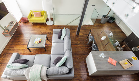
DECORATING GUIDESRoom Doctor: 10 Things to Try When Your Room Needs a Little Something
Get a fresh perspective with these tips for improving your room’s design and decor
Full Story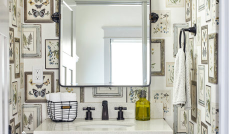
BATHROOM DESIGNKey Measurements to Help You Design a Powder Room
Clearances, codes and coordination are critical in small spaces such as a powder room. Here’s what you should know
Full Story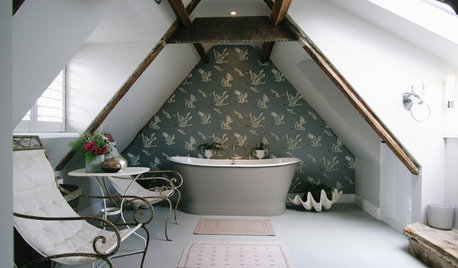
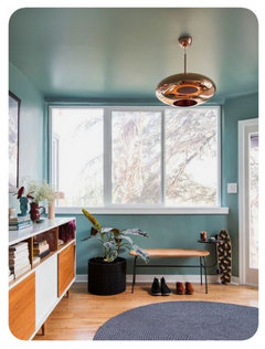
CEILINGSEmbrace Your Low Ceiling With One of These Clever Design Tricks
Don’t let a low ceiling cramp your interior style. Use these ideas to help fool the eye and make more of your space
Full Story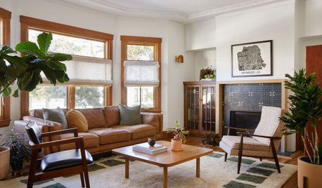
LIVING ROOMSHow to Decorate a Small Living Room
Arrange your compact living room to get the comfort, seating and style you need
Full Story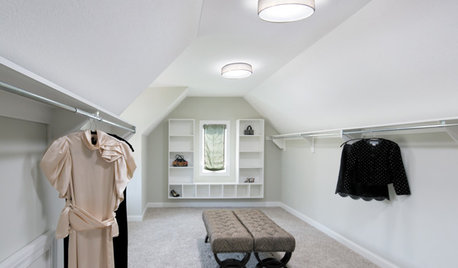
WINDOWSSmall Skylights Add Comfort and Light Where You Need It
Consider this minor home improvement in rooms that don’t get enough natural daylight
Full Story
WHITEGive Your Small White Room a Boost
Your white room probably needs something more. Give your space a design boost with these 8 ideas
Full Story
SMALL SPACESDownsizing Help: Storage Solutions for Small Spaces
Look under, over and inside to find places for everything you need to keep
Full Story
DECORATING 1017 Ways to Make Low Ceilings Seem Higher
Well-chosen paint, lighting, millwork and other details can give rooms a lift
Full Story
Susie .