


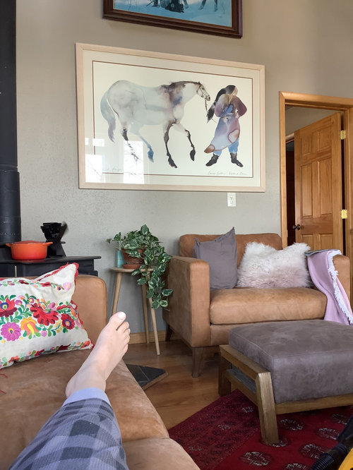
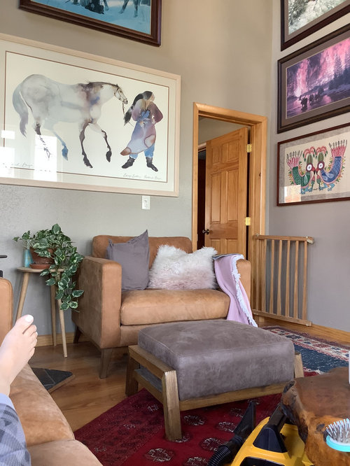
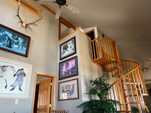
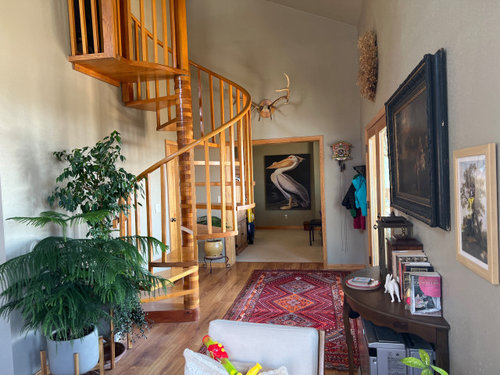
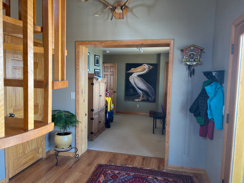
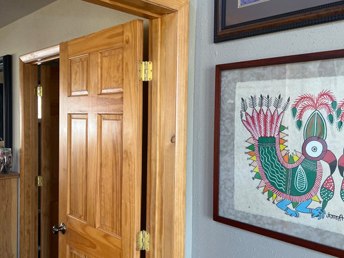
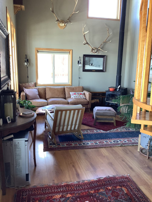
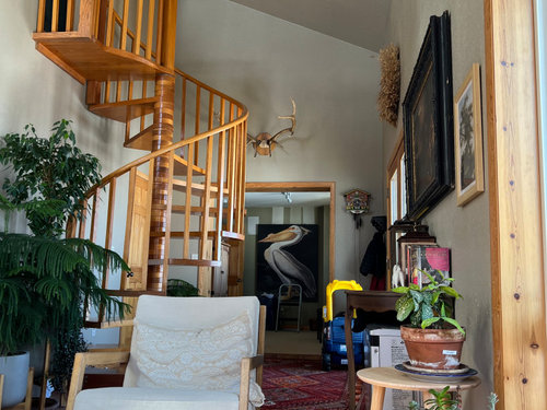
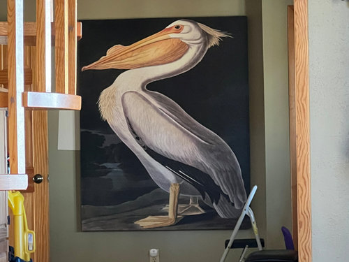
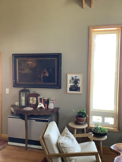
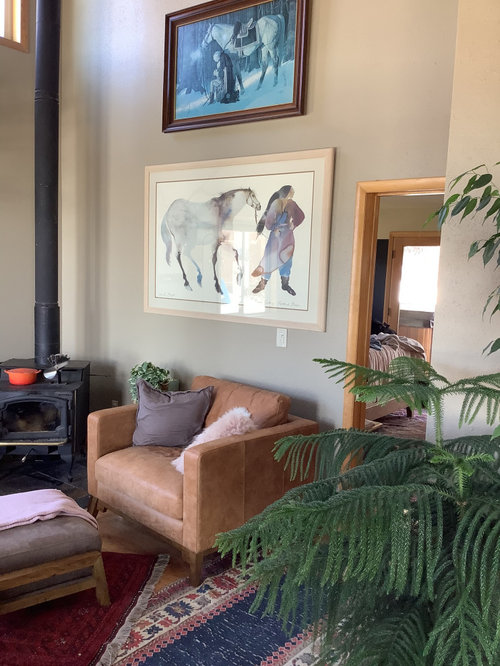
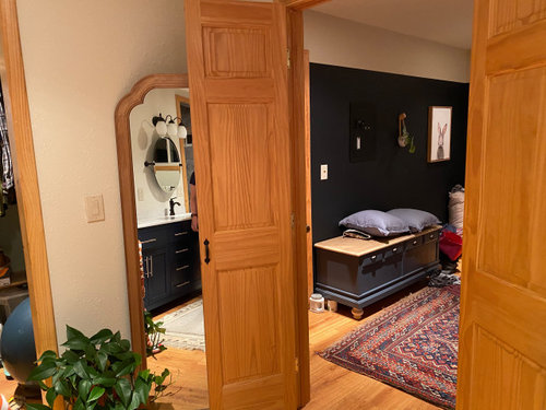
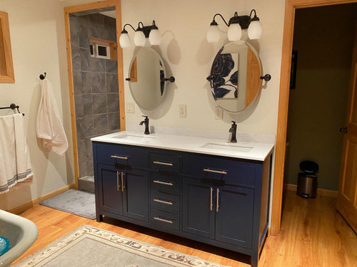
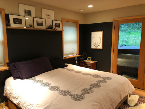
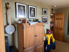
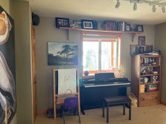
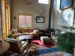
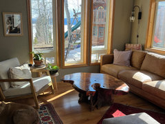
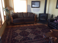
Looking for some paint advice - Benjamin Moore only, please
Toni Gunning
2 years ago
Featured Answer
Sort by:Oldest
Comments (11)

Toni Gunning
2 years agoRelated Discussions
Benjamin Moore advance high gloss paint micro bubbles everywhere
Comments (0)I am painting my kitchen cabinets, there are a white melamine, I sanded, put two coats of shellac binz, resanded cleaned with tac cloth, I am applying BM adv initially with a foam roller and there are micro bubbles everywhere! I switched to a short nap fabric roller and again micro bubbles everywhere, the only thing that didn’t cause bubbling was a brush. Any advice please help!...See MoreBENJAMIN MOORE BLUE BEDROM PAINT ADVICE NEEDED!
Comments (4)Gray is definitely a hard colour to work with. It's either too brown, too green, too mauve or too blue. I tried 6 different shades of gray before I finally settled on Coventry Gray and Stonington gray by BM. After the first coat of Coventry GrayI was unsure. It looked too blue?? After the second coat I was falling in love LOL!! I used Coventry gray for accent walls and Stonington Gray on walls with less light. You can barely tell that I used two different shades which is what I wanted. The colours are amazing! Everyone that walks in can't believe the transition. I would suggest you buy a sample jar (I used Behr paint) and paint a good size on a few of the walls to see how the lighting hits it. I'll send you a photo, if I can figure it out HAHA!! I looked at your colour choices and they all look beautiful on the swatches, but beware of how it will look on the wall....See MoreDecorators White by Benjamin Moore looks blue. Need paint advice
Comments (12)Yeah According to Maria Killam decorator white is a blue white. The scale goes: Blue white, true white, off-white, cream. Honestly you’ll have to live with the color or repaint it. If you wanted a creamy trim color, Bm simply white or bm cloud white are two choices. I wouldn’t use a cream trim unless you have very brown/earthy hard finishes and it doesn’t look like you do. Grays look better with whites and off whites anyhow. If you want a white with out the blue and not as creamy as an off-white, bm chantilly lace is a true white. You didn’t notice before because the walls were darker and the white white provided a lot of contrast. What color is the gray? Looks like a blue gray which will always read more blue on the walls. We’re you looking for something more ‘putty’ and neutral feeling? If so, a gray with a green undertone is where you want to look....See MoreAppropriate Benjamin Moore flat paint for exposed basement ceiling
Comments (12)We did our basement ceiling that way for part of our basement remodel. i think it looks great, although I do prefer the drywall ceiling in the media room. We used Sherwin Williams Cashmere paint in low lustre, spraying and rolling. We used a dark gray with a lot of brown (Gauntlet Gray). I think anything darker might actually show the imperfections. This is not special paint, just a good quality paint I've used throughout the house. Just be sure to prep well. Clean, sand, then clean again. If the environment in your basement was that different from your main floor where you need special product, I don't think you'd be finishing it for use....See MoreToni Gunning
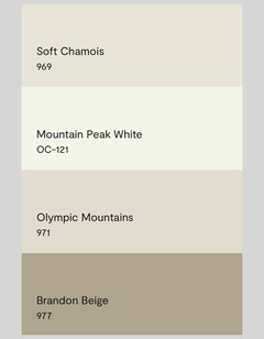
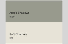
2 years agoToni Gunning
2 years agoToni Gunning
2 years agoToni Gunning
2 years agoToni Gunning
2 years agoToni Gunning
2 years ago

Related Stories
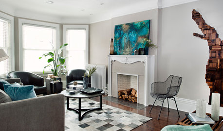
MOST POPULARCrowd-Pleasing Paint Colors for Staging Your Home
Ignore the instinct to go with white. These colors can show your house in the best possible light
Full Story
COLORBenjamin Moore Floats Breath of Fresh Air as Its Color of 2014
Touted as a new neutral, this baby blue can stand on its own or support bolder colors. Here's how to use it
Full Story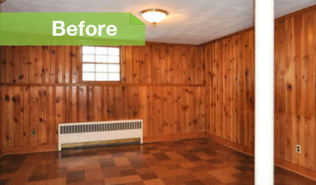
PAINTINGKnotty to Nice: Painted Wood Paneling Lightens a Room's Look
Children ran from the scary dark walls in this spare room, but white paint and new flooring put fears and style travesties to rest
Full Story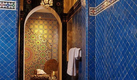
TILEMoor Tile, Please!
Add an exotic touch with Moroccan tiles in everything from intricate patterns and rich colors to subtle, luminous neutrals
Full Story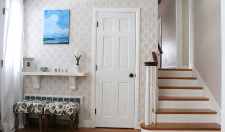
DECORATING PROJECTSGet a Wallpaper Look With a Hand-Painted Touch
Stencil a pattern for all the beauty of your favorite wallpaper at a fraction of the cost
Full Story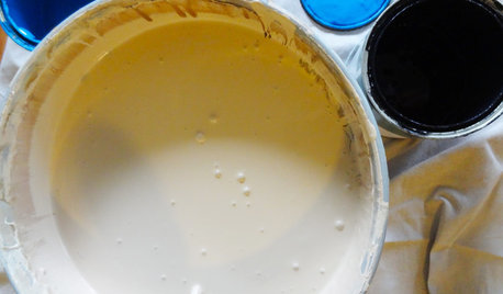
DIY PROJECTSTint Your Own Paint for New-Looking Walls
Dabbling in mixology means you can use up leftover paint and give your walls a custom look in one fell swoop
Full Story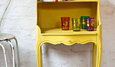
PAINTINGWhat to Know About Milk Paint and Chalk Paint — and How to Use Them
Learn the pros, cons, cost and more for these two easy-to-use paints that are great for giving furniture a vintage look
Full Story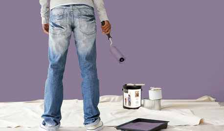
PAINTINGBulletproof Decorating: How to Pick the Right Kind of Paint
Choose a paint with some heft and a little sheen for walls and ceilings with long-lasting good looks. Here are some getting-started tips
Full Story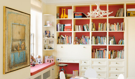
COLORPaint Your Bookcases to Transform Your Room
Give your shelves some color for a whole new look. Here are 10 examples, from subtle to bold, and some styling tips to try
Full Story
DECORATING GUIDESFrom the Pros: How to Paint Interior Walls
A slapdash approach can lower a room's entire look, so open your eyes to this wise advice before you open a single paint can
Full Story
decoenthusiaste