


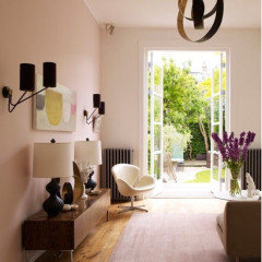
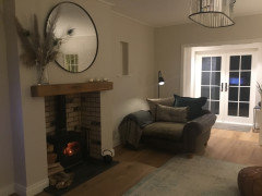
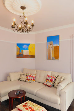
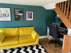
Dark lounge but stuck with furniture
elaine Hirst
2 years ago
last modified: 2 years ago


Featured Answer
Sort by:Oldest
Comments (27)

Kate
2 years agololalola73
2 years agoRelated Discussions
Stuck on furniture...Help!
Comments (6)One of the best cures for a dark room is to add edison's lights...I see some recessed cans for general lighting, but if it's not too late, you can add some spots to highlight where drapes would be by the window, something to highlight whatever it is you'll put on the mantel and maybe some spots to highlight some obvious places for artwork. Then also keep in mind lamps and torchieres that might brighten the room. Then you can feel free to add more depth of color to the room. I'm not a fan of dark brown leather either, but taupe certainly or even red or navy. Unless you are intentionally going for a monochromatic look...which most family rooms are not...then you want to be able to add color and life to the space to keep it lively and energetic enough for a young and growing family. This post was edited by AnnieDeighnaugh on Sun, Feb 9, 14 at 18:10...See MoreJust don't know what to do...stuck on an island!
Comments (54)Well Kanga, as you've seen from this thread...there are people who would change your wall color, change your cabinet color, who would do any number of different things with the island. lol. No point in thinking about what a future owner might or might not do. In your shoes, I'd be thinking about the kind of kitchen I'd like to have in my NEW place. Exciting....See MoreStuck in the 90's! Fix my Family Room!
Comments (41)I love the character of your room! I agree with cpartist that blue walls would highlight the orange tones of the wood, so that's something to consider, though is not necessarily a bad thing if you like that look. A deep, dark navy, something like BM's Hale Navy, probably wouldn't have the orange-highlighting effect as much as the less saturated blues in the mock ups. I also love aktillery's example of the her husband's office in Pewter Green and think that (or something like it) would look great in your space. Though I completely disagree with the sentiment that white rooms are boring, especially when the ceiling and architecture ooze character as yours do, I understand that they're not for everyone. I think a warm off-white would look beautiful, but it sounds like it wouldn't suit your tastes. Hope you'll update us with whatever you decide!...See MorePatio Furniture... Lounge, or Dining? How do I orient it?
Comments (3)How many guests will you host at one time? As a vacation property manager myself, my concern would be how the sun/shade hit the area.You might consider a group of two or four chairs and a table. Chairs will be easier for guests to move in accordance with sun/shade issues during the time of their stay. I assume you plan to pressure wash the pavers. The pergola looks to be quite weathered. I suggest you replace or repair and paint it. Will you add an awning to the pergola?...See More
Sonia
2 years agoelaine Hirst
2 years agoelaine Hirst
2 years ago
Juliet Docherty
2 years agolast modified: 2 years ago
Avril
2 years agoelaine Hirst
2 years agoKate
2 years agomacbroom
2 years agoSteph Pew
2 years agoelaine Hirst
2 years agoC Wilson
2 years agoMargian
2 years agosksj1
2 years ago PRO
PRONellie Vin
2 years agoLeanne Jonez
2 years ago
Alana Hale
2 years agoLeanne Jonez
2 years ago


Related Stories
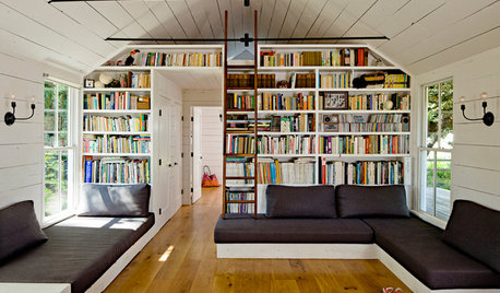
FURNITURE10 Built-In Sofas for Lounging in Style
Check out these custom sofas that pros created to maximize space and complement the design of the rooms
Full Story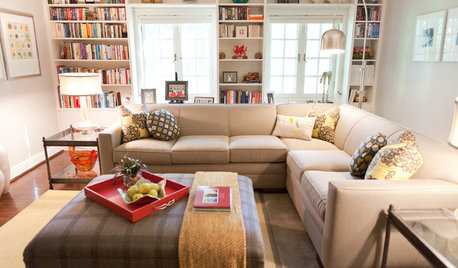
LIVING ROOMSRoom of the Day: Sink Into This Cozy Upstairs Lounge
Cushy furniture, great reading light and dashes of color make this sitting room a couple’s favorite hangout
Full Story
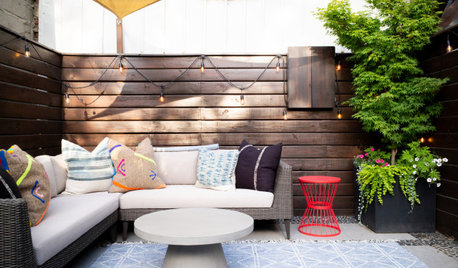
PATIOSBefore and After: 3 Patios for Comfy, Stylish Lounging
These makeovers show how furniture, plants and minor structural upgrades can transform an outdoor space
Full Story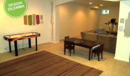
MORE ROOMSDesign Dilemma: The Perfect Basement Lounge
What Color to Paint It? Where to Put the TV?
Full Story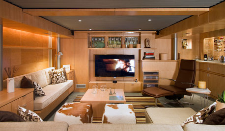
BASEMENTSBasement of the Week: Clever Details Update a Below-Ground Lounge
Lower-level design reaches new heights with rearranged ductwork, lighting, a new ceiling and modern styling
Full Story
DECORATING GUIDESExplore the Art of Light and Dark in Design
Play with dramatic contrast, the art of chiaroscuro, to add depth and interest to your architecture and interiors
Full Story
DECORATING GUIDESWhat Goes With Leather Furniture?
If that hide-covered sofa is making you seek decorating solutions, we’ve got just the pairings for you
Full Story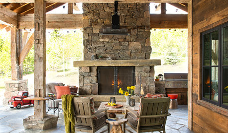
PATIOSDon’t Put Away the Patio Furniture Just Yet
Look for durable materials on outdoor furniture and cozy up your patio for year-round enjoyment, weather permitting
Full Story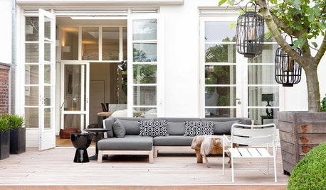
GARDENING AND LANDSCAPINGUnwind in a Boutique-Hotel Lounge — on Your Patio
Bring vacation-style comfort to your patio with cushy all-weather furnishings and accessories worthy of a posh getaway
Full Story


Isla Cherry