


Interesting Color: Sherwin-Williams Tarnished Trumpet SW 9026
gsciencechick
3 years ago
Sort by:Oldest
Comments (36)
Related Stories
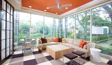
MOST POPULARHeads-Up Hues: 10 Bold Ceiling Colors
Visually raise or lower a ceiling, or just add an eyeful of interest, with paint from splashy to soothing
Full Story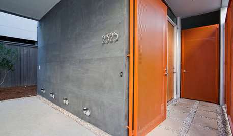
FRONT DOOR COLORSFront and Center Color: When to Paint Your Door Orange
Bring high energy and spirit to your home's entryway with a vibrant shade of orange on the front door
Full Story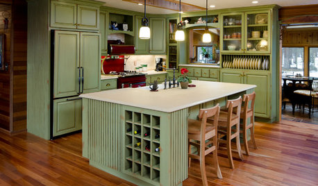
MOST POPULARHow to Reface Your Old Kitchen Cabinets
Find out what’s involved in updating your cabinets by refinishing or replacing doors and drawers
Full Story
DECORATING GUIDESDecorating 101: How to Use White Right
If you’ve ever been in white-paint-swatch limbo, you know white can be tricky to work with. Here’s how to get the fresh look you’re after
Full Story


mtnrdredux_gw
Sueb20
bbstx
Arapaho-Rd
Allison0704
mtnrdredux_gw
SEA SEA
Jilly
mtnrdredux_gw
Sueb20
suedonim75
Tina Marie
blfenton
Lukki Irish
SEA SEA
mtnrdredux_gw
Springroz
jill302
Rory (Zone 6b)
Sueb20
User
RNmomof2 zone 5
3katz4me
Fun2BHere
User
User
Joaniepoanie
cawaps
Annie Deighnaugh
User
lascatx
lyfia
Bluebell66
nini804
Yayagal
User