


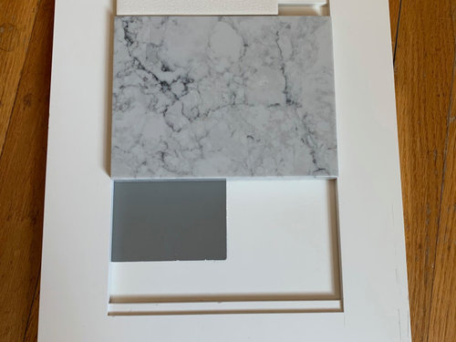
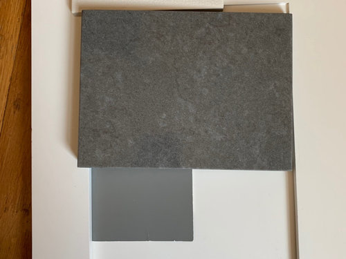
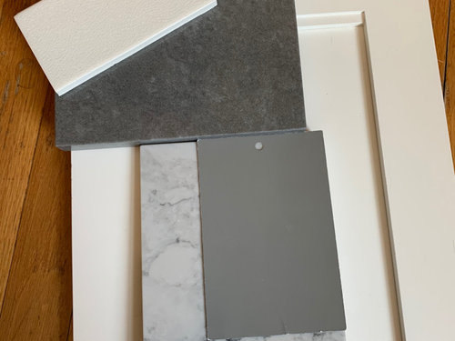
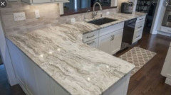
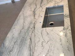
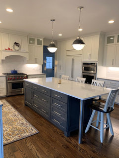
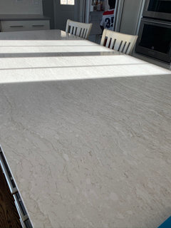
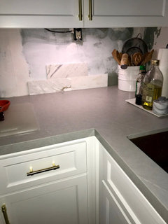
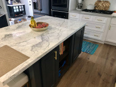
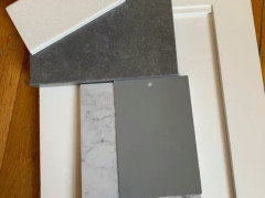
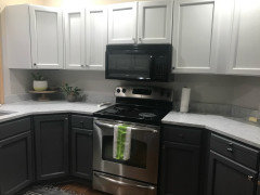
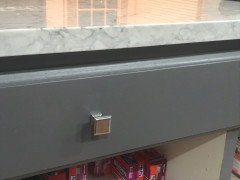
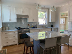
Need help choosing countertops please!
sarah_hains
4 years ago

Featured Answer
Sort by:Oldest
Comments (57)
 PRO
PRODebbi Washburn
4 years ago
sarah_hains
4 years agoRelated Discussions
Help choose countertop - please - with pics
Comments (23)Just a word of wisdom from one frugal buyer to another; sometimes the cheapest option isn't always the best and that extra cost can pay off in other ways. It's more important to love the stone you put in and hire people who are competent to do the install correctly. When you consider the expense to have it and amount of time it will be in your home, you should really love the stone you put in instead of just choosing the cheapest one available. The other really important issue to consider is fabricating & the install. Lowe's and HD contract with outside fabricators who have bid the lowest price for the job. On top of that, they pay Lowe's a brokering fee (of sorts) to find them what I refer to as low maintenance customers. By that I mean they don’t have to deal with you. The yards are either quite a ways away or they don’t allow customers to come to the site. You’ll essentially be waiving the opportunity to choose the slab you want or the fabricator who will do the job. I've heard that a lot of times those granite yards will either use the slabs no one else wants or a slab that has a lot of fissures or anomalies in it. Fissures or anomalies aren't necessarily bad, we had them keep the anomalies that were in our stone. One is fairly large, looks like the milky way and sits in the middle of our peninsula, we like it, but most people prefer not to have them. You also will have very little control over the measuring, cutting and installation as a whole. I'm not saying ALL Lowe's/HD installs are bad but what I am saying is you definitely run a higher risk of experiencing problems. Just Google Lowe’s and HD granite install reviews/ratings and read. Granite isn't like laminate and it's crucial to have experienced people who know what they are doing. Good fabricators are worth their weight in gold and generally stay busy by word of mouth alone; they don't need to negotiate their prices in order to get work from Lowe's or Home Depot. You need a fabricator who is going to know the best spot to make any needed cuts and you want someone who can install it with seams that are flawless and smooth which is not easy. If you think I'm exaggerating, please go to the kitchen forum and read about the many different issues others have run into because of a bad a install or fabricating job. It’s really a bummer when it happens. The bottom line is, you do get what you pay for and by just going with the cheapest company available you have to know they will be cutting corners anyway they can and your installation could very well suffer for it. I would also make sure that the cost psf at Lowe's includes the edges, sink and faucet holes. Usually, charges for the edges are separate and the sink & faucet cuts are free but I think the Big Box stores may charge for those as well. I'm really not trying to rain on your parade, but reading your posts gives me the impression that you really don't understand that there are some important factors to consider, Granite is not cheap and while it's great to be sure you get the most bang for your buck, you also want to be sure you pay what's needed to get the best people for the job as well....See MorePlease help me choose Countertop for Island /also backsplash
Comments (1)I think all the bits and pieces you posted look really nice together! The only thing you didn't post was the grey tile. I would pick a warm grey (no blue in it)....See MoreNeed help choosing between 2 countertops
Comments (16)You have a play of light/dark....[ backsplash/light quartz] . However, then you have a medium tone inserted into your palette with cabinets and floor. I think you might be well served by getting back to what is most compelling in your preference. Light/dark contrast is perfectly acceptable in kitchens. Also, one can do a monochromatic mid tone kitchen where the total effect stays in that midrange for harmony......esp. in small spaces. You are moving along both of these paths here. Not a violation, but you achieve a "miss". Cabinets look nice-they are the most costly....I might go back and work with those in regards the counter/backsplash options. Personally, I'd start over with floor/counters and backsplash as I find them ho-hum with your nice cabinets....See MoreNeed help choosing kitchen colour..brn floor & countertop
Comments (2)antique white looks good...See Moremegs1030
4 years agosarah_hains
4 years ago
Trish Walter
4 years agolast modified: 4 years agoMarielena
4 years agoSJ McCarthy
4 years agosarah_hains
4 years ago PRO
PROBeth H. :
4 years agolast modified: 4 years ago
Design Girl
4 years agosarah_hains
4 years agoDesign Girl
4 years agolast modified: 4 years agosarah_hains
4 years ago- PRO
Beth H. :
4 years ago strategery
4 years agosarah_hains
4 years agoDesign Girl
4 years agosarah_hains
4 years agoSJ McCarthy
4 years agosarah_hains
4 years agoDesign Girl
4 years ago
mark_rachel
4 years agolast modified: 4 years ago
sprtphntc7a
4 years agojemimabean
4 years agosarah_hains
4 years agomvcanada
4 years agolast modified: 4 years agoMichelle misses Sophie
4 years agolast modified: 4 years agosarah_hains
4 years agoMichelle misses Sophie
4 years agolast modified: 4 years agosarah_hains
4 years agoHU-656653905
4 years agotheresa21
4 years ago
Tracey Woods
4 years agoTracey Woods
4 years agosarah_hains
4 years ago- PRO
Beth H. :
4 years ago sarah_hains
4 years ago
Blueberry Abode
4 years agosarah_hains
4 years agoBlueberry Abode
4 years ago
Rachel
4 years agoajohnsonk
4 years agoJj J
4 years agoJj J
4 years agosarah_hains
3 years agosarah_hains
3 years agosarah_hains
3 years agosarah_hains
3 years agosarah_hains
3 years ago
Jason Hays
3 years ago


Related Stories
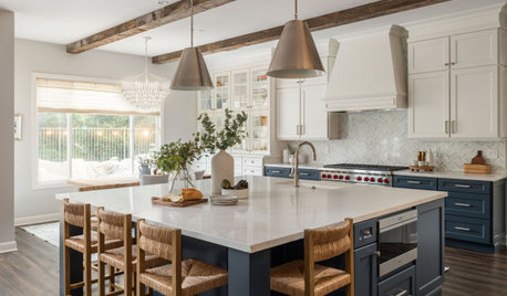
KITCHEN COUNTERTOPSWhat Kitchen Countertop Colors Should You Choose?
Consider these popular colors and styles to get the look you want — no matter what material you use
Full Story
KITCHEN DESIGNKitchen Countertops 101: Choosing a Surface Material
Explore the pros and cons of 11 kitchen countertop materials. The options may surprise you
Full Story
DECLUTTERINGDownsizing Help: Choosing What Furniture to Leave Behind
What to take, what to buy, how to make your favorite furniture fit ... get some answers from a homeowner who scaled way down
Full Story
MOST POPULARYour Guide to 15 Popular Kitchen Countertop Materials
Get details and costs on top counter materials to help you narrow down the choices for your kitchen
Full Story
KITCHEN DESIGN3 Steps to Choosing Kitchen Finishes Wisely
Lost your way in the field of options for countertop and cabinet finishes? This advice will put your kitchen renovation back on track
Full Story
LANDSCAPE DESIGNFire-Wise Landscapes Can Help Keep Your Home and Property Safe
Choose fire-resistant plants and materials and create defensible areas using these design strategies
Full Story
KITCHEN DESIGNHouzz Quiz: What Kitchen Countertop Is Right For You?
The options for kitchen countertops can seem endless. Take our quiz to help you narrow down your selection
Full Story
KITCHEN DESIGNHow to Choose the Right Depth for Your Kitchen Sink
Avoid an achy back, a sore neck and messy countertops with a sink depth that works for you
Full Story
EXTERIORSHelp! What Color Should I Paint My House Exterior?
Real homeowners get real help in choosing paint palettes. Bonus: 3 tips for everyone on picking exterior colors
Full Story
REMODELING GUIDES6 Things to Consider When Choosing a Kitchen Sink
Use this guide to help you think about sink size, bowl depth, location and other factors
Full Story


sarah_hainsOriginal Author