


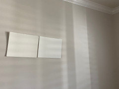
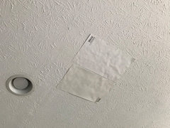
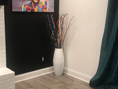
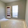
Benjamin Moore Oxford White / White Heron - in rooms with less light?
hawami
4 years ago
Featured Answer
Sort by:Oldest
Comments (77)

Sherly Indrajana
3 years ago
Jennifer Hogan
3 years agolast modified: 3 years agoRelated Discussions
Benjamin Moore Simply White looks yellow
Comments (28)Hello! I realize this is an old thread, but I'm currently experiencing the same issue. Our kitchen cabinets are painted BM Advance Simply White in satin finish. The cabinets are a lovely, radiant white with no perceptible yellow undertone. We're repainting the walls and trim and Simply White in eggshell appears yellow next to our cabinets (light beige wall was primed and then three coats of Simply White). We'd like to stick with white on the walls and wondering if anyone came up with solutions? Thank you in advance, Kristin :)...See MoreBenjamin Moore Blue Heron
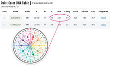
Comments (7)As for recommendations for colors I always start, like you, with a few samples, then decide if I need to go a bit more gray or more colorful, a bit warmer or a bit cooler. I use a tool called easyrgb, and my eyes, to help get me where I need to be ( https://www.easyrgb.com ) You can look up a color and see what the similar colors are to a specific color and limit the selection to the brands you are considering. The site uses a very high quality spectrophotometer to read colors from unused fan decks. Fan decks are printed using very good color matching technology and high levels of quality control, but they are not perfect and there is always some discrepancies, but it is a great starting place. I also have a color muse ($50.00 tristimulous color matching tool) that is good for comparing two colors and will provide you with color matches to popular brands of paint colors. It is a $50.00 tool, so don't expect perfection - but again, it will get you close. If you have something that you own that is the color you are looking to match it is the only tool that most of us can afford that will give you the information needed to get close. I have also sometimes used something as simple as excel to help me get to the right color. You can look up the RGB value - color two or three cells with the RGB Value, then change the color in one of the cells using the "More colors" option and the HSL option and I can make a color a bit less or more saturated, a bit lighter or darker, a bit warmer or cooler and then look up the new RGB value in Easy RGB and see what colors it suggests. Computers/monitors in general suck at rendering color accurately, but as long as I have something that I know I can move from that color to the correction and get where I want to be as a final result. The best numbers to use to slightly alter a color is probably the LCH notation in EasyRGB. Look up the color you like in easyrgb Hit the convert button and you will see the LCH notation. L = light (100 is white, 0 is black) C =Chroma (0 is neutral gray and the higher the number the more colorful the color becomes) H= Hue - what is the Hue measurement of the color Red=18 Orange = 54 Yellow=90 Green=160 Blue=234 Purple=306 Blue Heron CIE-L*Ch(ab) = 45.533 16.209 275.902° If I then look up the two closest SW colors I get Denim Blue - Just a bit less purple more true blue - just a bit more saturated - less gray and just slightly lighter CIE-L*Ch(ab) = 46.929 16.932 270.463° and Luxe Blue - more purple - not the direction I want to go. CIE-L*Ch(ab) = 45.501 18.259 279.397° Before buying samples of anything more I use my eyes - take the chips into natural daylight and look at them next to each other to see if what I am expecting is what I am seeing....See MoreHaters will hate but Navajo White Benjamin Moore is winning the race
Comments (32)It has been a while here is the final decision and I went with Navajo White (walls) Ben Moore and chantilly lace Ben Moore. In the foyer walls are Navajo White and trim is tricon black Sherwin-Williams...See MoreBright white Benjamin Moore paint with best coverage?
Comments (6)Not everyone likes the same colors. That's why every paint manufacturer has hundreds to choose from. There are at least a dozen whites as well. Impossible for us to predict which one you will like since it also depends on the lighting you're working with. In low light I would lean toward whites with some yellow like White Dove, Simply White and Cotton Balls. You don't think yellow when you see them. All colors are influenced by what is next to them also. Since you're working with the opposite exposures of north and south that can be problematic as colors look very different in those lights. I also have mostly north and south exposures, but I always use colors instead of white. I used Simply White for trim in all rooms except the one with strong southern light where I used Chantilly Lace. I wish I had used White Dove. I find Chantilly Lace to be too strong - blinding. But Chantilly Lace is very popular. Keeping in mind the fixed elements in a room such as the flooring, cabinetry (if relevant) and any furniture you already own, start sampling. Paint chips are a starting point, but you need to graduate to larger samples before committing yourself. As for coverage, whites aren't the best, so use primer and as many coats as is required. If you have chosen the right color for yourself the extra work will be worth it. And consider that using some color instead of white might actually give you a better result....See MoreJennifer Hogan
3 years agoSherly Indrajana
3 years agoSherly Indrajana
3 years ago
Connie Welcheck
2 years ago
Nice
2 years ago
susanlynn2012
2 years agoNice
2 years agoNice
2 years agoNice
2 years agoNice
2 years agoNice
2 years agosusanlynn2012
2 years ago
Mary S
2 years agoJennifer Hogan
2 years ago PRO
PROLori A. Sawaya
2 years agolast modified: 2 years agosusanlynn2012
2 years agosusanlynn2012
2 years ago- PRO
Lori A. Sawaya
2 years ago  PRO
PRODiana Bier Interiors, LLC
2 years ago- PRO
Lori A. Sawaya
2 years ago - PRO
Diana Bier Interiors, LLC
2 years ago Jennifer Hogan
2 years agoMarylee H
2 years ago- PRO
Lori A. Sawaya
2 years ago - PRO
Lori A. Sawaya
2 years ago - PRO
Diana Bier Interiors, LLC
2 years ago Nice
2 years agoJennifer Hogan
2 years agosusanlynn2012
2 years agoAmanda
2 years agolast modified: 2 years agoAmanda
2 years ago PRO
PROBeth H. :
2 years ago
Rachel L
2 years agolast modified: 2 years agoRachel L
2 years agolast modified: 2 years agoAmanda
2 years agolast modified: 2 years agosusanlynn2012
2 years agoRachel L
2 years agolast modified: 2 years agoAmanda
2 years agoNice
2 years ago- PRO
Lori A. Sawaya
2 years ago Nice
2 years ago- PRO
Lori A. Sawaya
2 years ago Nice
2 years agolast modified: 2 years ago- PRO
Lori A. Sawaya
2 years ago Nice
2 years agolast modified: 2 years agoJennifer Hogan
2 years ago- PRO
Lori A. Sawaya
2 years agolast modified: 2 years ago Jennifer Hogan
2 years agolast modified: 2 years ago


Related Stories
COLORDiscover White’s Surprising Power to Energize Every Room
Using white in different ways gives you limitless options for light, color and creativity
Full Story
MOST POPULARMust-Try Color Combo: White With Warm Off-White
Avoid going too traditional and too clean by introducing an off-white palette that brings a touch of warmth and elegance
Full Story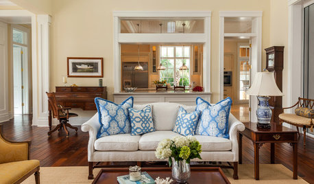
COLORThe Best White and Pastel Colors for Every Kind of Natural Light
Understand how sunlight affects your rooms and get tips on choosing paint colors for each type of exposure
Full Story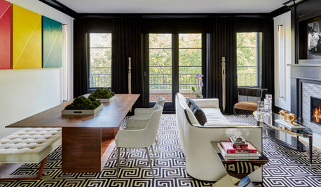
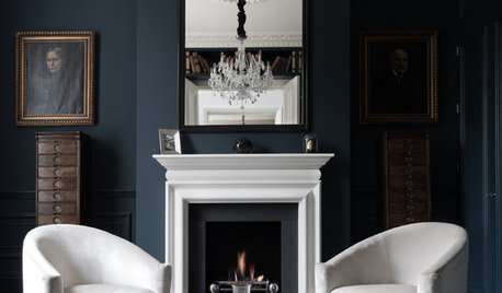
LIVING ROOMSBlack-and-White Palette for a Casually Refined Great Room
A designer layers in Art Deco-inspired furniture, sculptural LED lights and a Greek key rug for a first-time homeowner
Full Story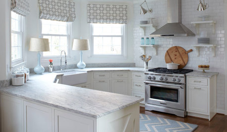
KITCHEN DESIGNHow to Keep Your White Kitchen White
Sure, white kitchens are beautiful — when they’re sparkling clean. Here’s how to keep them that way
Full Story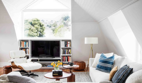
LIVING ROOMSNew This Week: How to Punch Up a Modern White Living Room
Consider these easy combinations to bring personality, color and texture to your neutral backdrop
Full Story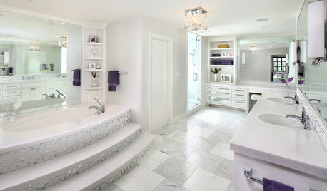
BATHROOM DESIGNRoom of the Day: Luxe Hotel Look for an All-White Master Bath
A ‘beauty bar,’ marble-lined steam shower and laundry chute are a few of the amenities in this glamorous spa bathroom
Full Story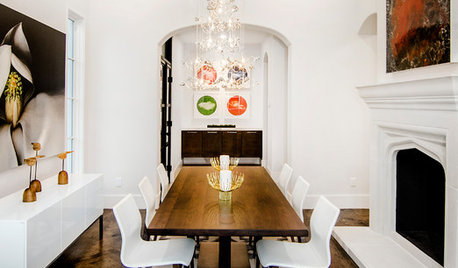
WHITEGive Your Small White Room a Boost
Your white room probably needs something more. Give your space a design boost with these 8 ideas
Full Story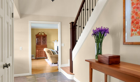
MORE ROOMSWarm Up Your Rooms With a Beautiful Off-White Paint
White paints warmed with a hint of color create radiant backdrops for countless interior design options
Full Story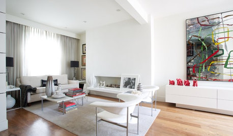
COLOR9 Decorating Ideas for White Living Rooms
These inspiring living rooms show how good an (almost) all-white room can look
Full Story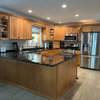


hawamiOriginal Author