


"Help me find a color...."
So I've been wanting to write about this for a while now, the dilemma of choosing paint colors. So many Houzzers ask the question, "what color should I paint my room?" or "what color is on the walls of this or that room?" in a photo. It's not a question that can be answered remotely, online, or from a photo or computer monitor.
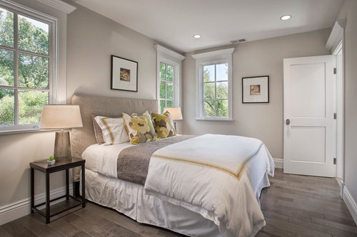
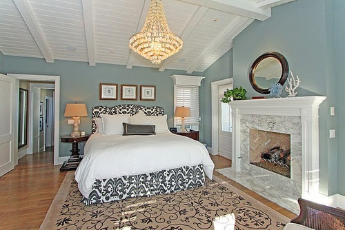
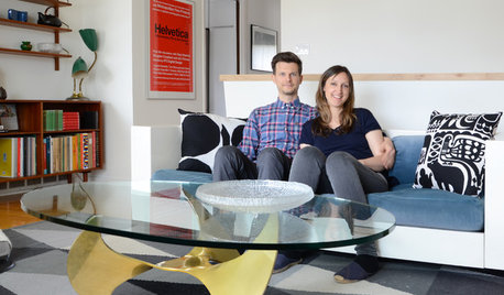
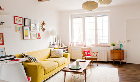
Here are some illustrations of the problem. The following three photos are of rooms painted with Benjamin Moore's "Edgecomb Gray," one of their most popular colors. As you can see, the first photo looks to be a taupey gray, the second a very light pure gray, and the third looks beige.
Let's look at another example of rooms painted in Benjamin Moore's "Wedgewood Gray."

Here again, the colors appear very different in the three images. The first looks to be a pale blue, the second a darker blue, and the third looks like a very toned gray, with a slight greenish cast.
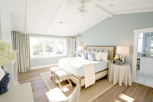
In case you think this illusion is limited to pale colors, consider these three rooms all painted in Farrow & Ball's "Stiffkey Blue." This first image shows a very bright, saturated blue.
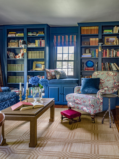
Here is a much more muted darker blue:

This color looks like a very dark navy blue, with an almost purple cast to it:
You might wonder how do I know what these colors are in reality? All were taken from the answers posted by the designer or homeowner in the question sections of the photos.
The only way you can determine how a color will look in your room is to test it in your room, with the lighting that exists in your space. Color is a function of light, and the lighting can totally change your perception of a color. Just think of walking into a very dimly lit room--everything looks gray and colorless until the light hits it.
So the next time you need color advice, you can START your search online, and get others' ideas. But the only way to end your search is with the actual color in your actual space.
Comments (117)
 PRO
PROLori A. Sawaya
4 years agoJennifer,
I'm going to choose to believe that your research simply falls a bit short and that you didn't cherry pick information and take it out of context on purpose.
I'm sure it's just a matter of your not having enough time to go far enough or deep enough to get to the conclusions about CIELAB to Munsell conversions. Look up tables is the rest of the polynomial equations story and why conversion from CIELAB to Munsell works - and works well especially in an architectural color application.
Even with the small areas of known uncertainty like the Blue to Purple-Blue hue family neighborhood (ish).
The known, and well-documented, areas of uncertainty is one of the reasons I'm constantly dropping reminders that we can't color by the numbers alone. In an architectural application how it looks is what counts most anyway.
Alos, I'm usually the ONLY one on the threads here on the forum cautioning against using only Kelvins and the need to reference CRI as well.
As I said before.
You are trying to use device dependent digitized swatches to compare data values that model in-real-life color appearance. It doesn't work that way.
The problem is you do not understand the difference between device dependent and device independent color spaces.
I encourage everyone to make their own conclusion about how well a framework of LCh and Munsell notations works for not only for describing, defining and ordering color but also as a framework for creating basic color harmony.
Here's how ya do it. You can use ANY color collection. We're using the Affinity collection just because the chips are nice and big and it's a compact 144 chips.
Get a Benjamin Moore Affinity Fandeck. There are 144 chips. Great range of colors and perfect for trying to break theories.
Use this table to look up each color by number and copy the notation on to the back of the chip.
Here are hands-on exercises that demonstrate - visually - how the data values and notations translate to color in real life.- Sort and group the colors by hue family.
- Sort by value.
- Sort by chroma.
- Sort by hue angle.
- For fun you can also sort by LRV just to see what you get.

It's more fun if you sort the chips color down, notation up and flip them over when you're done sorting.
At this point, I've had several hundred students complete these exercises and I'm always amazed at the creative color combinations and individual discoveries!
Again, you don't have to get too crazy accurate about the light source - experimenting under different light sources is actually ideal. Because this is about seeing, first-hand how the framework works in real life application.
If you don't want to get an Affinity fandeck, you can also experiment with the colors from this infographic. Get some or all of the colors. I'd say you need at least a dozen.
If you decide to use these colors of white, also experiment with the rule of thumb that as long as there is a difference of 0.20 in Munsell Chroma, neither color of white will make the other look dirty or dingy.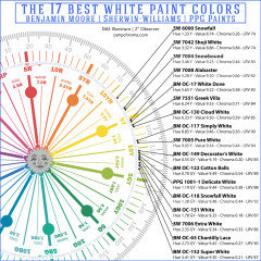
These exercises will give you a good understanding of the basics.
As you get more fluent with notations, you'll innovate other ways to apply what you've learned on your own.Related Discussions
Please help me find this color? ++
Q
Comments (1)Bleeker beige is similar to Shaker without the pink undertone....See MorePlease help me find these colors!
Q
Comments (2)Thanks funcolors. I was wondering if the Kennebunkport Green might work, but I had never seen it in person before. Does the gloxinia have a touch of purple to it like the door? I wasn't able to find any photos of the color. It looks like the Sears Hardware stores carry Pratt and Lambert so I'll pick up a chip. Thanks so much for your help!...See MoreYikes, painter starts Thurs, help me find a color
Q
Comments (9)What color bedding do you have in the second bedroom....can you pick a color from that? I don't think bedrooms have to coordinate in color with each other.... Without seeing the rest of the bathroom...I think white is fine in there since you have a vibrant blue tile...but if you want blue in there I would go with the deepest blue in the tile....See Morehelp me find a color for kitchen please
Q
Comments (1)I have been thinking magical stardust. any opinions or suggestions?...See More- PRO
Lori A. Sawaya
4 years agolast modified: 4 years agoI just realized the table doesn't include hue angle.
Here's a PDF of the Affinity stickers we use in my color courses. Not going to leave the link up forever, so download while you can.
Instructions:
Buy Avery 5160 Stickers, print the labels, stick 'em on the back of the Affinity chips, play with color.

CC
4 years agoLori, you are my color hero! Everything you say makes so much sense and you have helped me immensely. I’m so grateful that you share your knowledge here for the “color confused masses”... like me! I keep rereading your posts and they make more sense each time I read them. You are a treasure! :)
- PRO
Lori A. Sawaya
4 years agoThank you, CC. :)
Color literacy is a passion project for me.
The is an abundance of misinformation - especially on blogs - and I am fully committed to sharing correct information and resources to counter it. 
Jennifer Hogan
4 years agoLori,
I remember when a small software vendor came to my company with a proposal. They boasted that the single largest distributor of the data system that their database solution was developed on. My response wasn't awe, it was "why?". Why are they using a data system that others are not using? Why aren't companies like Walmart, Exxon or Apple using this system?
Knowing that CIE LCH was made an ISO standard nearly 40 years ago, my response to your statement that you are the one and only resource for this simple method of color analysis is similar. Why?
If it is so straight forward and simple with no complicating factors, would it not stand to reason that someone other than you may have figured this out?
I have been using LCH for years - I know how to use it.I own over 400 large painted color samples (8 1/2 x 11 or larger) that I use when assisting others with selecting colors.
I have them organized in binders by Munsell color family, whites, cool neutrals by hue and warm neutrals by hue. I have had this system for somewhere in the range of 20 years, although the number of samples in the books keeps growing as more and more people who I help give me samples of colors that are not already in my books.
I realize that you are the supreme expert and just because virtually every other color expert states that other colors in a room will make a neutral appear pink or purple or green or blue, I should probably just bow down and accept that this is simply not true and that the only thing that makes colors shift is the quality of light.
I should probably also continue to preach CRI as I did 3-4-5 years ago, but I backed off after the regulations were put in place that a light bulb can't have a CRI of under 80 and be energy start rated or sold in California. I bought Cree 5 years ago because it was one of the only light bulbs with a CRI of 90. You had to research it back then as there were no CRI requirements and few manufacturers shared their CRI data. I think you may have been late to this game.
I will not apologize or change my method of illustrating color via the use of sRGB equivalents until you show me a way to shove my large painted samples into my computer and have them plop out on the desk of the OP. Until then I have to use the technology that is available. It isn't perfect, but it is the best available.
And just so you know - the color space is not so atrociously limited that it can't render close approximations of most colors used in interior design. Pictures that your kids send you of your grand-kids don't show grotesque green monsters on your screen.
The issue with most of the pictures on the internet of paint colors are that the color space used to shoot the picture, the one used to edit the picture and the one used to display the picture on the internet are different. Many people have photo shop and use the adobe rgb space, thinking it renders color better than sRGB, but what it actually does is mimic how a photo will be printed on a CYMK printer where sRGB is displaying how the RGB light will be viewed on other devices. Generally we see washed out photos and loss of blues and green values because of this, not that sRGB can't produce the color, it is because the numeric value defined for a color in sRGB is lighter or a slightly different value than the one defined for CMYK printing. The reason the color definitions have to be different is because the RGB lights on the computer are all transparent, and the inks used for printing have different levels of transparency. Ever notice that is is much harder to cover white walls with red paint than equally saturated blue paint? It is because the red pigments used are more transparent than blue pigments.- PRO
Lori A. Sawaya
4 years agoI will not apologize or change my method of illustrating color via the use of sRGB equivalents until you show me a way to shove my large painted samples into my computer and have them plop out on the desk of the OP. Until then I have to use the technology that is available. It isn't perfect, but it is the best available.
Using digitized swatches of color to illustrate an aesthetic concept is not the problem. At this point I think everyone understands that how colors appear online will not match how they look in real life.
Whatever you find online is for ideas and inspiration only - you have to pull physical samples together in real life to make visual judgments.
Using digitized swatches of color to demonstrate color appearance differences as defined by LCh data values in an effort to prove that LCh is not effective for describing what colors look like in real life is what is incorrect and misleading.
Which is why I provided everyone the tools they need to prove out how LCh and Munsell notations work for themselves with hands-on exercises using in real life color. - PRO
Lori A. Sawaya
4 years agoI should probably just bow down and accept that this is simply not true and that the only thing that makes colors shift is the quality of light.
I never said or even remotely implied that the only thing that affects color appearance in context is the quality of light.
The light source is critical but there are other factors to consider as well. - PRO
Lori A. Sawaya
4 years agoyour statement that you are the one and only resource for this simple method of color analysis is similar. Why?
I'm not the only resource.
I'm the only one focused on color literacy for interior designers, color consultants, and color professionals and educating them about the science and the art of applying an evidence-based approach to their color design workflow. 
beckysharp Reinstate SW Unconditionally
4 years ago"Unlike you, I am not a self-proclaimed expert"
"I realize that you are the supreme expert"
"I should probably just bow down and accept"
I find such a sarcastic, snarky, defensive tone is so off-putting and unpleasant that I can't listen to the messenger long enough to absorb any of the actual message.
I'm reminded of the time when my husband had the choice for a serious ailment of a top surgeon with a wretched bedside manner who dismissed patient concerns and denigrated nurses and other doctors, and a top surgeon with an excellent bedside manner and working relationship with his colleagues. He chose the latter and never regretted it.
Jennifer Hogan
4 years agoYou reamed me for using digitized swatches to show that Revere Pewter can appear purple when surrounded by green. I wasn't saying a thing about LCH.
Your response was "Jennifer,
You're trying to compare digital color swatches by applying data values that model in-real-life color appearance.
It doesn't work that way.
You're comparing apples to oranges and as a result nothing of what you've shared illustrates anything correct, useful, or meaningful."
I found your comments to be unduly harsh, dismissive and arrogant.
I use my experience with cosmetology and several years doing makeovers in a shop. I know that very slight variations in skin tone (all Caucasians are pretty much some shade of beige) make a huge difference in color selection of lipstick, blush, hair color and wardrobe color choices.
I have found this to be true when selecting neutrals for a home. Just the slightest change in hue, when painting 400 square feet of wall or covering 100 square feet of floor space can and will directly impact the colors that you should use in the room. I generally advise people to choose color first, then pick neutrals that will work best with the colors they love.- PRO
Lori A. Sawaya
4 years agoI found your comments to be unduly harsh, dismissive and arrogant.
That was not my intent. I could have worded that part better so it wasn't so matter of fact. Thanks for pointing it out.Diana Bier Interiors, LLC thanked Lori A. Sawaya 
cpartist
4 years ago"Unlike you, I am not a self-proclaimed expert"
"I realize that you are the supreme expert" "I should probably just bow down and accept"
Jennifer Hogan, I'm wondering why you're so angry?You reamed me for using digitized swatches to show that Revere Pewter can appear purple when surrounded by green. I wasn't saying a thing about LCH.
I found your comments to be unduly harsh, dismissive and arrogant.
No she wasn't reaming you and there was nothing harsh and dismissive about her comments. She was explaining how she works and how she tries to educate about color. She was explaining the difference.
I think the real issue is with yourself. You have this need to prove yourself correct.
Diana Bier Interiors, LLC thanked cpartistcpartist
4 years agoThat was not my intent. I could have worded that part better so it wasn't so matter of fact. Thanks for pointing it out.
You are a true lady. :)
Diana Bier Interiors, LLC thanked cpartist- PRO
Lori A. Sawaya
4 years agoJennifer raises excellent points and asks many good questions. The tough color questions are the most fun. I appreciate everyone's patience with our detailed color conversations.
Diana Bier Interiors, LLC thanked Lori A. Sawaya 
Lyndee Lee
4 years agoI am definitely getting an education on these matters. Thank you for more information than will ever truly find its proper location in my gray? matter
Diana Bier Interiors, LLC thanked Lyndee LeeJennifer Hogan
4 years agocpartist,
If you believe that calling someone out on a public forum , stating that "nothing of what you've shared illustrates anything correct, useful, or meaningful." is appropriate online etiquette I am going to respectfully disagree.
I would never say anything that disrespectful to another poster. You are correct that this behavior angered me and my responses were fueled by this anger and at times snarky. For that I do apologize. I probably should have simply addressed the inappropriateness of her post and let it go. I was too pissed off to do that.
I also apologize that you and others had to witness our battle.Jennifer Hogan
4 years agoLori,
I am sorry that my remarks were snarky. You also raise excellent points and you have helped many people gain a better understanding of color.
I am still not sure what the intent of your comments were if it was not meant to discredit my opinion or illicit and angered response, but I will accept your word that this was not your intent.
I also apologize for attacking your opinions, even if they differ from my own, I should have approached our differences from a place of curiosity, not anger. We only learn when we continue to be curious and allow our minds to expand beyond our own limited understanding.
I did find your comment "nothing of what you've shared illustrates anything correct, useful, or meaningful." to be rude and disrespectful and am asking that you do not address me in this fashion again.- PRO
Lori A. Sawaya
4 years agoI'm happy to explain what I meant. Thanks for asking.
We need to put my comment back into its original context first. I was speaking to these illustrations about LCh only and specifically - nothing else.
Using digitized swatches of color to compare color data values that model color appearance in real life is not going to render accurate or meaningful results.
Because in order to judge how LCh values align with color appearance you have to use real color chips because that's the single intended application of LCh.
Which is why I provided everyone the tools they need to prove out for themselves how LCh and Munsell notations work to describe and define what color looks like in real life.
Because I think everyone would agree that while links and quotes are interesting and informative, there's nothing like seeing the results of using an organized framework of color notations for yourself. Jennifer Hogan
4 years agoJust to be clear - this is not directed to Lori.
This is a clarification of the danger to using just the LCH numbers when working with neutrals.
Someone posted something today, stating that a white was really a green white, not a blue white.
I looked at the white - my eyes tell me it is a blue whiteI looked it up in Easy RGB - hue is listed as 133 (7.5 GY).
Confusing?
Here is a picture of the swatch against the Maria Killam Color Wheel for Specifying Colour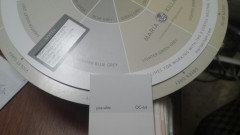
Is it blue gray or green gray? What do your eyes tell you?
This got me thinking - what are the LCH values of the other neutrals on her color wheel?
I used my handy dandy Color MuseDocumented the LCH Values using the comparison tool
(Remember - this is a $50.00 tool - not perfect, but pretty decent for an inexpensive tool)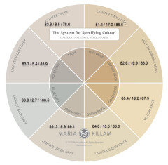
I then mapped those Hue Values to the Color Strategist Wheel.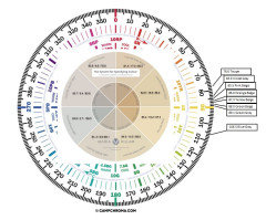
Very small changes in the Hue of a neutral color can really vary the color you will see. Maria defines this, as do I as the undertone of a neutral. Just stating that a color is near 5Y does not mean that it is a yellow beige. Much depends on both the L&C values.
- PRO
Lori A. Sawaya
4 years agoJennifer,
We could probably duplicate what you're seeing - and easily agree with you - if we knew what light source you were using to make your color judgments. - PRO
Lori A. Sawaya
4 years agoAlso, hoping you can fill me in because I don't follow her.
But it looks like she is giving those color wheels away for free, pay shipping only, because she didn't know that you couldn't duplicate paint colors using CMYK inks?
And in order to salvage it in some way, you have to get in-real-life paint chips and glue them to the color wheel because the colors on the wheel are wrong.
Therefore the wheel is not usable unless you do the patch with paint chips? Lyndee Lee
4 years agoI actually just used that color last week and in that house the color was a blue gray.
L thomas
4 years agoHi Lori-
I'm not trying to ruffle feathers - genuinely trying to figure out the way you think about color. I downloaded the apps you suggested, and for kicks, looked up the color of nearly every room in my home: BM Chelsea Gray; Hue 90.9. I found the degree on the color wheel and lo and behold - I have yellow walls.
When I talk or think about the color of my walls- they're gray. Sometimes they're a muted tealy green gray. Sometimes they're more olive. In one room upstairs the go almost purple gray. I find all this sort of fun and am light hearted enough about my own house that I don't freak out.
What I never have thought, nor what I don't think anyone who has seen the rooms in my home have thought, is that we have yellow walls. I think the idea of moving color perception from subjective to objective is fascinating because I've always thought that was subjective. This is taking color and assigning a precise numeric value. But the way humans live and talk about and work with color, is entirely different. If someone ever said they like my gray walls, I don't think I could ever say "thank you, but they're actually yellow" without them thinking I was either colorblind or batsh*t crazy (admittedly I sort of am). So, I guess - what good does this all do? What am I missing? Thank you :)- PRO
Lori A. Sawaya
4 years agoThis is taking color and assigning a precise numeric value.
Yes, that's true. What we're doing is looking up and reading the original color data values which are CIELAB/LCh that are used to make paint colors in the first place. - PRO
Lori A. Sawaya
4 years agolast modified: 4 years agoBut the way humans live and talk about and work with color, is entirely different.
The original color data values CIELAB/LCh model color appearance based on human perception under specified illuminants (kind of light).
It explains WHY a color looks the way it looks under different yet specific kinds of lighting.
It's one of the reasons it serves as an elastic framework for describing, defining and ordering color.
It allows for individual color perception, different contexts, and various lighting conditions - in a word, it's elastic.
Which is very different from subjectively judging color under random, unspecified light sources and then categorizing it into unyielding, static silos of "undertones".
If you don't agree with the person who says a paint color has "X" undertone, then you're just wrong. Period.
Color science is much more inclusive. Notations like LCh democratizes color.
It is the original color DNA used to make color in the first place and it models in real life color appearance according to an average of real humans with normal color vision - not just ONE person's subjective color opinion. - PRO
Lori A. Sawaya
4 years agoSo, I guess - what good does this all do?
If a color looks different from its LCh or Munsell notation, there's plenty of room to explain why and figure out what to do instead.
And the tangible framework of notations gives you an orderly template to follow to find a different near neutral if Revere Pewter doesn't work out for you, for example.
Instead of shuffling aimlessly through painted sample boards or paint chips, data values and notations gives us framework to follow to find the right color.
If Revere Pewter is the color of depressing green mud in your space, we'd know to stay away from colors that are similar to Revere Pewter.
Instead, we might pivot to a different near neutral -- like Accessible Beige.
Accessible Beige because it's a little closer to the yellow-red hue family so it'd be less likely to read as green, it's also a smidge lighter, and has a bit more chroma. - PRO
Lori A. Sawaya
4 years agoWhen I talk or think about the color of my walls- they're gray. Sometimes they're a muted tealy green gray. Sometimes they're more olive. In one room upstairs the go almost purple gray.
First, that sounds amazing. lol! :)
And it's the perfect example of why color can't be pinpointed to single idea of "undertone".
The science explains WHY the color appearance of Chelsea Gray is different in different contexts.
In context of a balanced light source similar to daylight, Chelsea Gray would look "just gray" no discernible hue.
Because we know that's what near neutrals from the Yellow Hue Family look like, that's what they "do" under a balanced light source.
If Chelsea Gray shifts and doesn't look neutral with no discernible hue, then we know it's a matter of inherent light sources and context influencing what it looks like.
At which point you can choose to lean in to it and appreciate it for what it is, or you can try to manage the light you have to work with by choosing a different kind of gray, from a different hue family. L thomas
4 years agoThank you so much for taking the time to provide a thoughtful explanation. It makes so more sense now. When I was in architecture school, one studio touched briefly on color, but nothing like sort of knowledge and outlook. I very much appreciate it!!
Jennifer Hogan
4 years ago
Do you have any food coloring at home? If you take a glass of water and add one drop of blue and one drop of yellow you will get a blue green color. Now add more yellow - how many drops of yellow do you need to add for the water to look yellow instead of green?
Dump the water out and and do the experiment again, only this time add more and more drops of blue until the water looks blue.
When you mix pigments together to create gray or brown you need to use varying amounts of triangulated color - it can be red, blue, yellow or green, orange, purple or any other colors that are separated by 120 degrees. By adding a little more of one or two colors you make the different
When you do this you always use more yellow than the other colors because it is a weak pigment.
The LCH values are showing what colors went into a can of paint to make the color.
Munsell color codes are based on the human perception of color. It is the color that most people with normal color vision will say a color is if they see the color in natural daylight.
The two are not one and the same. Their isn't some magic mathematical formula that converts LCH to Munsell.
So, now we know all true grays and browns are actually yellow and we are all bats**t crazy!Jennifer Hogan
4 years agoOh, and to answer why your paint color looks different in different rooms.
When you have light, reflective colors (High LRV), the paint will reflect the colors that surround it, but the lower the LRV, the less this happens. My one sister picked a very neutral white, then installed green carpet and suddenly her walls look kind of green.
Light can also change the look of a color because different lights have different wavelengths, so if you have 2700 k light bulbs in one room and 5000 k light bulbs in another room the color should look more yellow in the room with yellow light (2700 k). You just dropped another drop of yellow into your glass of water.
Remember that your gray has some blue, some red and a bunch of yellow pigments in the paint.
Since your paint has all of these colors if you have a lot of one color in a room - like yellow flooring you are going to see more of the complementary color, so your gray may look more blue.If you have a lot of green you may see purple. ( I know my definition of complements isn't what you learned in grade school.)
For some reason our brains always seem to seek balance.
Here is a link to a fun exercise that demonstrates complementary color and seeing colors that aren't even there.
https://www.animations.physics.unsw.edu.au/jw/light/complementary-colours.htm#6
When we have true color, our brains love complementary color schemes, but it seems to me that when it comes to mixing neutrals in a room our brains seem to get confused and you feel like throwing up if we put green gray with pink beige. Maybe it is too much unclear stimulus all at once?
One other thing that can impact how you see color is your mood. When you feel blue you actually see more grays and blues. Dopamine is a neurotransmitter that stimulates the rods and cones in our eyes and make them see color. When we produce less dopamine we won't see colors as vividly and our red green cones seem to be more suppressed than blue.- PRO
Lori A. Sawaya
4 years agoThe two are not one and the same. Their isn't some magic mathematical formula that converts LCH to Munsell.
Oh I don't know, some people might think it's magical. :)
The Munsell Color Order System was the template for CIELAB color space.
CIELAB and LCh are the same color space.
CIELAB is the Cartesian coordinate format and LCh is the cylindrical format.
Which is we can convert CIELAB values to a Munsell hue/value/chroma notation.
Also, why we can correlate LCh values (within a reasonable range) to Munsell Hue families like you see on The Color Strategist Color Wheel. - PRO
Lori A. Sawaya
4 years agoWhat Munsell Hue Family would you place this LCH value?
In the 1 P to 4 P hue family neighborhood. Jennifer Hogan
4 years agoHere is one that isn't my data, but from the Moscow University Science Bulletin
p 144
MOSCOW UNIVERSITY SOIL SCIENCE BULLETIN Vol. 73 No. 4 2018
Let us compare the data on change in gley color
with browning of gley soils (gleysols) from Fougeres
[16]. The color of bluish-gray green rust of gley hori-
zon is 5ВG 6/1 in the Munsell system. In an hour of
exposition in the air, it becomes 5Y 6/4. After the
transformation of these data to the CIE-L*a*b* system
according to the scheme [7], we receive color charac-
teristics of the gley horizon: L* = 61.7; a* = −5.2; and
b* = −0.66. Then we determine color parameters of
the pale-yellow–olive horizon by the same approach:
L* = 61.7; a* = −2.46; and b* = 28.97. The lightness
of the samples remained stable, and the mean rate of
change in color as a result of oxidation of green rust is
calculated as Va = (–2.46 + 5.2)/1 = 2.74 h–1; and Vb=
(28.97 + 0.6)/1 = 29,57 h–1.
Thus, fast browning of green rust in the open air (in
the soil of Fougeres) is reflected in the rapid increase
in yellowness b* at constant lightness L*.
5BG 6/1=LAB 61.7 -5.2 -66=LCH 63.2 57.2 270.3 (5 PB?)5Y 6/4=LAB 61.7 -2.46 28.97=LCH 61.70 29.07 94.85 (Between 5Y and 7.5Y)
- PRO
Lori A. Sawaya
4 years agoThat is the color of the Munsell Color Chip 10PB 3/6
Yeah, that's about right.
I have slightly different numbers for 10PB 3/6, but we're close enough.
CIE-L*Ch(ab) = 30.760, 33.816, 303.091 (D65/2)
The difference source to source could be because of any number of reasons. Different samples were measured, different devices, one source may have rounded up while the other used 2 or 3 decimal points, etc.
And, of course, knowing the illuminant, observer, and measurement geometry always helps too.
Even with a difference (or unknown) in the basics, we're still gonna end up in the same hue family neighborhood.
But this is also a good reminder that in order to make the data values and notations most meaningful, consistency is critical. You need to choose one resource for the measurements.
Like, if you're going to use the Munsell notations Dunn-Edwards publishes in their fandeck, then that's the only source you should use - especially if you're comparing - not just referencing - hue/value/chroma attributes.
- PRO
Lori A. Sawaya
4 years agoThe color of bluish-gray green rust of gley horizon is 5ВG 6/1 in the Munsell system. In an hour of exposition in the air, it becomes 5Y 6/4. After the transformation of these data to the CIE-L*a*b* system.
Stuff like this out of its original context is always difficult to decipher accurately.
But.... based on this sentence alone, there's a critical error.
We can convert CIELAB to Munsell but we can't go the other way - you can't convert Munsell to CIELAB.
So, the details of their actual process for their study would be important to review. Jennifer Hogan
4 years agoLori,
Did you mean to say "We can convert CIELAB to Munsell but we can't go the other way - you can't convert Munsell to CIELAB"?- PRO
Lori A. Sawaya
4 years agolast modified: 4 years agoBecause conversion, transformation from a color order system like Munsell requires look-up table interpolation. It can't be done entirely using equations.
Altho I've heard AI or some kind of software exists that can do it but I don't know what it is. Jennifer Hogan
4 years agoIf you are comfortable calling blue grays yellow or saying that a color can be matched accurately to both Munsell 5P and 10PB or another matched accurately to both 5BG and 5PB, who am I to argue.
I am not comfortable with inconsistent data, but to each his own.- PRO
Lori A. Sawaya
4 years agoI am not comfortable with inconsistent data, but to each his own.
Oh it's very consistent and repeatable.
If it wasn't, mixing gallons of paint to match paint chips wouldn't be possible.
Actually manufacturing anything in color wouldn't be possible. Because everything has a CIELAB value.
The main thing that makes the data consistent is a specified light source.
Without a specified illuminant/light source then color data values and notations are meaningless.
Because without light there is no color for humans to perceive.  PRO
PROJAN MOYER
4 years agolast modified: 4 years agoAs I say...... Go in that windowless closet, shut the door, and tell me the color on the walls. Good luck : )


JAN MOYER