


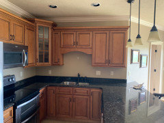
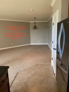
BM Simply White walls with Super White trim
m111675
4 years ago
Featured Answer
Sort by:Oldest
Comments (88)

Gina S
3 years ago
victoria b
3 years agoRelated Discussions
Trim: BM Simply White, Want: white wall; which white will work?
Comments (2)Thank you amrad. I have the BM fan deck at home with weekend so that helps with visualizing the colors together. I should have mentioned that I will be repainting the now pale yellow walls to BM Hawthorne Yellow (well, at least I think that now, we'll see after the test pot goes up). Would that change your recommendation?...See MoreWhat White Ceiling Color with BM Simply White Trim?
Comments (2)Do you have crown molding?...See MoreBM Super White on walls-what white for trim?
Comments (5)Trust me, the Aura matte is amazing with regards to scrubbing, really! We had scuff marks on our wall behind a large hibiscus plant/tree where the branches had scraped against it (we bring it inside for the winter and turn it every few days so different sides are exposed to the sun streaming in through the windows). I scrubbed the wall, with lots of elbow grease in some stubborn spots with no loss of paint or change in the finish at all. I've scrubbed other marks on the walls as well (we used Aura matte in other colors in a couple of other rooms so far) with the same great results....See MorePaint: BM Simply White walls with Super White trim
Comments (4)I love simply white but in a bright interior it looks very white. I really really love ivory white for walls if you want something softer, but I’m not sure if that’s what youre going for...See More PRO
PROFlo Mangan
3 years ago
Jennifer Hogan
3 years agoJennifer Hogan
3 years ago PRO
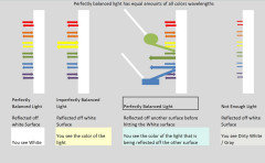
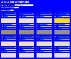
PROLori A. Sawaya
3 years ago- PRO
Lori A. Sawaya
3 years ago - PRO
Lori A. Sawaya
3 years ago - PRO
Lori A. Sawaya
3 years ago Gina S
3 years ago- PRO
Lori A. Sawaya
3 years ago Gina S
3 years ago
Carolae
3 years agoGina S
3 years agolast modified: 3 years ago- PRO
Lori A. Sawaya
3 years ago Jennifer Hogan
3 years agovictoria b
3 years agoGina S
3 years agoGina S
3 years agovictoria b
3 years ago
Anne Rambo_Young
3 years ago- PRO
Flo Mangan
3 years ago victoria b
3 years agovictoria b
3 years agoJennifer Hogan
3 years agoJennifer Hogan
3 years agoGina S
3 years agoAnne Rambo_Young
3 years agoJennifer Hogan
3 years agoGina S
3 years agopetula67
3 years agoJennifer Hogan
3 years agoGina S
3 years agoAnne Rambo_Young
3 years agoAnne Rambo_Young
3 years agoJennifer Hogan
3 years agopetula67
3 years agoHU-969855738
3 years agovictoria b
3 years agoJennifer Hogan
3 years agotdemonti
3 years agoHU-969855738
3 years agoJennifer Hogan
3 years agolast modified: 3 years agoHU-969855738
3 years agoHU-969855738
3 years agoJennifer Hogan
3 years agoHU-969855738
3 years agoJennifer Hogan
3 years agodmontante
3 years agoLori
3 years agolast modified: 3 years ago


Related Stories
TRIMTrim Color Tips: Get Your White Trim Right
Set off wood tones, highlight architectural features, go minimalist ... white trim is anything but standard when you know how to use it
Full Story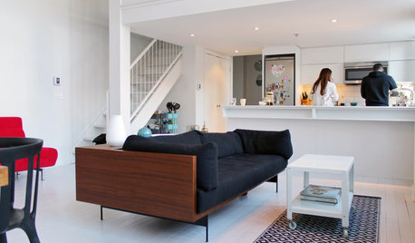
HOUZZ TOURSMy Houzz: Color Hits the Spot in a White-on-White Scheme
Bright red furniture strikes a dramatic pose against snowy walls and floors in a Montreal loft
Full Story
MOST POPULARMust-Try Color Combo: White With Warm Off-White
Avoid going too traditional and too clean by introducing an off-white palette that brings a touch of warmth and elegance
Full Story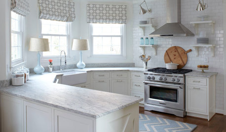
KITCHEN DESIGNHow to Keep Your White Kitchen White
Sure, white kitchens are beautiful — when they’re sparkling clean. Here’s how to keep them that way
Full Story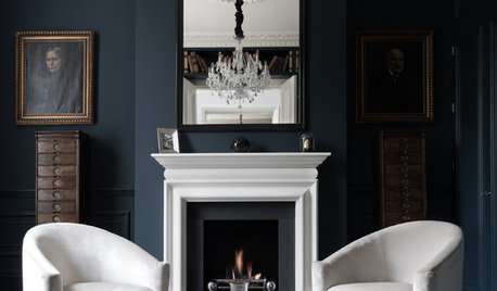
COLORDiscover White’s Surprising Power to Energize Every Room
Using white in different ways gives you limitless options for light, color and creativity
Full Story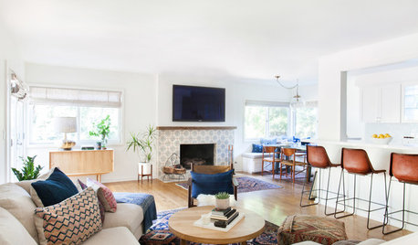
DECORATING GUIDES10 Reasons to Embrace White Walls
Do they strike you as even more boring than watching white paint dry? Consider what makes them the darling of so many
Full StoryWHITE7 Reasons to Trim Your Home in White
White trim is multifunctional, and it can do amazing things
Full Story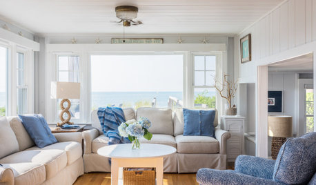
WHITEWhat to Know Before You Paint Your Walls White
A coat of white paint can do wonders in one room and wreak havoc in another. Here are tips for using the popular hue
Full Story
KITCHEN DESIGNWhat to Do if Your Kitchen Is Simply Too White for You
Does your all-white kitchen have you craving a little color? Here are some ways to introduce it
Full Story
DECORATING GUIDES10 Wonderful Ways to Colorize a White-Walled Room
Drawing a blank on white walls, you say? These decorating ideas can help your rooms come alive with color
Full Story


Lori A. Sawaya