


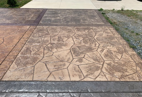
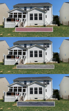
What colors for stamped concrete patio?
User
4 years ago
last modified: 4 years ago
Featured Answer
Sort by:Oldest
Comments (40)

jck910
4 years ago- PRO
SJS Interiors
4 years ago Related Discussions
Patio - stamped concrete vs. pavers - Conflicting Info
Comments (18)You know, it's interesting how when we travel to Europe or other parts of the world where we can see buildings several hundred years old, we appreciate the patina of age on things -- plaster showing its age, cracked stone paving, irregular color in brick, time-worn marble, and so on. In the US we always want to rip out the old, solid materials because of minor imperfectons, and replace them with something shiny, new, and not necessarily of equal quality. If there is a real problem with your tiles -- undermined and unstable surface, safety issues, water leaks, or whatever -- sure, replace them. But otherwise the older material has charm that pavers do not have, in particular with your nice brick wall and balusters. You'd want all your architectural elements to be speaking the same language....See MoreStamped concrete on top of existing concrete patio
Comments (3)Some friends of mine back in IN did what you're suggesting and love it. They had their concrete entryway done over with the overlay to look like brick and it's incredible. We have an old concrete patio that we're going to redo (one of these years) in the overlay, using a stone finish. We thought about putting a layer of decking on but the look doesn't match our yard and it's too thick. The overlay is not very thick -- I don't remember specs but I can't imagine it would be much thicker than flagstone. We only have a few inches clearance between our current patio and the door sill and that's plenty of room for the new surface. I've seen samples of the product and it looks incredible, and care is supposed to be a dream. I'd be interested to hear if anyone has any bad experiences with this. See link for photos but I can assure you the finished product looks much better than the photos can show. In case you can't tell, I'm hooked on this idea :) Here is a link that might be useful: concrete overlay...See MoreStamped Concrete Patio
Comments (1)In my region the cost should be about $10 per square foot or about $5500 complete. Given that the 'other guy' already did some of the work, one might think the cost should be less...but that isn't always the case. The 'new guy' may have to pay for his own contractor license or figure out how to correct the failures of the guy who left the job. The 'other guy' may have also left your job because he simply didn't know what he was doing and bid the job too low. That said, simply take whatever estimates you are getting to complete and correct the abandoned job at face value, then decide......See MoreHelp - how can I change color of new stamped concrete patio?
Comments (1)I have (had) painted my stamped concrete twice now, two different colors since the original, and it comes out great and lasts a few years. It just needs to be a specific kind of outdoor paint....See MoreMrs. S
4 years ago
pink_peony
4 years agolast modified: 4 years agoUser
4 years agoUser
4 years agolast modified: 4 years ago- PRO
User
4 years ago User
4 years agopink_peony
4 years ago- PRO
User
4 years agolast modified: 4 years ago User
4 years agoUser
4 years agoUser
4 years agoUser
4 years agopink_peony
4 years agopink_peony
4 years agoUser
4 years ago- PRO
SJS Interiors
4 years ago - PRO
SJS Interiors
4 years ago luscious111
4 years agoUser
4 years agoUser
4 years agosaccharum
4 years agopink_peony
4 years agoUser
4 years agoUser
4 years ago PRO
PROYardvaark
4 years agolast modified: 4 years agoUser
4 years ago- PRO
Yardvaark
4 years ago 
sweetshome
3 years agoUser
3 years agosweetshome
3 years agolast modified: 3 years agoUser
3 years agosweetshome
3 years agoUser
3 years ago
Victor Palacio
3 years agoUser
3 years ago


Related Stories
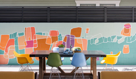
PATIOSPatio Details: Color and Industrial Touches Transform a Narrow Spot
A roll-up garage door connects a San Diego home to the outdoors and its new patio dining area and colorful mural
Full Story
GARDENING AND LANDSCAPINGGarden Tour: A Colorful Patio Blooms in the Arizona Desert
A landscape designer transforms a couple's backyard patio into a feature-packed oasis
Full Story
LANDSCAPE DESIGNPatio of the Week: Vibrant Color Enlivens a Toronto Courtyard
Designers make a small sloped backyard usable by creating spaces for dining, planting and playing
Full Story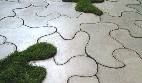
PRODUCT PICKSGuest Picks: Concrete Ideas for Patios and Decks
Look to lightweight fiber cement for functional outdoor furniture and accessories that are heavy on style
Full Story
GREAT HOME PROJECTSHow to Tear Down That Concrete Patio
Clear the path for plantings or a more modern patio design by demolishing all or part of the concrete in your yard
Full Story
LANDSCAPE DESIGN5 Ways to Make Your Concrete Patio More Attractive
These design ideas can liven up your paved outdoor space
Full Story
LANDSCAPE DESIGN9 Fresh Concrete Patio Ideas for Yards of All Styles
This versatile flooring material can enhance landscapes in unexpected ways
Full Story
PATIOSPatio Details: Good-bye Cracked Concrete, Hello Lush Garden
A San Francisco couple replace an old parking space with a barefoot-friendly outdoor retreat for eating, entertaining and play
Full Story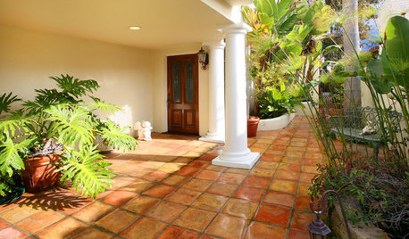
PATIOSLandscape Paving 101: Tiles Bring Bold Color and Pattern
This versatile garden material can blanket an entire patio or liven up the scenery with striking accents
Full Story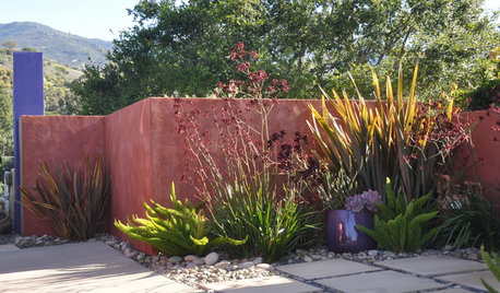
LANDSCAPE DESIGNBold Backdrops for Colorful Gardens
Use painted walls as tools in the garden, solving problems in a most artistic way
Full Story


Yardvaark