SHOP PRODUCTS
Houzz Logo Print
brb22

PLEASE help decide on flooring-mid process! Keep or start over???

B B
5 years ago

Hi,


We are in the MIDDLE of redoing our flooring in a powder bath and open areas including a small entry, living room, dining room, kitchen, and morning room and currently living in absolute chaos. A project that was meant to be completed in about a week is currently at a standstill. The installers finished demo and delivered the tile, and it is completely different than what was represented.


Anyway, I'm in a panic trying to decide if we should move forward with the tile we originally chose sifting through tiles for selection or choose a different tile and layout altogether.


We love the look of natural stone, travertine, limestone, etc., but have decided against it for practical purposes. We are certain we want a porcelain tile for maintenance and practicality, but do not like the faux natural look. We prefer a square no less than 20 x 20 (greater is fine) set at a diamond or diagonal bond (grid laid on a 45 degree angle) pattern or a herringbone pattern in rectangles. We also do not love anything that is too busy or linear and prefer something with a little texture.


Our style is old world, traditional, transitional, mediterranean, BUT we want something that is versatile and transitional with decor changes as time passes since we will absolutely not be doing the floors again...especially after this debaucle!


Any advice or opinions are appreciated. Thank you so much for your input.


Comments (46)

  • B B
    Original Author
    5 years ago
    last modified: 5 years ago


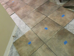
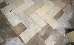
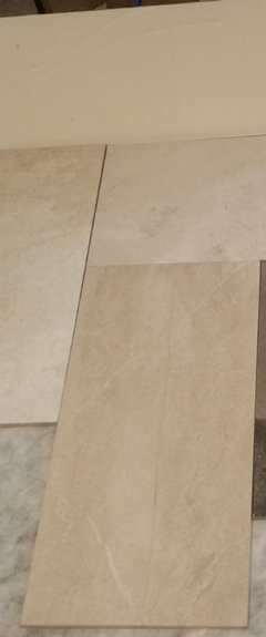
    These are pictures of the tile in a dry lay using select tiles. One reason we really like this tile is because it has both grey and beige tones, but this dye lot is also darker than the previously purchased (We bought a box prior to making the full order to make sure we knew what we were getting...so much for due diligence. :/ ) and sampled pieces.


    Does it look too busy or too dark or neutral? We have fairly detailed furnishings and lighting and tend to prefer relatively neutral core features for a palette...also goes with wanting something that is versatile and will endure throughout the years.

  • B B
    Original Author
    5 years ago

    This is a picture of different options. I like DalTiles Delegate in Off White and Light Grey (both shown left), but neither seem to have the muted greige color variation, and the light grey doesn't blend with our beige fabrics very well. It's also a little green at certain angles and in certain lighting. We want something with greige tones. I also wonder if maybe the floor should have a little more warmth
    than the Off White to help ground the space. A plank of the wood that begins at the stairs is shown along with our paint board at the bottom right of the attached picture.

  • Related Discussions

    Please help me! Need to rip out and start over!

    Q

    Comments (12)
    I can't believe he has that much information either. He's the Lawn Whisperer. If you're really going to do Option 3, I would suggest watering daily after the first app of RoundUp. That will germinate any seeds in the grass. Then the next app of RU will take those new seedlings out. If you have full sun, you can use Kentucky bluegrass. If you have some shade you can mix fescue varieties in with the KBG seed. Fescues need to be overseeded annually in the fall. That's the main reason I asked about shade. After the second app of RU, then tend to the leveling. Give the RU a day to be sure it worked and then get after the leveling. Have you searched this forum for topics on leveling? It is very easy to do wrong, so do some research. As a start, NEVER ROTOTILL to prepare for grass. That is the biggest mistake people make. All of the leveling topics were for bermuda, but if you are using RU, the process would be the same. In a nutshell you scalp or kill off the grass, apply just enough sand to fill the holes and low spots, drag a drag over top to smooth it out, water it to settle the sand, add more sand if/where needed, drag, water, add, drag, water, etc., until you are happy with it. You can make it putting green smooth like this. After you seed, roll the seed down with a water fillable roller to ensure it makes good contact with the soil. Then you do not need to cover it with anything, but many landscapers do. Certainly if you do not roll it, then you will need something. It's just easier to roll it down. If the area is small, just walk over it all to press the seed into the soil. Here is a picture of a drag mat. It looks a lot like a chain link fence. I personally use...chain link fence. My fence was not heavy enough so I put some boards on top and a bag of topsoil. Your mileage will vary. This leaves an excellent surface, though. Drag from the lowest area to the highest area for proper drainage. The drag will not move much soil, but no sense fighting against what you're trying to do. Can you post a picture of the lawn so we can see what leveling issues you might be dealing with?
    ...See More

    Master BR - new floor, fresh start - help, please!

    Q

    Comments (24)
    More lamps in my future ...!? Not such a good thing when I have two perfectly good matched sets in our office with no good place to go. One set is actually tall, antique alabaster (can you see them in the "before" pics?), probably worth a pretty penny, but they just aren't "us". I would love to see them in Magnaverde's home. Maybe I should sell them on e-Bay, but then I'd have to scam the buyer, right? That's what I hear people do these days. :-) (Stupid scammers. I hate meanies.) These are them (they?): The other set is nickel-tone, non-expensive lamps from LNT or BB&B or somewhere like that. Back before we found ourselves gravitating to iron, we thought we'd decorate a little more mod, with brushed nickel lamps and stuff. Didn't take but about a month to figure out that we'd made a mistake, but too late. So I have THOSE lamps to contend with. They're probably in an old picture of the living room. If I were made of money, I'd go straight to Hubbardton Forge for our bedside lamps. I can't get enough of their stuff. Must be because I went to college in Vermont. I was lucky enough to find a H.F. floor lamp on Craigslist a couple of years ago and snapped it up in the blink of an eye. I paid about 25% list price, such a deal. What's the right height for bedside lamps anyway?
    ...See More

    Starting the planning process, floor plan suggestions please

    Q

    Comments (7)
    Hi, Lucas Tx. That looks like a nice space you have to work with. My own kitchen needs are pretty much like yours. If it were mine my top priority, as always, would be simply to create a very good main place to work, a place I liked to be, with everything else placed to serve that spot efficiently. Your statement that "prep space between the sink and cooktop is small, I end up prepping on the other side of the sink" says something very important to me. Your prep space was never meant to be that little scrap between those two, it's that BIG area between the stove and fridge that you don't mention at all and don't like to work at. No matter what you do to the rest, if you don't move the sink you will always have a dysfunctional kitchen and be carrying stuff back and forth across the sink to where you want to work, as you do now. Therefore, if it were mine :), I'd open up the diagonal wall, decide where I really wanted to do my prep and cooking and then place everything else where it needed to be. Without much musing, I'm imagining the DW next to a widened doorway in (we could stroll right past with the DW door open), and the sink next to it looking out to the back yard; the DW side would be the cleaning side (where mess is gathered for cleanup) and the left the prep side (where freshly rinsed veggies were set for chopping, etc.) The stove would need to be slid somewhat farther left on the wall it's currently on, incidentally adding some more nice work space, but especially to avoid a competing-bottoms problem between the diagonal prep counter and the sink. This would create a pleasant and spacious main prep counter optimally between stove and water. The other cook could prep between stove and refrigerator. The rest is details. I'd do almost all drawers, though. I have them and love them. If I bought another old house, much as I love old kitchens, I'd eat beans and rice until I could afford to upgrade to drawers. Everything is so easy to put away and find, and there's so much more effective storage area (you don't have to leave search room for the questing arm and moving stuff around to get at the rest). Summary--plan on moving the sink. :)
    ...See More

    Help Me decide. Photos. Over budget and have not Started.

    Q

    Comments (19)
    Thanks everyone..I just got back from the decorator. I picked all my windows for the house..the plumbing..deciding on doors for rooms..But we ran out of time for the kitchen. I did decide to to some glass upper cabinets. And started looking at knobs. But I am still on hold until the cabinet maker returns from vacation. Please continue to chime in your thoughts and I will get more photos up. I looked up the wood floor cost again. It is $9 for 2.25 inch and $12.5 for wider...I think it was 5 inch not sure.
    ...See More
  • PRO
    Patricia Colwell Consulting
    5 years ago

    I rarely like floors with a lot of movement or pattern for me it looks very busy I would choose a 12 x 24 plain porcelain tile lated in a simple pattern and add rugs for floor interest.

    B B thanked Patricia Colwell Consulting
  • K R
    5 years ago
    I like the other tiles you’ve chosen much better, the ones you’re laying look dirty (and busy) to me. Plus the rectangular size is much more updated than small square.
    B B thanked K R
  • ci_lantro
    5 years ago

    I *think* that I like the rectangular tile on the right side of the photo best but could change my mind after seeing more of the tile laid out. Next best is the off white Daltile. I don't like the gray tile at all.


    B B thanked ci_lantro
  • B B
    Original Author
    5 years ago

    Thank you all SOOO much! Being mid-process is causing a lot of people to say "it's fine" just put it in so you can be finished. While I am very stressed with the situation and current living conditions and inconvenience, I am only doing this once and want it done well so your advice and encouragement are greatly appreciated.


    Does anyone have a recommendation for a tile or an opinion on the herringbone pattern in a 12 x 24 tile? Our space is fairly small just about 800-900sq. ft. for all areas combined (including the powder bath that is separated by a couple of stairs and a small landing that will have wood).


    Would herringbone in a 12 x 24 tile work well in a 59" x 70" bathroom. (Originally we planned to do the half bath with a Hale Navy and change out the sink to an antique cabinet, but given the current situation, I need to keep things simple for now with French White paint and a simple white pedestal sink and toilet. That is an entirely different post. ;)


    Here are a few tiles I saw but need to obtain more samples to see them in our space.

    I like the 3rd from the left's coloring as far as the greige tones, but it is very flat. I like having a tiny bit of subtle "sparkle" like the 2nd tile from the left(?) to give the floor depth.


    This is just a quick response to thank you all for your input before I continue searching for more tile options.


    More on our style later...I need to keep tile searching.


    Thank you all again!!!

  • Pam K
    5 years ago

    I know you’re getting stressed but ignore the People who say “it’s fine”. Your gut tells you it’s not, and I think you’re right. It’s a big surface and as you said, it needs to be right.


    I do like 12x24 tiles but not personally a fan of them laid in herringbone pattern. I think it can make a floor look busy, and that seems to be one of your concerns about the current tile choice. Also the size of your powder room cant really accommodate that pattern. This is what it would look like:


    Really needs a bigger space for the pattern to shine, because the Overall pattern keeps getting disrupted with walls and fixtures in a small space.


    I would personally opt for either half offset or third offset pattern. I think it will fit your space better and be calmer to the eye.


    For the floors, have you considered continuing the wood from your stairs/landing throughout the rest of the space? Have you considered wood look tile?


    if you want to move forward with porcelain tile, here are some options that are along the lines of the “look“ youve been posting that I think could work, but of course you’d have to see them in person in your space.


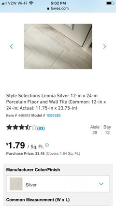
    i have this above Leonia sand tile in my kitchen laid in third offset pattern. It has visual texture but it not busy, and it a very neutral color. It is somewhere between beige and Greige. If you want somewhere between Greige and grey, perhaps Leonia silver tile:


    In person it’s not actually so silver and “cool” looking.


    Or you said your style is old world Mediterranean. Have you considered a porcelain slate look tile? The could have beige and grey and slightly greenish tones depending on the option selected.


    A few other important points.


    Recommending and selecting flooring is not something that can be done without considering the context of your rooms, style and other finishes, and inspiration photos. Posting photos would serve you extremely well :) selecting flooring without this info is akin to pairing an outfit in the dark. So I promise taking the time to give us a full vision of your space will be thoroughly worth it!!


    Another thought. You seem to be questioning your initial direction with the powder room because of this little tile fiasco. As though because you made a “mistake” with the tile, you’re second guessing yourself and your other design inclinations, instead opting to play it safe.


    Youre paying good money to renovate your home, make it what your heart wants. If you LOVE French white paint and a white pedestal sink, then go for it. There’s nothing “wrong” with that.


    BUT If it’s just the ”safe” choice because you’re now gun shy, post here and we can help with all your spaces! There’s no reason you can’t have a space that reflects YOU and is aesthetically harmonious and is not boring. But again, we can only get there with more photos :)

    B B thanked Pam K
  • Pam K
    5 years ago

    Here are some other floor Tiles that may have merit. As usual, you’d need to see them in person in your space.


    Important: from personal experience, some tiles that are called “white“ in the name are not really white, just a light neutral (that may work perfectly for you since you felt the other tile was too dark). Same goes for tile called “gray” may be more greige. Frankly, same goes for pain colors haha :)


    Above photo beige one just showing textured look.


    tile patterns

    half offset:


    Third offset:


    ( my personal favorite and best option to avoid lippage )


    heres some info about lippage:

    https://www.tileoutlets.com/blog/managing-lippage-offsets-matter-installing-tile/


    Hope this helps:) If you get samples of these tiles, post photos here in your space and lighting and we’ll help you decide. Heads up that you can purchase single tiles from Home Depot and Lowe’s as samples and then return them to get your money back.


    Sometimes tiles from specialized tile stores are higher quality than those at big box stores. But I only posted things from big box stores since I don’t know what stores are available where you live. I’ve used tile from Home Depot and Lowe’s without issue, you just need to be a bit choosy when seeing them in person, don’t select something cheap looking. You’ll know ;)

    B B thanked Pam K
  • Pam K
    5 years ago

    Half offset layout photo didn’t post for sone reason. Trying again:


    Although I’d definitely first select a tile that works. Layout is secondary.

    B B thanked Pam K
  • B B
    Original Author
    5 years ago
    last modified: 5 years ago

    Again, I am so incredibly grateful for the input. I have been busy obtaining the various samples shown. Do any stand out as being too pink, white, etc.? Also, any keepers?


    I'm working on trying to have a couple of smaller pieces of furniture unwrapped and "staged" on both types of floor.

    In the meantime, I started an idea book with similar decor to our style. I'm not sure how that works as far as being able to access it so I will try to post a few pics here too.


    Our entire space could fit inside this one room, but our furniture is similar in style on a much smaller scale. :)


    I love this floor and several others, but they are almost all natural stone.


    The above photo says these are porcelain. I would just need to try to locate them for purchase.

    It's Thorntree Dordogne, Ivory, I think.

    Any thoughts on using this larger size rectangle in our space including the kitchen, which is probably about half the size of this kitchen?

    To answer a couple of your questions, Pam, we didn't want to break up the different areas since the space is already so small. Given that, we decided not to keep the wood going because we didn't want it in the kitchen. Also, we didn't want wood tile because it would be right next to the real wood going up the stairs. :/ We're pretty set on knowing we want porcelain tile at this point...it's just determining the right one.


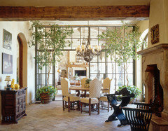
    This photo is similar to our dining area regarding the furniture and lighting.

  • B B
    Original Author
    5 years ago
    last modified: 5 years ago

    Please disregard the lines...they are indicative of the current tile pattern that was put in with the initial build. We are planning to tile the entire space shown minus the garage and stairs.


  • Pam K
    5 years ago

    Hi B B,


    Firstly, ALL these new tile options are far better than the original. All way lighter and less busy. Seeing your inspiration photos and furniture similar to your space, I wholeheartedly think the previous tile would've been way too busy and dark.


    I know your style is old world Mediterranean. In my opinion, you'll need to be discriminating with the rest of your choices to keep it relatively light and current looking. It can easily go too busy, too dark, too costume-like. I keep coming back to this photo as the feeling to strive for:


    Having some pieces of furniture unwrapped and brought in the space is a great idea. It's nearly impossible to choose without seeing the specific wood tones and fabrics.


    Also, do you have any photos of your kitchen finishes (cabinets, counter, backsplash) if they're staying, or your selections if you're putting a new kitchen? I don't find the 12x24 tile size problematic in your kitchen, even though your kitchen isn't huge. But I think whatever pattern you choose (if herringbone) must be plotted out to see if it will be effective in the space, given the dimensions and island etc.


    This photo is third offset installed on a diagonal, if you like that:


    I am confused by one thing that I need clarification on before I offer specific feedback on the tile options at hand. In your profile photos, you have a staircase that you indicate is like your wood stairs. The wood is quite red toned. Looks very different than the wood sample you previously posted (bottom left corner) which looks very neutral brown.


    Which is actually correct? Please post more photos of your wood with the new tile options. And you'll need to show your tile options with the kitchen finishes and wall color (if keeping) for me to tell you which one(s) work best.


    Glad to give feedback and help, but without taking these other finishes into account, we're choosing in the dark :) So let's get this squared away so you can get on with the floor install, and end the chaos. Your new choices are much better. You could endlessly look at tile and get stuck in analysis paralysis, there are so many choices. I think one of these should work. You don't need to look to all corners of the earth for all the choices out there and exhaust all options (and yourself along the way), as long as the floor tile choice is harmonious with your other elements it will all create visual flow.

    B B thanked Pam K
  • Pam K
    5 years ago


    If this is the color of your wood stairs, this will affect your choice for tile!! It is quite red.


    vs.


    more neutral wood color posted previously, warm but not red


    Also just pointing out, if I'm reading your floorplan correctly, your powder room is up two flights of stairs, so it's separated from the rest of the space to be tiled by wood steps and a wood landing. So if the proportion of the large tile in the powder room bothers you, you could go with a matching tile in a smaller size. A lot of tiles have 12x24 (could use in entire main area) and a matching 12x12 or even smaller (could use in powder room). Just a thought to consider, if I'm correct that the powder room floor DOES NOT connect directly to he rest of the floor to be tiled.

    B B thanked Pam K
  • B B
    Original Author
    5 years ago

    Good Morning! I have made such strides after a frantic weekend with your help!


    Pam, yes, the powder bath is separated only by a few hardwood stairs and a small landing.


    These are pictures of our actual wood.


    It does have color variation depending on the lighting and angles. (And it's obviously dirty...hard to actually find a place that isn't covered with paper, plastic, tools, or other "stuff".)

  • B B
    Original Author
    5 years ago
    last modified: 5 years ago


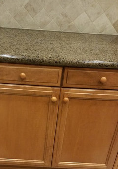
    These are our kitchen cabinets and hardware, granite, and backsplash. The dishwasher will be replaced with a stainless front. We were originally planning to either have the cabinets stained darker or painted some shade of antiqued white. However, as I mentioned previously, I just need to simplify everything at this point so I don't plan to do anything that hasn't already been started.

  • B B
    Original Author
    5 years ago

    Pam, Thank you so much for your valuable feedback!!! I'm am incredibly overwhelmed and am beyond grateful and blessed with your help. I agree with your assessments that it would be "too busy, too dark, too costume-like". Your advice is incredibly appreciated!!!

  • B B
    Original Author
    5 years ago


  • B B
    Original Author
    5 years ago
    last modified: 5 years ago

    Is there a way to direct message or private message in Houzz?

  • Carolyn T
    5 years ago

    We used the following tile from Home Depot that has a travertine look and it comes in different shades and sizes so you can select the one that best fits your home. https://www.homedepot.com/s/marazzi%2520travisano?NCNI-5

    B B thanked Carolyn T
  • Pam K
    5 years ago

    Hi BB,


    It’s been my pleasure helping you, and I’m glad it’s making this process a bit easier :) I agree, I think you’ve made tons of progress.


    I’ll sit down tomorrow morning at my computer and go through the different tile options, to see which I think go best with your kitchen finishes and wood floor.


    I‘m about to start the night time routine with my little guy, so unfortunately I don’t have time to look right now. But just wanted to message to say that I haven’t forgotten about you and will definitely look at things tomorrow!


    In answer to your question, I’m not sure if there’s a way to private message people. Perhaps another poster knows the answer to that question?


    Okay, talk tomorrow BB :)

    B B thanked Pam K
  • Pam K
    5 years ago

    Hi BB,


    Okay so I looked at the tiles with the different finishes in your kitchen, wood floors, and examples of types of furnishings. These are the ones (with blue stars) that I think could work best. You will need to try out each of them in your kitchen (and take individual photos of each one in your kitchen with the rest of your fixed finishes, if you want my input on final choice). The rest are probably too light or too gray or too yellow. But again, it's not in same photo with kitchen finishes. They all might have merit, so if you want to photograph other ones in the kitchen too, that wouldn't be a bad idea.


    But again, you'll need to try each one out individually. While you don't want as dark as the original option, it does need to ground the space somewhat.

    _________________________

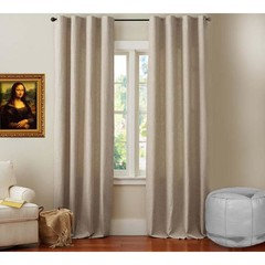
    In my opinion, if you want to keep the space visually not busy and lighter, you should seriously consider using linen drapery (specific option to be chosen AFTER paint).


    Something like this (but not tied back). I know it may seem like it'll be boring, but you really need a simple light backdrop with your dark and intricate old world furnishings, if you do want to make the space more current.

    _________________________

    Also, if you select a rug like this, it'll help lighten the space. Note how it brings in hints of red and little touches of light green or light blue.


    If you need another rug, a natural fiber rug like jute or sisal would work well to coordinate. Sometimes they can be a bit hard on the feet, but some retailers make ones that are softer.

    _________________________

    I also think (depending on what furnishing pieces you have and will be keeping in your space, I'd need to see photos), it would be beneficial to bring in some painted pieces of furniture and some pieces with simple lines. Would break up all the dark intricate wood. Which is beautiful, but doesn't stand out when it's overloaded into a space with nothing to contrast it. Here are some examples:


    Note the painted pieces in first 2 photos and some more transitional furnishings with simpler lines in last photo (sofa table etc.)

    _________________________

    These below photos really inspire me:


    _________________________

    In these below photos, there are elements that I like, but overall too "all warm tones". Camel, red, brown. That's why I suggested a rug with touches of light green or light blue, so you can bring in hints of those cooler tones to balance out all the warmth. I also think bringing in greenery (plants, real or faux...they make some good fake ones now) would really help.


    _________________________


    Also, I know you mentioned considering painting cabinets off white or staining them darker. I think that would REALLY help things. But we can cross the bridge after the floors. I know you're overwhelmed right now.


    Let me know what you think of all this, if any photos stand out to you that you love etc. If you want to post more photos of the tile in the the kitchen individually, I can help you make final choice. I would also be happy to help you source a rug, drapes etc. Just let me know :)

    B B thanked Pam K
  • Pam K
    5 years ago

    Hi BB,


    Okay I typed out this whole thing and then Houzz crashed :(


    I'll send it in sections so Houzz doesn't mess up again.


    Stared are the tiles that I think could work best based on photos. You'll need to look at them each individually in your kitchen with those finishes. If you want to post photos of them individually, I'd be glad to help you select the final tile choice. As in all the inspiration photos, I'd choose a grout as close to main tile color as possible, if you need to go a TINY bit darker on grout that's fine, but not too much. All tiles possibly have merit so I'd encourage you to look at each one in your kitchen lighting.


    ____________________


    Also I'd go with simple linen drapery panels as below:


    It may seem boring, but with all the dark and ornate furniture, you really need a simple and light backdrop. (not tied back like in last photo).


    Another post coming in a second

    B B thanked Pam K
  • Pam K
    5 years ago

    I'd encourage you to select a rug like this. Light and contains hints of red and touches of light green or light blue.


    If you need another rug too, a natural fiber jute or sisal rug will coordinate well. Sometimes they can be a bit rough on the feet, but some companies make versions that are soft.


    _________________________


    Depending on which furniture pieces you already have and are keeping, I think it would help a lot to bring in some painted pieces and/or pieces with simple more transitional lines. Mixing those with your darker more intricate pieces will break them up and also make them a feature. It gets too busy if all pieces are dark and intricate, and nothing is featured.


    (note the painted pieces in first 2 pieces and simple transitonal lines on sofa table)

    B B thanked Pam K
  • Pam K
    5 years ago

    And these are just photos that inspire me.


    _________________________


    These are photos that I like some elements, but find them to be overall too warm (all red, camel, gold, brown). That's why I liked the previously posted rug, how it integrates some light green and light blue, cools things off a bit for contrast. Also, bringing in greenery (real of faux...they make some good fakes now) would be really nice.


    Okay, let me know what photos you like etc. Also, as I said, feel free to post more individual tile photos. I'd be happy to help you make the final choice. Also, I can help you selecting a rug, drapes etc if you want.


    Finally, I know you said you considered painting cabinets cream or staining darker brown. Ithink that would really help. But we can cross that bridge when floors are done. I know you're overwhelmed with that right now. :)

    B B thanked Pam K
  • B B
    Original Author
    5 years ago

    Pam, Oh, wow! Thank you for your input and detail! I do already have the curtains.

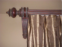
    These are similar in color to our curtains and hardware. Everything is all wrapped and packed away so well, I don't think I'll be able to open any of it up for staging, but hopefully similar pics will give an idea.

    I know it all matters as far as choosing tile, but I need something versatile anyway since our decor may change throughout the years, but our floor will likely not...especially after this.


  • B B
    Original Author
    5 years ago

    I've been out looking at tile again, and this is some of what I found.


    Your favorites of the first group are some of my favorites too. I love how you put those stars on them! :) I'm not that tech savvy; I can probably figure out black dots. :/ The ones to the right of that picture are some of my favorites in color and "pattern" (minimal), but their texture isn't that great to me.


    What do you think about these? I included the Travisano from Home Depot in 2 different shades that Carolyn T mentioned.


    Some of these seem like obvious discards to me now that I got them home, but I took pictures with them anyway.


    I keep going back to the inspiration pics with bricks too!


    Do you think I could pull that off with our space and do you think it would go with our current decor and also be versatile enough to change directions later? I found a 5 x 10 and a 3 x 5 in two shades that might work (shown below).


    I also found these, but I'm not sure if the color of the samples I received accurately reflects the collection.


    Below are the same tiles displayed in the showroom.


    The following are tiles we saw in a model home and loved but ultimately felt they were too busy. They have great texture. I keep seeing them so I went ahead and got samples. I asked for the "busiest" samples they had.


    This is it in the showroom in squares.


    Two simpler tiles from the same collection are shown below, but I still feel it's pretty busy.


    I don't think the below has been in any of the groupings shown, but I do seem to like it when I see it. It has that subtle bit of sparkle which I feel gives it depth and actually kind of like. It's almost unnoticeable unless the light catches it just right. It seems a little "yellow" in this pic. I'll have to look at it in different light next to different pieces, but I feel it would ground the space better than the lighter one above and to the left of it.


    And, finally... These are 16 x 24. Do you think that size can be arranged successfully in a herringbone pattern?


    Now I am very eager and would really love to know what you think about all of these! Thank you so much, and I hope you had a good night!

  • Cheryl Hannebauer
    5 years ago
    last modified: 5 years ago

    Here is what we laid in hbone pattern in our kitchen & foyer areas.

    angled Hb.

    [houzz=https://www.houzz.com/photos/new-build-gabe-phvw-vp~125260570]

    [houzz=https://www.houzz.com/photos/new-build-gabe-phvw-vp~126220094]

    B B thanked Cheryl Hannebauer
  • Pam K
    5 years ago

    Hi BB,


    Here are my thoughts about the new grouping of tiles:


    Blue star: really like them, think they could work nicely with your other finishes.


    Red star: only if you're set on something with a lot more visual texture. I personally think it'd be too busy, but slightly let busy than some of the other busier ones. At least it doesn't create a definitive "pattern" on the floor.


    Yellow star: If you decide on something lighter, this could be pretty.


    Again, you'll need to take photos of each option individually with your other kitchen fixtures. It should quickly become obvious after doing that.


    This above tile might also work if it's less yellow in real life than it photographed.


    I'm not in favor of any of the other tiles you posted because they're too busy.

    ____________________


    Brick tiles: no I don't think they would work in your space. Too small, too busy, way too many grout lines. I think the larger 12x24 will be effective in making the space seem larger, area and have more flow.


    Personally, I don't think the brick tiles is the reason why you (and I) like those inspiration photos. To me, those inspiration photos are appealing because they perfectly mix old world style with more organic elements, so as to not overload on the tuscan design trend elements popular 15 years ago (which never really worked). You can achieve the same look with many of the 12x24 tiles that I put stars on in 1st and 2nd batch. The flooring is not the focal point in those two inspiration pics, its just a nice clean simple neutral backdrop. The whole "vibe" of the room is the thing that appeals.

    _____________________


    On that note, we need to have a heart to heart about your entire space.


    I think you need to grab the steering wheel and decide which direction to turn. Because there are 2 very definitively different paths this whole thing could take. This goes back to my comment about "you'll need to be discriminating with the rest of your choices to keep it relatively light and current looking. It can easily go too busy, too dark, too costume-like."


    1) Harmonious marriage of old world furnishings with textured organic elements and keeping other finishes, fixtures etc very simple. Results in a space that looks homey, elegant but not super formal, authentic and comfortable.


    2) Overwhelming compilation of all tuscan trend choices. Old world furnishings with shiny intricate elements and other finishes, fixtures etc being busy. Results in a space that looks ostentatious, formal and uptight, contrived, and ADD overwhelming.


    I will post photos of how these looks differ later. Hint: All your inspiration photos are of option number 1.


    I hope we've gotten to "know" each other enough (and you to trust my opinion enough) for me to tell you this. Your drapes absolutely will not work to achieve this look. They will also not be at all flexible to changes in furnishings and styles.


    Because those drapes are meant for a space that's tuscan, busy, heavy, dark. Can you picture these drapes in this room? I can't


    They belong in completely different houses. I'll need to post more photos later to explain.


    The only other style these drapery panels would work in is a SUPER formal very very glam space. Not what you're going for.


    Now, can you picture these drapes in this space? I can. They belong.


    I know you're overwhelmed and you don't want to deal with this right now, but all this work you're doing will be for naught if you use your existing drapes. Replacing them will be a relatively small expense. It's only 7 curtain panels max if you do all windows and between each window section. It's only 4 panels if you do only on the sides of the bank of windows in breakfast room and living room.


    If you need to save the money somewhere to pay for the drapes, there are SO MANY tile options that are nearly the same. Did you look at any of the options I sent you at home depot and lowes? Those are inexpensive. Truly, the floor is just a simple neutral backdrop. The undertones, simplicity and lightness need to be right, but there are so many options that can fill that need.

    ________________________

    You need to keep in mind with each of these decisions, that there can only be a few "key players" visually in a space. Everything else needs to be simple background. If everything is interesting, nothing is interesting. It's ADHD in a room. So overwhelming. No where for the eye to sit. Restless. That's why the rooms that have your type of furniture + metallic shiny drapes + tapestries + busy floors + many patterned pillows + dark venetian plaster walls +++++ don't work. So with your type of furniture, you really need the other elements to be supporting players to contribute neutral-ness, organic texture and harmony. Otherwise, it becomes a costume.


    Please think about that. I don't mean to offend. I have your best interests at heart, and you need to hear this and make these decisions to move forward.


    If you want the type of space described in option 2, we can work with that. But nothing you've told me so far or shown me with inspiration pics indicates that. Absolutely nothing.


    As usual, I'm here to help :) I'll send more photos later, and maybe put together some elements for you on an inspiration board to guide your choices in the future.


    Finally, aside from looking at some of the less expensive tiles I sent if money is tight, I'd stop looking at tiles. You have many good options that could work. You're giving yourself analysis paralysis. As I've previously said, you don't need to exhaust all options and look to all corners of the earth. Seriously, I see so many options in the batches that you sent me that could work beautifully to achieve what I think you want.


    The next step is to post photos of them individually with the kitchen finishes! :)

    B B thanked Pam K
  • B B
    Original Author
    5 years ago
    last modified: 5 years ago

    Incredible feedback, Pam! Thank you so much! I appreciate your honesty! It is exactly what I need.

    I agree with a lot of what you say. Sometimes, I just appreciate the confirmation of things I'm thinking. Remember one of your first comments when I was questioning influences that it was " fine" was to trust my gut. I am paralyzed when is comes to making decisions much more so now than even before. You've given me so much clarity through your guidance.

    I do love the bricks in the inspiration photos but don't feel they would work in our space at all. I was wanting you to agree with me or convince me otherwise. ;) In other words, I was wanting exactly what you offered...honesty. ♡ Thank you for that!

    Did you have an opinion on the last set of tiles with the 6 pieces of 16 x 24? I also agree I have plenty of great tile options and don't need to look further. I'll take some pics with individual tiles next to our cabinets and granite, etc. if possible hopefully at some point today. I can not express my gratitude to you for your help!

  • B B
    Original Author
    5 years ago
    last modified: 5 years ago

    Quick correction...looking at my checkout slip from Home Depot indicates the 2 more linear tiles as Vettuno in Bisque and Greig (black dots) and the less directional one is Travisano Trevi (green dot).

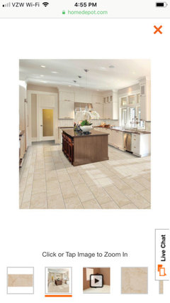
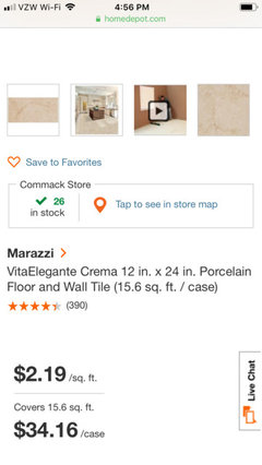
    Vita Elegante Crema (blue dot) was shown as well.


    While I did see almost all the tiles recommended from Home Depot (sans the Leonia), I did not make it to Lowes.


    Pam, I just noticed this is the tile we discussed looking yellow. I didn't realize it was actually in this grouping until I noticed it is one with a blue star. That's great because it's one of my favorites so long as it's not too yellow and depending how it looks with the rest of the space. It's the one with the red dot in this pic. Again, I'll try to take more pics today (if possible) of the favorites with our cabinets and granite. Something that isn't coming across in the pictures but matters to me is the physical texture as well as the visual texture. I realize this creates a disadvantage regarding your recommendations from pictures alone, BUT I think even visually you are really solidifying and narrowing the best options! Thank you again!

  • Pam K
    5 years ago

    Hi BB! You’re welcome :) I’m glad you took my feedback in the spirit it was intended. I’m glad my guidance has helped.


    Regarding the 16x24 tiles, I don’t think there’s anything wrong with the size, but the pattern and color is too busy in my opinion.


    Yes taking individual pics with your kitchen finishes is the next step. Then we will choose a tile so they can be installed and some of the chaos will be eliminated!! :)


    - any thoughts about what I said about drapes?


    - do you have a rug yet? Thoughts about my advice for rug selection


    - paint color will need to be chosen based on what’s compatible with floors and other finishes


    again, keep in mind that you may need to keep reminding yourself to keep your choices simple and clean, which is in benefit of the overall look you’re striving for. That may NOT be your natural inclination. A lot of people tend to want to select the best, most interesting option at each opportunity. And I understand why that is, it makes complete sense! The alternative can seem boring. But you need to remind yourself that these objects and finishes will not be in isolation...they’re all together in one room, and it can quickly become “too much”. It may even be advisable to add some neautral light toned throw pillows to your couches etc. but we’ll address that once we get there.


    You have good gut instincts on the overall goal for the space, but I think you find it challenging to make individual choices that will come together to achieve that overall look. And most people likewise struggle with that. Don’t feel bad :)

    B B thanked Pam K
  • B B
    Original Author
    5 years ago

    Individual tile pictures aren't going to be possible today. :( I have some opinion questions though.


    1) What is your opinion on physical texture in a tile (not just for traction)?


    2) What is your opinion on subtle sparkle (VERY subtle...not glittery - as in sales rep said she didn't even see it and forgot the tile had it)?


    3) What is your opinion on a 24 x 48 tile in our space?


    Thank you in advance for any thoughts, and have a great day! :)

  • Pam K
    5 years ago

    Hi BB,


    First, I'm happy to hear that the tile with the red dot might work out after all and might not be too yellow in reality. That just goes to show you how misleading photos can be because they're influenced by lighting, the space its in and the things around it.


    Which is exactly why it's important to take photos with your kitchen finishes, since that's really all we have to go on right now. Sorry to hear you can't take those photos today. But when you get to it tomorrow or this weekend, we'll be many steps closer to deciding :)


    To answer your questions:


    1) The physical texture of the tile seems to be important to you. For traction purposes, yes totally agree. But that can be accomplished by most tiles unless they're truly slick, which you're not looking at anyway.


    I personally feel that the visual texture of the tile is way more important than the physical texture, just because when it's actually installed it's going to be on the floor some 5+ feet from your eyes. People don't get down and inspect and feel the floor ;) So in my opinion, as long as it visually has texture and the look you want when you place it on the floor and you stand up and look from above and from standing away at different distances, I think it's fine!!


    Now sometimes physical texture might help the tile appear to have visual texture. And if that's the case, it's a totally different story.


    The flip side of that is that if it has such obviously fake visual texture, that it appears inauthentic, I don't think that will work for your space. It doesn't need to fool you into thinking it's stone, but it also shouldn't look like an obvious pixelated photo slapped onto a tile ;)


    2) Very subtle sparkle would be fine. But seriously, very subtle. Remember what I said about sparkly shiny things in this type of situation. Will become a costume.


    3) To be honest, I think 24x48 tile would be too large in your relatively small space. If you're going to go 48 inches long, I'd be more apt to look into a tile that's something like 8 inches wide (like a lot of the wood planks). But you said you didn't want that meeting up to your real wood, and I'm completely in agreement with that decision.

    _________

    Let me know:

    - any thoughts about what I said about drapes?

    - do you have a rug yet? Thoughts about my advice for rug selection

    B B thanked Pam K
  • Nancy Walton
    5 years ago

    I think that any layout other than stacked bond, running bond or diagonal stacked bond would be too busy for your space, given the style of your furnishings. It would also facilitate any change in decor down the road.

    B B thanked Nancy Walton
  • Pam K
    5 years ago
    last modified: 5 years ago

    I agree with Nancy with the principle that the floor should be layed with a simple layout. As I’ve previously said, I think that herringbone is too busy for your space.


    But this is YOUR space, and ultimately your decision. So if you decide to do herringbone, just make sure the grout blends into the color of the tile so as to minimize the visual “pattern-ness”.


    With that said, I don’t think third offset would be too busy. It is the recommended layout (over running bond) for minimizing lippage with large format tiles.


    For reference, here’s third offset 12x24 tile in my kitchen. This is the leonia sand tile from Lowe’s.


    B B thanked Pam K
  • B B
    Original Author
    5 years ago

    Thank you again to everyone who has shared their opinions!


    Pam,


    "Regarding the 16x24 tiles, I don’t think there’s anything wrong with the size, but the pattern and color is too busy in my opinion." Yay...confirmation again. I often need reinforcement for what I'm thinking.


    Completing the tile installation is a bit more complicated than just choosing the new tile. There are a lot of details to be worked out regarding changes from the tile we were expecting to receive compared to what we got. I'm afraid chaos is expected to continue for a few more weeks, but at least a definitive course of action has been made to stop installation of the old tile which is the primary issue for this posting. Phew! And in working towards which tile to choose instead, we will be one step ahead when that time comes. I'm just grateful to know which direction to take.


    Regarding the drapes and rug, I am still so consumed with the flooring details that I can't even go there yet.


    I intend to keep the paint color selected previously if it works with the new tile. Knowing we have a lot of darker woods and intricate decor, we were planning on French White to keep things from being too dark.


    I was able to take some pictures of individual tiles. There are a lot of similarities in them which is one reason I asked about texture and sparkle because those are the main distinguishing elements between the favorites along with size. Some of them do come in 6 x 24 and 8 x 48 so there are options with the pattern that could also help decide.


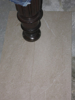
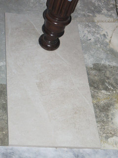
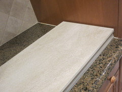
    Also, do you feel any of these tiles has the mix of grey and beige tones we were hoping to achieve? I think the pics under the table leg actually help in determining this since it shows them next to the grey from the concrete. Do any of them look too pink, yellow, green...too anything? :)


    Going from top to bottom of the above picture 1-5.


    1)


    2)


    3)


    4)


    5)


    I realize some of them look completely different than their match, but that just proves how lighting can affect them.


    Any keepers or discards based on these pics?


    I have a couple I think I prefer, but I'm really excited to hear what you think!

  • B B
    Original Author
    5 years ago

    And, Pam, thank you so much for giving your opinion and still acknowledging...

    "But this is YOUR space, and ultimately your decision. So if you decide to do herringbone, just make sure the grout blends into the color of the tile so as to minimize the visual “pattern-ness”."


    That is incredibly appreciated!!!


    Also, thank you for posting a pic of your tile and pattern. I really like the third offset and the direction it runs in the space.

  • Pam K
    5 years ago

    Hi BB,


    I have some initial thoughts, but I’m on my phone right now so it’s kind of hard to see. I’ll need to look at them on my computer tomorrow.


    Can you post post the names of the tiles in order, so I can also look at them online? Some of the photos are blown out (overexposed) so it’s a little hard to tell. Finding them online and looking at full rooms done in the tile will give me some good info.


    Thanks! :)

    B B thanked Pam K
  • B B
    Original Author
    5 years ago

    I only know the names of some of them (the others I need to ask the reps from the showrooms).
    Also, I do feel like the manufacturer's photos can be deceiving sometimes.


    1) Daltile - Delegate - Off White

    2) ??? - something from Daltile, I think

    3) American Olean - Merit - Cool Beige

    4) Daltile Consulate - Liason Beige Quartzite

    5) Daltile - Society - Civic Sand


    I think this is accurate...no promises. :)


    Thank you again for your help.


    Have a good night.

  • Pam K
    5 years ago

    Hi BB,


    Just letting uou you know that I didn’t forget about you!! I just never got a chance to hop on my computer yesterday :(


    Will do it today. Send some more individual photos of tiles in your kitchen and will take a peak at those too!


    talk later :)

    B B thanked Pam K
  • Pam K
    5 years ago

    Hi BB,


    So here are my thoughts about the tiles thus far. The ones I like the best in these photos are numbers 2 and 4. Next best 3.


    Because what I'm seeing in these photos is that your countertop has a yellowish undertone and backsplash has slight pink undertone in some spots. So it's going to be a little tricky to choose a tile that works with both. From these pics, it looks to me that number 2 and 4 pick up coloration from both the counters and backsplash, and tie them together.


    They also have visual texture (maybe physical texture, you tell me?) and character, without appearing busy/dark/muddy.


    Let me know your thoughts on each of these tiles. It is difficult from pictures to really get a grasp. As you've pointed out, the lighting in each pic is different, the photo exposure is different, so the tiles look different *shakes head*


    Send photos of the rest of the tiles individually, so we can start narrowing down.

    B B thanked Pam K
  • Pam K
    5 years ago

    Mock up of tile #2 in your kitchen (with cabinets painted off white/cream) and other elements I've recommended and other similar furnishings and finishes you have.


    Same with current cabinet color


    B B thanked Pam K
  • Pam K
    5 years ago

    Also just wanted to comment that you may ultimately find BM French White to have too much yellow undertone for your other finishes. You may prefer BM White Sand or BM Muslin. But we'll swatch them after floors are done and decide then.


    Just wanted to post this before I forgot, I know you're not up to this yet.

    B B thanked Pam K
  • B B
    Original Author
    5 years ago
    last modified: 5 years ago

    Thank you once again for your time and opinions, Pam!

    "It is difficult from pictures to really get a grasp. As you've pointed out, the lighting in each pic is different, the photo exposure is different, so the tiles look different."

    I know. I tried so hard to take them in the same conditions, lighting, angles, etc. It's just really difficult to get them to come across in pictures.

    And then, for whatever reason, lighting/conditions, a couple of the favorites that had SUBTLE sparkle were crazy sparkly (WAY too much) as I was looking at them last night so they're now out....2 and 4, go figure. I hate to waste any more of your time since it's just so difficult with pictures. I plan to do one more tile run since I need to return some samples anyway and because so many favorites turned out to be discards. I appreciate the guidance you have provided to get me to this point so very much!

    Any suggestions on what sizes I should seek out if I decide to do a herringbone pattern?

    I definitely would not be this confident and have made it this far without your help!!!

    I hope you had a great weekend!

  • Pam K
    5 years ago

    Hi BB!


    For some reason didn’t get notification of your last comment, so sorry for delayed response :( Weird! Houzz has been having some strange glitches recently.


    So crazy that those tiles are very sparkly in person. That doesn’t show up in photos at all!


    So here’s my advice. Go with what your eye is telling you in terms of sparkle, texture etc. Narrow it down to however many you like based on the criteria that only you can see in person. THEN post however many you narrow it down to. Photos same way you did last time, each one individually with kitchen finishes. And I can help you with things I can see via photos like color undertones, lightness/darkness, busyness etc.


    Certainly no need to feel as though you’re wasting my time. I enjoy helping :) You’re doing so well with improving your confidence and refining your vision of the end goal. I’m happy to help guide you along the way and keep you on track.


    Re: herringbone. 12x24 always works and numerous other rectangular sizes. It kinda just depends on you prefer the look of a more stretched out herringbone (long and skinny), or shorter wider. I’m personally not a huge fan of herringbone, but I tend to like middle ground more than either extreme. I think if you’re going to go in the herringbone direction, you’ll need to get quite a few samples of the final tile decided on and lay out a large-ish sample area to decide if it works or is too busy. You can do the same with different tile sizes if there are options.


    okay, I hope you make some more great progress with narrowing down the tiles. And again send me photos of the narrowed down batch by posting here. All is not lost via computer, i can still get a read on many elements of the choices, as long as you first discard ones that the texture and sparkle isn’t to your liking. Talk soon! :)