


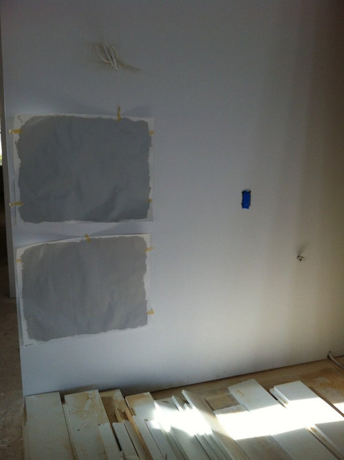
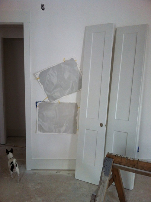
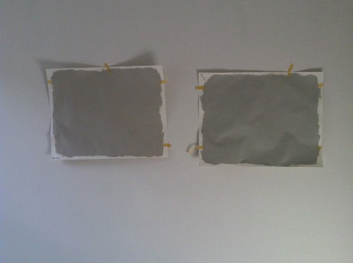
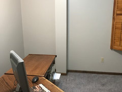
Repose Gray is a lot darker than what I was expecting...help!
kimmer69
7 years ago
Featured Answer
Sort by:Oldest
Comments (29)
Related Discussions
Carpet is darker than I imagined it would be
Comments (51)Get some sample boards made (I would go with the paint chip in the middle, myself). Since you have eastern facing windows in the LR, it will be in the shade most of the day so walls will look darker. Prop the boards in different areas next to the rug and see if the colors work together at different times during the day. Here are some other colors that would work as accents.Another fun thing to do is to go to a fabric store and find a printed fabric that you like that have your taupe colors in it. Then use the other colors for accent colors. You can buy a 1/4 of a yard of the fabric to take with you when you are shopping for pillows or accessories - even furniture....See MoreRepose Gray for walls & ceiling-new construction
Comments (24)Thank you everyone for responding! Update: We are going to go pay more to have the ceiling painted a different color. Thank you for providing the encouragement to make that upgrade. As long as we like the 3 colors we choose (walls, ceiling, and trim), we'll be able to relax in our new home without feeling like we need to start painting right away. We need a break from making house decisions. We were surprised by the heavy ceiling texture. I actually called my husband and the builder in a panic when I saw it but it was too late. We were asked if we were okay with orange peel texture and were told that is what most people get so we said ok without looking into it. Is there something we should keep in mind when choosing paint if we want to down-play the texture? We are getting more samples and I will post again, either once we are done (I can dream) or if I need your help again. The list so far has 16 new colors to consider. :-) Passive 7064 Worldly Gray 7043 Mindful Gray 7016 Modern Gray 7632 Snowbound 7004 City Loft 7631 Heron Plume 6070 Origami White 7636 Popular Gray 6071 Spare White 6203 Extra White 7006 High Reflective White 7757 Ceiling Bright White 7007 Eider White 7014 Incredible White 7028 Big Chill 7648 Thank you again! Sara...See MoreKitchen cabinet color to go with Repose Gray walls
Comments (17)My guess is the stone on the wall fits in a pocket where there aren't very many paint colors to choose from across major brands. It proved challenging in terms of finding a stock wall color to work with it so they went with a custom color. I knew we could take the wall paint and have them make it lighter, but I had thought making it darker was more complicated than that. (Or at least that's what the not-very-helpful people at SW led me to believe.) Either way it's complicated. Going down the rabbit hole of custom colors takes time, patience and money. Many on the interwebs over simplify the process - especially cutting and doubling formulas - which is easy to do when you're not the one with any skin in the game. Lori and Arcy, I was wondering about using white - they left some of the trim paint in the garage, so I'll use that color as one of my test swatches. It sounds like the "safer" option, which is what I tend to go for. I've been doing this a very long time. Edit and simplify is never the wrong answer. 🙂...See MoreWall Color to go with Repose gray cabinets
Comments (4)"Too bright" WOW interesting. Love your ceiling!! From the pics the color on the cabinetry looks rather muddy. Matching the tile color is an interesting suggestions--its a clear color the room could use but is it too dark for a space where one needs to read recipes and see what you are doing? The flooring goes a totally different direction than the back splash and cabinetry, maybe something to help it makes sense?...See More
kimmer69
7 years ago
prairiemom61
7 years agokimmer69
7 years agosahai6
7 years agolast modified: 7 years agoprairiemom61
7 years agolast modified: 7 years agosahai6
7 years ago
romy718
7 years agoromy718
7 years ago
Lenny Davis
6 years agolast modified: 6 years ago PRO
PROLori A. Sawaya
6 years agoromy718
6 years agopandang81
6 years agoromy718
6 years agojtascam
6 years agolast modified: 6 years agoKatherine
5 years agoMark
5 years agoKatherine
5 years agoadriennestitt
5 years agobethl316
5 years agoAmby924 BY
5 years ago
Holly Stockley
5 years agoHU-159430695
4 years agodjmcmom
last year


Related Stories

EXTERIORSHelp! What Color Should I Paint My House Exterior?
Real homeowners get real help in choosing paint palettes. Bonus: 3 tips for everyone on picking exterior colors
Full Story
ENTRYWAYSHelp! What Color Should I Paint My Front Door?
We come to the rescue of three Houzzers, offering color palette options for the front door, trim and siding
Full Story
MOST POPULAR50 Shades of Gray
Gray is hotter than ever, thanks to a hit novel full of risks and dark secrets. Tell us: Which paint shade possesses you?
Full Story
GRAYDesigners Share Their Favorite Light Gray Paints
These versatile neutrals can help create a range of moods in any room
Full Story
FOLIAGEGet a Cool Garden Look With Gray and Blue Plants
Looking for plants that calm with color in the heat of summer? Look no further than these 14 soothing beauties
Full Story
KITCHEN DESIGNSubway Tile Picks Up Gray Grout
Heading into darker territory, subway tile offers a graphic new look for kitchens, bathrooms and more
Full Story
MOST POPULARWhat’s Your Neutral: Beige or Gray?
A designer shares 10 tips for using the neutral shade that works best for you
Full Story
DECORATING GUIDESColor Guide: How to Work With Charcoal Gray
The most modern neutral, charcoal gray looks great in dining rooms, living rooms and even nurseries. Here's how to use it best
Full Story
COLORHow to Layer Tones of Gray for Depth and Harmony
Use texture, pattern, contrast and more to create a subtle, sophisticated look with this popular color
Full Story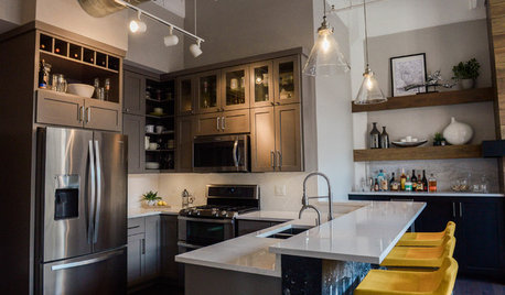
KITCHEN DESIGNGray Cabinets and a Wood-Wrapped Fireplace Update a Downtown Loft
The kitchen peninsula is jazzed up with custom wallpaper made using a photo from the homeowners’ Amsterdam honeymoon
Full Story


Anglophilia