


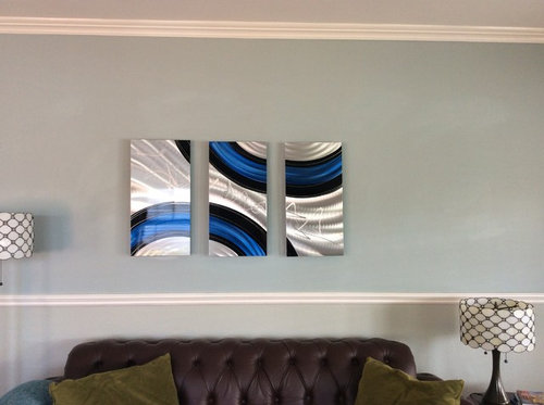
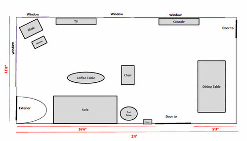
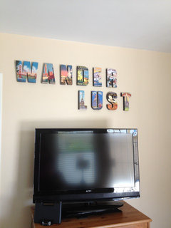
Artwork Over Sofa - Sizing
aimeekm
7 years ago


Featured Answer
Sort by:Oldest
Comments (45)
Related Discussions
Art Glass Wall Decor Over Sofa
Comments (71)This is the first I'm seeing of this thread. Love the glass. Not sure I'd be bold enough (and I love color too!). What's on the other side of the LR? Did you share your source for the glass? If you did, I didn't see it. I'd love to see a picture of them lit :)...See MoreNeed advice on Wall Art placement and Size of Art
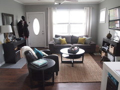
Comments (16)@groveraxle I really, really like your placement of artwork with the four pieces!! Thank you very much for your input!! Would you say that the 2 smaller black and white pieces are 8x10 frames? I'm trying to figure out what size of frames and the 2 larger canvases are, so I can make this look happen! Also, do you happen to know where the floating shelf below the tv can be purchased? Or something similar? You made my morning with your help!!!...See Moresize of art work behind couch+lamps
Comments (3)The best way to get advice here is to show pictures of the space along with pics of what you have in mind for art. Dimensions of furniture and art are helpful, too. Maybe someone can give you a mock-up with the pictures and info....See MoreI'm not sure what size art work to put above the couch ?
Comments (1)As long it is centered 35"x35" or a 40"x30". Also if you do two prints with the 30" wide you can have a 9" space between them....See More
aimeekm
7 years agolast modified: 7 years agoaimeekm
7 years agoaimeekm
7 years agoaimeekm
7 years agoaimeekm
7 years agoaimeekm
7 years agoaimeekm
7 years agoaimeekm
7 years agoaimeekm
7 years agoaimeekm
7 years ago PRO
PRODouglas Page Photography
7 years ago


Related Stories
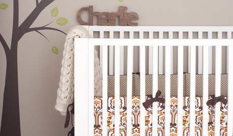
MORE ROOMSPint-Sized Design: Charlie's Owl-tastic Nursery
Handmade touches, warm colors and a light-handed motif fill a baby's room with charm
Full Story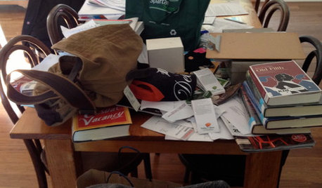
LIFEAnatomy of a Family-Size Mess
Study your home’s dumping grounds to figure out what organizational systems will work — then let yourself experiment
Full Story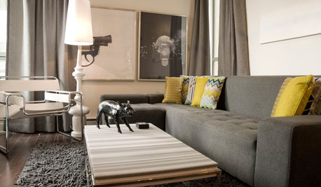
HOUZZ TOURSMy Houzz: Pint-Size Playfulness in Vancouver
An interior designer mixes handmade art with creative touches to give his small downtown Vancouver home a fresh look
Full Story
GARDENING FOR BUTTERFLIESBring on the Birds: Natural Habitat Ideas for Gardens of All Sizes
Provide nesting, watering and perching spots inspired by the Costa Rican jungle and watch the birds flock on over
Full Story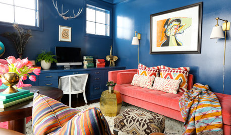
DECORATING GUIDESMove Over, Neutral Sofa — Here Comes Color
Sometimes it makes sense to ignore the conventional wisdom about furniture and make a bold, colorful statement
Full Story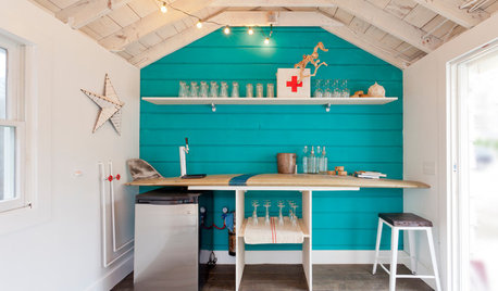
ENTERTAININGRaise Your Glass to Home Bars in All Shapes and Sizes
When you have a personalized home bar, the party will always follow you. Which of these styles could you toast to?
Full Story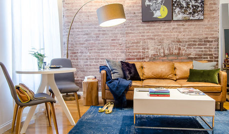
ROOM OF THE DAYRoom of the Day: Making Over a Harlem Living Room From 3,000 Miles Away
Using photos, video and email, San Francisco designer Jacqueline Palmer created a stylish living room for a New York City entrepreneur
Full Story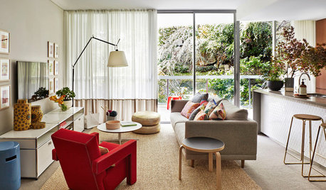
DECORATING GUIDESSize Up the Right Area Rug for Your Room
The size of a rug can make an important difference to the feel of a room. Here are some tips to help you make the right choice
Full Story
KITCHEN DESIGNRelocated Colonial Kitchen More Than Doubles in Size
Putting the kitchen in a central location allows for a big boost in square footage and helps better connect it with other living spaces
Full Story
REMODELING GUIDESTour Sarah Susanka's Newest Right-Sized House
Get ideas for neighbor-friendly, efficient home design from best-selling author's latest project near Chicago
Full Story


aprilneverends