SHOP PRODUCTS
Houzz Logo Print
uscroy

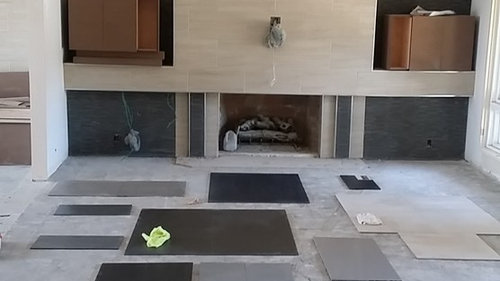
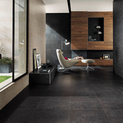
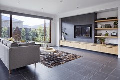
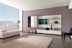
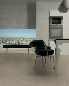
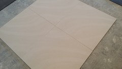
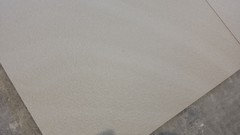
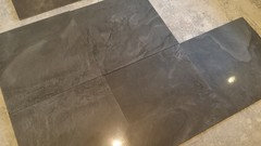
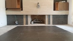
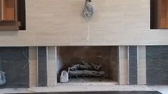
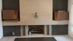
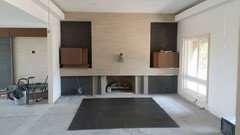
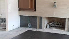
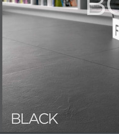
What color floor do you think I should use?

uscpsycho
7 years ago

Help!

I am struggling to pick a floor tile for this room and the adjacent room which is about as big as this one. So the tile I pick will cover a lot of floor. The wenge cabinets you see have not been installed yet but will be mounted to the wall inside the niches. The adjacent room has a different design but the same color tiles on the wall and same wenge cabinetry.

I want a modern looking floor tile and hope to find one available in a larger format but would settle for 12x24 if the tile I pick is only available in that format.

This room is adjacent to the front door and is the first thing you see when you enter so I want it to look amazing.

I think the most feasible color options are something in black, gray or brown/beige. I'm not really a fan of greige or taupe. What are your thoughts in general? And if you know of a specific tile that would be perfect please share a link/photo.

Thanks!

Comments (40)

  • uscpsycho
    Original Author
    7 years ago
    Thanks! Love that second photo. Definitely something to consider! Would I want to use a wood to match the cabinets? Is that actual wood wood or wood look tile?

    I wasn't necessarily expecting people to comment specifically on the samples currently in the room. It's hard to really get a sense of how these tiles really look in the photo. I was asking for more general advice rather than advice on the specific floor tiles in the photo.
  • Related Discussions

    What do you think I should do in this little flower bed?

    Q

    Comments (8)
    I always like the bad news first - the crepe myrtle is too close to the house and should be moved while it still can be. The boxwood will eventually outgrow it's little space, but that can take a hard pruning to keep it for a few years. The fallen leaves are okay. The silvery plants are Dusty Miller - and I think the snaps, plumbago, alyssum, and dianthus are fine. A nice change from the tortured into submission evergreens in some yards. Snaps will wilt when they need water; but they'll put out more bloom spikes if you pinch off the spent ones. Your conditions in zone 8 are much different than mine in zone 4 - we rarely get prolonged heat enough to bake a garden like you probably do in Houston. I wouldn't plant anything directly over the buried downspout extension - too easy to forget it's there and slice through it with a shovel or something. Some more snaps underneath the arrow, some more allysum on the up side of the dianthus and you're all set.
    ...See More

    What color do you think this door should be painted?

    Q

    Comments (23)
    Here you go: I confess, I've never quite mastered the official directions for doing this, so I use the tried and true HTML method. You can skip #1 & 2, because you already did that part. Start with #3. 1. Open a Photobucket or Flicker or whatever freebie photo storing site you like. I randomly chose Photobucket and it's really easy to work with. 2. Load your photos from your camera onto your computer. From Photobucket (or wherever), hit the "upload" button and follow the directions. 3. When you mouse over one of your stored photos a box comes up with a list of things like "direct link," "html code," and "image code." The one you want to click on is "direct link." It begins with "http://" and ends with ".jpg" 4. Whenever you want to place a photo in a post, you type in this script: <img src="Your URL location here" </img> Paste the direct link address you copied from your photo between the quotation marks (replacing "Your URL location here"). 5. If you want to use a photo from somewhere else on the net, click on the photo and a list comes up which includes "copy image location." Click that to copy and proceed as above.
    ...See More

    What colour do you think the shelf portion should be?

    Q

    Comments (3)
    You may not want faux brick as well as faux wood grain in the same space. I would remove the adhesive, and paint the whole shelf unit the same color as your walls. You'll need to lightly sand and prime it first or the paint won't stick on the the laminate.
    ...See More

    I'd like to know what you think i should do with this large TV wall.

    Q

    Comments (12)
    If you want a minimal look, see below. You could also add art for impact and balance. https://franceandson.com/products/gramercy-media-console-black-lacquer-on-walnut8677?utm_source=pinterest&utm_medium=cpc&utm_campaign=shopping&variant=14491573583914&sfdr_ptcid=19280_1787_403808349&sfdr_hash=632c34345861c2a5239df622bc54bd53
    ...See More
  • theclose
    7 years ago

    I like the darker options. Hard to tell which one I think is best but I am not a fan of the light walls/light floors look. I agree with Oly that the large sample in the middle looks the warmest on my monitor. After that I would choose the one right below it on the left.

    uscpsycho thanked theclose
  • JustDoIt
    7 years ago

    Well, I'm not loving any of them. They don't appear to have a brown tone as the wall covering. However, if I had to pick it would be the one with the green thingy on it.

    uscpsycho thanked JustDoIt
  • eld6161
    7 years ago

    I really like Oly's second example. A black floor will look dusty all of the time. Solid gray would be a bit too industrial looking for my taste.


    uscpsycho thanked eld6161
  • Olychick
    7 years ago
    last modified: 7 years ago

    For cleaning purposes, if you did a wood and tile duo, I'd use wood look tile. Then all the materials would have the same durability. In the pic I posted the floor wood is a great match to the wall wood; I'd be inclined to do something similar to your wenge. Then it all kind of becomes a neutral background to your furnishings, etc.

    uscpsycho thanked Olychick
  • uscpsycho
    Original Author
    7 years ago

    Thanks for the advice guys. A lot of you prefer the one in the middle (with the green thingy). Here is an up close photo.

    And this is the one below it to the left.

  • Annie Deighnaugh
    7 years ago

    I would consider doing the whole floor in a wood look tile, if you want tile, or look into luxury vinyl tile for a durable but softer finish. I'd think about a medium blond wood tone or maybe a little darker.


    Olive Tree Lane · More Info


    Presidio Heights Residence, Huang Iboshi Architecture and John Maniscalco Archit · More Info


    uscpsycho thanked Annie Deighnaugh
  • User
    7 years ago

    We did light. I guess you might call it beige. Looks like sandstone. It's hard to keep clean. I think both light and dark have that problem.

    We did the 12 x 24. I have decided I don't like that format as much as I thought. Now I get to live with it for 20 years.

    We have honed slate in the master bath. A green-black. Lots of variation in the slate even at that level of darkness. 26×26. I think it would look cool massed on the main level. The variation would keep it from looking totally black. But it's too dark for me. It might work for you.

    I like oly's first photo.

    uscpsycho thanked User
  • uscpsycho
    Original Author
    7 years ago
    last modified: 7 years ago

    I don't want to do a wood look tile for a couple of reasons. One is that I don't think it's as modern looking as I want to go. The other reason is that I have real wood upstairs and the wood comes down the stairs. You can see the stairs if you are standing right outside these rooms. I don't think it is a great idea to have a nice real wood floor and a totally different wood look tile floor in such close proximity.

    jn3344 - You said you don't like the 12x24 as much as you thought. Is it too big or too small?

    I looked at some photos of honed slate and I like that idea. Problem is that it's natural stone and I'm trying to avoid natural stone floors because they stain easily and some are less durable than tile. And some you have to apply sealer on a regular basis. I don't want anything high maintenance on the floors downstairs. What is the durability of slate compared to something like marble or porcelain tile? Does it require a sealer?

    I'm starting to think oly's second photo might be a bit busy for my rooms. The floor looks cool in that photo but the room has a very minimalist design. I already have a lot going on on my walls so I'm thinking I should keep the floors simple. You guys agree with that?

    I don't have a picture handy but the black tile you see on the wall isn't pure black. It's a mosaic of basalt stone mixed with metal pieces so there is some color variation in there with the metal. I'll take a close up picture of it and post it later.

  • practigal
    7 years ago

    I like oly's photos, I think the first would work best in your situation because you seem to have a lot of other stuff going on. But yes, those kind of floors definitely give a cool tone to the room (and may be physically cold in reality).

    uscpsycho thanked practigal
  • User
    7 years ago
    last modified: 7 years ago

    Speaking of basalt...I love this tile line.

    http://www.eleganzatiles.com/product-series/porcelain/basaltina.html

    I would say on reflection I like the 12x24 in the guest bath. It's a small bathroom and having the same tile on the floor, walls, and shower surround make it look bigger. See below.

    We have mixed tile and wood on the main level. I think the 12x24 looks busy with the sandstone veining. The basalt type look might lend itself better.

    I don't baby the slate heaven knows. I don't think it was sealed. Looks fine still (1 yr). The natural variations hide spots, etc

    uscpsycho thanked User
  • uscpsycho
    Original Author
    7 years ago

    This is a close up photo of what the black tile looks like. I looked at some slate today and that's definitely an option. The Eleganza Basaltina tile is discontinued.

  • uscpsycho
    Original Author
    7 years ago

    This is the impossible challenge -- trying to imagine what any of these tiles will look like covering nearly 800 sqft across both rooms.

    Part of my apprehension to going with beige here is my kitchen is like ten feet away. It is large and the floor is beige, close to the wall tile. That's going to be a hell of a lot of beige tile if I also put it on the floor in the living room/den as well.

  • ravencajun Zone 8b TX
    7 years ago

    Several would go I like 4
    Scroll down to floor tiles

  • amykath
    7 years ago

    Of all of the them I too like the one with the green glove on it. However, I think you need a lighter version of that tile.

  • User
    7 years ago
    last modified: 7 years ago

    So the kitchen beige is different from the FP beige? So you wouldn't want the floor in between the two beiges yet another beige or beige-like tone.

    The dark tile is elegant. Whether it is a natural like slate or the green glove tile, I think it works better.

  • Olychick
    7 years ago
    last modified: 7 years ago

    It really depends on what you like to surround yourself with...when you say it's whole lot of beige, that sounds kind of boring, but it really will be just a light background. To me, doing a dark floor is a whole lot of dark (even if there is light elsewhere) and that would be depressing to me. Here's kind of a visual of a whole lot of beige, dark and med tiles.


    eta and a medium warmer color.

    uscpsycho thanked Olychick
  • uscpsycho
    Original Author
    7 years ago
    last modified: 7 years ago

    I've been looking and looking and stressing and stressing. The room pictured above now has several more samples. I'd like your opinions on the following two tiles.

    This first one is the same one that is in the kitchen. I've kind of come around on the idea of essentially flooding the first floor with this tile. Remember, the living room/den and the kitchen are separated by my entry which is about ten feet wide. You can't really see the living room from the kitchen or vice versa, but from the entry you can see it all.

    This is a different color of the same series which I'm not considering but this is what the tile pattern looks like in a room.

    You can't tell from the photos above but this tile has a very faint glitter effect. Not sure how to explain it, not actual glitter but TINY metallic granules like you might see in natural stone. You can hardly see them but with the lights on but you don't miss them either. It's very subtle. It might sound cheesy but it's actually really cool and what largely sold me on using this tile in the kitchen.

    Here is the other tile I'm strongly considering if I go dark. The grays are lighter than they appear in the photo so it's not quite as dark as it looks in this photo.

    Lots of great advice in this thread. Would love your thoughts on these two options. If you click to enlarge the photos you'll get a better visual.

    I'll have a box of each tomorrow so I'll lay them out and try to take my own photos which will represent them better.

  • User
    7 years ago

    Nice tiles. I am getting ready to gut the in laws new place and will do 900 ft tile all the same. The massing effect can make a statement.

    Now I want to redo my place.

    The second photo looks like our bathroom tile which I like. I still find the dark to be more elegant. More formal. But the mass of the sparkly light tile is very modern.

    How does the light look with the FP wall?

    uscpsycho thanked User
  • uscpsycho
    Original Author
    7 years ago

    Tomorrow I'll take a picture of the light tile next to the FP wall and post it.

    Even though I'm not in love with the idea of so much beige, like you said, the massing effect could be cool. All told it will be 1,250 sqft between the kitchen, den and living room. Then again, 650 sqft of that black tile in the living room/den area could be very cool too.

  • Ice
    7 years ago

    Just remember everything will show on that black tile.

  • uscpsycho
    Original Author
    7 years ago
    I'm very aware of this downside of dark floors. I decided if dark floors are what will look best then I'll have to live with it. Perhaps I'll get a sweeping Roomba and schedule it to clean once a day. I understand they can be very effective.

    I could be wrong but won't a busy pattern on a dark floor mask dust or whatever else is on the surface. I would think that things would be a lot more visible on solid black tile. Right?
  • uscpsycho
    Original Author
    7 years ago
    last modified: 7 years ago

    Here is the beige tile that is going in the kitchen, which I am considering in the living room/den. If you enlarge the second one you can see the slight sparkle.

    Here is the black tile. I really like it but a friend pointed out that it might be too busy. The manufacturer's photo I posted above with this tile is in a very minimalist room where the only movement is on the floor. In my rooms there's a lot going on. For instance, in the adjoining den there will be a pool table, three TV's and a wet bar. There will be some granite or quartz on the bar and possibly the two fireplace hearths.

    Long story short, maybe that tile in the middle of the room with the green rag on it is the way to go. Here it is again for reference.

    Any final thoughts? I really need to make a decision by the end of the weekend so I can finally order tile on Monday.

  • aimeekm
    7 years ago

    I don't think the black tile is too busy at all, it will read neutral.


    I personally would absolutely dread the maintenance of a dark tile. But from reading through your posts, you seem to have come to terms with that. I get the feeling that you really want the dark floor, and that's what your heart is saying. Your head is saying use the lighter tile. But if you use that lighter tile, will you feel a little disappointed every time you're in the room?

    uscpsycho thanked aimeekm
  • uscpsycho
    Original Author
    7 years ago

    The "not too busy" black tile you're referring to, is that the wavy one or the lightly mottled one?


    One other thing about the wavy black tile is that it is shiny -- you might not be able to tell in the photo. It's not quite glossy but it is reflective, they call it polished. I like that it's shiny but maybe that adds to the busyness.


    I am really torn about this decision; I've been struggling with it for weeks and I can't drag it out any longer. I have to force myself to order tile on Monday.


    Anyone think the black wavy tile will be less maintenance than the black mottled option or will they both be a pain? I always thought I would avoid dark floors because of the maintenance. I want everything to be low maintenance but I want to make a statement and I feel like either of the black options make more of a statement than the beige. However, if I use the same beige tile as in the kitchen that makes a statement too. Beige is definitely the safer option.


    I think when it is clean I will love the dark floor more. But when it's not I will probably wish I had gone light and want to kick myself. Pros and cons to both, which is why I'm struggling.


    Someone made a point to me that dark tile will make the area look smaller and a light color will make it look bigger. I know that black clothes are slimming on people but does the same effect work on floors?


    Thanks for the help!

  • Olychick
    7 years ago
    last modified: 7 years ago

    I would choose the lighter tile, for me to live with. But it's apparent that you really, really want a dark floor. I think you might kick yourself over the maintenance, but maybe not. You might swoon every time you walk in the room!

    And you might kick yourself every time you look at the beige floor. If I were you, I'd rather take a chance on something I might LOVE and go dark.

    The swirled dark one is stunning...it reminds me of water sitting on the surface - so I like it shown in that bath with water in proximity. I don't know about it in a large living space.

    I'd probably pick the original dark that you pictured last, if you like how it plays with all the other materials, but if you love the swirled one, you probably can't go wrong.

    uscpsycho thanked Olychick
  • uscpsycho
    Original Author
    7 years ago
    last modified: 7 years ago

    So after all the helpful advice here and advice from people I have asked in person I think the tile in the middle of the room, with the green rag, is the best option. It gives me the dark floor that I'm drawn to and it doesn't compete with the other stuff in the room.

    I picked up a few boxes and laid them out in front of the fireplace. I'd love to hear your thoughts (you have to click on the photos to get the full view). Remember the black tile on the wall is not the same as the floor, it's a mosaic with metal pieces, there's a photo above. Ignore the dust, I didn't have a clean enough cloth to clean the tiles, I just kept pushing dust around.

  • uscpsycho
    Original Author
    7 years ago

    @jn3344 I didn't make the connection until just now but this tile is also called Basaltina but it's from Arizona Tile instead of Eleganza who discontinued it. Comparing the two versions online they are nearly identical. Good call! :-)

    http://www.eleganzatiles.com/basaltina.html

    https://arizonatile.com/en/products/porcelain-and-ceramic/basaltina

  • daisychain Zn3b
    7 years ago

    I think it's amazing. I can hardly wait for your finished pics. Great choice.

  • Olychick
    7 years ago

    It looks great!

  • User
    7 years ago

    I think it's going to look great in that space. I wish I had been able to lay mine out like that.

  • mommyjoy
    7 years ago

    Great choice! I think it will look amazing

  • lizzierobin
    7 years ago

    Nice! It will look great when its done. :-)

  • uscpsycho
    Original Author
    7 years ago

    So... This room is still not done. We ordered the tile and it had issues so we had to send it back. Tried twice with different lot numbers and the tile had issues both tmes.

    So I had to go back to the drawing board which was extremely frustrating! I ended up selecting the tile below in 24x48 format. But I'm not sure how to lay it out. Rather than start a new thread I thought I'd bump this old thread and see if I can get some input.

    I don't know how to word this but if you are looking at the photo in the very first post, would you put the tile in portrait orientation (short edge faces fireplace) or landscape orientation (long edge face fireplace)? My intuition is portrait but the tile installer said most designers would go with landscape because it is a wide room. However, it's only a "wide" room if you count the two rooms as one. You can see in that first photo that this is really two rooms with a large opening in between; and if you consider this as two rooms then they are "tall" rooms rather than wide. Thoughts on orientation?

    Other question is whether I should lay this out in a grid pattern or staggered. With the original 24x24 tile it would have been a grid, but not so sure with 24x48. And not sure about grout. I usually hate to see grout lines but with such large tile there are fewer grout lines so it might be interesting to provide some contrast.

    Here is the tile from the manufacturer's brochure: