


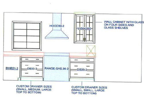
hood design question
Wendy
8 years ago
last modified: 8 years ago
Featured Answer
Sort by:Oldest
Comments (45)

Wendy
8 years agoRelated Discussions
Range hood design/spacing
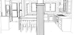
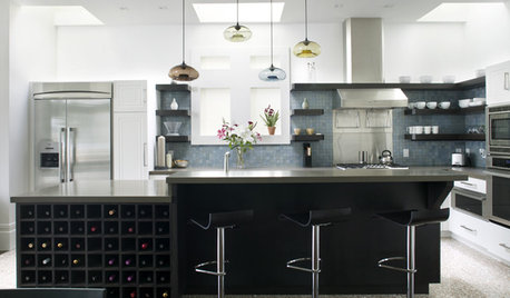
Comments (25)Here's one idea that moves the sinks to the side walls with the DWs next to them. The primary Prep Zones are a bit tight, but as they're in the corner, I think they might work b/c of the extra depth and the workspace on both sides of the corner. In addition, there's the peninsula as well for whatever prepping you allow there. Why didn't I put the DWs on the other side of each sink to increase the prep space? Because... (1) You need room (at least 12") b/w the sink and a wall or tall cabinet and there isn't enough room on either wall for that if the DWs were b/w the sink and the corner and (2) You need the upper cabinet space for dish storage - if the sinks were in front of the wall and the DW under the window, you wouldn't be able to have upper cabinets. Aisle widths...Minimum aisle widths should be 42" (107cm) if only one person will ever work on an aisle -and- if there is no traffic on that aisle 48" (122cm) if more than one person is working on an aisle -or- there is traffic on the aisle. Seating at a peninsula/island... You need 24" (61cm) of linear space per seat - so for 2 seats, you need 48" (122cm); for 3 seats, you need 72" (183cm) You need 15" (38cm) of clear knee/leg space for the overhang - after accounting for the decorative doors/end panels most people put on the backs of the cabinets in the peninsula/island. Storage... You have two corner susans for small appliances, food, etc. You have two sets of 33" drawers under the 24" cooktops/stovetops/rangetops. Note that the cooktops are not centered on the 33" cabinets. To do so, would reduce further the amount of prep space is available. You have two 24" upper cabinets for dishes/glasses. You have 45" of drawer storage on the peninsula as well as the 9" wide cabinet (cutting boards?), the 12" pullout, and the 21" cabinet under the overhang. I would put your silverware storage in the peninsula You have two 12" pullouts flanking the refrigerator I did not put any upper cabinets to the right of the right cooktop even though they would fit b/c it would throw off the balance/symmetry. Hood...With the added space now for the cooktops, you could do the hood you like - over both cooktops! There should be enough room that you won't violate any Code and there will be no danger of the roman shades catching fire. There should also be enough room so the hoods do not overwhelm the space. . Just a suggestion, but if you eliminated the peninsula, you could put the refrigerator on that wall, move the oven cabinet to b/w the two cooktops, and move the left sink & DW down to provide more workspace for the left prep zones. You would also gain a foot to split b/w the two work zones on the top wall (24" oven cabinet vs 37" for the refrigerator). , Here's the layout and it's associated zone map. Layout #1: . Layout #1 Zone Map: . Now, I think it's time to wait for Miriam to return here for comments & answers to some of the questions....See MoreHelp with hood design measurements?
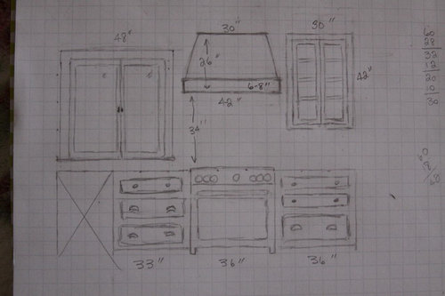
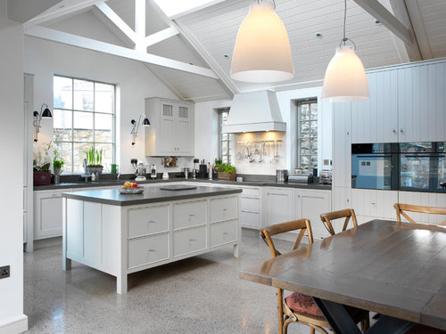
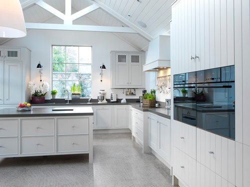
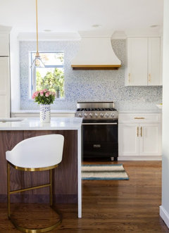
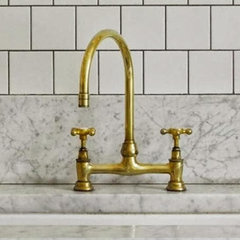
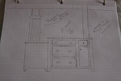
Comments (9)Thank you beenzmail. I received a rendering and feel like it isn't even close to the look I am going for. rendering: inspiration: It looks like the inspiration hood's chimney top is set back from the bottom trim. The bottom trim is thinner (she has it at 8 in). And, the smaller trim is much thinner than in the rendering. the angle is too sharp, maybe. I was thinking 30" across top, but she thinks 27? I love the inspiration hood. Even though it is large, it looks much more delicate and simple than the rendering. The rendering looks big and bulky to me. Can anyone help me figure this out? My sketch with bottom trim @ a little over 6 in and the angle @ 30 in....See MoreUndercabinet Range Hood Size Question
Comments (4)Echo Sophie. My 30" slide in range has a 36" undercabinet exhaust hood. The extra 3" on each side does "push" the upper cabinets further from the hot cooking surface. Which is desirable....See Moreisland vs peninsula in kitchen and hood vent design question
Comments (20)I like this plan a lot. I had sketched it out this way but wasn't sure it was really enough space. Thanks for taking the time to show the dimensions. My one concern about the refrigerator placement is whether of not it will make the kitchen feel "boxed" in when I am working in it. Maybe just when I am at the sink?. Question- could I put the DW next to the refrigerator without struggling with the DW door when it is open? I would most likely house my dishes and silver ware in drawers at that end of the island. It's nice to be able to move things straight from the DW into their storage spots without having to first put them on the island and close the DW door. I like the idea of the pantry. Do you have the space next to the pantry as a coat closet or the W/D? Thank you so much for responding and taking the time to sketch and upload. I am very, very appreciative....See MoreWendy
8 years agoWendy
8 years agoWendy
8 years agolast modified: 8 years agoWendy
8 years agolast modified: 8 years agoWendy
8 years agoWendy
8 years agoWendy
8 years agolast modified: 8 years agoWendy
8 years agoWendy
8 years agolast modified: 8 years agoWendy
8 years agoWendy
8 years agoWendy
8 years ago
rebunky
8 years agoWendy
8 years agoWendy
8 years agoWendy
8 years ago
funkycamper
8 years agolast modified: 8 years agoWendy
8 years agoWendy
8 years agoWendy
8 years ago


Related Stories
REMODELING GUIDESPlanning a Kitchen Remodel? Start With These 5 Questions
Before you consider aesthetics, make sure your new kitchen will work for your cooking and entertaining style
Full Story
Design Dilemmas: 5 Questions for Design Stars
Share Your Design Know-How on the Houzz Questions Board
Full Story
5 Questions for Design Stars
Houzz Members Need Your Help With This Week's Design Dilemmas!
Full Story0
User