


Finishes Angst - Still
steph2000
8 years ago


Featured Answer
Sort by:Oldest
Comments (64)
Related Discussions
black widow angst
Comments (6)Well I decided to let nature decide. Checked on them again yesterday and there were only a few spiderlings left hanging about. No sign of mom. A couple of things helped me make up my mind: this is the first one I've seen here in the yard--ever. Can't be like we are overrun with them. I am allergic to beestings, so you could say given the number of wasps, hornets, yellowjackets, etc. around the place, the stinging insects pose a bigger threat to me than a single spider, yet I avoid problems with them by just trying to be observant and a little respectful. I think if this were a recluse, which is a wanderer and not a web-based spider, things would have been different. And I also know firsthand how dense recluse populations can get! If and when we ever have to go into the crawl spaces under the house, we will simply have to be extra careful, shine the corners and beams for others, and watch where we put our hands. I coexist when I can....See MoreKitchen angst is alive and well . . . AGAIN !!
Comments (6)oofasis . . . thanks for your empathy !!!! Appreciated, to be sure !!!! An update . . . went out to the showroom/factory . . . Talked with someone who actually makes the cabs. and said that ANY color can be duplicated !! Nicest guy . . . said someone will be out to take a look . . . I had a sample of our "old" vs. the "new" with me, and he right off the bat could tell it was not right at all !!! Thank goodness !!!! So, I am feeling lots better this afternoon !!! It sounds like I will get back the kitchen of my dreams !!!! All along, this has just been a company of superior values and products . . . So, there's the update for today . . . Life is good again !!! C....See MoreAngst; thy name is microwave
Comments (2)Here's another thought about the MW, suggested by our cabinet maker when we remodeled in 2002, and immediately implemented: forget & eschew the trim kit. I can tell you it's not needed. We have plenty of air flow & gap around the MW, our's sits in a shelf built into the island. The MW should not be a show-stopper. We used a Kenmore MW which has a large turntable & 1000 watts, though takes up little space. I think this same MW is now available at Great Indoors for $79 or $89....See Moremy almost-finished kitchen - pix & backsplash angst
Comments (29)Yes, the hood is a Zephyr Tamburo. 400 CFMs. A piece of sculpture! So yesterday I ran around looking at tile. I picked up 8 more of the bumps and kept looking. At one point I had a vision of medium gray glass tiles, medium gray grout, grass green walls. I picked up a quart of grass green, a couple of other paint samples, and came home. Taped a sq. ft to the wall. A resounding NO. They looked brown,which would be ok except that if the soapstone darkens (which it will, I suppose, eventually) the tiles will really not work. It just looked off. Bummer. Last night I was up till all hours doing a glass tile search to find something that was less than the $27-39/sq ft I had been seeing around here. Will report in at the next round. The handles and shelves went in today. The first thing I did was start to fill the bookshelves. that horrible Minidata notebook is full of recipe clippings I will never live long enough to try. Need to organize it and maybe do something with that ugly notebook cover. A shelf of art books and then we'll see. Second thing I did was put the tea tins back on the shelf over the sink where we are used to finding them. That shelf will be usable stuff, the ones above, display for my antique tins: a counterpoint to all the sleekness. I printed out labels for the 5 mailboxes: one each for DH & me, one for my mother - whose bills I take care of, one for outgoing mail, and one for random stuff. I will have to nag DH to sort the mail instead of leaving it in a pile on the island. Grrrrrr. New leaf. Two weekly papers came in today: the one I haven't read yet is in my box. Finally, I picked up the barstools I had ordered at Crate & Barrel. $89 each and they SPIN!! What fun! I can sit and read my cookbooks at the island while I contemplate what I am going to make for dinner, instead of standing at the counter and reading. DH can sit with his laptop or pay bills at the island instead of upstairs in the 2" of space on his cluttered desk. He will do this while I am on my teaching trips, no doubt. The kitchen table will be a while in coming, although we ordered it. Thanks for the input on the tiles; they work en principe - mais pas en réalité. On continue. Tomorrow, if we are lucky, the crown molding goes up and maybe the light rail. Off now to get a decent night's sleep - or what is left of the night....See More
steph2000
8 years agolast modified: 8 years agosteph2000
8 years agolast modified: 8 years agosteph2000
8 years agolast modified: 8 years agosteph2000
8 years agosteph2000
8 years agosteph2000
8 years agosteph2000
8 years agosteph2000
8 years agosteph2000
8 years agolast modified: 8 years agosteph2000
8 years agolast modified: 8 years ago
a2gemini
8 years ago


Related Stories
KITCHEN COUNTERTOPSKitchen Counters: Granite, Still a Go-to Surface Choice
Every slab of this natural stone is one of a kind — but there are things to watch for while you're admiring its unique beauty
Full Story
GARDENING GUIDESBoxwood: Still Shape-Shifting After 350 Years
Wild or mild, the humble boxwood still brings style and order to all kinds of gardens
Full Story
KITCHEN DESIGNShaker Style Still a Cabinetry Classic
The Shaker profile stays true to its generations-old square simplicity but can adapt to any modern taste
Full Story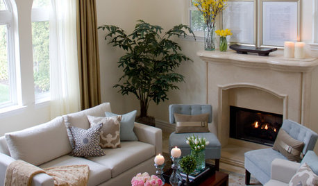
SELLING YOUR HOUSESave Money on Home Staging and Still Sell Faster
Spend only where it matters on home staging to keep money in your pocket and buyers lined up
Full Story
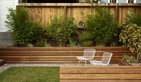
LANDSCAPE DESIGNSmall Garden? You Can Still Do Bamboo
Forget luck. Having bamboo that thrives on a wee plot just takes planning, picking the right variety, and keeping runners in check
Full Story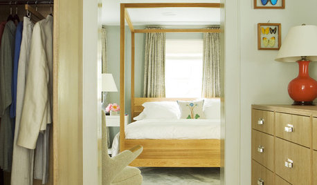
BEDROOMSCanopy Beds: All Grownup and Still Magical
Add a Dose of Drama and Romance With an Elegant Four-Poster
Full Story
REMODELING GUIDESHow to Size Interior Trim for a Finished Look
There's an art to striking an appealing balance of sizes for baseboards, crown moldings and other millwork. An architect shares his secrets
Full Story
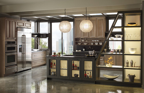
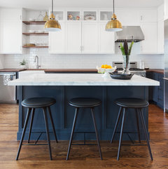
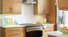
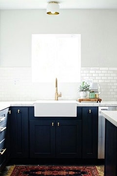
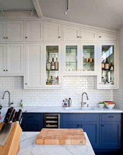
KITCHEN DESIGNTwo-Tone Cabinet Finishes Double Kitchen Style
Love 'em or not, two-tone kitchen cabinet treatments are still going strong. Try these strategies to change up the look of your space
Full Story
KITCHEN DESIGN3 Steps to Choosing Kitchen Finishes Wisely
Lost your way in the field of options for countertop and cabinet finishes? This advice will put your kitchen renovation back on track
Full StorySponsored
Columbus Area's Luxury Design Build Firm | 17x Best of Houzz Winner!

Jillius