Houzz Logo Print
siobhan_1

Facelift

13 years ago

Great shakes, what has happened to Reader's Paradise? After all these years a different appearance! I don't know what to think!

Comments (37)

  • 13 years ago

    I agree! It's quite a change,and it's so light, it's a bit jarring. Hmmmm....

  • 13 years ago

    I think this might take some time to get used to and I'm not to keen the green. Is it just my computer or is anyone else finding it very 'slow'?

  • Related Discussions

    exterior facelift needed

    Q

    Comments (27)
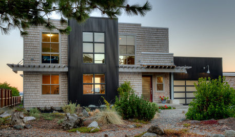
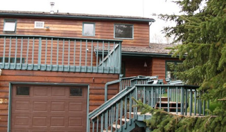
    Two problems -- the brick and the roof. All your inspiration images also show different window colors than what's on your house. The two dark images both have brick that works with the dark siding. I like the monotone look, but to pull it off successfully, other things will need to change. You might be able to fix the brick with a coating, but since the roof has to stay, I cannot imagine a really good paint color to recommend, especially looking at your images. Someone really needs to be there, looking at the house as a whole and seeing the existing materials to offer the best suggestions. Larger image.
    ...See More

    Laundry Room facelift

    Q

    Comments (17)
    I should mention I have had a utility sink but never where I do laundry and putting paint and chemicals down a drain are always a bad idea.. We have had a utility sink under out stairs in this last house and I admit came in handy . I like laundry rooms to be a designated space ,no food storage no chemicals stored just laundry and laundry stuff . I have never had or want to have a huge waste of space laundry room to have to add to my cleaning every week so the one posted is a great size but we need all the measurments and better pics. We also need some clue as to the style of the home , your wifes fave colors . Surprises need to be done with planning.
    ...See More

    Fireplace facelift

    Q

    Comments (1)
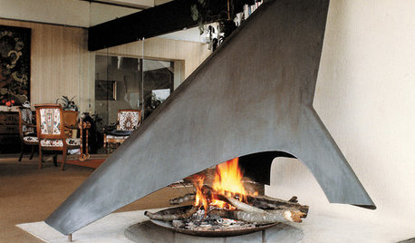
    I think it looks great as is. It goes with the architecture of the room. No to river rock and tile will distract from the wood ceiling.
    ...See More

    exterior facelifts

    Q

    Comments (9)
    The existing colors of your home and shutters seem to make the brick look like the-odd-man-out. Since you’re probably not changing the brick, use it as the basis for choosing new colors. Have you tried going shutter-free? That might help, along with widening the window trim as you suggested.
    ...See More
  • 13 years ago

    Seriously dislike the bright white. I never thought there was anything wrong with it the old way, but nothing stays the same forever.

  • 13 years ago

    I don't like the bright white background either. Change is not always a bad thing, but at least make it nicer, not worse!

  • 13 years ago

    UGH!!!!!!!!!!!!!!!!!!!! What was wrong with the "red"!!!!!

  • 13 years ago

    Prefer the old way.

  • 13 years ago

    When I first logged it I thought I was in the wrong place!
    The background is fine for the "Garden" but I don't care for it for Readers!

    Pat

  • 13 years ago

    Same here folks, I thought the gremlins were in my PC!!
    I don't mind the change.

    I post with google chrome, I find that it is much faster, and it also does a spell check as you go!!

  • 13 years ago

    I love it. For me it's much more readable.

  • 13 years ago

    Don't like it at all. It seems too busy to me. I realize we wouldn't have RP if it weren't for the ads, but a cleaner appearance would have been nice. Looks to me like a fifth-grade class project. My humble opinion.

    I wish they would fix the log in glitch while they are tinkering with the appearance. I've only been able to get in through the GardenWeb main page for ages.

  • 13 years ago

    Don't mind the new appearance, but the overabundance of bright white is painful to my eyes. A nice restful very pale green would be much appreciated. (Just an old memory, we used a light green background stain for histological slides when possible, since it was easy on the eyes and allowed for more scanning.)

  • 13 years ago

    It's quite bright and very white, which may look clean but isn't at all a friendly look, especially for tired eyes. I keep my screen brightness toned down and even then it comes up too glaringly white. I hope they change it to a slightly tinted colour.

  • 13 years ago

    I don't like the bright screen either. I won't be able to read more than a few posts each time.
    It is doing my head in!

  • 13 years ago

    Whoa..........has the blizzard it the RP forum!?

    White is nice
    For mice.

    Not sure I'm lovin' this new look.
    I am a strange creature of habit and this one is not feeling comfy.

    Yvonne

  • 13 years ago

    I'm going to have to dig out the sunglasses for sure. I do see it as an improvement over the old dark screen but it needs toning down a bit. Maybe off-white or eggshell?

  • 13 years ago

    My eyes have always been overly sensitive to glare, and the white screen makes it uncomfortable for my vision. I wonder why they chose white, when a light pastel would have been so much easier on our eyes?

  • 13 years ago

    This is just too weird! Although the new posting options are nice.

  • 13 years ago

    I would suggest that those who feel strongly about this send comments using the 'Contact Us' link at the bottom of the page. It may be possible that they would be willing to tint the page a softer color if enough people requested it.

  • 13 years ago

    it's fine with me (although it did surprise me at first! Thought I was in the wrong place for some reason.)

    Could do without the distraction of moving ads, but fully understand the need to pay the bills. Plus it's free to us so I think that rather takes us out of the equation a bit. (Not that we're not a vitally important part of the RP world.)

    Just gonna take getting used to, I think. There haven't been significant changes to RP for years.

    (As an aside, research suggests that having black font on a white background is good for making it easy to read for a lot of people, including those with eye-related challenges.)

  • 13 years ago

    I wonder if the rather feeble search function has been improved to match the rest of Gardenweb? If so, that would be well worth any cosmetic changes.

    Rosefolly

  • 13 years ago

    I think the initial page with the pale green and blue is pretty, but the reading background certainly is white.

  • 13 years ago

    Rosefolly, I have written to Contact Us as you suggested. I hope it does some good!

  • 13 years ago

    Yes, I find it a bit blinding too. And the grass hardly fits a reading site, although it is quite pretty. (Why did we ever get put with a garden site anyway?)

  • 13 years ago

    > Why did we ever get put with a garden site anyway?

    The forums got taken over (or Spike sold them) to GW (or was it THS?) and they never got integrated into the main site.

  • 13 years ago

    I don't love it either-the page is too bright and the posts are too narrow, but what bugs me most is the minimizing of our reading goddess. They shrank her, and against the white she pales in significance.
    However, I am eternally grateful that they did not go white on black-I regularly visit a blog that switched to that, and I need to cut and paste the text into a temporary Word doc to read the entries I am interested in-the white on black = instant headache.
    Oh Spike-once again I miss your control-freak presence.

  • 13 years ago

    I have found that since they changed the page, I am reluctant to visit RP, not because I don't like the site or the people here, but the look of the page is off-putting to me. I am going to have to contact them and ask if they can do anything to make it look more inviting.

  • 13 years ago

    The red was cozy. This new format seems so... harsh.

    Too bright, hurts my eyes.

    PAM

  • 13 years ago

    Has anyone else noticed that since the change, everything is slower to load?

  • 13 years ago

    Yes, and more ads. I have my blocker on, but they still have a trailer across the bottom of the page and load behind the scene.

  • 13 years ago

    I'm not a happy camper with this site right now. I tried several times to open the post about contentment and each time an ad opened in its place. I know that I didn't accidentally hit a link to an ad. I very carefully touched the thread itself and still a stupid ad showed up instead. I know they have to sell ads to keep this site going but this is ridiculous! (And yes I did contact them about the new look but as we can all see, it did no good).

  • 13 years ago

    I've never had a problem with ads here.

  • 13 years ago

    rouan, I had the same experience with that incredibly obnoxious pantene ad. I could not open any thread without being sent off to Pantene, then it would completely block out the main RP page. I sent off a nastygram to tell them that the company had just lost any business from me! If it's still here tomorrow, the nastygram goes directly to Pantene. :)

  • 13 years ago

    I can live with the facelift, but the ads are driving me nuts! One was a fuzzy blue thing that I could see the main page behind (maybe it was for Pantene like donnamira mentioned), but I couldn't get rid of the ad so I had to kill everything. It has not reappeared, but a banner ad for Olay hair removal and another for exercising my aging brain are exasperating. Maybe I need to remove some hair and tweak my brain, but I don't need damn ads to remind me. Pffft!

  • 13 years ago

    Just asked the DH about all the ads that many of you seem to face here.
    He says (and I hope I've got this right).
    We use Firefox rather than Explorer and use the 'add-on' No Script which is extremely good at blocking pop-ups plus/because it turns off Java Script which is the system used by the ad people.
    Sometimes it might be necessary to temporarily disable the affect on the page if for eg. you needed to make a card payment or similar.
    So on this RP page, I am virtually ad free and have lots of blank white spaces. There are however a few google ads that appear on the right of the area.
    As you all know google has many very clever ways of knowing far more about each of us than might be considered necessary or desirable.
    A small eg. Our older son has recently started work as a 'partner' in a computer firm (he is introducing computer forensics to their portfolio). He told me the name of the company and I 'looked them up' as you do, on google.
    However some days later, on this Garden Web site I started to see ads down the right hand side of the page for my son's company. Google had 'memorised' my search and will go on reminding me of it.
    Garden Web carries a huge number of ads and you don't have to look at them. I just clicked the 'options' box bottom right and our system is blocking THIRTEEN possible pop-up sites.

    I'd write more but a voice in my head is telling me to buy Pant*ne shampoo . . .Must obey . . . O Master . . . I am yours to command . . .

  • 13 years ago

    I ordered some shoes from ShoeMall.com, and I can't tell you how many ads for shoes have come to me on whatever site I'm on. I had that blue thing once and had to close down the internet completely and start over.

    Vee, I hope you got your hair nice and clean.

  • 13 years ago

    Carolyn, you wouldn't recognise me. I float through a field of poppies with my raven locks floating in the breeze, while slightly less beautiful females can only looking on with envy. And just wait until you see the handsome hunk leaning on the hood of the latest model Aston Martin waiting to whisk me to . . .who knows where?

  • 13 years ago

    Skyfall?