


Impossible Kitchen part II
gardenwebber
16 years ago
Sort by:Oldest
Comments (18)
Related Stories
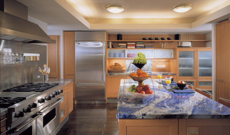
KITCHEN DESIGNAlternatives to Granite Countertops, Part II
Still looking for a new kind of countertop? Try sodalite, zinc, limestone, onyx and more
Full Story
KITCHEN DESIGNNew Year's Resolutions for Your Kitchen, Part II
Here's how to make your new kitchen more functional and fabulous this year
Full Story
MORE ROOMSGetting the Room Right: Part II
Great spaces show how to avoid the Top 10 decorating mistakes
Full Story
LOFTSHouzz Tour: A Bachelor Pad’s Part II
A designer has a hand in two phases of this movie director’s life and his loft in a landmark Art Deco building in L.A.
Full Story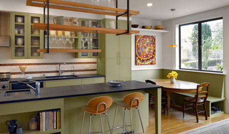
KITCHEN DESIGNAlternatives to Granite Countertops, Part III
9 more reasons to rethink the granite kitchen counter
Full Story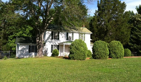
LIFETime Travel to Houzzers' Childhood Homes, Part 3
See postwar homes built by family members, rural farmsteads, cold-water flats and much more
Full Story
DECORATING GUIDESGetting the Room Right: Part I
Great Spaces Show How to Avoid the Top 10 Decorating Mistakes
Full Story
LIFETime Travel to Houzzers' Childhood Homes, Part 1
Peek into home design's past and share the memories of Houzz community members with these personal photos and stories
Full Story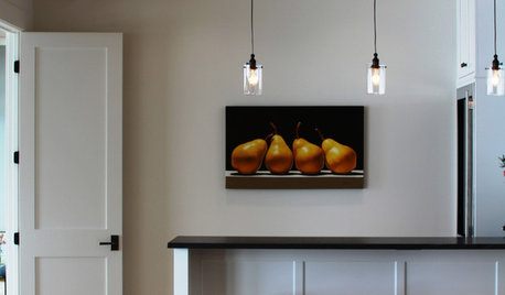
DOORSKnow Your House: Interior Door Parts and Styles
Learn all the possibilities for your doors, and you may never default to the standard six-panel again
Full Story
LIFETime Travel to Houzzers' Childhood Homes, Part 2
Catch a glimpse of kit houses, bungalows, Tudors and more just as they were way back when — and listen in on the intriguing personal stories
Full Story


rhome410
gardenwebberOriginal Author
Related Discussions
Kitchen at work...post what you are cooking! Part II
Q
Help with managing contractors Part II
Q
Part II: take a peek at my "soft modern" small kitchen design?
Q
Design Around #18: Art of Kitchen Design Part II
Q
gardenwebberOriginal Author
gardenwebberOriginal Author
rhome410
gardenwebberOriginal Author
loves2cook4six
lpolk
Buehl
User
Katie S
gardenwebberOriginal Author
gardenwebberOriginal Author
lascatx
rhome410
gardenwebberOriginal Author
gardenwebberOriginal Author
User