


It shouldn't be this difficult....
divamum
16 years ago

Sort by:Oldest
Comments (46)
Related Stories
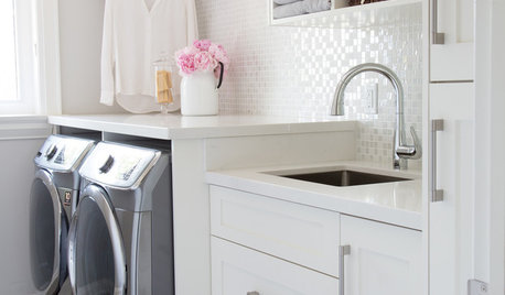
LAUNDRY ROOMSYou Have Style — Shouldn’t Your Laundry Room?
Make folding clothes your favorite chore of the day with these 10 designer tips
Full Story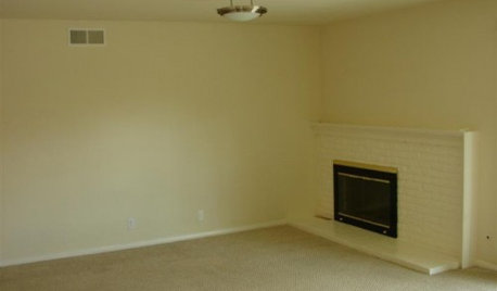
FIREPLACESDesign Dilemma: Difficult Corner Fireplace
Where to Put the TV? Help a Houzz Reader Set Up His New Living Room
Full Story
DECORATING GUIDESThe Art of the Window: Drapery Solutions for Difficult Types and Shapes
Stymied by how to hang draperies on a nonstandard window? Check out these tips for dressing 10 tricky window styles
Full Story
GARDENING GUIDESHow to Use Pachysandra Responsibly in the Landscape
It's tops at covering lots of ground quickly, but be sure this low evergreen plant doesn't spread where it shouldn't
Full Story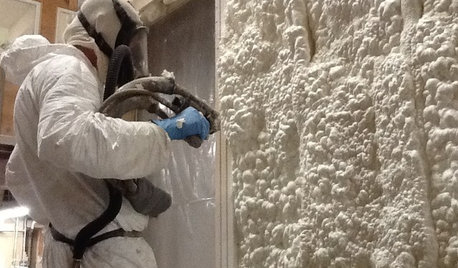
MATERIALSInsulation Basics: What to Know About Spray Foam
Learn what exactly spray foam is, the pros and cons of using it and why you shouldn’t mess around with installation
Full Story
COLORDecorating 101: How to Choose Your Colors
Learn where to look for palette inspiration — and one commonly advised place maybe you shouldn’t
Full Story
KITCHEN DESIGNHaving a Design Moment: The Kitchen
Take a peek at 11 design opportunities you shouldn't overlook in the kitchen
Full Story
DECORATING GUIDES10 Easy Fixes for That Nearly Perfect House You Want to Buy
Find out the common flaws that shouldn’t be deal-breakers — and a few that should give you pause
Full Story
FUN HOUZZ10 Things People Really Don’t Want in Their Homes
No love lost over fluorescent lights? No shocker there. But some of these other hated items may surprise you
Full Story
MOST POPULAR5 Remodels That Make Good Resale Value Sense — and 5 That Don’t
Find out which projects offer the best return on your investment dollars
Full StorySponsored
Zanesville's Most Skilled & Knowledgeable Home Improvement Specialists


ntt_hou
divamumOriginal Author
Related Discussions
"Mystery poison ivy," contact dermatitis rash from house plants
Q
Can this extra-large Bougainvilla be transplanted?
Q
Planting depth of Salvia spathacea
Q
This shouldn't be this difficult, but...
Q
fnzzy
coleen3201118
sarschlos_remodeler
divamumOriginal Author
Valerie Noronha
Buehl
organic_donna
divamumOriginal Author
sarschlos_remodeler
oruboris
plllog
monroviamom
rmkitchen
divamumOriginal Author
raehelen
saskatchewan_girl
sarschlos_remodeler
fnzzy
kren_pa
petra_il
talley_sue_nyc
adoptedbygreyhounds
divamumOriginal Author
lascatx
wisrose
divamumOriginal Author
plllog
wisrose
divamumOriginal Author
tartanhabit
vwhippiechick
woleile
hmsweethm
divamumOriginal Author
wisrose
vwhippiechick
divamumOriginal Author
plllog
divamumOriginal Author
plllog
divamumOriginal Author
vwhippiechick
igloochic
divamumOriginal Author