


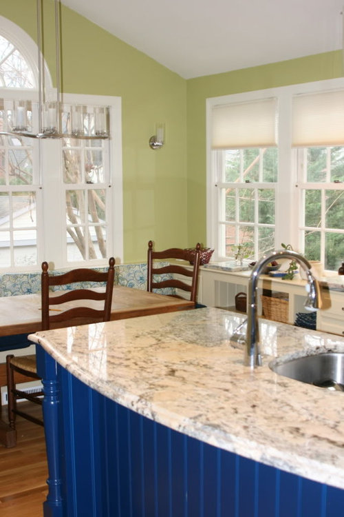
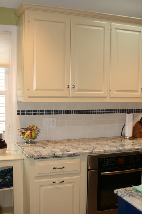
i don't like my island
sophie123
12 years ago


Sort by:Oldest
Comments (112)
Related Stories
LIFEYou Said It: ‘Just Because I’m Tiny Doesn’t Mean I Don’t Go Big’
Changing things up with space, color and paint dominated the design conversations this week
Full Story
SMALL KITCHENS10 Things You Didn't Think Would Fit in a Small Kitchen
Don't assume you have to do without those windows, that island, a home office space, your prized collections or an eat-in nook
Full Story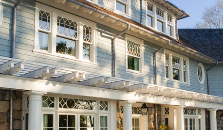
TRADITIONAL HOMESHouzz Tour: New Shingle-Style Home Doesn’t Reveal Its Age
Meticulous attention to period details makes this grand shorefront home look like it’s been perched here for a century
Full Story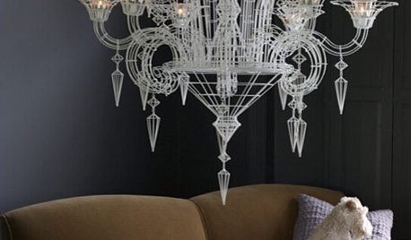
LIGHTING10 Chandeliers for People Who Don't Like Chandeliers
Get all the chandelier benefits without channeling Liberace, thanks to wood, paper, wire — and even a surprising old-fashioned staple
Full Story
FURNITUREObjects of Desire: Recliners That Don’t Look Like Recliners
Forget bulky, hulky eyesores. These 7 smart and svelte chairs — some without levers — have mastered the art of disguise
Full Story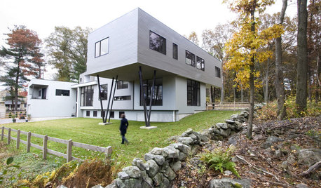
When a Column Doesn't Look Like a Column
See Why Designers May Opt for Tree-like Supports in Wood or Steel
Full Story
BEDROOMSRoom of the Day: An Island Bed Makes Way for a Reading Niche
This designer’s bedroom wasn’t working until she set the bed adrift
Full Story
COFFEE WITH AN ARCHITECTA Few Things I Would Like to Ask Frank Lloyd Wright
It could take a lifetime to understand Frank Lloyd Wright's work — less if we had answers to a few simple questions
Full Story
KITCHEN DESIGNTake a Seat at the New Kitchen-Table Island
Hybrid kitchen islands swap storage for a table-like look and more seating
Full Story
STORAGEMan Space: A Guy Likes a Nice Closet, Too
If clothes make the man, shouldn't a man make a great space for the clothes? Take inspiration from these dream closets for dudes
Full Story

TracyO
blondelle
Related Discussions
I don't like my backsplash...Should I send it back?
Q
I don't like my pendants (never did)...so...
Q
Help! I don't think I like my new recessed lights! What to do?
Q
I think I don’t like my NEW counters
Q
Bunny
marcolo
sophie123Original Author
User
marcolo
TracyO
Bunny
allison0704
User
sochi
blondelle
annachosaknj6b
blondelle
enduring
mtnrdredux_gw
dianalo
mrshanson1
hatethecold_gw
boxerpups
mamadadapaige
CEFreeman
Bunny
cawaps
skyedog
Bunny
jenhp
shelayne
cawaps
ellendi
joyce_6333
sixtyohno
shanghaimom
annachosaknj6b
mtnrdredux_gw
sochi
caligal
sandy808
petra66_gw
sophie123Original Author
blondelle
marcolo
Stacey Collins
Stacey Collins
blondelle
shanghaimom
mamadadapaige
blondelle
peytonroad