SHOP PRODUCTS
Houzz Logo Print
catsam00

99% Finished Off-White Kitchen - want your honest opinion

catsam00
15 years ago

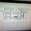
Hello All - We are near the end of our kitchen renovation and I am really happy with most of the choices but there is one thing that has been bothering me. I wanted to add the glss hutch in the kitchen to display glassware etc. but I'm not sure if it looks off balance with the rest of the wall run. I am always thinking symmetrical but our contractor says it's more important to be balanced around the focal point (the hood fan) What do you think? Be honest.

Dining Room area

Here is a link that might be useful: Cathy's Kitchen

Comments (67)

  • kelleg69
    15 years ago

    I think your kitchen is great! I think you could do nothing and it would remain great. If you did change anything, I would just change those glass doors on the right to solid. But, again, I don't think you need to do anything. I think all the elements look really nice. I definitely wouldn't add drawers to the glass cabs on the right b/c I think the counterspace is perfect. Another thing you could consider is doing very different things in the two glass cabinets. Maybe all white one and clear in the other? or, display pretty things in the one on the left and plates and more everyday stuff in the one on the right.

    I am making these suggestions, but my overall thought is that leaving it as is is perfectly acceptable. You have done a wonderful job. I only hope my plans turn into such a nice kitchen! It is so hard to know on paper.

  • rhome410
    15 years ago

    Your contractor is right. The beautiful hutch balances the longer run of cabinets on the other side of the hood. I like the unexpected 'spot' of glass in that run, too. I think it gives it some interest it wouldn't otherwise have and that works with the balancing act. Balanced asymmetry beats symmetry to me any day!

    Love the light on light and dark on dark you've done with the countertop materials. Wonderful color choices overall.

  • Related Discussions

    Need HONEST opinion on turquoise/teal stools

    Q

    Comments (53)
    Why don't you try painting one of the chairs you have to see what you like? You could try painting one chair with this coloration in mind. Except do the chair in red and leave the seat color you have. I tried for some visuals here to explain what I meant in a previous post above. I know others have mentioned black or stainless but to me it would just be adding another color to the mix. The picture below is nothing like your kitchen but it does have red stools next to a red island. If the kitchen was like yours and had teal/turquoise accents in the back ground one could get away with a teal seat color weather it be the same as yours or a bit darker. I think you can also get a basic idea on how black or stainless stools would not look right in the mix and could just look cluttered. If you paint one chair as suggested above and like the colors but not the chair there are a few other stool companies who do red. Bago Luma is one off the top of my head (although pricey). They have a few styles besides this plus different seat cover picks but I wanted to show the red. Or, this...
    ...See More

    Jbrodie's 99% Finished Kitchen Creamy White w/ Soapstone

    Q

    Comments (9)
    So this explains the sudden new wave of emails! I continue to be astounded by the positive response. Thank you all! The space between the rangetop and the wall is 21 inches. The pulls are RH Gilmore 4" http://www.restorationhardware.com/rh/catalog/product/product.jsp?productId=prod1080017&navCount=1 The knobs are RH Aubrey 1.5" (or possible 1.25"). The latches are from Rejuvenation, the small size. Can't remember the total size of kitchen. I will look at the plans or measure again and post. So glad I can help!
    ...See More

    Kitchen Finishes - your opinion please.

    Q

    Comments (10)
    Oh, cool! I've gained a lot of knowledge and inspiration for my next kitchen from this board, so it's good to know I'm contributing back! I ended up using Ohara Natural. My original choice was Hida Natural, but they were way, way, way backordered. I have red oak flooring, too. We used English Chestnut stain. I like the way it looks, but it still reads more red than I'd like. ditto rhome - can't wait to see the finished product. It's neat to see how kitchens that use similar materials and design elements can be totally different with their own personality.
    ...See More

    Your kitchen hardwood floors: shoes off or shoes on? I want to know!

    Q

    Comments (54)
    Hardwood throughout my entire first floor, including the kitchen and all entry areas. Residents don't wear shoes in the house. Human residents, nor furry ones. :) Visitors are not given any rules upon arrival. :) Most people see you walking around in bare feet, or socks, or slippers, and immediately move to take off their shoes. Depending upon who they are and why they are there, I often tell them don't bother. For instance, if it's the HVAC guy and he's going to work in the cellar, I couldn't care less if he keeps his shoes on. As someone noted upthread, the nice thing about hardwood is that it does clean up very easily. I prefer the residents keep shoes off the floor b/c it does keep the floors cleaner, but there is no way I would ever make a guest remove their shoes. As far as damage - most of the damage to my floor comes from the toenails of the 20 pound furry lunatics who share my home. Yes I keep them short - no lectures on appropriate dog nail procedures please! They are young and love to run and play - nails dig in on cornering no matter how short they are. :) However there has been some damage from people in shoes who had rocks stuck in the treads. Most of it from the early days when the house was under construction because sadly my GC was an inconsiderate moron regarding things like this. TL:DR. It's hardwood. It dents. I do what I can to keep the dents to a minimum but don't stay up at night about it either.
    ...See More
  • holligator
    15 years ago

    Your kitchen is beautiful! I think it looks better being asymmetrical--symmetry in this case would look too forced and odd. I also like having the glass doors to the right to break up that long run of uppers. I do think it would look better with some color in there, though. Maybe you could pick up a bit of the navy(?) from the rug in front of that cabinet.

  • remodelfla
    15 years ago

    Good Lord woman! Your kitchen is the stuff TKO dreams are made of!

  • susanlynn2012
    15 years ago

    I just love your kitchen and everything is perfect except like you said, it needs a back-splash to become perfect. I love the dark and the light in the same kitchen. I love the glass doors, the crown molding, the white shutter doors, the beautiful carpet, the dark floor, and the beautiful ceiling. Please share more pics when you have your back-splash installed.

  • mustbnuts zone 9 sunset 9
    15 years ago

    At first I couldn't figure out what you were talking about. I thought you wanted to add another piece of furniture to the room. A glass hutch to show off your glassware. I thought where is she going to put it? In the dining area? (sorry it is very early in the morning here and I am having an insomnia attack) Then I realized you were talking about your glass fronted cabs. They are gorgeous like the rest of your kitchen. I wouldn't change a single thing. I like how they are placed. I think they look great. Just like they were supposed to be there all along. Beautiful kitchen and dining area. Wouldn't change a single thing.

  • organic_nettie
    15 years ago

    Your kitchen is lovely. Raehelen is right, just add a little comething under the cabinet or move the coffee pot underneath. I love your Hutch.
    What color counter did you choose, it is hard to tell from the pictures.
    Enjoy your good choices.

  • ci_lantro
    15 years ago

    Your kitchen is beautiful. Symmetry can get boring (predictable) real quick. Ya gotz balance & that's the important thing!

  • rmlanza
    15 years ago

    Oh good lord, gag me! That is such a horrid kitchen! I think I'm going to vomit...that hutch area...BLAHHH!!!

    JUST KIDDING!!! What remodelfla said, your kitchen is a TKO DREAM!!! Definitely one of the most beautiful kitchens I've seen here. Seriously, it's really stunning. What are you planning for your backsplash?

    Congrats on your gorgeous new kitchen...and sorry to be such a pain in the butt! ;o)

  • catsam00
    Original Author
    15 years ago

    Hello all - based on a few requests I have summarized the finishes/choices below:

    Cabinet colour  Benjamin Moore CC-50 (White Down)

    Cabinet countertop is calacatta

    Backsplash (not yet installed) Â I was thinking of using the calacatta tile in a subway pattern. We have a lot of tile left over from our bathroom reno we can have cut.

    Island stain is in a walnut finish Â

    Island countertop  is Nordic ÂAntique black granite  it looks and feels great and is easy to clean.

    Faucet was from Home Depot  canÂt remember the name

    Appliances

    Cooktop  6 burner Thermador

    Microwave / Wall Oven  Thermador

    Fridge  Amana (with a Panel front)

    Dishwasher Âwe kept the existing one which is black Kitchenaid. It looks fine as it blends in with the island.

    Wood Floor  Duraseal  Antique Brown  Satin Finish

    All the hardware was from leevalley.com

    Just as some background, we bought a 20 year old house which had many rooms but the kitchen was so small. We decided to tear down a load-bearing wall (that was a long process) between the dining room and kitchen to create a more open airy feel. Here are some of the before pictures:

    Dining Room wall Before

    Kitchen Wall Before

    Kitchen Work Area Before

    Eating Area Before

  • susanlynn2012
    15 years ago

    Now with seeing the before pictures, I am even more in awe with the amazing transformation! I just love your new kitchen. Thanks for sharing.

  • morton5
    15 years ago

    Great transformation. I think if you had absolute symmetry around the range it would be boring, and would highlight that your island is not exactly centered in front of the range.

    I will be posting my asymmetrical kitchen in about 2 weeks, I hope!

  • pbrisjar
    15 years ago

    It's horrible. Let's swap and I'll suffer with yours.

    Seriously, I think it looks great. The entire "L" of the cabinet run has your balance and symmetry. (Ovens and fridge on the one side balance out the pantry and hutch on the other.) If I were to change anything, I'd swap out the glass doors on the right - either replace with solid doors or move them to the right one set. But I'd wait to make any changes like that until you have everything in and have lived with it for a while.

    Looks like you have the same coffee maker as me (the Cuisinart with the dispenser)- I love that thing.

  • glad
    15 years ago

    I am a huge fan of symmetry and I didn't notice either. Looks great!

  • loiseau
    15 years ago

    I love your white kitchen. You said that you cabinets are painted--it seems that you painted some or all of your old cabinets? I like the idea of painted cabinets (instead of pre-finished) because in years to come they can be repainted to freshen up if needed. I don't think you can do that with new white pre-finished cabinets (or at least not easily). Did you use any new cabinets and if so, what brand--I have found it very difficult to find good quality unpainted cabinets (except for very, very expensive custom cabinets).
    Mary

  • lynninnewmexico
    15 years ago

    It's a lovely, lovely kitchen now! I'll be anxious to see some follow-up pics once you've gotten settled in there a bit more and have added more accessories. The hutch doesn't look unbalanced at all to me. You know, sometimes too much symmetry can lock you in with your accessory options, so be careful what you wish for ;^P
    Very nicely done!!
    Lynn

  • adoptedbyhounds
    15 years ago

    My jaw dropped when I saw your kitchen, and I didn't even notice the non-symmetry. It's beautiful. I would love to have a kitchen exactly like yours. Congratulations!

  • stiles
    15 years ago

    Your kitchen is soothing on the eye! I love your ceiling detail.

    Melinda

  • maydl
    15 years ago

    I wouldn't change a thing, and I think the hutch looks perfect. Your kitchen is a dream!

  • rhome410
    15 years ago

    Seeing the before photos, which really aren't at all bad as many I've seen, I'd cry with joy every time I walked in that new kitchen. Enjoy, enjoy. Put the fears that anything was a mistake behind you. It really is amazingly beautiful while looking comfy and welcoming...and looks well-designed functionally, too.

  • catsam00
    Original Author
    15 years ago

    pbrisjar - yes that is a Cuisinart coffee maker - I love it too. I just bought the stainless steel toaster oven from Cuisinart.

    loiseau - no we didn't reuse the old cabinets in the kitchen - they are all new but we did reuse them in the laundry room - see below:

    The painter used a matte finish (I can't rememeber what it is called) and they really look brand new with some new handles.

  • sailormann
    15 years ago

    I think it looks perfectly balanced. The two glass areas feel symmetrical. If it was a mirror image it might look a little contrived. Beautiful kitchen - feels warm and inviting!

  • loiseau
    15 years ago

    Catsam
    Thanks for answering my question about your painted cabinets--I think you are my answer to a prayer! WHERE did you get your cabinets? Custom? or a brand name you could give me? I really want white cabinets but I want them painted (as in by a painter, not pre-finished). Thanks, Loiseau

  • catsam00
    Original Author
    15 years ago

    loiseau - the kithen cabinets are a painted finish, the laundry room cabinets were primed and hand painted. You should call a paint place and ask them what product to use on existing cabinets. They could also refer you to painters who specialize in this work.

    After lurking around I found 2 kitchens which I think are beautiful and are not totally symmetrical. See below. I guess we are so critical of ourselves. Because we designed the kitchen ourselves I always wonder if it would have been worth it to hire a kitchen designer. Functionally, the kitchen works great and I am proud of that.

    {{!gwi}}

    {{!gwi}}

  • redroze
    15 years ago

    Catsam - Your kitchen is just beautiful, and I (and I'm sure a lot of others) was eagerly anticipating your finished photos. I think symmetry is not necessary by any means, nor does it always look right. But I do feel a "heaviness" to the left side of your kitchen photo with the ceiling-to-counter glass hutch, and the shifted placement of your island to the left - which you probably did to allow for more clearance to the right which is a heavy traffic area.

    Here is what I would do if I were you, and this is only advice, and if you leave your kitchen as-is it will still look beautiful and perfect. But I think what would take it up a notch - can you switch out some of your upper cabs on the right to have glass doors as well? Not sure if you can do this from either a budget perspective, or a functional perspective (if those cabs carry things you want to "hide"), or if it's possible at all this stage. I just think if you did all glass doors it would show that you're clearly not trying to "match" the glass hutch to the left, and give it a design element that stands on its own.

    Just a thought, but great job!!

  • catsam00
    Original Author
    15 years ago

    redroze - I think you hit the nail on the head - it's the island that is throwing everything off for me. We couldn't centre the island because we needed enough walking clearanc on both sides of the island. I'm thinking of adding a small message centre to the left of the kitchen perimeter. It may make the island look more centred. I think that is what was throwing me off. As far as changing all the cabinets to glass I would hsve to have in the inside part sprayed with beadboarding and that can be very expensive.

  • redroze
    15 years ago

    Catsam - see my response to your other post. Great minds think alike!

    How much clearance do you have there?

  • pluckymama
    15 years ago

    Catsam,

    First, I want you to know your kitchen is truly lovely and as everyone has said if you do nothing, it is always going to be an amazing kitchen.

    You do have some clearance on the end of your island. How many inches is between your island and the double wall oven/fridge wall? Is it possible that you can move the island down a few inches towards that end w/o doing too much damage to the floors? Depending on how they secured your island, that may be all you would need to do to make it more centered. Most people seeing your kitchen will never notice this though, they will be too busy admiring it! I happen to really like the way you did the one double glass cabinet to the right and don't see the need to add more glass cabs.

    Is your trim and wall color all the BM White Down? It looks so good. Really great creamy color. Your whole kitchen is gorgeous.

  • kateskouros
    15 years ago

    you know what? i'm a big fan of symmetry... easy on the eye, balanced, etc... BUT i think it looks magnificent. i think if you brought the other cab down to counter height it would cause an unnatural break or interruption in the visual as well as work flow. beautiful kitchen. i hope you can find a way to love it as it is certainly worthy of your affection!

  • gorilla_x
    15 years ago

    Well, I am anal so my opinion may count as much as other's opinions. I do not like it. I personally like kitchen items be symmetrical on the wall, but base cabinets do not have to be symmetrical.

    The glass hutch looks "off" to me... would have looked much nicer with a glass wall cab that matches the one on the right.

    And if I may add another thought, you do have a long "wall of white," and so the lack of symmetry makes my eye focus on that 'wall of white".. meaning you have a long row of wall cabinets of the same color, and lacking any "breaks" if you will. A SS hood, or wood colored hood finished in the same satin as the island would have given you that break I speak of.

    Since you had the flexibility of a new makeover, to me it looks like the sink is too close to the range. Can someone be at range range cooking, and another at the sink, without getting in each other's way if either one step back a step?

    -Gorilla

  • catsam00
    Original Author
    15 years ago

    pluckymama - the trim and paint colour is all White Down from BM.

    gorilla - I know what you mean about the glass cabinet matching the one to the right. That's why the left looks heavily weighted. I could take out the bottom draweres as they are installed as one unit. What do you think? There is not a backsplash installed so there will be more colour. I like the stainless steel hoods but by DH wanted a painted hood. As far as the clearance there is 38 inches between the island and the cooktop. There's plenty of room for 2 people. Thanks for your honesty.

    redroze - I will respond in the other post.

  • gorilla_x
    15 years ago

    catsanm,

    Pulling the drawers from the left side would look better to me... but it's not my kitchen :) Question is: Would you like it?

    And except for my negative comment, I really like your kitchen (I am partial to white/off-white). DW and I went with off-white cabs, wood flooring, etc, when we built a new home 4 years ago.

    -Gorilla

  • malhgold
    15 years ago

    I think redroze is right about the island. How much space do you have between the frig and the island. From the angle of the pictures it looks like quite a bit. I'd think at this point it might be hard to move the island because of the plumbing, but maybe, as redroze suggested in the other thread, you could add a smaller cabinet to the frig side of the island. Maybe top it with a piece of marble to match the perimeter counters. Take a look at the island in this link.

    Here is a link that might be useful: My Marble's Too White.

  • catsam00
    Original Author
    15 years ago

    I'll take some measurements of the clearance between the fridge and island and pictures from the hallway into the kitchen and post tomorrow.

  • catsam00
    Original Author
    15 years ago

    redroze and malhgold - there is 6 feet from the fridge to the island. The problem is that this is another walk way from when you enter the kitchen. Because of the clearance issues we had to centre the island to the entryway b/w the kitchen and dining room. I have taken some more pictures.

    view from hallway

    view into hallway

    Island centred to the entryway
    {{!gwi}}

    View of kitchen with the lights on:

    Here is a link that might be useful: Cathy's kitchen

  • redroze
    15 years ago

    Catsam - 6 feet???? That's huge. You can easily fit a 2' mini island there and still have 4 feet of clearance. With respect to it being centred to the entrance, that is definitely something that a designer would *probably* advised you against. If you think about it, how long are people going to be standing in your doorway, ensuring that your island is centred to the entryway? You have a diagonal wall to the left of your kitchen end run (with the window) and that makes it a "different" part of the room. So I would have personally centred the island to the range hood. Or as I advised, now that you can't move your island, I would add an extension to the right of the island.

    Again, this is only advice and it's absolutely your choice to keep it as is for budgetary reasons and personal preferences. I'm only responding to your post for help, but man is your kitchen ever gorgeous. Your range hood is so nice with all that detail (wish mine were that nice), and I love the beadboard in the glass cabinets.

  • catsam00
    Original Author
    15 years ago

    redrose - thanks for following my thread. Sorry when I said we centred the island to the entryway I meant the opening from the dining room to the kitchen area. We had clearance issues and had to be very careful where we place the island. Here is a diagram of the floor plan which may give you a better visual. It was a difficult floor plan to work with but now that I look at all our choices, the layout is very functional and am appreciating it more and more each day. BTW, I love your kitchen.

  • tinykitchen
    15 years ago

    Catsam-
    Your kitchen is positively beautiful. If you don't mind- would you share more about the floors? I saw you posted the stain and finish, but are those oak floors, and are they red oak? I have red oak floors and would love them to look like yours! Thanks

  • catsam00
    Original Author
    15 years ago

    tinykitchen - the floor is red oak, 4 inch planks.

  • redroze
    15 years ago

    Thank you!

    It looks like you've decided then. Good for you to post to feel confirmed about your kitchen and island placement. Your kitchen is wonderful, enjoy it.

  • catsam00
    Original Author
    15 years ago

    thanks redroze - I really like your idea of adding to the end of the island - I measured and I could add 2 feet with a butcher block top. Have you posted your final kitchen pictures? Would love to see them.

  • malhgold
    15 years ago

    Catsam-so if I understand correctly, based on the length and width of the island, it had to be place where it was so there was clearance from the kitchen to the eating area(I'm assuming you're talking about in the southern part where the wall juts out?). IF you're unhappy, I think adding a narrower piece at the frig end would look nice. You could even buy a freestanding type table to put there like what's on either side of this island.

    Here is a link that might be useful: Freestanding table

  • catsam00
    Original Author
    15 years ago

    malhgold - you are correct - we needed to centre it for clearance issues from the eating area. I love the idea of adding a piece off the island. It adds dimension and extra storage. thanks.

  • starpooh
    15 years ago

    hi catsam ~
    May I archive your kitchen in the Finished Kitchens Blog? If so please submit the Category Checklist to give your approval.
    Thank you!

    Here is a link that might be useful: Finished Kitchens Category Checklist

  • redroze
    15 years ago

    Catsam - No, I haven't posted finished kitchen photos yet. All our cabinets are in which is great. The crown molding needs to be installed. We chose some fabrics for custom kitchen chairs and drapery but we've run into some issues...one is discontinued, the other fabric is backordered until mid-Feb! Our sectional for the attached family room is currently being upholstered. So the progress has been good...but I don't feel ready to post finished kitchen photos until we have the drapes, kitchen table and chairs.

    In good time though. I think it will be more like early 2009!

  • erikanh
    15 years ago

    I love it. I think it's very balanced and pleasing to the eye. I think symmetry is way overrated. Of course I may be a bit biased since your color scheme is very much like the one I've chosen, and my layout isn't exactly symmetrical either. Congratulations on your fabulous new space!

    E

  • catsam00
    Original Author
    15 years ago

    starpooh - Once the backsplash is in I would like to post it to the Finished Kitchens blog

    erikanh - I let a few weeks go by and now I think I am over the fact that the kitchen is not symmetrical and am adoring the kitchen again. So much time and effort is spent into renovating a kitchen that you feel like everything has to be a certain way. I have also seen some of your kitchen designs for your own kitchen and I think they look awesome. You are thinking outside the box and I can't wait to see your results.

    redroze - I absolutely love your kitchen and will watch out for your finished results. I read a post where you said you were from Toronto, Canada. I am also from Toronto. May I ask which company built your kitchen? They did a great job.

  • Christine Clemens
    15 years ago

    Wow! What a beautiful kitchen! I really love the walnut stain on the island. Maybe I missed it in your notes but where did you purchase your cabinets? Enjoy your beautiful space.

  • pluckymama
    15 years ago

    catsam, I am glad you are feeling better about your gorgeous kitchen. You have done such a great job and I second erika with symmetry being overrated. Enjoy it and can't wait to see the backsplash.

  • tiskers
    15 years ago

    Oh! I LOVE it and wouldn't change a THING!
    Gorgeous, gorgeous kitchen.