SHOP PRODUCTS
Houzz Logo Print
macybaby_gw

Help for Dining room - part 2

macybaby
12 years ago

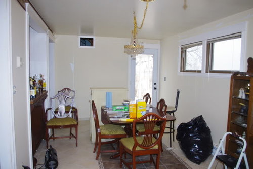
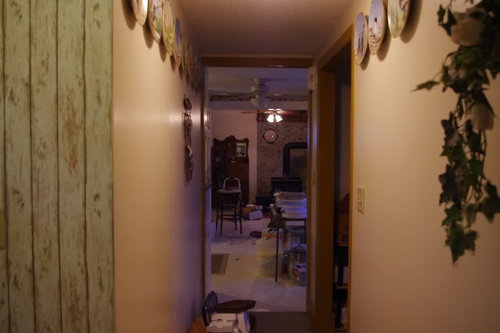
Weeded through a lot of ideas on the first thread, so here is the result - still a lot of work to be done though. For sure the ceiling fan has to be changed, but there does have to be one there. The fan does not need a light, but I like having it there. Electrical for the light over the table will be moved. I've always planned on moving it as that is where the ceiling fan use to be (when it was a den).

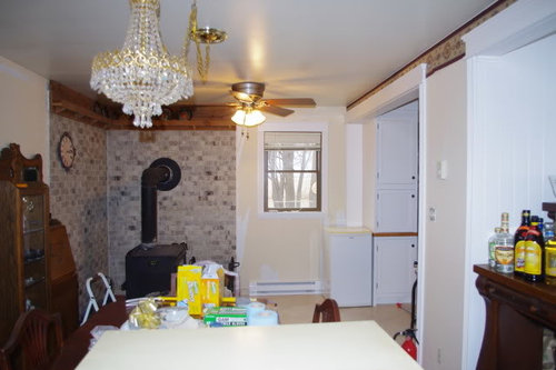
So far - windows/doors/wood stove are not going to be changed. We use to have bigger windows in this room and prefer the little ones. For those wondering, this is the view - a lot of nothing.

And if corn is planted across the street, the view for about 5 months is a row of corn and a mail box. The poor little tree is going next spring. We tried for three years and the darn deer have wrecked it each fall.

Don't know if it matters, but it's just DH and I here, kids are grown and live far, far away. Closest relatives live 400 miles away and we don't entertain. We moved here because I found my dream job - just happened to be in the middle of South Dakota. . . We will have casual dining in the kitchen. Re-sell is not a consideration either.

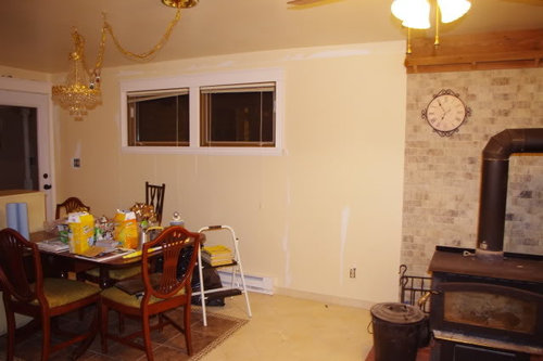
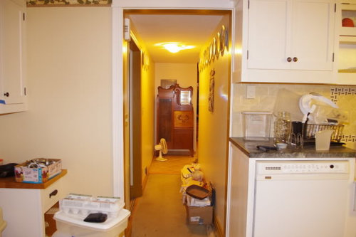
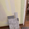
Here is the room with some furniture and the wall paper mostly removed. I have not removed the paper backing yet (that is the messy part) as it turns out, that paper is very close to the wall color in the kitchen - that I am considering for this room. And eventually the windows will be painted the same color as the trim. I hate painting windows, so they are still the color they were with the trim we put up when it was a den. That trim did not match the kitchen, so we replaced it.

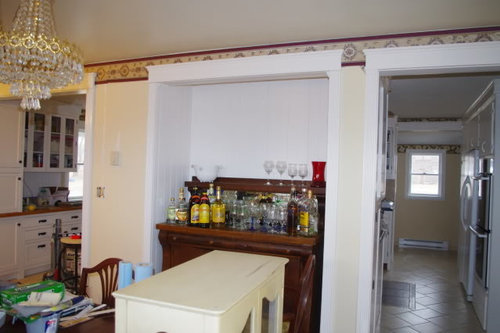
For reference, that little bit of wall in the far doorway is the painted kitchen wall.

In the summer this window gets the AC that is the main cooling for the house. That is why the window is short, it was put there specifically for the AC unit. There use to be one in the wall in the kitchen- where the baking center is now, and of course the opening was not sealed well so the whole wall was moldy and rotting. The little fridge is there because I put the secretary where it use to be. Don't know what I'll do with it, but with all the changes I'm making, telling DH he's losing his beverage cooler would not be a good idea. In his opinion, the dining room was fine the way it was.

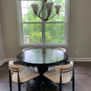
This was taken after I got the secretary moved.

there is a consideration here - this is the view before I moved it - and about what a person first sees coming into our house. Where the secretary was is a main focal point.

This is where the secretary is for now (that is not the main electrical panel behind it). I don't think I like it there, but will live with it and see if it grows on me.

The sewing machine is now in the sewing room (for decoration though). The yellow hutch is going to be moved to the library, but we won't put the liquor in it there. thinking about some sort of shelf in the alcove for the liquor. Took out some I need to take to work to give away. When son moved to GA, he gave us some he didn't want to haul, and we'll never drink it.

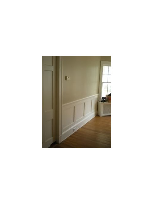
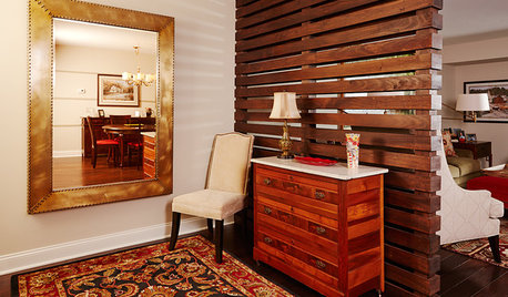
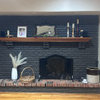
I like the idea of wainscoting on the wall, but have no idea what color would work (match trim, something different?) I found this picture of a look I like - would want something to be similar to the inset cabinet look in the kitchen.

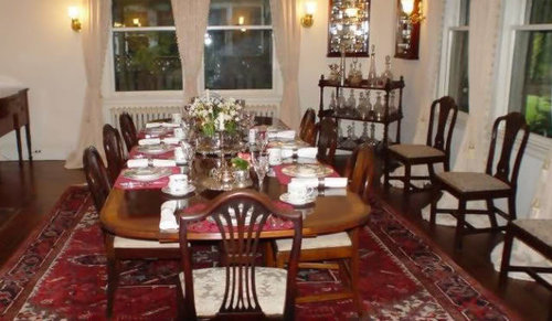
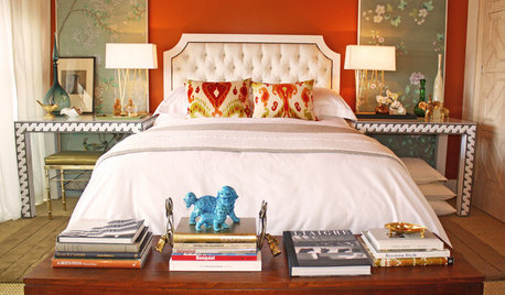
I'll worry about fabric after the walls are figured out. Though while searching for pictures of historical dining rooms, I came across this one. It's a room in a historic hotel, though they said they think the furniture was assorted items put together - those are very similar to my chairs - including the fabric on the seats.

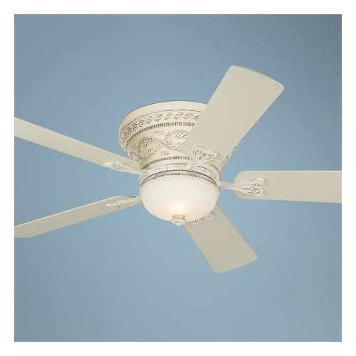
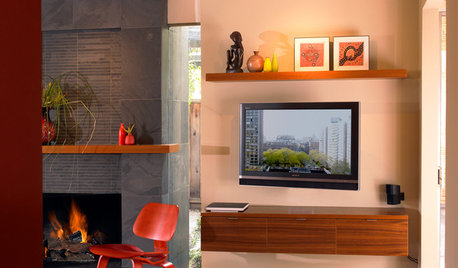
I found this ceiling fan - maybe this is too much, but I wonder if a white/offwhite fan might be better than something dark?

I put a link to the original thread, in case anyone is wondering.

Here is a link that might be useful: part 1

Comments (24)

  • dianalo
    12 years ago
    last modified: 9 years ago

    I have your exact chairs with a similar green damask (Thomasville 1930s, btw)! I had the fabric redone when I bought them, so it is funny how we ended up with clones!

    Can you hang a tapestry/wall panel behind the secretary to hide the electric box? I'd see it sort of like an accent wall. That is a gorgeous piece of furniture.....

  • franksmom_2010
    12 years ago
    last modified: 9 years ago

    Macybaby, you've given us a lot of information, but how do you feel about the space now?

    To my eye, just removing the wallpaper has made the room look much lighter and larger.

    I like that secretary where it is now. No reason that it couldn't still hold the liquor bottles where it is, and it's freed up a lot of space in that dining room.

    Do you see how in that photo that you've shown how the large patterned rug grounds the whole room? There's essentially colorless walls and drapes, but that rug gives the dining table the presence it deserves.

    With short ceilings, and so much else going on visually in that space, I would buy the most simple ceiling fan you can find that will disappear into the ceiling. I would want it to be as plain and simple as it could be and still be functional. In this case, it's not a decorative feature, it's an appliance.

    I think that plate rail isn't helping either. To my eye, it contrasts too much with the brick, and sort of chops that wall off, making the ceiling look even lower. If you love it and want to keep it, I'd consider painting it to either match the trim or the brick.

    Really, I think the room looks so much better already, and I hope you feel that way too. Of course, I'm not the one having to scrape wallpaper, so...

  • Related Discussions

    help with dining room part 2

    Q

    Comments (16)
    IMHO your table and chairs with the table cloth look like a great building block for the look you want. They tie in the kitchen cabinets and work nicely with the chandelier. I like the chairs as they are. I suggest adding some textural accessories on the table cloth. Pier 1 has these very nice oval whitewashed rattan place mats. They would add some texture and informality to the setting, and be good for everyday eating. Then instead of a runner I think a super large shallow tray or crate, in the table center, with some accessories would be just wonderful. Add in candles and large pebbles for 1 look, salt pepper cream sugar and candlesticks for a different look. Small potted ivy and a few framed photos for a completely different look. Contemporary vase with fresh flowers and some votive candles. Whatever you would find joy in seeing every day. I think you are like me and find a lot of patterns a bit dizzying and too much visual noise. So I would try to add some rough texture, and then some neutral but shiny items, but mostly neutrals with only 1 or 2 accent colors that tie in with your wall art, and the living room.
    ...See More

    Cheap and cheerful oddball dining room part 2 - paint

    Q

    Comments (69)
    I think the warmer color is a great idea. But what stands out for me in the room is everything is angular, straight, hard lines. There's nothing soft and curvy (except the archways, which I love). Even your chairs have square backs; the rug has some curves, but overall reads geometric. For me, that makes the room feel stiff and uptight, not a place to linger and relax. Maybe lose the lamp and collection of little stuff on top of the sideboard and put something large and curvy up there--either on top or hanging on the wall behind. That would help incorporate the archways into the design, too.
    ...See More

    Part 2 - Dining Room Rug

    Q

    Comments (21)
    So happy that you all like it. sas, yes the rug did come from esale. aktillery, I think my rug also may never be completely flat, but I can live with it as it is now. I like your noticing the light; to me that's a very important part of the beauty of a room, and I've been fortunate that in this house the light in most of the rooms is very advantageous.
    ...See More

    Help me with my living room/dining room. 2 sofas? and how many chairs?

    Q

    Comments (13)
    These are the listing photos from the prior owner. The room is empty and I'm looking for help. In the dining room all I have is a table. I really like this Robin Bruce sofa that a local store has but I was thinking Navy. My husband thinks that is too dark in the room and also not practical with the dog. But I'm really wanting advice on furniture placement/arrangement. Would you do 2 sofas facing each other and tv over fp or put a console on long wall with tv?
    ...See More
  • honeybea5
    12 years ago
    last modified: 9 years ago

    Hi - I've been lurking, and I love your dining room possibilities. The room looks much more spacious now without the wallpaper and the secretary. I like your idea of making it the "impress the neighbors" Farmhouse+Victorian dining room!
    FWIW, once all the wallpaper is gone I'd paint the windows and the door in the creamy trim color. If you'd like wainscoting I'd make sure the baseboard is as tall as your baseboard heaters and paint the baseboards your trim color. Then the wainscot and upper wall could both be painted in your kitchen color or slightly darker and the upper wall could be stenciled over with that lovely stencil you showed in part 1. It would be pretty to choose a pale warm taupe or gray for the stencil -chosen from the colors in the stone around the fireplace, but something with green or gold undertone - not pink. The look would be fairly neutral but with depth of pattern, like the neutral example on the stencil page. Very pretty! Ceiling color lighter than the walls but not as light as the trim. I'd paint the upper plate rail in the stencil color. An off white fan like you show, or painting what you have in ceiling color, would help make the fan less noticeable while keeping it's necessary function. Any metal trim on the woodstove or chimney would be painted out in black.

    I'd paint the interior of the alcove the same color as the stencil but a shade or two darker to show off the great hutch. A big oval mirror horizontally over the hutch with a wood or antique gold frame. It will pick up the sparkle of the chandy. I'd center the chandy (without the swag chain) over your table and add a round medallion where it meets the ceiling. Maybe the medallion painted in the wall color? I'd alter the chandy a bit -antique or buff the gold parts so they're not shiny. Sounds like you admire the prisms of color that crystals make around a room - I do too!

    To echo the triangle shape of the chandy and the flare shape on the chairs I'd put a sheer or lace panel on the door window with a rod at top and bottom and tie it in the middle to make an hourglass shape.
    A big rug under the table with designs in golds and greens and some burgundy or brick to call in the red tones of wood and brick.
    The middle fabric you noted in part 1 looks nice. Colors like those would look great in your room! It could be used on your chair seats and as a gathered valance on the windows, hung at ceiling height and covering the window shades -which could be kept in place under the valence for summer use.

    I also like the yellow hutch with the glassware and bottles. It's shape looks good on the wall with the door and I think it would look good to have a piece of painted furniture in the room along with the wood. You could paint it a color from your fabric, but not too bright. A light green-gray or a pale salmon-brick?
    Add a vertical painting or photo on the wall between the windows and the hearth, or maybe a couple of narrow wall-hung shelves with greenery and a book or two. Have some dishes on the upper plate rail that work in the colors of the room and stone. Some ideas from part 1 like a curvy victorian-like lamp on the hutch with buff gold fittings that echo the chandelier gold, and a small chair and floor light in the corner between hearth and kitchen. Aaah.
    Oops- I've written a book. Hope you don't mind, I got carried away! I can just see this gorgeous room and would want to invite someone over for dinner just to "impress the neighbors"!

  • les917
    12 years ago
    last modified: 9 years ago

    It really feels different without the wallpaper, doesn't it?

    As to the wall color, I would be looking for something that compliments the tones in the brick, a bit more on the taupe side than the wallpaper backing is. That could be a problem with the floor color, so you will need to find a way to make those work together. You might consider a soft shade of green.

    I think the fan should be something that disappears - good if you don't need a light fixture on it. You have the very fancy chandy in gold tones very nearby, so the fan should fade into the ceiling as much as possible.

    How does the little beverage cooler get used? Is it when DH is sitting in the DR, or in the kitchen, or in the den? I would find a place for it that is near where it is most used, and that room wouldn't seem to be it from how you have described your lifestyle.

    Once that is moved, that would seem to be a perfect spot for a comfy chair, small side table, and floor lamp, so cozy by the fireplace.

    Where the secretary was, I could see a wonderful tall open bookcase in the trim color. I think it would be a nice sight from the entry, and also be a good transition from the brick behind the stove.

    I think your room is already broken up by so many doorways and windows, and with the low ceiling, I would not put in the wainscot. I think it will only make the room feel smaller and the ceiling lower.

    I am guessing you can't take the plate rail down, because there is no brick back there, so I would paint it the trim color. Make it look intentional, and by putting some colorful plates or other items up there, you can brighten that corner.

    I agree that a larger, patterned rug would be great in there.

    I love where the secretary is now, but you need to paint the electrical panel the same color as the wall. Then add a pretty floral arrangement or plant (a fern would be in keeping with the style) on the top left to finish the camouflage job.

  • macybaby
    Original Author
    12 years ago
    last modified: 9 years ago

    So many ideas - but you are all coming up with things when I was drawing a blank.

    I'm not sure how I feel about the room yet, I had not realized how dark the wallpaper made the room feel, so that is a big improvement.

    I'm not in favor of any fabrics in the room - partly because of the wood stove and partly because of the cats. They do nasty things to fabric, but they are family (for now). I keep telling myself that when these three are gone I won't get more. They are as bad as designing around little children. That is not to say I won't put any fabric in the room, just explaining my hesitance.

    I think I'll need to do some mock-ups in the room for the wainscoting - I'm usually good at envisioning things, but I'm having a real hard time with that room.

    BTW - the plate rail will be painted, and if that does not work we'll need to take it down and try something else. The bricks do not go all the way to the ceiling as we had always planned on putting some sort of transition up there. The plate rail is something my DH put together one afternoon from boards pulled out of the barn, so it is on the rustic side.

    This is the main reason the bricks don't go all the way up.

    Putting in the stove was one of the first things we did so we'd have a back-up heat source (which worked out because a year later we were without power for 10 days in the winter). But we knew we had to rebuild the ceiling at some point.

    This is when it was a den.

  • mjlb
    12 years ago
    last modified: 9 years ago

    What an amazing transformation just from one day to the next! I think your idea of getting walls and ceiling 'together' will make everything else a pleasure.

    I can't see it clearly, but I like the plate rail -- I could see extending around three sides of the room, omitting it only from the wall with the openings to the kitchen. Add a high wainscot that aligns with the bottom of the high windows. Paint plate rail and wainscot same color as the trim.

    Extend the fireproof surface around and under the window that holds the a/c in summer. Use the area under that window for extra wood in a decorative container.

    I like your choice of ceiling fan, altho' it might be better with a flatter light, for more clearance.

    Not sure about this, but wondering if painting the exhaust flue on the stove the same color as your trim would be an improvement -- would photoshop that first just to see.

    I used to live in an authentic Victorian home, and I had a single high window, placed very much as your high windows. If the windows had a leaded glass design (or possibly stained glass), they would feel more Victorian, and be more of a focal point.

    I sporadically lurk here, and once in awhile, someone's project really, really, gets my interest -- and it's definitely your's this time. Can't imagine SD in winter -- bet it brings out a very strong nesting instinct! Much good luck to you -- I think you are now 'unstuck'!

  • graywings123
    12 years ago
    last modified: 9 years ago

    Would you consider painting the bricks? If you painted them black, it might help the stove area visually disappear from the dining room.

  • lascatx
    12 years ago
    last modified: 9 years ago

    While I understand that the swag allows you to drop the chandelier for cleaning, I think it would look a lot better without the swag. That gold chain in two large drips is just a lot of distraction with a lower ceiling. If you didn't have that and got a white fan more like the one you found, the ceiling wouldn't be so busy. Another option would be to enjoy the chandelier in your bedroom. It is pretty, although the bright gold or brass is not a current metal favorite, and I would definitely want to find a way to use any piece with Swarovski crystals.

    I was thinking of taking the wainscot up high tot he windows too. If you do something lower, you will chop up the room horizontally and it just isn't tall enough to take it in my mind. I'd paint the top part of the wall a softer color. I'm seeing blue (possibly green or yellow since you already have those colors) -- and maybe carrying it across the ceiling in the same shade or a lighter version. Everything would then visually lift the room and be cozy too.

    You definitely need a rug to ground the room and the space in the alcove seems to be crying out for a mirror. At least a painting, but a mirror would reflect the light from the windows across and your chandelier -- beveled edges would add some sparkle.

    Last night I was going to suggest trying the secretary where the sewing machine table was, but I wasn't thinking about the window. Have you tried the simpler hutch by the wood stove and the secretary at the other end of the room?

    Can the stove angle out of that corner? You said it was turned the other way before, but I'm wondering if a split using the angle would work for both heat distribution and to soften it visually.

    I like the plate rail, but it feel chopped. I see why you ended it where you did though and there isn't room to continue it around. Could you fit a simple crown or cove between the door and window tops and carry that all the way around and then tie it into the plate rail (maybe paint it all the same trim color)? If that didn't work, then maybe just the same crown treatment all the way around and the plates displayed in another way.

    Some fun challenges and you are working in the right direction.

  • User
    12 years ago
    last modified: 9 years ago

    The space already looks amazingly better. That is the power of light colors and low contrast in a small space. Because it is a small space with low ceilings, you don't have a lot of visual room for very detailed and contrasting items. Almost everything you do will need to be tone on tone ivory and white. A good rule of thumb is that any small room has room for only 3 visually fussy focal points.

    The chandy is item number one on the fussy focal point list because of how the gold contrasts with the crystal. It's beautiful, and I'd personally keep it, but I'd tone the gold down from it's shininess. Let the crystal be the star by itself. If it becomes more integrated and less contrasty, then it goes off of the list and you get to put something else on it, like a large detailed rug. If you don't want to change it, move it to another room and look for something like this capodimone chandelier that is detailed enough for your Victorian aspect, but tone on tone enough to blend into the rest of the room more.

    Item number two on the visually detailed contrast list is your wood stove. You really cannot do anything to it to make it white and pale and blend in, so it has to remain a contrasting feature. The pale stone behind it helps, but at some point, if you want a more integrated look, since you've mentioned replacing it, replace it with a white one and it can go off of the list.

    Item number three in the visually fussy category is the dining set itself. It's appropriate to the room, so other than recovering the seats, it stays as is. Or, you could paint it cream and move it off of the list in favor of another item. See how this dining set painted white allows the beautiful wood floor be the focal point?
    {{gwi:1902183}}

    Item number 4 on the current fussy list is the alcove with the buffet. That's definitely a keeper though, and painting the niche with a darker paint to lower the contrast between the buffet and wall and putting a horizontal mirror there and some sconces or lamps would make it an outstanding feature of your room. Something like this.
    {{gwi:1902184}}

    I think that making a "bar" area with the beverage fridge where the secretary once was could also work well. It needn't be large. You can build a small cabinet to the left of it and place a marble remnant over the whole thing and do a mirrored back very shallow glass cabinet above that would reflect light back into the room. All should be white to match your kitchen cabinets of course. The large dark block of the secretary closed it in but something small scale and light with reflective qualities will actually make the room look larger and be functional at the same time. Here's one idea, but in white.

    The wall between the kitchen and your outside door is too shallow for furniture, but that would be an ideal spot for a couple of shallow plate rails arranged like a china cabinet displaying white ironstone or very light colored china. If you don't have whiteware to display or can't keep it light and bright, then skip doing anything there at all but a simple non busy print without too much contrast to the rest of the room. See how this very shallow plate cabinet with very light displays from the movie Something's Gotta Give can work.
    {{gwi:1902186}}

  • patty_cakes
    12 years ago
    last modified: 9 years ago

    Live wire, I LOVE the pictures you've posted, and hope macybaby takes some of the ideas and uses them in her space. IMO, this is what's needed to tie in with her already beautiful kitchen.

    Just one question macy, why did you start all this before the holidays??? ;o)

  • teacats
    12 years ago
    last modified: 9 years ago

    Amazing transformation!! Very well done indeed -- your hard work has paid off in a lighter brighter and much bigger (visually) room!

    LOVE the white fans! YES -- two of those would work VERY VERY well in your room! :)

    A vote to paint the plate rail above the wood stove to white too! :)

    I do love the placement of the secretary as the first thing that you see as you enter the house -- just add white milkglass lamp to it for a lighting option -- and hang your clock above it!

    Add lamps to the alcove for the buffet too! Especially white milkglass ones -- again -- for a Farmhouse Chic look!

    Yes -- Keep the room simple and fresh -- I just love the idea of fresh creamy white walls and white trim! :)

  • macybaby
    Original Author
    12 years ago
    last modified: 9 years ago

    Dh picked up a matte finish white ceiling fan from Lowes today. Work got called for weather so he had time in town before heading home. Good to have camera phones.

    I think I will leave the light part off for now even though DH said he really likes it. I'll wait until I've figured out about the chandleier and then decide.

    I like the idea of putting a plate shelf on the "focal point" wall. It woudl be very easy to make a unit like in the above picture. Then I'd have a place to display my shelfs, it would add interest and color, and I could do something less noticable above the bricks - not sure what, some sort of crown, maybe in grey to match the brick.

    I have that "Something's Gotta Give" picture in my Kitchen Ideas folder, I do love that look.

    I'd like to mess with the chandelier to see if I can tone down the gold. Replacing the chain and wire is the easy part, and I can shorten it as needed. I didn't know there were prodcuts to do that. I have no where else in the house it could go. It's one of the few pieces of "jewery" in the house and I do love my sparklies. Right now it's very dusty so not making rainbows all over the room.

    I'm not looking forward to putting the wiring right above the table, but it make sense and then I could put a big madeilan up there - or a stencil pattern. The bad part is I only have about 18" of room in that part of the attich so I have to do it laying across the ceiling joists. At least we don't have blown in insualtino anymore so I don't have to were a resporator while I'm up there like in the past.

    As to starting it now - with no family around to celbrate with, tearing up the house now won't affect anything. This room never got finished as a dining room. I think I must have felt the wallpaper didn't work right after I put it up, so it's sat like this for two years.

    December 2010- being used as a drying rack for parts of kitchen cabinets.

    Dec 2009 - ripped out the carpet for Thanksgiving and spent the next month dealing with the floor.

    Dec 2008 0 back when it was a den, pretty much all done, had sage green carpet at this point.

    Dec 2007 - this was taken a few months earlier, but it looked like this all winter - while the area our bedroom was in was under construction (yes, that's our bed)

    december 2006 - trying to decide if the fish tank would work there. That is another thing I finally gave up on. Someone got a great deal from Craigslist when I sold the whole setup for $50.

    Dec 2005 -this year we were working on the other end of the house - but you can see the stove from here!

    Dec 2004 - though in this pic, the room is through the doorway. Here you can tell that was once an exterior wall.

    I moved out here in April of 2003, and bought the place in September of 2003. Took a year to get our other place in WI sold, so DH didn't move in until April of 2004 and that is when we started working on the house - and have not stopped.

  • macybaby
    Original Author
    12 years ago
    last modified: 9 years ago

    Just had another thought - I think I'd prefer to leave the table with a wood finish, but I could paint the hutch in the alcove. It looks like someone experimented on removing the finish on one corner, and it also has water damage on the top. I had planned on doing something with it as the finish is in very rough shape in person. It's a neat older peice, but far from an antique so I'm not ruining anything by painting it.

  • macybaby
    Original Author
    12 years ago
    last modified: 9 years ago

    I was doing an image search for ideas, and one of my own pictures showed up. Never had that happen before LOL!!

    Anyway, if I painted the hutch, I could maybe do something like this in the area above it. I need more pratcial storage

    I'd work it so it matched the plate cabinet on the other wall.

    I know many like the "white on white" decorating scheme, but I love color so I'd I put some of the plates I have on the wall. It matches the kitchen anyway - I have glass doorw with colorful dishes.

  • macybaby
    Original Author
    12 years ago
    last modified: 9 years ago

    plate rail is down and new ceiling fan is up.

  • blfenton
    12 years ago
    last modified: 9 years ago

    Gosh - you are just hustling right along with this DR transformation. I can't wait for the next installment. It's looking great so far.

  • macybaby
    Original Author
    12 years ago
    last modified: 9 years ago

    I'm getting all set to pull the hutch out and paint it this weekend - so if you all think that is a bad idea - please let me know asap!

    The original plan was to end up making it look sort of "built in" so having it the same color would go a long way to making that happen.

  • blfenton
    12 years ago
    last modified: 9 years ago

    Are you painting the hutch or the alcove? And what colour of whatever it is you are painting? My personal preference is to leave the hutch and paint the alcove. But that's just my 2cents.

  • macybaby
    Original Author
    12 years ago
    last modified: 9 years ago

    I'm considering painting the hutch the same color as the alcove. It's the same paint I used on my kitchen cabinets.

    I think overall, that hutch is too dark for the look that the room is taking on.

    Here is another picture of the hutch and dining room table showing the difference in color.

    The hutch has much more of an orange hue to it. On my monitor, this picture shows the color quite well. It also shows a bit more of the damage. It looks like someone experimented at removing the finish on the front corner of the top. It's all veneer and for the most part a real blotchy looking finish.

  • arlosmom
    12 years ago
    last modified: 9 years ago

    You bought your house 3 months before we bought ours. So you definitely know what I mean by "the lost decade"! We should both shoot for 2 years till completion.

    I love the view from your dining room. I find it so calming and serene. Funny that you see it as nothing special.

    Your room looks so much better without the wallpaper. If it were me, I'd pull the new wall color from tile by woodstove -- a gray or putty neutral. I'd consider painting the niche for the buffet either the wall color or a shade or two darker. Your niche/hutch is a star in the room. I love the picture live_wire_oak posted with the big mirror above the buffet.

    DON'T PAINT THE HUTCH!!! (sorry for shouting) It's a beautiful piece just the way it is. I think it looks too dark to you now because the contrast with the current niche color is too stark. I think if the niche were darker, the hutch would look wonderful. I also like your ideas for shelves above the hutch. Not sure what color I'd paint them. Probably the white or cream trim color.

    Will you be getting a rug for your dining room? I agree with franksmom about the importance of the rug in your instiration picture. The rest of the inspiration room is pretty calm and neutral, and the rug anchors the rest.

    It's going to be a wonderful room. I'm so impressed with the progress you've made already and so quickly.

  • mjlb
    12 years ago
    last modified: 9 years ago

    I'm impressed too! And love the kitty hiding in the 'field of horses' (Dec 2008 photo)

  • macybaby
    Original Author
    12 years ago
    last modified: 9 years ago

    Sorry if I got some people confused - the picture I posted is not an inspiration picture, just one I found with chairs similar to what I have.

    I think if I don't paint the hutch, I have to find a new home for it. I think it is the main thing not working in my "dream" view of this room. I would say it photographs way better than it looks in person. I got it many years ago at an auction, paid $350 for it and my husband was appalled I was willing to pay that much. But that was when it had no back and the mirror was falling out. The doors don't close right, needs the hinges taken off, the holes patched and redrilled so the screws are tight.

    I'm normally against painting any furniture, but I knew when I bought this piece that it needed to be refinished. I also did some research on it (from the label on back) and it's nothing special.

    I don't want to put a mirror, picture or anything like that above the hutch. All along it was suppose to have shelves of some sort there, which is why it's got beadboard, it's meant to look like the back of a cupboard, not part of the walls of the room - another reason I don't want to paint it the color of the walls.

    This is helping me a lot. I've had to think long and hard why I didn't like the idea of painting the recess and putting a picture or mirror there. They are very good ideas, but just didn't feel quite right to me.

    I learned the hard way to be careful not to let myself get talked into something that is beautiful, but does not make my heart happy.

    After we built our house in WI, I decorated it based on a lot of magazines and resell and stuff like that, and in the end I felt like I was living in someone else's house. Since the house was brand new, it was almost like I was afraid to put my stamp on it.

    Now that place had a view! This was out the dining room window.

  • eelover
    12 years ago
    last modified: 9 years ago

    macybaby, what's the name of the paint on your dining room wall. that lovely creamy yellowy color.

  • macybaby
    Original Author
    12 years ago
    last modified: 9 years ago

    eelover - it's not paint, it's the paper backing from the wallpaper that I have not washed off the walls yet - that iw why there is the white showing in places.

    It did photo a real pretty color though, think it's because of how the light reflected off the nappyness of the paper.

    Still have not got the walls cleaned yet, but I found homes for the furniture that needed to be moved out. Have no travel/celebration plans for this weekend so I'll be working on the dining room.