


What colors worked in your NW-facing low-natural-light rooms?
annab6
14 years ago
Featured Answer
Sort by:Oldest
Comments (31)

mahatmacat1
14 years agoholleygarden Zone 8, East Texas
14 years agoRelated Discussions
Low Natural Light - Share Your Paint Pics!
Comments (7)So many good choices, you guys are great! I love the pictures  very helpful! I purchased the BM color software and it doesnÂt even come close to providing real world color representation  so the pics are much appreciated! I only wish I could easily translate these wall colors into my room. I feel so lost with color, which is surprising and disappointing to me. I thought that I was a "stylish" person and could easily pick paint color to coordinate my style and projected room ambiance. NOT!!! This is so much harder than I thought it would be. I think whatÂs really throwing me is the lack of natural light. That REALLY makes a huge difference in the samples when I get them home. Amyrsq  Thank you for your suggestion. I can see where green would make a lot of sense since itÂs the opposite of purple. However, the taupe I have in the room now (donÂt remember the name) looks like it has a green hue to it and itÂs not working for me. I will check out the colors you suggested and what a great idea about paint matches for the bedding! IÂve been taking my pillowcases with me. sarschlos_remodeler  I LOVE YOUR COLOR! IÂm going to get a paint chip of this for SURE!! OMG, LOVE IT! johnmari  WOW, another hot contender! Your room looks awesome and we have twin flooring! My only concerns is that it would generate very dark in my low-light bedroom. But IÂm going to pick-up a swatch of this color as well! Please keep the suggestions coming!...See MoreHelp picking a basement paint color for a north facing low light room
Comments (5)My experience is that dark gloomy areas need a strong saturated color. You have to have the lights on when you use this room and artificial light murders lights and whites, so why not do a deeper color? I would paint everything, trim, walls one color so the room is not broken up by distracting trim. Relying on my monitor to make this S.W. suggestion, because this shade of green looks like a good backdrop for you darker sofas and rug. Don’t you rely on my monitor, though…the green/blue in the rug....See MoreHELP! Need Paint colors for Low-light North Facing Rooms
Comments (7)Did you decide? I'm surprised you find the colour so bad... I actually really like it. It looks very seaside cottage / beachy and it works with the counter tops and back splash I think, which look like sand. If I were you, I'd paint the fireplace bricks the same colour as your trim, and extend the blue into the livingroom. I think it will look great. Good luck!...See MoreBest white paint color for low natural indoor light
Comments (17)You are right about the North facing rooms being difficult to make look brighter. Usually White Paint in a North room doesn't work. White paint needs light in order to make it look white! That's prob why you have difficulty. plus, it's usually a cooler, bluer light from the north. AS you can see, your winter white is a gray/green undertone. not the best color to have in a bathroom! Definitely not a warm white! Vanilla Milkskake is a warmer white. leans on the yellow/green spectrum though I tried White Dove in my room (west/south) and couldn't stand it. too dingy looking. I painted over it w/Simply White. White Opulance is a nice white. but it's a red undertone, not a warm yellow. (has a very slight pink hue. This one would actually be better in your bathroom) You should read those links I posted above. she talks about diff light from diff directions and gives paint advice. https://www.kylieminteriors.ca/the-best-most-popular-benjamin-moore-paint-colours-north-facing-northern-exposure-rooms/...See Morekarinl
14 years agoUser
14 years agonanny2a
14 years agoannab6
14 years agozeebee
14 years agopps7
14 years agocheryll1952
14 years agoboystown
14 years agopluckymama
14 years agoalex9179
14 years agodainaadele
14 years agohoosiergirl
14 years agosue36
14 years agopluckymama
14 years agoannab6
14 years agocheryll1952
14 years agoholleygarden Zone 8, East Texas
14 years agocheryll1952
14 years agoUser
14 years agomahatmacat1
14 years ago
cyn427 (z. 7, N. VA)
14 years agokarinl
14 years agosherwoodva
14 years ago
gsciencechick
14 years agohappymrsh
14 years agocyn427 (z. 7, N. VA)
14 years agomahatmacat1
14 years agoannab6
14 years ago
Related Stories
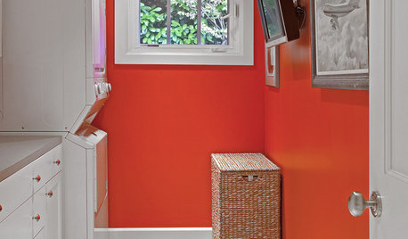
MORE ROOMS8 Colors for North-Facing Rooms
Have a room with little sunlight? One of these vibrant, saturated paint colors will warm it up
Full Story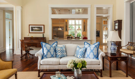
COLORThe Best White and Pastel Colors for Every Kind of Natural Light
Understand how sunlight affects your rooms and get tips on choosing paint colors for each type of exposure
Full Story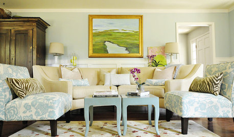
MORE ROOMS8 Colors for South-Facing Rooms
Choose one of these soft, cool colors to tone down the sun shining in
Full Story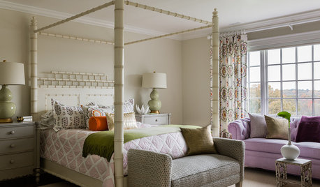
KIDS’ SPACES5 Teen and Tween Girls' Rooms With Fresh-Faced Style
Youthful and light, these girls' bedrooms show an age-appropriate mix of playful spirit and design-savvy sophistication
Full Story
COLORNature’s Color Wisdom: Lessons on Earth Tones From the Great Outdoors
Look to the land for hues that are grounding, soothing and endlessly versatile
Full Story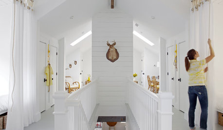
DECORATING GUIDESColor Guide: How to Work With Bright White
There's a reason clean, crisp white is the eternal standard for walls. See how it can take your rooms from pallid to pleasing
Full Story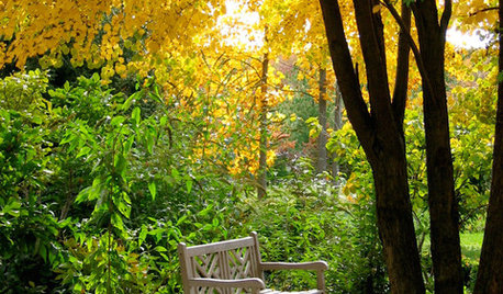
COLORNature’s Color Wisdom: Lessons on Yellow From the Great Outdoors
Let the sunshine in. These ways to use yellow will cheer up your interiors and make Mother Nature proud
Full Story
COLORNature’s Color Wisdom: Lessons on Blue From the Great Outdoors
Take some cues from the sea and sky to find a blue to match any taste and mood
Full Story
BROWNColor Guide: How to Work With Brown
It's all over nature and the decorating world too. From light latte to dark walnut, there's a brown for everyone
Full Story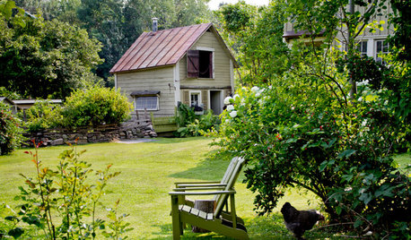
INSPIRING GARDENSMy Houzz: DIY Love and Nature-Inspired Colors Update a Couple’s Garden
Secondhand finds and favorite pieces add whimsical beauty to this animal-loving couple’s property
Full Story


burnGirl