


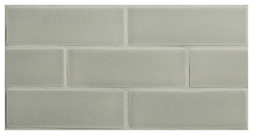
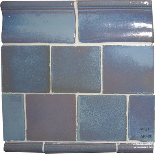
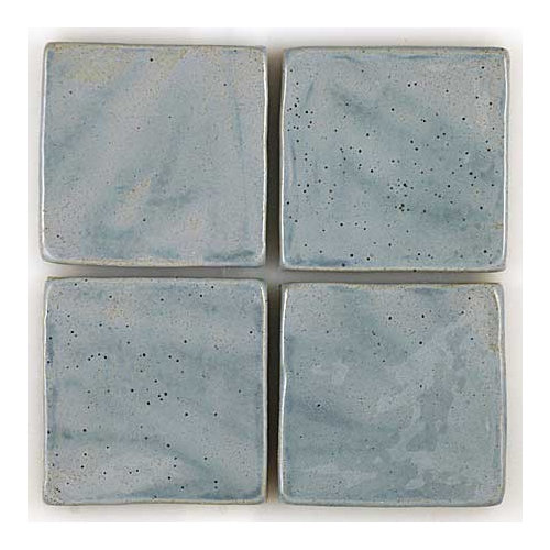
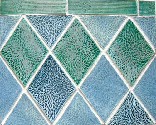
Towards a unified theory of tile. (Many pics)
angie_diy
11 years ago
Featured Answer
Sort by:Oldest
Comments (78)

angie_diy
11 years agolast modified: 9 years agobahacca
11 years agolast modified: 9 years agoRelated Discussions
Lacunosas and the Chaos Theory of Gardening
Comments (18)My home depot says they can't do spec orders, that all the ordering is done from the corporate offices and that they just order "assorted selections". Of course I got this piece of information from a garden center employee, and we all know how knowledgable they are about their plants. I too would love to see a closeup of those turquiose flowers, they are awesome looking. One hoya I have no trouble with is linearis, I bought a full size one - actually my garden center ordered it for me, so it never underwent any abuse at any store...I watched them take it out of the shipment box. It is in the foyer under a skylight, and I keep it on the dry side. When I do water, I water very lightly, maybe wetting only the top 2 inches of the soil. I had a little of it die back the first winter, but for the most part it does great. Getting very long. I think linearis is very sensitive to overwatering....See MoreHappy Dance! Bathroom Finished! many pics
Comments (16)enduring: thanks --- the bedroom and bathroom walls are painted same color (as is newly created suite area between them) and this goes a very long way toward harmonious feel. Antique headboard is about same the finish as the bathroom vanity and this helps too. I did the best I could to make the original bathroom attractive, but it was a losing battle. I did not post the photos of mold, cracked tile, rusty hinges, broken tiles and fixtures, and the hated hollow core door. The room never felt clean no matter what I did. Ugh, it just wore me down. Towel bars on door were my only option as I wanted to eliminate clutter on walls. Original idea was to mount towel bar on half-wall, but the resulting clutter and narrowed walkway weren't worth it. Since the bathroom door is closed during showering anyway, it isn't a big deal for me to reach over to the door for my towel. DH takes his towel from door and hangs on shower door towel bar for easier access. Normally the bathmat hangs on shower door towel bar. This process is still not ingrained in our "muscle memory" but we are trying. We mounted the hand towel ring on the wall of the toilet nook, so to dry hands at the sink, I make a half turn behind me to reach hand towel --- or take the towel over to counter and rehang it after drying. Again, hiding towel ring there cuts out clutter. It would make more sense to hang towel ring on a tower beside sink, but I worried about the water droplets hitting the wood tower and making a mess over time. If the vanity were painted instead of stained, this probably would not have been an issue. See the tiny details that must be considered from the very beginning stages of planning?!?! We have two grab bars (Moen) in the shower. GC blocked the studs during build-out to accommodate these bars. Jury still out on whether we could have gotten by with handheld shower head only. During the weeks we were without a shower door (fabricator cut the door too tall; what frustration!), I carefully showered with handheld and grew to love it. Full-time though? I am not sure. Possibly so. Good luck with your plans....See Morewinter project, many pics - new ebay & cl 1/2 bath
Comments (48)Good morning, everyone! allison, The 1/2 bath might be considered a 'folly' down there! I do have a small area around it somewhat finished, but the rest of it will always be a spot to work on my many hobbies, like furniture refinishing, messy crafty stuff, you-name-it. I also have a doggie door in the opposite 'working' side of the cellar, that goes to a former garage under my office, which I made that into a wood working 'shop' years ago. Another doggie door in the shop takes them out to their fenced in area of the yard. The cellar and the shop are valuable real estate to me, just as they are. I do have 3 windows and a door with glass in that 'living' part of the cellar, as well as a wood stove, and an armoire with a TV it in. It's cozy in the winter with the stove, and cool in the summer and the couch down there is great for naps! These pics are of my former LR sofa down there and a 'reading' nook with big chair. Not much decorating has taken place yet! The door you see on the right in this pic is to the 1/2 bath. This is the reading nook which faces the wood stove. Being a dog lover, I got this original oil painting of a Springer from eBay for $21.49! His eyes are a perfect match to the Behr 'Cork' paint color. And this is Ikat fabric called Casbah, that I got at 1/2 price at Ballard Designs. I might make sill length panels for the 1/2 bath for fall and winter from it. The way it goes with that paisley wallpaper is the stuff that (my) dreams are made of. I'm happy to see so many paisley lovers here, as I have always been one, and I LOVE to mix patterns in a room, even a small one like this. I'm glad that others are inspired by my 're-cycled' bathroom! I'd never have done it if there hadn't been a rough one down there to start; but I just replaced that with one that even I'll use. No more storing tires and hoses in this one....See MoreUnify with paint?
Comments (13)Thanks! Toward the end you said "unless you go with warm white". You wouldn't do the trim in warm white if the walls were done in warm white? I really don't think I want to do something as dark as coastal fog, and I'm not sure I buy the idea of gray with golden oak/pine to begin with. I know people do it, but every time I see a photo of it I feel like it doesn't match. I have tried White Dove before, and for that application thought it was just gray enough to look dirty, but maybe in this situation that would be OK. I think I'll try samples of that and Acadia White (Ivory.) Any opinions on the idea of leaving the windows wood and just painting the outer trim? I will check with the contractor about painting the beams last. I just can't imagine anyone thinking those dark chocolate stained beams are good. There's no wood grain, it's just like dark paint on a rough cut surface. And I've seen so many Houzz makeovers where they took mountain homes with dark trim and ceilings and they painted it all "white" and it was so much better. I vow'ed I would never get caught in the "don't paint wood" trap. I think leaving the ceiling and floor wood is plenty. In fact, if I were going to live there and I wanted more wood, I'd add really nice wood doors which I like more than wood trim anyway. To me wood trim looks dated unless it's really nice wood and the walls are darker. Isn't that why all the trim is painted out in all the "Modern Farmhouse" photos....See Moreyoungdeb
11 years agolast modified: 9 years agoayerg73
11 years agolast modified: 9 years agobahacca
11 years agolast modified: 9 years agoayerg73
11 years agolast modified: 9 years agoangie_diy
11 years agolast modified: 9 years agobahacca
11 years agolast modified: 9 years agotami3
11 years agolast modified: 9 years agopentimento
11 years agolast modified: 9 years agomarcolo
11 years agolast modified: 9 years agomarcolo
11 years agolast modified: 9 years agopalimpsest
11 years agolast modified: 9 years agohappy2learn
11 years agolast modified: 9 years agoangie_diy
11 years agolast modified: 9 years agoangie_diy
11 years agolast modified: 9 years agopentimento
11 years agolast modified: 9 years agoLovesPurple
11 years agolast modified: 9 years agomarcolo
11 years agolast modified: 9 years ago
cawaps
11 years agolast modified: 9 years agodeedles
11 years agolast modified: 9 years agoLovesPurple
11 years agolast modified: 9 years agonuggly
11 years agolast modified: 9 years agonuggly
11 years agolast modified: 9 years agoLovesPurple
11 years agolast modified: 9 years agoaliris19
11 years agolast modified: 9 years agocolorfast
11 years agolast modified: 9 years agoangie_diy
11 years agolast modified: 9 years agosudaki
11 years agolast modified: 9 years ago
a2gemini
11 years agolast modified: 9 years agophiwwy
11 years agolast modified: 9 years ago
mtnrdredux_gw
11 years agolast modified: 9 years agoLovesPurple
11 years agolast modified: 9 years agocawaps
11 years agolast modified: 9 years agokippee
11 years agolast modified: 9 years agokippee
11 years agolast modified: 9 years agoangie_diy
11 years agolast modified: 9 years agoLovesPurple
11 years agolast modified: 9 years agoleela4
11 years agolast modified: 9 years agoangie_diy
11 years agolast modified: 9 years agoLovesPurple
11 years agolast modified: 9 years ago
Bunny
11 years agolast modified: 9 years agowishiwasinoz
11 years agolast modified: 9 years agoangie_diy
11 years agolast modified: 9 years agoLovesPurple
11 years agolast modified: 9 years agodeedles
11 years agolast modified: 9 years agoLovesPurple
11 years agolast modified: 9 years ago
Evan Thomas
10 years agolast modified: 9 years agoangie_diy
10 years agolast modified: 9 years ago


Related Stories

THE HARDWORKING HOMECES 2015: Inching Toward a Smarter Home
Companies are betting big on connected devices in 2015. Here’s a look at what’s to come
Full Story
CONTEMPORARY HOMESHouzz Tour: Craning Toward the View in Seattle
‘Head turning’ takes on new meaning with this modern two-story home overlooking the mountains
Full Story
TILESo Many Reasons to Love Cement Tiles
You’ll notice their beautiful patterns right away, but cement tiles have less obvious advantages too
Full Story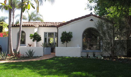
ARCHITECTURERoots of Style: Many Cultures Make Their Marks on Mediterranean Design
If you live in California, Florida or certain other parts of the U.S., your architecture may show distinct cultural influences
Full Story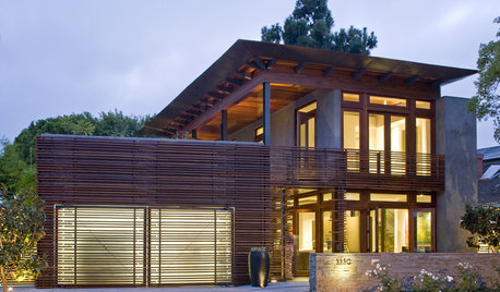
GARAGESDesign Workshop: The Many Ways to Conceal a Garage
Car storage doesn’t have to dominate your home's entry. Consider these designs that subtly hide the garage while keeping it convenient
Full Story
TILEPorcelain vs. Ceramic Tile: A Five-Scenario Showdown
Explore where and why one of these popular tile choices makes more sense than the other
Full Story
COLORNature’s Color Wisdom: Lessons on White From the Great Outdoors
Blizzard fierce or butter soft, white can highlight shapes, unify a room and perform miracles on the cheap
Full Story
REMODELING GUIDES10 Tile Patterns to Showcase Your Floor
There's more to a tile floor than the tile itself; how you lay out your tile can change the look and feel of the room
Full Story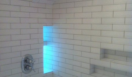
BATHROOM DESIGN10 Top Tips for Getting Bathroom Tile Right
Good planning is essential for bathroom tile that's set properly and works with the rest of your renovation. These tips help you do it right
Full Story
HOUZZ TOURSMy Houzz: Colorful and Conservative Mingle in a Manhattan Apartment
Divergent tastes get a unified look in a chic yet warm and comfy open-plan home
Full Story


mommyto4boys