


Backsplash for Typhoon Bordeaux
peach32
12 years ago
Sort by:Oldest
Comments (46)
Related Stories
KITCHEN BACKSPLASHESHow to Choose a Backsplash for Your Granite Counters
If you’ve fallen for a gorgeous slab, pair it with a backsplash material that will show it at its best
Full Story
KITCHEN DESIGNHouzz Quiz: Which Kitchen Backsplash Material Is Right for You?
With so many options available, see if we can help you narrow down the selection
Full Story
KITCHEN DESIGNHow to Pick a Kitchen Backsplash That Wows
Design your ideal backsplash with help from these Houzz guides and inspiring ideas for every kitchen style
Full Story
KITCHEN DESIGNKitchen Design: A Picture Frame for Your Backsplash
Frame a tile pattern for a piece of built-in wall art for your kitchen
Full Story
TILE5 Head-Turning Tile Styles for Backsplashes and More
If plain subway tile would derail your bold decorating vision, these dashing tiles can help you arrive at a brilliant solution
Full Story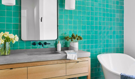
BATHROOM DESIGNBathroom Countertops 101: The Top Surface Materials
Explore the pros and cons of 7 popular bathroom countertop materials
Full Story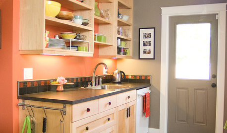
KITCHEN DESIGN23 Inspiring Real-Life Kitchens
Get Ideas for Your Own Project from Creative Houzz Members' Kitchens
Full Story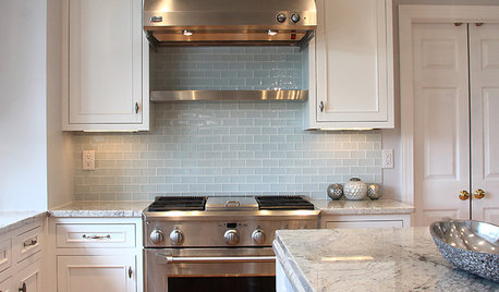
KITCHEN DESIGN5 Favorite Granites for Gorgeous Kitchen Countertops
See granite types from white to black in action, and learn which cabinet finishes and fixture materials pair best with each
Full Story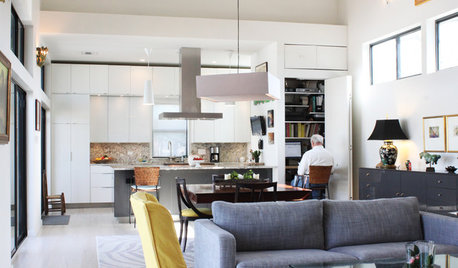
HOUZZ TOURSMy Houzz: Luminous and Low Maintenance in New Orleans
See the new build that replaced a hurricane-ravaged house, beginning a new chapter for a retiring couple
Full Story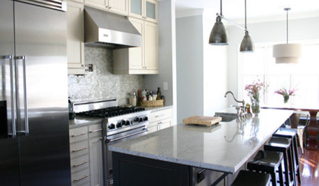
KITCHEN DESIGNKitchen Details: The Right Edge for Your Countertop
Square, Mitered, Waterfall or Bullnose? See What Counter-Edge Style Looks Best to You
Full Story

ellendi
peach32Original Author
Related Discussions
What backsplash with absolute Black and Typhoon Bordeaux?
Q
Typhoon Bordeax granite ... what backsplash
Q
Backsplash help- to go w/Typhoon Bordeaux granite
Q
What accent backsplash tiles did you use for Typhoon Bordeaux?
Q
aliris19
davidro1
vitamins
aliris19
beekeeperswife
breezygirl
sandesurf
peach32Original Author
peach32Original Author
sandesurf
peach32Original Author
aliris19
sandesurf
remodelfla
skeetie219
sandesurf
peach32Original Author
plllog
aliris19
efc54
sandesurf
peach32Original Author
efc54
peach32Original Author
caryscott
kitchenaddict
vitamins
peach32Original Author
caryscott
peach32Original Author
Laura Weller
aliris19
peach32Original Author
sandesurf
beachpea3
peach32Original Author
peach32Original Author
sandesurf
peach32Original Author
sandesurf
peach32Original Author
sandesurf
marieskit
peach32Original Author