


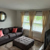
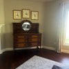
What do you think of this paint combo
User
10 years ago
Sort by:Oldest
Comments (53)
Related Stories
SMALL KITCHENS10 Things You Didn't Think Would Fit in a Small Kitchen
Don't assume you have to do without those windows, that island, a home office space, your prized collections or an eat-in nook
Full Story
BATHROOM WORKBOOKStandard Fixture Dimensions and Measurements for a Primary Bath
Create a luxe bathroom that functions well with these key measurements and layout tips
Full Story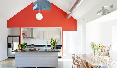
MODERN ARCHITECTUREBuilding on a Budget? Think ‘Unfitted’
Prefab buildings and commercial fittings help cut the cost of housing and give you a space that’s more flexible
Full Story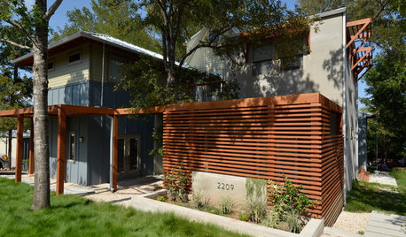
HOUZZ TOURSHouzz Tour: Visit a Forward Thinking Family Complex
Four planned structures on a double lot smartly make room for the whole family or future renters
Full Story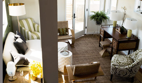
SMALL SPACESDownsizing Help: Think ‘Double Duty’ for Small Spaces
Put your rooms and furnishings to work in multiple ways to get the most out of your downsized spaces
Full Story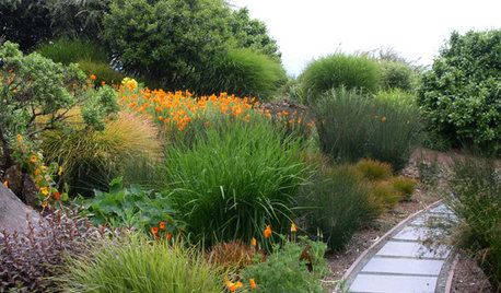
GARDENING GUIDESNew Ways to Think About All That Mulch in the Garden
Before you go making a mountain out of a mulch hill, learn the facts about what your plants and soil really want
Full Story
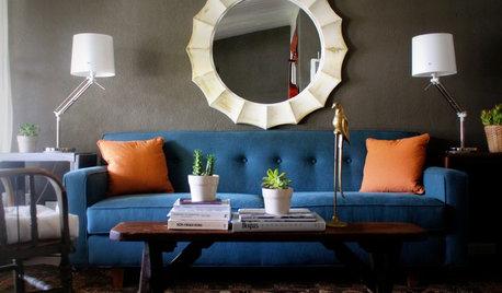
DECORATING GUIDESHot Color Combo: Cool Blues and Warm Brass
It's trending all over, but navy or royal blue with brass or gold just also might become a new classic pairing
Full Story
MOST POPULARMust-Try Color Combo: White With Warm Off-White
Avoid going too traditional and too clean by introducing an off-white palette that brings a touch of warmth and elegance
Full Story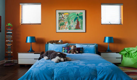
COLOR10 Color Combos You Never Thought Would Work
Orange and blue? Purple and green? Yes and yes. Unlikely pairings can look great if you do them right
Full Story

sreedesq
jterrilynn
Related Discussions
Master Shower/Tub Combo what do you think so far?
Q
What do you think about this combo???
Q
What do you think of these pillows/ color combo?
Q
what do you think of this combo?
Q
awm03
awm03
awm03
jterrilynn
UserOriginal Author
liriodendron
WalnutCreek Zone 7b/8a
jterrilynn
UserOriginal Author
Fori
randita
lavender_lass
UserOriginal Author
jterrilynn
jterrilynn
UserOriginal Author
jterrilynn
UserOriginal Author
jterrilynn
UserOriginal Author
badgergal
UserOriginal Author
christine40
jterrilynn
Karenseb
UserOriginal Author
franksmom_2010
jterrilynn
franksmom_2010
UserOriginal Author
UserOriginal Author
texasgal47
User
UserOriginal Author
jterrilynn
UserOriginal Author
User
jterrilynn
UserOriginal Author
jterrilynn
juddgirl2
User
User
UserOriginal Author
UserOriginal Author
jterrilynn
Karenseb
jesshs