


scale and height advice please
User
14 years ago
Sort by:Oldest
Comments (46)
Related Stories
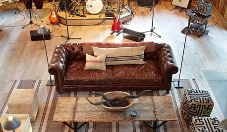
THE ART OF ARCHITECTURESound Advice for Designing a Home Music Studio
How to unleash your inner guitar hero without antagonizing the neighbors
Full Story
TASTEMAKERSBook to Know: Design Advice in Greg Natale’s ‘The Tailored Interior’
The interior designer shares the 9 steps he uses to create cohesive, pleasing rooms
Full Story
DECORATING GUIDES5 Decorating Tips for Getting Scale Right
Know how to work art, sectionals, coffee tables, lamps and headboards for a positively perfect interior
Full Story
KITCHEN DESIGNSmart Investments in Kitchen Cabinetry — a Realtor's Advice
Get expert info on what cabinet features are worth the money, for both you and potential buyers of your home
Full Story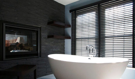
BATHROOM DESIGNDreaming of a Spa Tub at Home? Read This Pro Advice First
Before you float away on visions of jets and bubbles and the steamiest water around, consider these very real spa tub issues
Full Story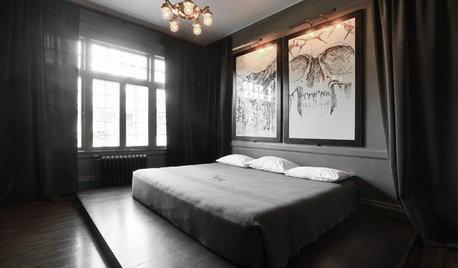
DECORATING GUIDESDecorating Advice to Steal From Your Suit
Create a look of confidence that’s tailor made to fit your style by following these 7 key tips
Full Story
FARM YOUR YARDAdvice on Canyon Farming From L.A.'s Vegetable Whisperer
See how a screened garden house and raised beds help an edible garden in a Los Angeles canyon thrive
Full Story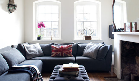
DECORATING GUIDESHow to Use Full-Scale Decor to Make a Small Space Feel Bigger
With a less-is-more approach, even oversize furnishings can help a compact area seem roomier
Full StoryROOM OF THE DAYRoom of the Day: Right-Scaled Furniture Opens Up a Tight Living Room
Smaller, more proportionally fitting furniture, a cooler paint color and better window treatments help bring life to a limiting layout
Full Story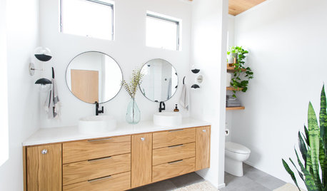
BATHROOM DESIGNThe Right Height for Your Bathroom Sinks, Mirrors and More
Upgrading your bathroom? Here’s how to place all your main features for the most comfortable, personalized fit
Full Story


Lori A. Sawaya
cyn427 (z. 7, N. VA)
Related Discussions
Help, please! Pachira (money tree) with scale? aphids???
Q
Vent hood height problem... Advice please!
Q
Please Help with Chandelier style/size 9' Ceiling living room scale
Q
39" Countertop Height - Advice Please!
Q
UserOriginal Author
bronwynsmom
UserOriginal Author
olychic
Lori A. Sawaya
UserOriginal Author
Lori A. Sawaya
stinky-gardener
terezosa / terriks
UserOriginal Author
UserOriginal Author
User
Lori A. Sawaya
UserOriginal Author
novacat_2010
Lori A. Sawaya
UserOriginal Author
olychic
novacat_2010
Lori A. Sawaya
Lori A. Sawaya
Lori A. Sawaya
novacat_2010
Lori A. Sawaya
novacat_2010
Lori A. Sawaya
olychic
UserOriginal Author
Lori A. Sawaya
pmacbee
Lori A. Sawaya
UserOriginal Author
novacat_2010
bronwynsmom
cyn427 (z. 7, N. VA)
terezosa / terriks
nhb22
UserOriginal Author
Lori A. Sawaya
novacat_2010
Lori A. Sawaya
UserOriginal Author
Lori A. Sawaya
novacat_2010