


Attn GW Admin: New Format Problem
function_first
11 years ago
Sort by:Oldest
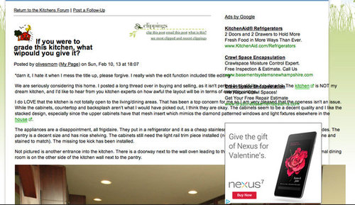
Was loving the look of the home page, but then I clicked on a link and the ads run over the top of the post, see screen shot below.
I'm using Safari as a web browser, Version 6.0.2


mama goose_gw zn6OH
debrak_2008
Related Discussions
GW problems-can't post on the exchange forums
Q
GW New look
Q
ATTN: Search for Name Before Starting a New Post
Q
The new format
Q
ghostlyvision
Cloud Swift
quiltgirl
lisapoi
oldbat2be
mama goose_gw zn6OH
angela12345
mama goose_gw zn6OH
purplepansies
debrak_2008
mama goose_gw zn6OH
eleena
debrak_2008
writersblock (9b/10a)
breezygirl
mama goose_gw zn6OH
breezygirl
purplepansies
aliris19
gwtamara
ghostlyvision
deedles
islanddevil
anrol
angela12345
deedles
angela12345
writersblock (9b/10a)
Bunny
mama goose_gw zn6OH
purplepansies
purplepansies
Buehl
lyfia
breezygirl
purplepansies
mama goose_gw zn6OH
Buehl
purplepansies
2LittleFishies
aliris19
Buehl
writersblock (9b/10a)
Buehl
2LittleFishies
bellsmom
oldbat2be
angela12345