


Design around this, pink, part 2....
melissastar
12 years ago

Sort by:Oldest
Comments (59)
Related Stories
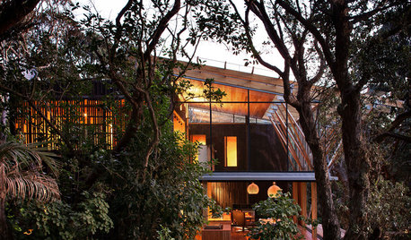
CONTEMPORARY HOMESHouzz Tour: Native Trees Are Part of This Home’s Design
A coastal New Zealand house is built to blend into a surrounding forest of pohutukawa trees
Full Story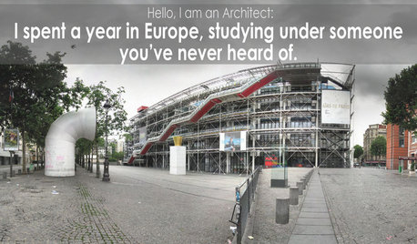
COFFEE WITH AN ARCHITECTAn Architect's Calling Cards: Part 2
In the battle against social awkwardness, an intrepid architect calls upon ... what else? His design skills
Full Story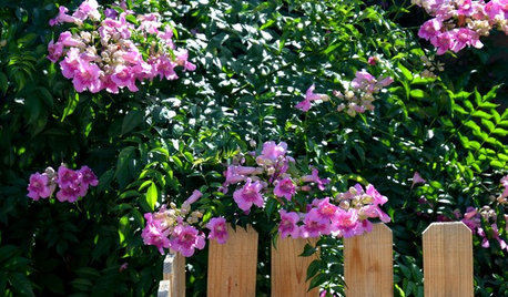
PINK FLOWERSGreat Design Plant: Pink Trumpet Vine Heralds Vibrant Color
Announce your landscape beautification efforts with this flowering vine that perks up hot, dry gardens
Full Story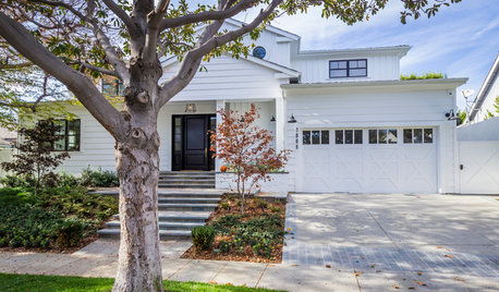
TRANSITIONAL HOMESHouzz Tour: Part Traditional, Part Modern and All Family Friendly
With clean lines, vintage touches and durable surfaces everywhere, this Los Angeles home balances tastes and needs beautifully
Full StoryHOW TO PHOTOGRAPH YOUR HOUSETake Better Photos of Your House in a Snap: Part 2
Think like a professional photographer and learn to capture stunning images of your home
Full Story
MOST POPULARThe Many Paths of Design, Part 1
Blame engineering issues, unforeseen revisions or even the Internet. As these diagrams show, it's probably not your fault
Full Story
LIFETime Travel to Houzzers' Childhood Homes, Part 2
Catch a glimpse of kit houses, bungalows, Tudors and more just as they were way back when — and listen in on the intriguing personal stories
Full Story
DECORATING GUIDESGetting the Room Right: Part I
Great Spaces Show How to Avoid the Top 10 Decorating Mistakes
Full Story
THE ART OF ARCHITECTUREDesign Workshop: Put Industrial Mesh to Work Around the Home
From open gratings to fine weaves, commercial metal mesh is a durable and beautiful choice for residences too
Full Story
DECORATING STYLESFinding the 'Wabi-Sabi' in Midcentury Modern Design
Part 2 of our wabi-sabi series: in which Knoll, the Eameses and more celebrate streamlined forms around the home
Full Story
cawaps
mtnrdredux_gw
Related Discussions
more of tickled pinks........part 2
Q
Design Around This; Goth Beachhouse
Q
Design Around #18: Art of Kitchen Design Part II
Q
Design Around This #11: Pink for the Present Day
Q
formerlyflorantha
palimpsest
formerlyflorantha
palimpsest
shmeal
formerlyflorantha
cawaps
lavender_lass
shmeal
marcolo
melissastarOriginal Author
skyedog
lavender_lass
cawaps
lavender_lass
sochi
lavender_lass
cawaps
sochi
formerlyflorantha
palimpsest
formerlyflorantha
mudhouse_gw
annachosaknj6b
mudhouse_gw
formerlyflorantha
palimpsest
sochi
lavender_lass
mudhouse_gw
formerlyflorantha
angie_diy
mudhouse_gw
marquest
stinky-gardener
mudhouse_gw
formerlyflorantha
stinky-gardener
mtnrdredux_gw
lavender_lass
mudhouse_gw
cawaps
palimpsest
melissastarOriginal Author
lavender_lass
formerlyflorantha
lavender_lass
lavender_lass