


Kitchen Design

Kitchen of the Week: White, Wood and Navy Updates in Oregon
A Portland family takes down walls to bring more light and openness to a once cramped and cluttered kitchen

Before. The homeowners found their existing 1970s kitchen dark and cramped, and they disliked that the wall to the right made it feel closed off from the living room. “The parents couldn’t see what the kids were doing when they were cooking together in the kitchen,” says designer Terah Beth Baltzer Varga.
A peninsula with open shelves above it was meant to provide extra storage but really just made the space look and feel more cluttered. It also blocked the flow of light from adjacent windows.
A peninsula with open shelves above it was meant to provide extra storage but really just made the space look and feel more cluttered. It also blocked the flow of light from adjacent windows.
After. This photo, taken from the same angle as the previous photo, shows how removing the peninsula and the wall to the right changed everything. “We were lucky that the wall separating the kitchen and living room was not structural,” the designer says. “That was a huge cost saver.”
Without altering the footprint, she and her builder-husband Justin Varga created a new layout that allowed the kitchen, living and dining rooms to work in tandem and maximize flow.
All the cabinets, fixtures and appliances were replaced as well.
Fixture above island: Capucina one-light mini pendant
What you should know before you tear down a wall
Before. This view from the living room shows how the original kitchen sat behind a wall.
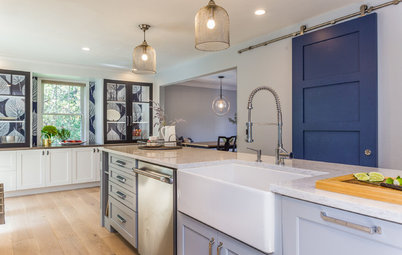
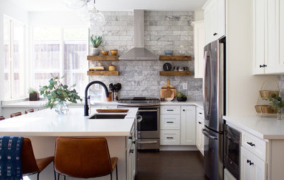
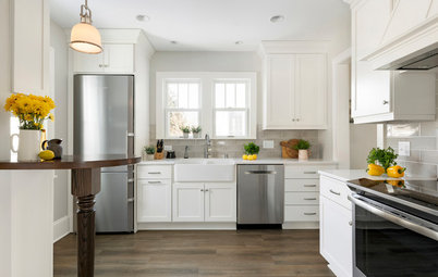
After. Now, shown from the same angle as the previous photo, the kitchen, dining room and living room are one big, open, connected space. With crisp white cabinetry and more natural light shared between areas, the overall look is brighter, something highly sought-after in rainy Portland. “You need to be able to look outside and see the sky,” Baltzer Varga says.
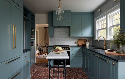
A shot of yellow, a navy blue island, honey-hued floors and a big leaf-maple island top add warmth and energy.
A shot of yellow, a navy blue island, honey-hued floors and a big leaf-maple island top add warmth and energy.
Island top. The single-slab maple countertop is 38.5 inches wide and 51 inches long, with a 13.5-inch overhang on the seating side. It was milled from a fallen tree on a street on the University of Portland campus, which, as it turned out, was along a path one of the homeowners used to frequent as a child.
Island cabinet paint: Moscow Midnight, Sherwin-Williams
Island cabinet paint: Moscow Midnight, Sherwin-Williams
When the woodworker was milling the lumber, he found a bullet — estimated to be 40 years old — lodged within the trunk. The team incorporated this into the design by leaving the bullet exposed. “It’s a great conversation starter,” Baltzer Varga says.
Walled-in refrigerator. “If you’re not going to have a built-in refrigerator, making a cabinet for it makes a big difference,” Baltzer Varga says. She created a nook by adding a panel on the right side and extending the hallway wall to cover the left side of the fridge. “When people are looking toward the kitchen from the living room, they see the art on the wall, not the side of a refrigerator,” she says.
Above the fridge, a pull-out cabinet creates the perfect home for special-occasion tools, like roasting pans.
Above the fridge, a pull-out cabinet creates the perfect home for special-occasion tools, like roasting pans.
Hardworking cabinets. Pullouts and corner systems make efficient use of storage space, as do custom cabinets extending all the way to the ceiling.
In lieu of a walk-in pantry, the design team added a floor-to-ceiling unit in the dining room, where the family now keeps appliances and lesser-used food items.
Cabinet paint: Extra White, Sherwin-Williams
In lieu of a walk-in pantry, the design team added a floor-to-ceiling unit in the dining room, where the family now keeps appliances and lesser-used food items.
Cabinet paint: Extra White, Sherwin-Williams
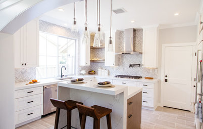
Perimeter countertop. A smoky gray quartz fits the contemporary style and allows the white subway tile backsplash and accessories to pop. Baltzer Varga made sure to create plenty of roomy countertop areas so the homeowners can work side by side comfortably.
Backsplash. The designer amped up the white subway tile backsplash in two ways. First, she took it all the way to the ceiling for a cost-effective design statement. Second, she chose a high-quality, mold-resistant grout that matched the color of the countertops.
Countertops: Concerto Quartz; tile: Rittenhouse Square 3-by-6-inch semi-gloss in Arctic White, Daltile; grout: Tec Specialty Power Grout
Efficient range and sink. To get more counter space next to the fridge, the designer moved the range onto the wall with the sink and dishwasher. This included moving the gas line, an extra expense that was worth it for the added prep area and the optimized workflow. The sink remained in the same place but was replaced with a slightly bigger and deeper 33-inch model with no divider.
Heavy-duty floors. With an active dog, older cat and two small girls, durable floors were a must. Since scratchability was a big concern, Baltzer Varga went with the homeowner to test options. “We scratched the samples with our keys,” she says.
Ultimately, they landed on a vinyl style made with recycled wood and bamboo dust. “This isn’t cheap flooring by any means,” she says. The planks are made to last and look like high-end hardwood. Not only are they eco-friendly, scratch-resistant and 100 percent waterproof (great for aging or untrained pets), they also have a cork layer that dampens sound. “You don’t hear the clicking sound of heels,” she says.
Flooring: Coretec Plus XL-E in Waddington Oak, US Floors
Beyond the kitchen. Because the open layout connects the kitchen with all the other public spaces, the team didn’t want to leave the homeowners hanging with a disjointed home. They used color to pull the rooms together by painting the fireplace to match the kitchen walls and the walls in the living room to match the island cabinets.
More
See past Kitchens of the Week
Find nearby kitchen designers and browse their portfolios
More
See past Kitchens of the Week
Find nearby kitchen designers and browse their portfolios


Kitchen at a Glance
Who lives here: A couple with two small kids, a dog and a cat
Location: Portland, Oregon
Size: 216 square feet, including dining room (20 square meters)
Designers: Husband-wife duo Terah Beth Baltzer Varga (designer) and Justin Varga (builder and contractor) of The Jack + Mare Design & Build