


Kitchen of the Week: A Family’s Big-Island Dreams Come True
A large island transforms a kitchen into the hub it was meant to be

Problems. The kitchen had a decent amount of space but it wasn’t being used as well as it could be, and when it came to serving as a family hub, it was failing. “There was a lot of wasted space,” designer Katie Griffith says. There was a tiny kitchen table, dated appliances and cabinets, and the sink was in the corner by the windows. “One of my clients is not supertall, so this deep corner cabinet and sink made it hard for her to reach,” she says.
Solutions. Griffith changed the U-shape of the kitchen to an L-shape, moved the sink and replaced the double wall ovens and separate stovetop with a range. She swapped out the over-the-stovetop microwave for a microwave drawer. She used a counter-depth refrigerator and tweaked the cabinet composition to make it feel more open and fresh. Part of this included removing two cabinets that wrapped the corner past the sink. (See before-and-after plans below.)
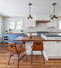
Now she was able to fit in the large central island her client had been dreaming of. By moving the sink into the island, she got rid of that awkward corner situation. And don’t worry, the homeowners still have a view — the sink faces out the sliding glass door to the backyard.
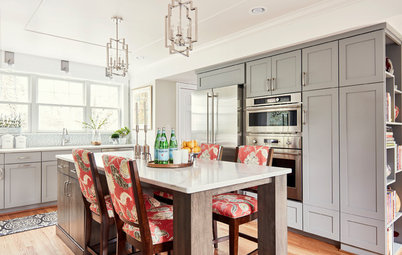
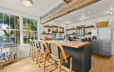
Island. The island is 4 by 8 feet and has seating for five. Inside are pullout trash bins and dishwashers, and the back has additional storage for bulky items and appliances not used every day. The faucet is a modern matte black.
“Adding a huge island actually made this kitchen look and feel bigger,” Griffith says. “The kids live at the island. They are always hanging out, doing homework or grabbing a snack here.”
Faucet: Delta; browse more dark-colored faucets
Now she was able to fit in the large central island her client had been dreaming of. By moving the sink into the island, she got rid of that awkward corner situation. And don’t worry, the homeowners still have a view — the sink faces out the sliding glass door to the backyard.
Island. The island is 4 by 8 feet and has seating for five. Inside are pullout trash bins and dishwashers, and the back has additional storage for bulky items and appliances not used every day. The faucet is a modern matte black.
“Adding a huge island actually made this kitchen look and feel bigger,” Griffith says. “The kids live at the island. They are always hanging out, doing homework or grabbing a snack here.”
Faucet: Delta; browse more dark-colored faucets
Before. Note the solid wall to the right of the cabinets and the composition of them.
After. Griffith removed that wall and broke up the composition of the cabinets, replacing the floor-to-ceiling pantry cabinet with lowers topped with a counter and uppers. She was able to fit a microwave drawer in this section as well — a great solution for those who are not “supertall.” She removed the wall ovens, scooted the refrigerator over a little and added a pantry cabinet just past the refrigerator. This thoughtful move gave the kitchen a more open feel.
Flooring. New flooring for the entire first floor was also a part of the project. Griffith helped her client choose a maple beechwood laminate, which resembles walnut, from CY Flooring to replace the old tile. “It’s a really good laminate; often when you use this much of it you can see the repeat of the grain patterns, but you don’t with this one,” Griffith says.
Lighting. They chose clear glass globe pendants to keep the view to the range wall as open as possible.
Island lights: Wayfair; counter stools: West Elm
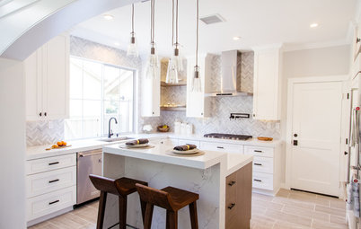
Range wall. And here you can see why they’d want to keep the view to the range wall clear. “The homeowner was very hands-on and chose a lot of the materials herself,” Griffith says. The designer gave her a few layout options, including one with cabinets flanking the vent hood and one with open shelving.
“The cabinets would have made it look crowded,” Griffith says. Instead, open shelving allows for a larger expanse of the 4-by-12-inch Carrara marble tiles and transformed the wall into a stunning focal point that grabs your attention as soon as you walk in the room. “It was important to have that texture of the marble here; otherwise it would have looked blank and flat,” Griffith says.
Grout. Notice that Griffith used a medium-gray grout, which picks up on the colors of the veining in the marble and will be much easier to keep looking clean.
Countertops. The counters are a light-colored quartz.
Open shelves. The shelves are wood boxes that float. They provide a spot to display favorite items, plants, spices and cookbooks. Like the leather counter stools and the floors, they add warm tones and texture to all the gray and white.
Storage. “We kept the cabinetry really simple,” Griffith says. While she lost a few cabinets around the perimeter, she more than made up for it in the island. A wide Shaker-style profile and matte black hardware are a fresh twist on a classic look. She also installed a Lazy Susan in each corner to improve functionality.
Cabinet hardware: Cosmas; check out more black cabinet hardware
Cabinet hardware: Cosmas; check out more black cabinet hardware
Before. The large expanse of flooring in this plan shows how much space was being wasted.
After. Now the large, dreamy island makes the most of the space.
Takeaways
- The area around a vent hood is a good spot for open shelving.
- Taking the backsplash up to the ceiling can pack a strong design punch.
- Consider nonwhite grout for kitchens, as it will be much easier to keep looking clean.
- Adding textures like warm-colored wood and leather can keep a mostly white kitchen from feeling cold or sterile.
- Using new finishes like matte black brings modernity to a classic look.
- If double ovens are hogging your wall space and you don’t really need them, consider an all-in-one range instead.


Kitchen at a Glance
Who lives here: A couple with two young boys
Location: Thousand Oaks, California
Size: 201 square feet (19 square meters); 13 by 15½ feet
Designer: Katie Griffith of Sundling Studio
It started with island dreams. This homeowner’s No. 1 wish was to have a big island that would serve as a work and gathering area in her kitchen. In addition, she was looking to update the style and make the kitchen light and bright.