


Let Purple Passion Infuse Your Home
We take the mystery out of using this most spiritual of colors to create a deeply beautiful interior design
Julia Pockett
May 3, 2013
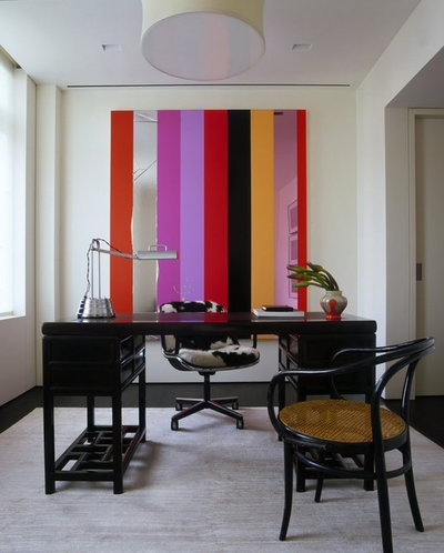
Purple is the perfect median between its two main hues — less aggressive than red but more active than blue. Indeed, writer Brad Thor summed it up well when he said, "From the political angle, I'm trying to be apolitical if you will. I mean people say, 'Are you a red state or blue state?' I say I'm purple."
However, purple doesn't sit on the fence. This color makes bold statement and is often selected to help a feature or room stand out. It is associated with royalty, wisdom and spirituality and is said to uplift and to promote pure thought. Too much can be tempestuous and overpowering, but it can be beautiful when the balance is right.
However, purple doesn't sit on the fence. This color makes bold statement and is often selected to help a feature or room stand out. It is associated with royalty, wisdom and spirituality and is said to uplift and to promote pure thought. Too much can be tempestuous and overpowering, but it can be beautiful when the balance is right.
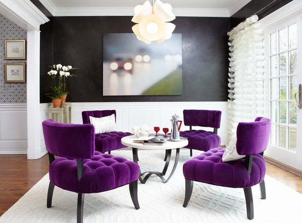
The color worn by Roman emperors and then later Roman Catholic bishops, purple is still associated with royalty and piety. It is great for statement pieces and, in velvet, makes these chairs even more extravagant and royal.
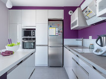
Purple's name and color come from a Tyrian dye, purpura in Latin, made from the mucus of a Mediterranean sea snail. The dye was so expensive, only kings could afford it.
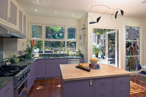
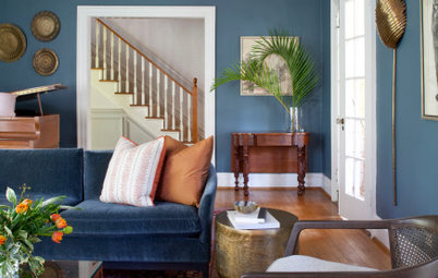
Maybe its origins make it a good choice for Mediterranean-inspired design, where a blue rather than red tint (as in the photo shown) looks perfect.
Maybe its origins make it a good choice for Mediterranean-inspired design, where a blue rather than red tint (as in the photo shown) looks perfect.
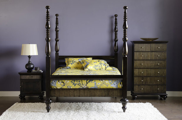
Vincent van Gogh was an avid student of color theory and used violet in many of his 1880s paintings, including those of irises and moody skies. In his famous painting "Starry Night," he used violet with complementary yellow — this makes for a similarly dramatic pairing in room design.
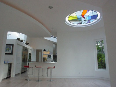
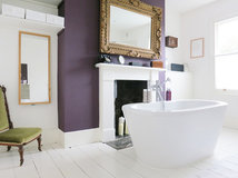
Leonardo da Vinci believed that the power of meditation increased by 10 under purple light, and in his case, this light came from the stained glass in the sanctuaries he was working in.
The serenity offered by this white room with its heavenly stained glass roof panel makes it a beautiful spot to meditate or relax in.
The serenity offered by this white room with its heavenly stained glass roof panel makes it a beautiful spot to meditate or relax in.
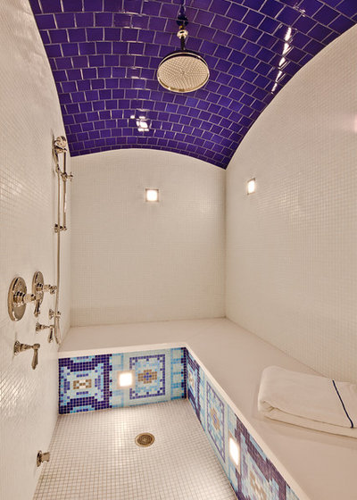
Violet is the color of the crown chakra, an energy point at the top of the head that some believe represents pure thought. This fabulous wet room, with its own crown of violet, feels like a retreat for clearing the mind.
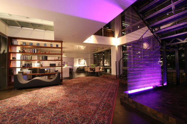
In metaphysics the term "purple power" refers to psychic abilities. Because violet has the highest frequency in the visible spectrum, mystics associate it with the highest level of spiritual intuition. Used here as light, violet does seem to add a mystical aura.
Purple is said to promote creativity. In her book Colors for Your Every Mood: Discover Your True Decorating Colors, color expert Leatrice Eiseman writes, "It is no wonder that highly creative and artistic types (as well as eccentrics) have a predilection for purple. They enjoy the uniqueness inherent in this extraordinary hue."
Indeed, Richard Wagner wrote his operas in a room with purple curtains. Clearly, it's a good color choice for a creative space!
Indeed, Richard Wagner wrote his operas in a room with purple curtains. Clearly, it's a good color choice for a creative space!
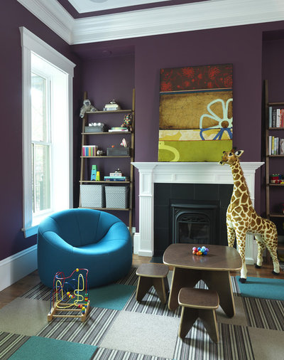
Early studies of color suggested that a preference for purple showed mental and emotional immaturity, but further research failed to prove this. I'd rather believe that it demonstrates creativity and playfulness. This room shows, playfully, how good purple can look with other strong colors, such as turquoise and green.
The smell of lavender is supposed to be stress relieving when used in aromatherapy. The lavender plant has both purple and green, so it's little wonder the colors work so well together.
I love the simplicity of this design and how it works with elements in the garden to bring in a natural feeling of space.
I love the simplicity of this design and how it works with elements in the garden to bring in a natural feeling of space.
In feng shui purple is not recommended for use as a wall color or in large amounts. "It's a very high-vibration color and should be used sparingly," says feng shui expert Rodika Tchi. She states that the only space where it can be used in large amounts is a meditation or healing area; otherwise keep with the paler shades, such as lavender.
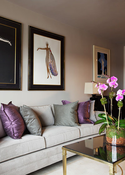
Purple looks amazing with natural linen (think about how homes in Provence look). So if you'd rather go the subtle route, consider how purple, hessian and gray work well together in this elegant design.
Show us: Do you dare to use purple in your house? Please post a photo below!
More:
How to Work With Plum
How to Work With Lavender
We specialize in custom cabinetry, but we also do interior trim & millwork. The quality of our work, the look of... Read More
What are you working on?
Related Products
Related Stories

Decorating Guides
Design Pros Share 10 Favorite Creamy White Paints
By Becky Harris
These off-white color choices include versatile tones, warming hues and pleasingly soft shades
Full Story

Kitchen Countertops
What Kitchen Countertop Colors Should You Choose?
By tidgboutique
Consider these popular colors and styles to get the look you want — no matter what material you use
Full Story

Colors of the Year
Pantone Picks a Peach for Its 2024 Color of the Year
By Jennifer Ott
See how to use this juicy hue to create calm yet flourishing spaces inside and outside the home
Full Story

Decorating Guides
5 Ways Designers Are Working With Rich Warm Tones Right Now
By Becky Harris
Interior designers describe their strategies for using rich warm colors to create an inviting home
Full Story

Colors of the Year
10 Paint Colors Ready to Take Over in 2024
By Jennifer Ott
Blue is huge, but dark hues and warm tones also find favor among major paint companies’ 2024 Color of the Year picks
Full Story
Decorating Guides
How to Mix Colors and Make It Work
By tidgboutique
Don’t want to confine yourself to neutrals but lack the confidence to embrace colors? Check out this pro advice
Full Story

Events
7 Color Trends for 2024 at Maison & Objet
By Claire Tardy
New harmonies and unexpected pairings at the fall 2023 trade fair set the tone for next year’s interiors
Full Story

Decorating Guides
9 Ways to Layer Warm Neutral Colors for Comfortably Refined Rooms
By Becky Harris
Design pros share advice for building an inviting palette, introducing high contrast and mixing textures
Full Story

Decorating Guides
How to Create a Cohesive Color Flow Throughout Your Home
By Erin Carlyle
Designers share eight techniques for avoiding a choppy feeling in your spaces
Full Story

Decorating Guides
How to Get Your Ceiling Paint Color Right
By tidgboutique
Here’s how to tweak the shade of your ceiling paint to get the effect you want
Full Story
Amazing
I've worked with colors primarily in PLUM CATEGORY. (2 baths in lavender, One SW bdrm. in squash as husband is from Santa Fe as is his art. K flows off D/L. room into K and that long wall is a med. plum with spring green accent walls in K. Cabs are grey, so are carpeted areas. (Plum colors vary from wall to wall.) House is one-story '60's limestone ranch.
Within a year or two I'd like to downsize even more, and of course hear that ONLY ONE "NEUTRAL" COLOR" IS ALLOWED for resale! Comments, experiences appreciated!