


12 Top Colors for Night Owls
These home colors reach their peak at the end of the day. Which is your favorite evening backdrop?
Lisa Frederick
December 3, 2011
Houzz Contributor. After journalism school, I fell into decorating media and immediately discovered a new passion. An Atlanta native, I spent several years as an editor for Atlanta Homes & Lifestyles magazine before making the leap to national publications and websites such as Houzz, Better Homes and Gardens and Southern Accents. I live in Birmingham, Alabama, with my husband and son, who’ve gotten used to coming home and finding the furniture rearranged. When I'm not dragging case goods across the floor, I enjoy good food and wine, college football, music of all kinds, and traveling.
Houzz Contributor. After journalism school, I fell into decorating media and immediately... More
It's a lesson straight from Color 101, but I've forgotten it more than once: Always test paint colors in evening light. A shade that looks great in bright sun can fade or become muddy as nighttime approaches. Fortunately, the opposite is true: Some colors reach their peak just when the day is winding down. Check out these better-by-night ideas.
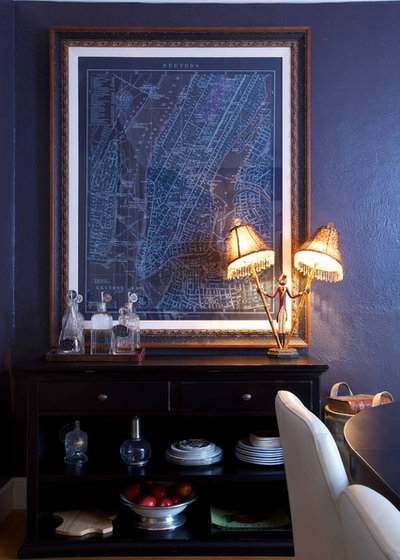
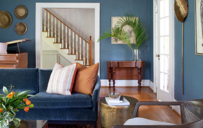
Moody and mystical, this smoky blue hue evokes the sense of twilight. I love the restrained effect of the framed blueprint on the wall — it adds just enough graphic interest without jarring the eye.
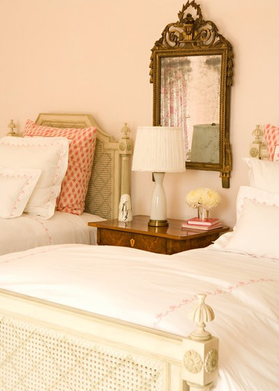
No matter the time of day, a pale blush hue simply glows.
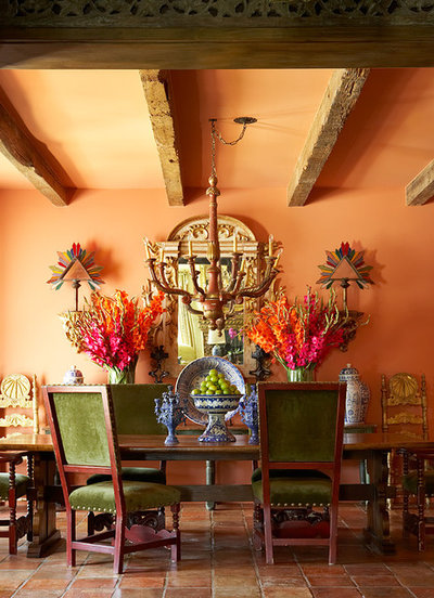
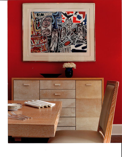
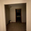
Somewhere between apricot and terracotta, this dining room becomes prettier as the sun sets. Wouldn't it look inviting with dimmed lights and lots of candles?
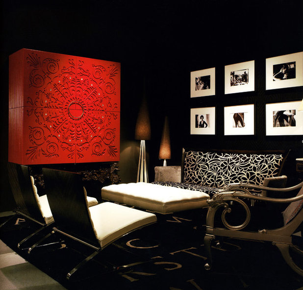
While black rooms can feel gloomy during the day, nighttime is a different story. Sleek, mysterious and — dare I say? — sexy, this ebony space comes alive as the day ends.
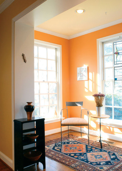
Brilliant tangerine walls radiate warmth. I can only imagine how pretty this space looks in the late afternoon and early evening.
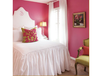
Clear pink looks great with soft light bouncing off it. And when that light hits skin, it's universally flattering. I can't think of anyone who wouldn't look just a little more fetching in this space.
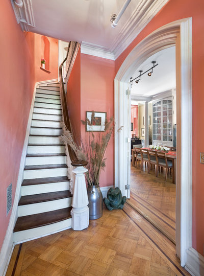
Walking into this salmon-colored entry would feel like a big, warm hug, especially at nighttime. What a welcome!
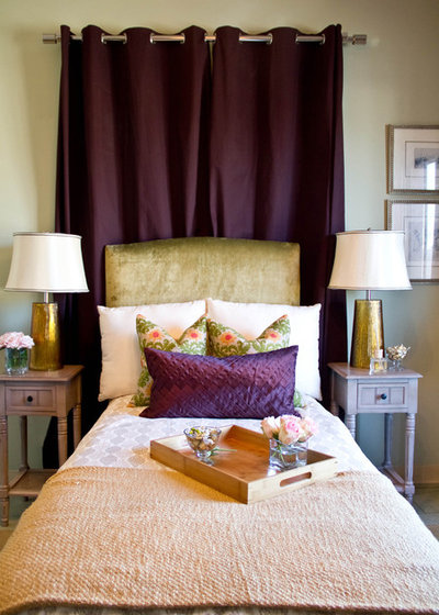
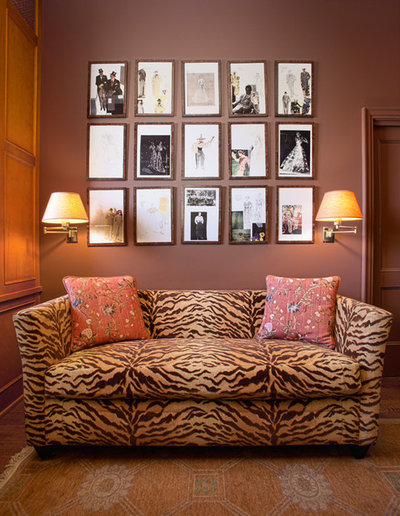
The aubergine color on the curtain panel is sink-right-in sumptuous, and it would only intensify in the evening. I'd extend it to all four walls for a glamorous effect.
Lipstick red sizzles, no matter what. But at night, it takes on an exotic, daring appeal.
Rich chocolate brown almost always looks lovely in low light. This hue, which feels like a melted Hershey bar, is particularly scrumptious.
When I saw this photo, my first thought was "Where's the bar?" It feels as though it's just waiting for a cocktail party. The deep gray-green on the walls feels cozy and intimate, and the mirrored accents help to spread light around the space.
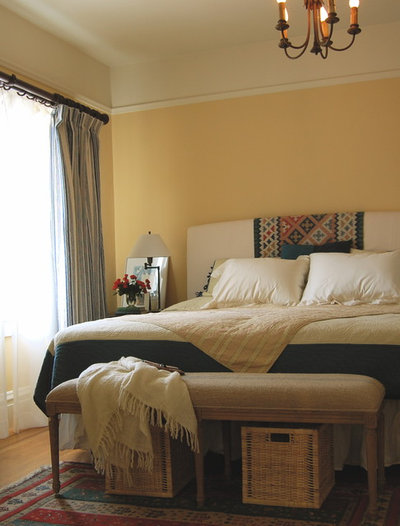
Yellow tones can die at night if they're too pale, too green or too lemony. This one is a little dirty, with just enough brown in it to keep it warm.
More: Pick Your Favorite From Our Paint Color Hall of Fame
More guides to choosing and using color
More: Pick Your Favorite From Our Paint Color Hall of Fame
More guides to choosing and using color

Related Products
Our philosophy at Kitchen Kraft is to make home remodeling convenient. We are your one-stop shop for kitchen... Read More
Related Stories

Decorating Guides
Design Pros Share 10 Favorite Creamy White Paints
By Becky Harris
These off-white color choices include versatile tones, warming hues and pleasingly soft shades
Full Story

Kitchen Countertops
What Kitchen Countertop Colors Should You Choose?
By tidgboutique
Consider these popular colors and styles to get the look you want — no matter what material you use
Full Story

Colors of the Year
Pantone Picks a Peach for Its 2024 Color of the Year
By Jennifer Ott
See how to use this juicy hue to create calm yet flourishing spaces inside and outside the home
Full Story

Decorating Guides
5 Ways Designers Are Working With Rich Warm Tones Right Now
By Becky Harris
Interior designers describe their strategies for using rich warm colors to create an inviting home
Full Story

Colors of the Year
10 Paint Colors Ready to Take Over in 2024
By Jennifer Ott
Blue is huge, but dark hues and warm tones also find favor among major paint companies’ 2024 Color of the Year picks
Full Story
Decorating Guides
How to Mix Colors and Make It Work
By tidgboutique
Don’t want to confine yourself to neutrals but lack the confidence to embrace colors? Check out this pro advice
Full Story

Events
7 Color Trends for 2024 at Maison & Objet
By Claire Tardy
New harmonies and unexpected pairings at the fall 2023 trade fair set the tone for next year’s interiors
Full Story

Decorating Guides
9 Ways to Layer Warm Neutral Colors for Comfortably Refined Rooms
By Becky Harris
Design pros share advice for building an inviting palette, introducing high contrast and mixing textures
Full Story

Decorating Guides
How to Create a Cohesive Color Flow Throughout Your Home
By Erin Carlyle
Designers share eight techniques for avoiding a choppy feeling in your spaces
Full Story

Decorating Guides
How to Get Your Ceiling Paint Color Right
By tidgboutique
Here’s how to tweak the shade of your ceiling paint to get the effect you want
Full Story
As far as using terracottas, pinks, or yellows, if you don't have the patience to follow the steps outlined above, beware: it you see any pink, yellow, or orange in a small chip, you can be sure it will be intensified tenfold on the wall, especially if you get any intense direct light.
As a side note, I would not have painted that ceiling orange as in picture #1- it's too much. In in case of all but the palest colors, it always looks to me that somebody was just too cheap or lazy to do it right. (You see this in a lot of spec properties.) And for God's sake, don't slap up a different intense color in every room unless you have always wanted to join the circus and this is just as close as you can come.
ps, to dejavous: It would do you no good to have the paint name. A photo never looks like the actual color and even if it did, it wouldn't look the same in your room. Just follow the steps above.