


Houzz Tour: Embracing a Loft’s Long, Narrow Lines
An old commercial building in Cincinnati gets new life with industrial textures, thoughtful lighting and a clever plan
Becky Harris
November 23, 2017
Houzz Contributor. Hi there! I live in a 1940s cottage in Atlanta that I'll describe as "collected."
I got into design via Landscape Architecture, which I studied at the University of Virginia.
Houzz Contributor. Hi there! I live in a 1940s cottage in Atlanta that I'll describe... More
Photos by RVP Photography
Loft at a Glance
Who lives here: A couple of empty nesters who are busy professionals
Location: Downtown Cincinnati
Size: 2,500 square feet (232 square meters)
Designer: Ryan Duebber
The backstory: With their single-family home down to just the two of them, this couple decided to move to downtown Cincinnati, just a few blocks’ walk from work. The loft had once been a McAlpin’s department store. (Those of you from Cincinnati may remember the large sidewalk clock that stood outside.) They wanted to preserve the building’s history by embracing an industrial loft look.
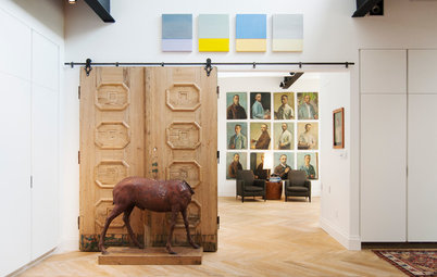
Before Photo
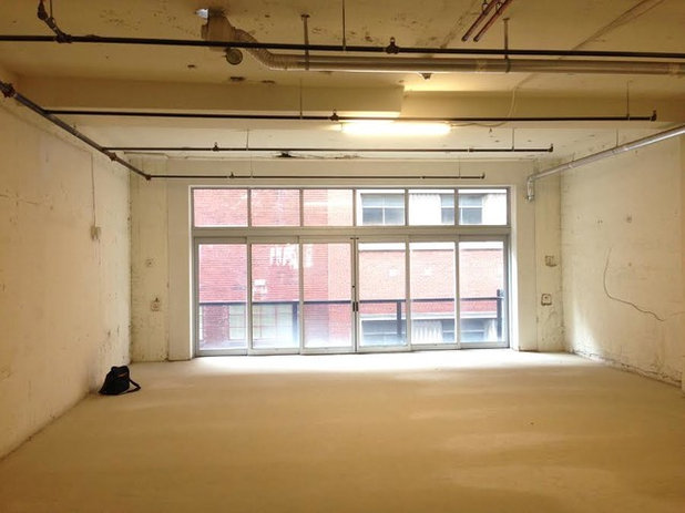
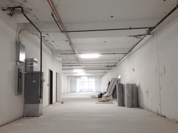
Before: Twenty-five feet wide isn’t necessarily what we’d consider narrow, but imagine four bowling lanes. At 120 feet long, this unit has similar proportions. Not helping was the fact that only the two farthest ends of the unit had windows. Plaster walls didn’t add much character, and the floors were a wreck that no tile or hardwood installer dared touch because movement between the concrete and wood beneath it was causing cracks.
The bright spot: Beyond these glass doors is a 4-foot-deep balcony.
The bright spot: Beyond these glass doors is a 4-foot-deep balcony.
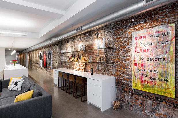
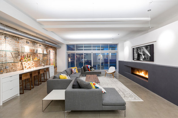
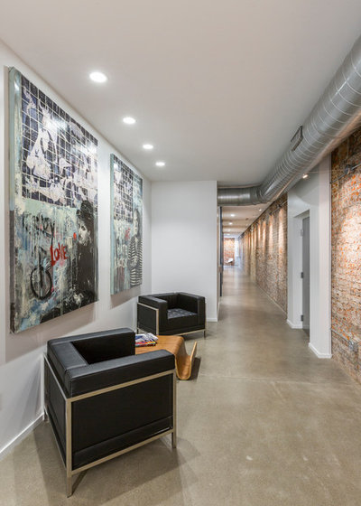
The solutions: Architect Ryan Duebber made the most of the building’s history and proportions. This long exposed-brick wall runs the length of the loft, and its markings tell the story of the building. Its texture and colors also provided inspiration for the rest of the materials palette.
Duebber had gotten a peek of the brick where some of the plaster had chipped off. “It took two guys three days to take all the plaster off with sledgehammers and some sort of motorized chisel,” he says.
The imperfections are telling: The remnants of black tar you see near the floor marks where a roofline used to be, and the holes beneath it are from joists that were once there. The new brick visible to the right of the R in the “Bar” sign marks the spot where an opening once led into the space next door. (After the chiseling, they discovered drywall covering the opening.) Some new markings, the really orange areas, are where the chisel went deep.
The bar: Duebber used glass shelves affixed to the wall with stainless steel supports drilled into the brick. “I used glass shelves so that the light would wash down through the bottles and glass shelves,” he says.
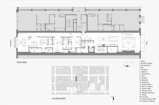
Floor plan: The white portion is this unit. The window on the left marks the master bedroom, with the other bedrooms in the middle and the kitchen and living room on the right.
One thing to note is that because this building was built to commercial code, it has much stricter fireproofing standards than residential architecture. For that reason, the bedrooms weren’t required to have egress windows and were permitted to have walls that reached the ceiling.
One thing to note is that because this building was built to commercial code, it has much stricter fireproofing standards than residential architecture. For that reason, the bedrooms weren’t required to have egress windows and were permitted to have walls that reached the ceiling.
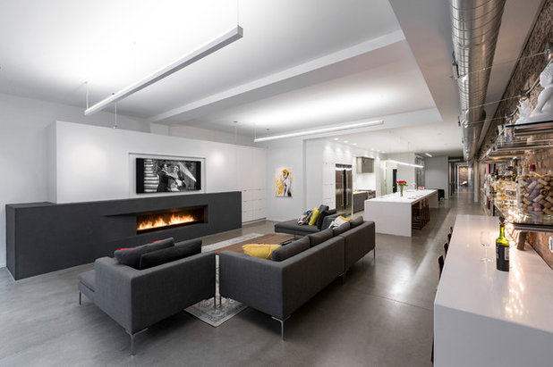
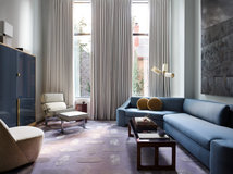
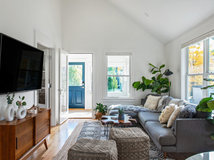
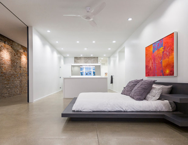
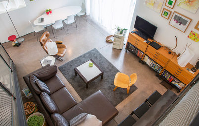
As for the proportions, the architect played off the strong horizontal lines of the footprint by emphasizing other long forms. The hearth and furniture make use of that here. The light fixtures are also long and narrow.
Lighting: You may have noticed that some of the minimalist lights are uplights, which illuminate the ceilings in the natural-light-challenged space. Duebber aimed the lights both up and down; among other considerations when designing the lighting were which textures he wanted to highlight.
Flooring: There were layers of problems lying beneath the existing floor. Duebber had it all ripped up and then poured 2½-inch-thick concrete floors, which are sealed with a simple clear polyurethane.
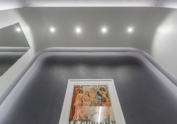
Hearth: Most of the rest of the walls and ceilings are smooth and white to contrast with the textures and colors in the brick wall. The wall’s tar markings inspired a deep charcoal gray for an accent color, which Duebber added to the hearth’s surround.
Lighting: You may have noticed that some of the minimalist lights are uplights, which illuminate the ceilings in the natural-light-challenged space. Duebber aimed the lights both up and down; among other considerations when designing the lighting were which textures he wanted to highlight.
Flooring: There were layers of problems lying beneath the existing floor. Duebber had it all ripped up and then poured 2½-inch-thick concrete floors, which are sealed with a simple clear polyurethane.
Hearth: Most of the rest of the walls and ceilings are smooth and white to contrast with the textures and colors in the brick wall. The wall’s tar markings inspired a deep charcoal gray for an accent color, which Duebber added to the hearth’s surround.
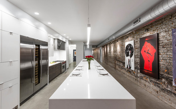
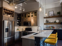
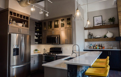
Kitchen: The living room is open to the kitchen, where the proportions of the island and light fixture above it continue to emphasize the loft’s footprint.
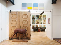
To the right you can see how Duebber lit the wall to highlight not only it but the couple’s bold art collection.
To the right you can see how Duebber lit the wall to highlight not only it but the couple’s bold art collection.
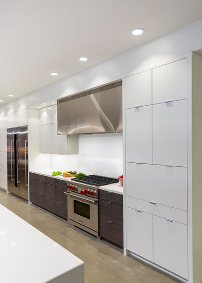
The appliance wall includes matching freezer, wine refrigerator and refrigerator from Sub-Zero. He custom-designed the vent hood to play off that large block of stainless steel, turning a functional item into a design element. An appliance garage conceals the toaster and coffee maker to maintain the sleek look.
A zebrawood veneer breaks up all the white, works well with the dark color Duebber chose for the hearth and doors, and reinforces the horizontal via its wood-grain pattern.
A zebrawood veneer breaks up all the white, works well with the dark color Duebber chose for the hearth and doors, and reinforces the horizontal via its wood-grain pattern.
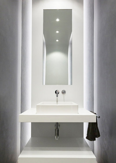
Powder room: When they got to the powder room, the couple were running out of room in their budget but still wanted to make a statement. It’s the one place in the loft that emphasizes the vertical rather than the horizontal.
Duebber created one long, curved element that starts at the floor behind the sink, continues across the ceiling and then down the wall behind the toilet to the floor. The vanity is made of the same MDF as the curved element so it all appears as one piece. Then he added LED tape lights behind it for backlighting. The tall mirror also emphasizes verticality.
Duebber created one long, curved element that starts at the floor behind the sink, continues across the ceiling and then down the wall behind the toilet to the floor. The vanity is made of the same MDF as the curved element so it all appears as one piece. Then he added LED tape lights behind it for backlighting. The tall mirror also emphasizes verticality.
Here you can see the lighting recessed into the curved piece.
Before: This photo shows the apartment from the entry down. We’ll take a look at how Duebber made the most of that bay window in a moment.
Entry: The loft has an elevator that provides direct access from the parking deck. It’s in the center of the unit and marks the division between the public and private areas.
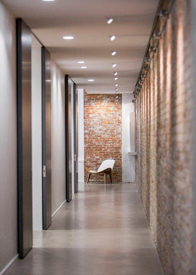
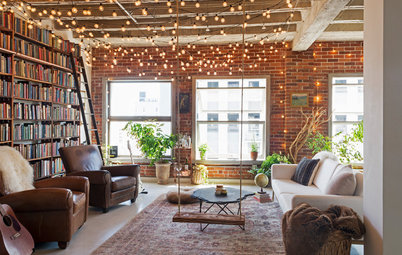
Hallway: Opposite the brick wall, large sliding doors open to the three bedrooms, which helps maintain an open feel in the windowless space. This photo also shows off how the light washes down the brick wall.
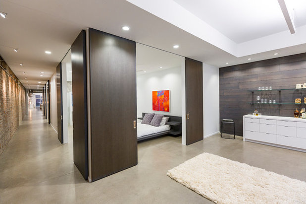
Master bedroom suite: All three bedrooms have these custom sliding doors to separate them from the hallway. They’re made of rough-sawn oak with a dark gray stain (also inspired by the marks on the brick wall). The doors are 4 feet by 9 feet 8 inches. The tracks are flush with the ceiling for a seamless look.
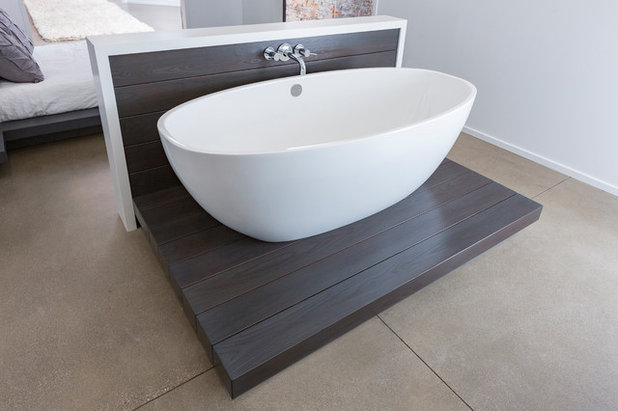
Master bathroom: The homeowners had experienced the open en suite look while traveling in Europe and wanted to bring it back across the pond with them. A knee wall provides some separation from the bedroom while allowing the two spaces to share light.
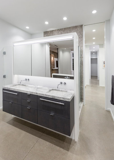
Duebber maintained the open feel while creating privacy in the master bath. Behind this vanity wall is a large shower stall, and he tucked the toilet around the side of it to the left.
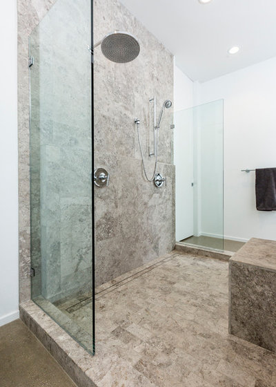
The shower stall is limestone and has two shower heads. Clear glass panels add to the openness.
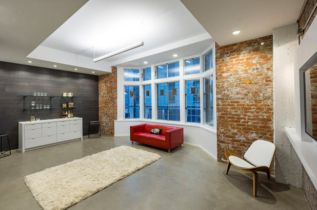
Sitting area-study: Past the master bedroom is this sitting area, which one of the clients has since turned into a workspace. The accent wall is the same rough-sawn oak used on the large sliding doors. Because this area is open to the hallway, it can be viewed all the way from one end of the apartment to the other. (Look back a few photos to match up the placement of that white chair.) And the sliding-door strategy allows the homeowners to open the master bedroom to this area as well.
Duebber mimicked the glass shelves he used on the bar here, but instead of using stainless steel supports he used wooden dowels to match the accent wall.
Fun detail: This side of the building faces a historic district, and the original window has inserts with coat-of-arms details. One of them is a harp. Does anyone familiar with the building’s history know if these have any significance? If so, please let us know in the Comments.
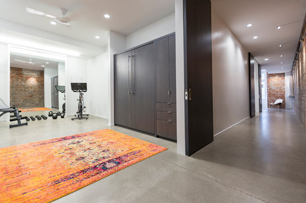
Spare bedrooms: There are two more bedrooms in the unit. Since the clients’ adult children stay here from time to time, Duebber made this one multipurpose. The doors conceal a Murphy bed, but when no one is staying here, the room functions as a workout space and a study. A large mirror reflects the light.
Browse more homes by style: Apartments | Barn Homes | Colorful Homes | Contemporary Homes | Eclectic Homes | Farmhouses | Floating Homes | Guesthouses | Homes Around the World | Lofts | Midcentury Homes | Modern Homes | Ranch Homes | Small Homes | Townhouses | Traditional Homes | Transitional Homes | Vacation Homes
Browse more homes by style: Apartments | Barn Homes | Colorful Homes | Contemporary Homes | Eclectic Homes | Farmhouses | Floating Homes | Guesthouses | Homes Around the World | Lofts | Midcentury Homes | Modern Homes | Ranch Homes | Small Homes | Townhouses | Traditional Homes | Transitional Homes | Vacation Homes


We design, build and renovate in the most exquisite of fashions. Our team of revolutionaries is dedicated to... Read More
What are you working on?
Related Products
Related Stories
Houzz TV
Houzz TV: Step Inside an Industrial-Chic Forever Home
See how a former commercial space becomes an art-filled dream home for 2
Full Story
Kitchen Design
Gray Cabinets and a Wood-Wrapped Fireplace Update a Downtown Loft
The kitchen peninsula is jazzed up with custom wallpaper made using a photo from the homeowners’ Amsterdam honeymoon
Full Story

My Houzz
My Houzz: White Paint and Light Floors Transform a Chicago Loft
Fresh holiday ideas add a festive touch to a couple’s renovated Scandinavian- and industrial-style home
Full Story
My Houzz
My Houzz: Books and String Lights Cozy Up an L.A. Loft
Devoted hours and Disneyland-like whimsy create a strikingly personal style in downtown Los Angeles
Full Story
Modern Homes
My Houzz: Splashes of Color in a Modern Arizona Loft
Artwork, travel mementos and midcentury furniture come together in this home in a Tucson residential community
Full Story

Houzz Tours
Houzz Tour: Boutique Hotel-Inspired Makeover for a San Diego Loft
Check out these before-and-after pictures to see the dramatic transformation of a downtown industrial loft in California
Full Story
My Houzz
My Houzz: A Restaurateur’s Lush and Luxe Chicago Loft
An artistic eye and the right cat make this spacious Bucktown condo a fun and very personal home
Full Story
Small Homes
My Houzz: Sweet Vintage Touches in an 1865 Cincinnati Loft
Collected farmhouse-style decor fits in beautifully in this couple’s cozy rented apartment
Full Story
My Houzz
My Houzz: A Moody Industrial Loft in Boston
By Faith Towers
A couple’s ‘moderate minimalist’ style works well with the raw finishes of their open space
Full Story

My Houzz
My Houzz: Pretty Pinks and Neutrals in a Boho-Chic Loft
By Faith Towers
Macramé blends with midcentury cool in this couple’s converted 1887 Rhode Island rental. Plus: An adorable cat tepee
Full Story
Incredible!
Job well done. What I really appreciate is the great photography and the dialogue.