


Kitchen of the Week: Big Leaves and Shades of Blue
Cooking and dining areas in a 1980s Colonial-style home are remodeled to maximize storage, function and style

Before: “I’ve seen so many of these 1980s Colonial homes that waste so much space in the kitchen,” designer Heather Alton says. “There’s all this space around an eat-in area that isn’t being used properly and the island’s proportions are never right.”
Layout: Alton moved the eat-in area and dining room into an adjacent space that was originally the living room, and moved the living room into the space that was the dining room. (See before-and-after floor plans below.)
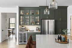
She kept the kitchen workspace and counters in the same area but reconfigured them and installed a larger island and an appliance wall. She added built-in china cabinets where the original eat-in area had been. It makes good use of that space and creates a connection between the kitchen and dining room. It also serves as a stunning focal point.
Layout: Alton moved the eat-in area and dining room into an adjacent space that was originally the living room, and moved the living room into the space that was the dining room. (See before-and-after floor plans below.)
She kept the kitchen workspace and counters in the same area but reconfigured them and installed a larger island and an appliance wall. She added built-in china cabinets where the original eat-in area had been. It makes good use of that space and creates a connection between the kitchen and dining room. It also serves as a stunning focal point.
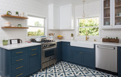
Style: Alton’s clients were a bit fearful about color and unsure about pattern, so part of her job was to help them open to the possibility and commit. “Sometimes I have to say to my clients, ‘Do you want a kitchen just like everyone else has or do you want to show off that you are confident with your own style?’ ” she says. In this case, they went for the oversize botanical wallpaper she’d found for the wall behind the glass cabinets, and it completely makes the room.
Must-have: The clients also love to play around with their personal style and needed storage for that. “She loves to switch her decor up seasonally,” Alton says. “Now she can show off her decorations in the glass cabinets and store the ones that are out of season underneath.”
Wallpaper: Leaf, Harlequin; check out more blue botanical wallpapers
Color palette: Alton talked her clients out of going with the all-white approach. There are three shades of blue happening in the kitchen: navy on the china cabinet wall, icy gray-blue on the island and a true indigo on the sliding door to the basement.
Sliding door: We don’t often think of a utilitarian door to a basement as a missed design opportunity, but Alton does. “I have seen so many of these types of houses that I always know exactly where the basement door is. This one adds a little mystery and is more fun than your typical swing door,” she says. The paneled door was a great opportunity to bring in texture, color and personality.
Sliding-door paint: Indigo Batik, Sherwin-Williams
Island: By adding the china cabinet, Alton was able to size the island to fit the kitchen’s proportions. “These homeowners cook a lot, they cook every day,” she says. “I love to keep the cutting boards handy for people like that. It doesn’t take up much space, either.”
Island paint: Frost, Cuisine Ideale; island counter: Minuet, Viatera
Island paint: Frost, Cuisine Ideale; island counter: Minuet, Viatera
This side of the island contains a dishwasher, utensil drawers, pullout bins for trash and recycling, and that open slot for cutting boards. On the other side Alton was able to add cabinets for scads more storage. “My clients told me they can’t believe that they got so much storage that they actually wound up with an empty cabinet,” she says.
Flooring: Alton replaced all of the flooring on the first level with a French white oak. It’s been wire-brushed to give it an aged look.
Cabinet paint: Whitestone, Benjamin Moore; hardware: Channing series, Top Knobs; flooring: Alta Vista in Laguna, Hallmark Floors
Flooring: Alton replaced all of the flooring on the first level with a French white oak. It’s been wire-brushed to give it an aged look.
Cabinet paint: Whitestone, Benjamin Moore; hardware: Channing series, Top Knobs; flooring: Alta Vista in Laguna, Hallmark Floors
Glass cabinet doors: Alton talks with her clients about exactly what they’ll be keeping in glass-front cabinets when they go for that option. “It’s best to fill them with china and glassware. Nothing gets dusty when you fill them with the everyday stuff,” she says.
Layout: Flanking the range with the glass-front cabinets gave pleasing symmetry to the room. While there’s a basic work triangle strategy at play here, Alton put the ovens and the fridge all on one wall. This keeps their heft off to the side but handy and close to the island and sink.
Lighting: Plenty of recessed light keeps the kitchen bright even on New Hampshire’s long winter nights. Two brass pendants add warmth and texture.
Metal cage pendants: Regina Andrews
“Before” floor plan: Here you can see that sea of wasted space around the eat-in area of the original kitchen (top right). Also note that the living room was located just off this area and that the dining room was on the opposite side. Alton marked the walls she removed in pink for us to make the before-and-after layouts easier to understand.
“After” floor plan: The first floor is much more open now, and flipping the living room and dining room made sense. Also worth zooming in on is the hallway to the garage (middle of the left side of this plan). Alton was able to carve out as much function and storage here as possible, including the mudroom cabinets and bench and the pantry cabinets she placed behind the fridge.
Here you can see what a pleasing view the range and glass cabinets offer from the entry hall.
Mudroom entry: The mudroom entry connects the kitchen and the door to the garage. It provided 43 extra square feet for Alton to make the most of. She used the same wood on the bench seat that she used on the china cabinet’s countertop. “There are so many hard surfaces in a kitchen, it’s good to get some wood in there for warmth,” she says.
Pro tip: Alton prefers to create cubbies off the floor for shoes. “Shoes tend to mess up the floors all around them. It’s easier to wipe down a raised cubby,” she says.
Pro tip: Alton prefers to create cubbies off the floor for shoes. “Shoes tend to mess up the floors all around them. It’s easier to wipe down a raised cubby,” she says.
Here’s a glimpse of dog Maggie, who was a little shy on photo shoot day.
Food storage: Pantry storage is located around the corner from the ovens (left) and in pullouts to the right of the refrigerator.
Dining room: The dining room is now a natural extension of the kitchen. A built-in bench on one side lends a more casual feel. And now that they love their first floor’s new look, the homeowners are ready for another phase of work that will make it even more cohesive. They’ve fallen in love with the bold wallpaper and agreed to continue it down this wall. Even though they hadn’t fully committed to the idea at the start of the project, Alton anticipated that they’d fall in love with the paper and ordered enough just in case. They’re also planning to follow her recommendation to add a window on this wall.
Wall paint: Silvery Moon, Benjamin Moore; ceiling and trim paint: Decorator’s White, Benjamin Moore; pendant lights: Elk Lighting; browse more globe pendant lights
Wall paint: Silvery Moon, Benjamin Moore; ceiling and trim paint: Decorator’s White, Benjamin Moore; pendant lights: Elk Lighting; browse more globe pendant lights
Living room: Since I mentioned that they swapped the living room and dining room spaces, it’s only fair to show how that worked out. This is the space shown in the previous photo.
Takeaways
More: See other Kitchens of the Week
Takeaways
- Don’t feel confined by how your existing rooms are defined. Try swapping them around if your layout isn’t working for you.
- Going bold with wallpaper can infuse a room with your personal style.
- When it comes to a ho-hum element like the door to the basement, realize that it can be a design opportunity.
- Glass cabinet doors are great for displaying everyday items as well as special objects.
- An appliance wall can get a lot of the bulky stuff out of the way visually.
- Make your island stand out by painting it a color that’s different from the rest of your cabinets, and by using a different countertop material.
More: See other Kitchens of the Week


Kitchen at a Glance
Who lives here: A couple with two kids and a dog
Location: Bow, New Hampshire
Size: 281 square feet (26 square meters)
Designer: Heather Alton of New England Design Elements
The backstory: The kitchen was dated, lacked storage and had an awkward, space-wasting layout. This busy young family needed better flow, function and more storage. And it needed help bringing its personal style into the design.
Scope of work: The project included the entire first floor of the home.