


Kitchen of the Week: Eclectic French Bistro-Inspired Style
The designers reclaim and reuse as much as they can while creating a personality-filled, family-friendly space

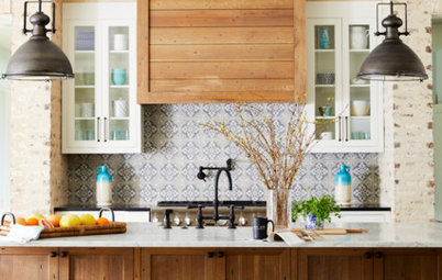
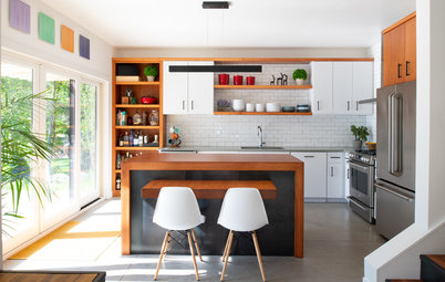
Style: “The kitchen was so dark and chopped up, it just wasn’t them,” Mathe says. So she got to know what was. “They loved the idea of a French bistro-inspired look.” She brought in black and white contrast, classic white subway tile, cafe-style furniture and the encaustic cement tile her clients loved, as a tile “rug.” She also used the existing cabinet next to the fireplace to create a coffee and tea station.
Must-haves: In addition to the cement tile, the homeowners wanted open storage under the range for their pots and pans so that they can easily find and grab what they need. Mathe gave them stained-wood pullouts there.
Layout: Of course, function was the most important part of the design. The tile rug marks the heart of the work triangle, with the range, large sink and double ovens within easy reach. A dishwasher and trash and recycling bins are tucked into the island, with seating on the other side. The refrigerator is just around the corner, and there’s a reason for that.
Cabinets: Mathe, Vaughan and Dawson collaborated to recompose the original cabinets in an arrangement that worked. “I always have my clients take an inventory of everything they have before we plan out the cabinetry,” Mathe says. For example, she finds out how many cookie sheets and trays they have so that she can add enough vertical inserts to accommodate them. Loaded with that information, Dawson crafted additional cabinets to match the 1966 originals. The team was also able to match the original traditional hardware.
Wall paint: Chantilly Lace, Benjamin Moore
Read about the 3 zones of kitchen storage
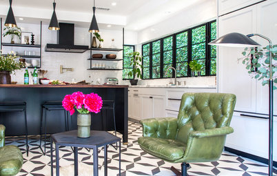
Entry: In considering the three kids and two dogs running in and out, as well as the mom and dad lugging in groceries, Mathe focused on that back entrance. This is what you see as you come in. The refrigerator is just out of view on the left and is surrounded by pantry cabinets. This way, the couple can bring in the groceries, plunk them down and put them away.
“There’s a smaller second sink so that they can wash vegetables right here before putting them away,” the designer says. And the kids can come in, wash their hands in the sink, and grab drinks and snacks without getting in the way of the work zone.
Dog station: “One of my favorite things is the dog dish solution,” Mathe says. “It keeps the dishes from sliding all over the place, prevents so much spilling, and they are out of the way so that the family isn’t stepping on them.”
Family organization: To the right, the entire corner is covered in chalkboard paint. The kids have taken over the design with artistic endeavors on one side, while the side facing the back door keeps their schedules straight. They write messages and reminders here. This wall is also magnetic so that they can pop invitations, permission slips and other important things up here with ease. The designer recommends mounting a magnetic substrate beneath the chalkboard, as she did here. “I find it’s much stronger than magnetic paint,” she says.
Find out how to make room for the dog dish | Learn to make your own chalkboard paint
Furniture: Bistro style comes in via the metal cafe table and the wood-and-metal chairs. The desk behind them is where the family charges electronic accessories. Dawson, the project carpenter, made it. “He’s so easy to work with. He just gets it,” Mathe says.
Shelves: Dawson also hung the floating shelves and had the decorative metal hooks made locally (these are more for style than support, as the shelves are anchored into the walls). The shelves give the family a chance to display their favorite cookbooks, pottery and other objects. The shelves themselves were very budget-friendly; they are wood from Floor & Decor that Dawson stained.
Fireplace: The fireplace is original to the house. Mathe is working on making it functional again and on updating the mantel. If you look closely at the first photo, you can see the original fireplace tools hanging from hooks on the side of the coffee station cabinet, where they’ve always been.
Island: Mathe gave the base a deep gray paint job and topped it with a white counter to create contrast with the white cabinets and gray counters around the room. The island counter is Super White granite, and the perimeter counters are Silver Pearl granite with a leathered finish.
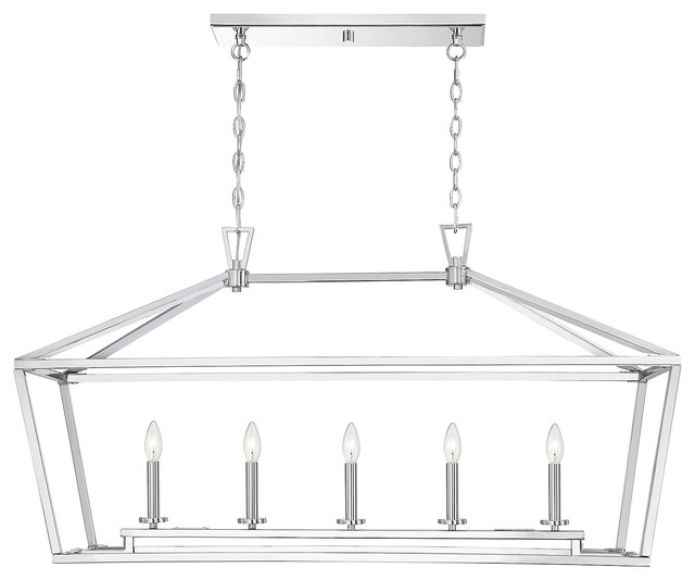
Pendant lights: “We tried to reuse the original pendants, but they wound up looking too heavy in the room,” Mathe says. The homeowners found these online.
Fun details: Vaughan provided the beautiful cut flowers from her own garden. And the plant hanger next to the window was unearthed within a wall that was removed during construction. It supports a plant hanger on the exterior of the house. One of the homeowners created the macramé plant hanger herself so that they could make good use of this neat little piece of found architecture.
More
Read other stories about kitchen remodeling
Find out when to use gray in the kitchen
Browse bistro sets


Kitchen at a Glance
Who uses it: A family of five and two dogs
Location: Richmond, Virginia
Size: 300 square feet (27.9 square meters)
Design team: Interior designer Melissa Mathe, architect Melissa Vaughan and carpenter Chopper Dawson
Before: The kitchen in this 1966 Cape Cod-style home hadn’t been touched since it was built — olive-green appliances and all. It was divvied up into four separate rooms: kitchen, small eat-in dining area, laundry room and back entrance. The kitchen had linoleum flooring, while the small dining room had hardwood. The walls were covered in the original 1960s dark-stained paneling.
Scope of work: “The architect, Melissa Vaughan, figured out which walls could come down structurally,” says interior designer Melissa Mathe. This opened and brightened the room, gave them loads of space to work with, and allowed room for a large kitchen island. Then the two women and contractor Chopper Dawson took stock of the existing cabinets and figured out a way to reuse them in the new kitchen.
Though this was a big makeover, the team saved and reused as much as possible — not just the cabinets, but also the paneled walls and hardwood floors. They were able to match the original cabinets, cabinet hardware and flooring where they needed to.
Homeowners’ great idea: A painting special to the family hangs over the mantel. Each kid from their children’s school drew one of the circles in the tree painting.
What you should know before tearing down a wall