


A Master Bath With a Checkered Past Is Now Bathed in Elegance
The overhaul of a Chicago-area bathroom ditches the room’s 1980s look to reclaim its Victorian roots

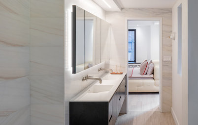
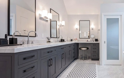
After: The homeowners have been renovating their home in phases, using modern-day materials that complement the home’s history. Their budget didn’t allow for them to take the room down to the studs and replace everything, or even to move fixture locations.
So designers Amy Storm and Lisa Abeln maintained the general layout and focused on finding new materials that work well with the traditional style of the home.
All of the plumbing fixtures, lighting, cabinets, mirrors and most of the tile were removed. However, as a cost-saving measure, the shower subway tile was in great shape and remained as part of the design scheme.“We ultimately feel we rewrote history in this beautiful and historic home,” Storm says.
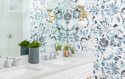
Larger makeup vanity: Demolishing the half-wall previously separating the vanity and built-in tub gained extra room for a new, larger makeup vanity and made the space feel less choppy and claustrophobic. A built-in cubby neatly stores rolled towels near the tub while an appliance drawer with integral outlets keeps the hair dryer and curling iron out of sight.
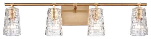
Softer lighting: Sconces with subtle illumination replaced the uplighting, and a shiny brass and glass chandelier was swapped out for an elegant pair of pendant fixtures with curvy fabric shades. Storm says they sought out fixtures with antique brass finishes to reference the period and other finishes elsewhere in the house.
Taller customized mirrors:
The previous mirrors were squat and topped off with cornice molding so heavy that they created jarring shadows, as seen in the previous image. Now, new wall-size framed beveled mirrors above the makeup vanity and sinks allow for looking into the mirror without stooping. Plus, Storm says, “Having the mirrors face each other really helped pull in the light and make the space feel more open and larger.”
Light fixtures: Hudson Valley Lighting
So designers Amy Storm and Lisa Abeln maintained the general layout and focused on finding new materials that work well with the traditional style of the home.
All of the plumbing fixtures, lighting, cabinets, mirrors and most of the tile were removed. However, as a cost-saving measure, the shower subway tile was in great shape and remained as part of the design scheme.“We ultimately feel we rewrote history in this beautiful and historic home,” Storm says.
Larger makeup vanity: Demolishing the half-wall previously separating the vanity and built-in tub gained extra room for a new, larger makeup vanity and made the space feel less choppy and claustrophobic. A built-in cubby neatly stores rolled towels near the tub while an appliance drawer with integral outlets keeps the hair dryer and curling iron out of sight.
Softer lighting: Sconces with subtle illumination replaced the uplighting, and a shiny brass and glass chandelier was swapped out for an elegant pair of pendant fixtures with curvy fabric shades. Storm says they sought out fixtures with antique brass finishes to reference the period and other finishes elsewhere in the house.
Taller customized mirrors:
The previous mirrors were squat and topped off with cornice molding so heavy that they created jarring shadows, as seen in the previous image. Now, new wall-size framed beveled mirrors above the makeup vanity and sinks allow for looking into the mirror without stooping. Plus, Storm says, “Having the mirrors face each other really helped pull in the light and make the space feel more open and larger.”
Light fixtures: Hudson Valley Lighting
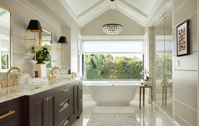
Freestanding tub: A classic-style pedestal tub replaced the blocky built-in one. Plus, the tub’s curves help soften the harsh angles in the ceiling. Besides creating a roomier look, installing a freestanding tub also enabled an installation of tile wainscoting and a ledge around the tub, an era-appropriate detail that would likely have been in the home’s original bathroom.
Avon acrylic pedestal tub: Signature Hardware; floor-mounted filler: Delta; artwork: via Storm Inspired
Avon acrylic pedestal tub: Signature Hardware; floor-mounted filler: Delta; artwork: via Storm Inspired
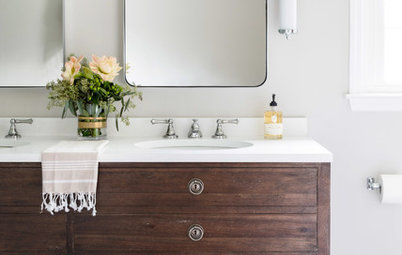
Sink vanity: Storm says another cost savings came from reusing the existing, and relatively new, nickel-finish sink faucets. The designers had to hunt for the coordinating floor-mounted tub filler seen in the previous photo.
Custom cabinets: Prefabricated cabinets wouldn’t perfectly fit the allotted spaces, so the sink and makeup vanities were custom-made.
Designer secret: “Tight spaces are tight spaces, so you have to find creative ways to make them feel more spacious,” Storm says. She advises using mirrors and natural light to your advantage. In one of the project’s splurges, the mirror glass was custom-cut to accommodate the electrical boxes for the mirror-mounted sconces. “These are the kinds of details that take up a lot of time and precision, but are worth every second,” Storm says.
Pinstripe in brushed nickel faucets: Kohler; Cashmere Carrara quartz countertops: MSI; wall paint: Paper White, Benjamin Moore; cabinet paint: custom match to Mindful Gray, Sherwin-Williams
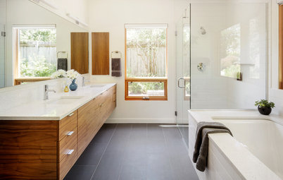
Browse bathroom vanities
Custom cabinets: Prefabricated cabinets wouldn’t perfectly fit the allotted spaces, so the sink and makeup vanities were custom-made.
Designer secret: “Tight spaces are tight spaces, so you have to find creative ways to make them feel more spacious,” Storm says. She advises using mirrors and natural light to your advantage. In one of the project’s splurges, the mirror glass was custom-cut to accommodate the electrical boxes for the mirror-mounted sconces. “These are the kinds of details that take up a lot of time and precision, but are worth every second,” Storm says.
Pinstripe in brushed nickel faucets: Kohler; Cashmere Carrara quartz countertops: MSI; wall paint: Paper White, Benjamin Moore; cabinet paint: custom match to Mindful Gray, Sherwin-Williams
Browse bathroom vanities
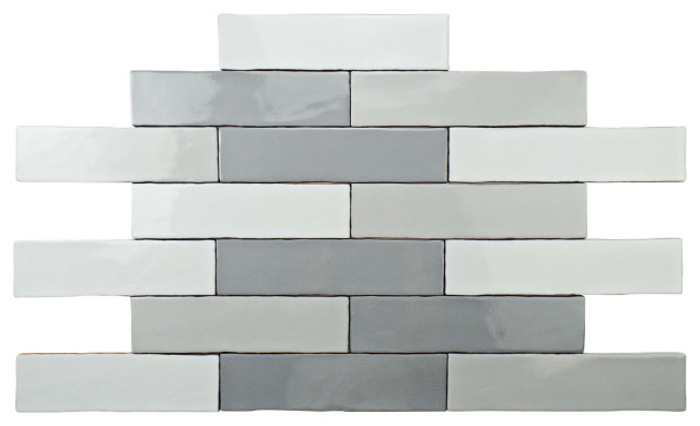
Elegantly patterned floor: The new cement floor tile design picks up the curvy lines of the tub and is less jarring than the previous black-and-white checkered tile.
Cannes III tile: Cement Tile Shop
Cannes III tile: Cement Tile Shop
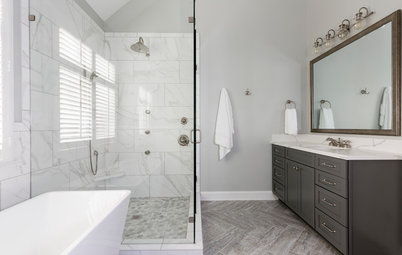
After: A new quartz seat to match the vanity countertops brightened the space, and the shower head was mounted higher to accommodate its tall owner. However, Storm says they had to remove some of the existing subway tile to work in the new seat and source new 3-by-6-inch subway tile that matched for the filled-in areas.
Penny round tiles on the shower floor are easier on the eye and offer more slip resistance.
Penny round tile: Horizon
Penny round tiles on the shower floor are easier on the eye and offer more slip resistance.
Penny round tile: Horizon
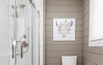
Transom window: The transom window over the wood door leading to the closet was shattered prior to the project. Now repaired, it’s as good as new.
After: Now the freestanding tub doesn’t encroach into the floor space. Demolishing the partial wall gave more space for the new makeup vanity.
More
What I Learned From My Master Bathroom Renovation
See How These 8 Bathrooms Fit It All Into About 100 Square Feet
Other Resources on Houzz
Find a pro
Browse bathroom products
More
What I Learned From My Master Bathroom Renovation
See How These 8 Bathrooms Fit It All Into About 100 Square Feet
Other Resources on Houzz
Find a pro
Browse bathroom products

Bathroom at a Glance
Location: Wheaton, Illinois
Size: 214 square feet (20 square meters)
Year built: 1890s
Designers: Amy Storm and Lisa Abeln of Designstorms
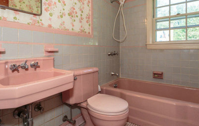
Before: Apart from the busy checkered tile, this master bathroom had other flaws. The oversize built-in bathtub ate up too much space and the lighting was constantly dim. Plus, one of the homeowners is very tall and had to duck down to look in the mirror. A sensitive material refresh kept the renovation budget in check while maintaining the Victorian charm in this historic home.