


Kitchen of the Week: Big Windows, Great Views and a Large Island
Knocking down a wall and raising the ceiling allow for a spacious kitchen with stunning lake views

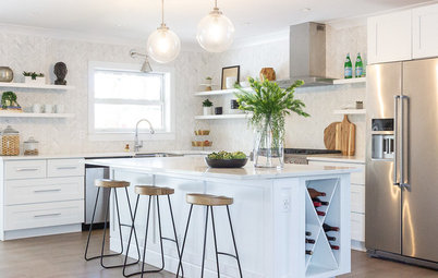
After: For this Seattle family, the big draw is the view. Although the old space had windows opening up to the epic vista of Lake Washington, they didn’t do it justice.
Weihs stepped in and gave the kitchen a complete makeover — completely gutting the space and then leaving out upper cabinets, raising the roofline, and adding color and texture — without modifying the actual footprint. “The square footage did not change,” project manager Kate Savitch says.
“We just played with the layout,” Weihs says, “and took down the wall between the kitchen and dining room. By removing the wall, we created a direct line of sight to the lake.”
Skylights flood the room with natural light and further enhance the beauty of the surroundings, while revamping the lounge ensured extra room for entertaining without cluttering the space.
Before: “The biggest challenge was the ceiling,” Savitch says. Fortunately, the roof pitch and trusses were in the right place, so the ceiling could be vaulted without removing the roof — a big plus in rainy Seattle, not to mention a major cost-saver.
After: Unable to find the right reclaimed beams (the owners’ first choice), the team opted for new Douglas fir. “We left them as natural as possible so they could age and weather with time,” Savitch says. Leaving them exposed, instead of wrapping them with drywall, connected them to other wood elements in the room. The ceiling went from a modest 7 feet, 10 inches to a lofty 11 feet.
For the flooring, Weihs used the same type of red oak hardwood that was there before and merged it with the existing flooring in the dining room.
Finding a home for appliances can be a puzzle: The pieces need to be within reach without overpowering the design. “The refrigerator is the big elephant in the room,” Weihs says. “If it went on the window wall, it would jut out and block the view. Place it on a far corner of the room and it’d be hard to get to.”
Refrigerator: Liebherr
The fix? Move the pantry door and put the fridge in its place. Bonus: The two main food storage spaces are right next to each other.
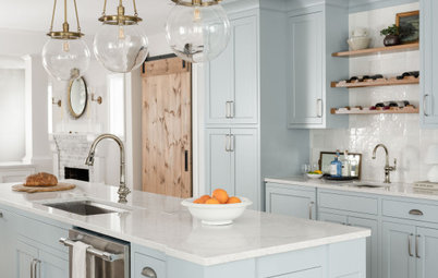
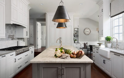
To spotlight the view, Weihs made the window wall stunning and clean. The most dramatic change came from removing all the upper cabinets. “Design has been going in the direction of less upper cabinets to make the room feel bigger and less closed in while letting in more light,” Weihs says.
In place of upper cabinets, she installed a dramatic, whole-wall backsplash to frame the windows and make the ceiling look higher. “It looks high-end and draws the eye up, creating the illusion of height,” she says.
Made of reclaimed brick, the tiles are hand-glazed and hand-painted by artisans. “Each one has a slightly different look, adding a lot of interest,” Savitch says.
Backsplash tiles: Glazed thin brick flats, Fireclay Tile
Base cabinets make up for the loss of upper storage. Each one is outfitted with dividers and pullouts, and some have outlets to charge electronics out of sight.
White Shaker-style cabinets offset the dark counters, while the cool blue recalls the coast and accentuates the backsplash.
For the hardware, the team went for weathered brass that looks lived-in and goes with elements like the tumbled brick around the fireplace and rustic wood beams across the ceiling.
The dishwasher and sink live in the island next to the drawers where dishes and silverware are kept. “For prep and cleaning, it makes sense to have the sink and dishwasher in one zone and the range and prep in another, so you can have multiple people working there at the same time,” Savitch says.
Cabinets: Cabinet Connection; hardware: Top Knobs
The family wanted soapstone counters for the patina the material develops over time. “You don’t seal soapstone like a quartzite or granite,” Weihs says. “You treat it with mineral oil so it looks less formal.” The designer allowed for plenty of counter space next to the range for prep and a big butcher block area to make a statement. “The mix of materials and tones makes the area look custom, and it’s functional,” she says.
Counters: honed black soapstone, Meta Marble & Granite; butcher block: custom, Contour Woodworks
Counters: honed black soapstone, Meta Marble & Granite; butcher block: custom, Contour Woodworks
The homeowners wanted the kitchen to be light and bright, but the designer convinced the couple to paint a nearby accent wall in a dark color to camouflage the TV and make the fireplace pop.
Paint by Sherwin-Williams: Software (accent wall) and Pure White (window wall, millwork and ceiling)
Paint by Sherwin-Williams: Software (accent wall) and Pure White (window wall, millwork and ceiling)
Natural brick replaced generic white tile to turn the fireplace into a focal point.
Details like brick tiles and Shaker-style cabinets in the pantry not only help make up for storage but also complement the overall design.
“Pantries are all about function, but they can also be attractive,” Weihs says. “Oftentimes they are an afterthought, but we believe it’s an opportunity to expand the overall space and connect the design.”
“Pantries are all about function, but they can also be attractive,” Weihs says. “Oftentimes they are an afterthought, but we believe it’s an opportunity to expand the overall space and connect the design.”
Everything in this kitchen is meant to make the room look lofty — including the lighting. The skylights bring in more sunlight and make the room feel like it extends into the outdoors, as do the big windows anchoring the main wall and side door. Can lights, in place of fixtures, add brightness without taking up space.
The mix of woods, unimposing lighting and decor details, and even the cool shades of blue and stainless steel appliances, all work together to enhance the open layout and give this family a dreamy kitchen where they can entertain and appreciate the natural beauty that surrounds them.
The mix of woods, unimposing lighting and decor details, and even the cool shades of blue and stainless steel appliances, all work together to enhance the open layout and give this family a dreamy kitchen where they can entertain and appreciate the natural beauty that surrounds them.
After: Without changing the size of the kitchen, the team knocked down the wall and moved the range, fridge, sink, and dishwasher to maximize the visual flow. They knocked down cabinets to add windows, and in place of a peninsula, created an island the spans the width of the room rather than cutting it in half. They moved the pantry door to an adjacent wall to create a natural nook for the refrigerator, where it is accessible but not intrusive. The sitting area and fireplace are still present and in the same location, but with a cleaner look that makes every nook appear brand new and bigger.
More
Kitchen Fix: Where to Stash the Stand Mixer
Read more Kitchen of the Week stories
Other Resources on Houzz
Search for kitchen products
Find a pro near you
More
Kitchen Fix: Where to Stash the Stand Mixer
Read more Kitchen of the Week stories
Other Resources on Houzz
Search for kitchen products
Find a pro near you


Kitchen at a Glance
Who lives here: A couple and their two young kids
Location: Seattle
Size: 415 square feet (38.5 square meters)
Designer: Harmony Weihs of Design Harmony
The backstory: A year after moving into their home, the owners were ready to update the kitchen. They loved the view and spacious design — complete with an entertainment den (perfect for hosting football games) and walk-in pantry — but did not love the low ceilings and inefficient layout.
Natives of New England, the couple dreamed of re-creating the warmth and casual appeal of the coastal homes they had grown up seeing in the Northeast, while remaining true to the Pacific Northwest by bringing in reclaimed materials and emphasizing the region’s natural gifts.
Although this kitchen is generously sized and benefits from an incredible panorama, its takeaways — reworking the layout, bringing in more light and playing with color — can be applied to any space.