


Before and After: Tub-Shower Combo Gets a Major Update
A mother-daughter bathroom in Toronto now has function and style, thanks to clean design and custom storage

A mother and daughter in Toronto had dealt with their bathroom long enough. The shower leaked. The window and lighting barely lit the area. And the pedestal sink offered them little to no countertop space. It was time for an update.
A friend of a friend referred them to designer Kate Dickson, who helped them transform their blue-tiled bathroom into a sleek bathing space in two months.
A friend of a friend referred them to designer Kate Dickson, who helped them transform their blue-tiled bathroom into a sleek bathing space in two months.
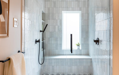
After: A new tub, shower head and glass shower doors shine in the light-filled bathroom. “This was the only full bathroom in the house for mom and her daughter,” Dickson says. “Mom likes to take a bath every now and then, so the tub-shower combo had to stay.”
Flooring: The first thing Dickson and the clients decided on was the floor. “I saw this tile, brought it to her and she loved it,” Dickson says. “I was nervous she wouldn’t like it, but we didn’t even look at any others.” The patterned 8-by-8-inch cement tiles act as the room’s focal point. “After picking that,” she says, “we kept everything else light and bright.”
Tub and shower: The decision to go with a glass tub enclosure continued the light and bright feel of the room. Dickson says they initially talked about using only a glass panel. That would have taken up even less space, but they couldn’t move the shower head plumbing into the other wall. “With the layout like this, a panel would have been too tricky to get in and out of,” Dickson says. “The door made the most sense.”
The glass shower enclosure was the last piece installed in the room. The glass panel on the right had to be cut by the contractor, DIFM Contracting, to fit into the angled space.
Pro tip: In a small space, consider using a glass shower door or tub enclosure, Dickson says. “Once you put up a shower curtain, you basically put up a wall and break up the room. The glass really opens up the space visually.”
Window: The contractor installed a new window with frosted glass. The window doesn’t open, but it does stay cleaner than the previous window and lets in more light, Dickson says.
Shower storage: “I hate when you have to put all your shampoo and soap in the corners of the tub,” Dickson says. The shower niche and the windowsill give the clients storage and keep the sides of the tub clear.
Floor tiles: Betty cement encaustic tiles, Saltillo Imports; shower wall tile: Ceragres; shower system: Disegno via Aquadesign; tub: Sydney, Hydro Systems via Home Depot; sink: Vox Square, Kohler; custom vanity: JMAC Productions; browse vanities
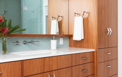
After: A custom-built vanity, complete with a ledge that runs across the wall above the toilet, gives the clients countertop space and added storage below the sink.
Vanity: The clients really wanted more countertop space and storage in the bathroom. But since the bathroom isn’t huge, Dickson had to get creative and work with the millworker, JMAC Productions, to design a cabinet and a shelf that maximized the space.
Pro tip: Go custom when you need to get the most out of a small space. It will cost more, but “it’s worth every penny in the long run,” Dickson says.
Medicine cabinet: The new mirrored medicine cabinet stretches across the wall above the sink and toilet, as it did in the previous design. The designer and client decided that this was the best use of the wall space, rather than sconces or shelves.
Lighting: The space did need more light, though, so Dickson added cove lighting above the medicine cabinet. It brightens up the once-dark room and makes use of the sloped ceiling space.
Find mirrored medicine cabinets
Style: Dickson used chrome fixtures and hardware throughout the bathroom. She chose this option because it was cost-effective and blends into the clean style of the room. It is also a traditional bathroom material, making it less trendy, Dickson says, so the bathroom will look updated and modern for years to come.
More
12 Ways to Make Any Bathroom Look Bigger
Read other stories about bathroom makeovers
Find a bathroom designer in your area
More
12 Ways to Make Any Bathroom Look Bigger
Read other stories about bathroom makeovers
Find a bathroom designer in your area
Bathroom at a Glance
Who lives here: A mother and her teenage daughter
Location: Toronto
Size: 50 square feet (4.6 square meters)
Designer: Kate Dickson, principal of Kate Dickson Design
Before: A tub-shower combo with a curtain fit against the far wall, which had a window with blinds. Baby-blue tile covered the bottom half of all the walls.