


Kitchen Design

A 1930s English House Gets a New Kitchen and Dining Area
The addition respects the home’s era while anticipating the changing needs of a modern family of 5

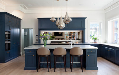
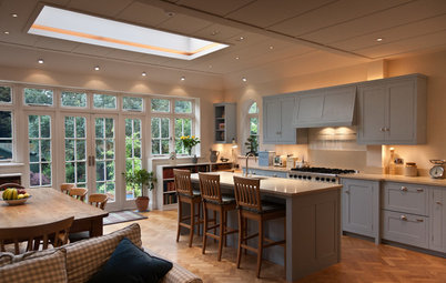
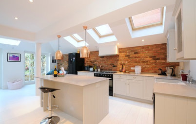
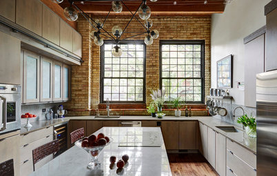
Much care went into making this addition compatible with the original 1930s house, since it’s in a conservation area in England. But it also needed to grow with a family — one minute, little ones need constant watching, and the next, teens are demanding privacy. When architect Kieran Hawkins set about designing five new interconnecting rooms for the home, he had those changing demands in mind, and at the heart of his plans was this generous kitchen-dining area. It is divided into zones for cooking, eating and relaxing, and has a real connection to the main house. “This space had to be big enough to be flexibly used by a family of five,” he says, “but still feel [homey] and warm.”
“The cooking and eating areas were arranged to make the most of the garden and natural light,” Hawkins says. A wall of Velfac windows and patio doors plus two generous skylights connect with the outside, while pendant lights define the eating areas at the dining table and the island.
Hawkins and his clients were keen to avoid creating a vast, nondescript space. “It had to be light and open but not feel cold or soulless,” he says. Materials including wood, ceramic and concrete were key to the characterful feel of the room. “It’s important to use natural materials that age well wherever possible,” he adds.
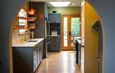
Design details were also an important part of adding personality. The door next to the refrigerator, which leads to the pantry, is vintage, but others are new and designed to echo the architectural style. “They’re a mixture. Some are reused from the original house; some were made to match by the contractor,” Hawkins says. The exposed wall is made from bricks cut into tiles.
Paint: Strong White (walls and island) and Down Pipe (perimeter cabinets), Farrow & Ball
Find bucket-seat bar and counter stools in the Houzz Shop
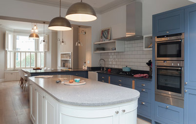
The Shaker-style kitchen has a contemporary look thanks to the white composite countertops and sleek exhaust fan, but Hawkins sought to put it in context. “We wanted to make a room that respected the feel of an English early-20th-century house. The rhythm of the windows and doors, and views of the garden, also helped define the layout.”
Kitchen cabinetry: Bryan Turner Kitchen Furniture
Find a cabinetmaker near you in the Houzz pro directory
Kitchen cabinetry: Bryan Turner Kitchen Furniture
Find a cabinetmaker near you in the Houzz pro directory
The beams supporting the house add a sculptural element to the ceiling and are a reminder of the original architecture. “We wanted to keep them exposed to provide a trace of where the walls used to be — a kind of ghost of the old smaller kitchen on the ceiling,” Hawkins says. “We also wanted to avoid a featureless plasterboard that can contribute to a feeling of a cold white box.”
Besides the aesthetic appeal, there were also practical benefits to this feature, Hawkins adds. “By exposing the beams, the rest of the ceiling could be raised to [a little over 9 feet] to improve the overall proportions.”
Browse globe pendant lights
Besides the aesthetic appeal, there were also practical benefits to this feature, Hawkins adds. “By exposing the beams, the rest of the ceiling could be raised to [a little over 9 feet] to improve the overall proportions.”
Browse globe pendant lights
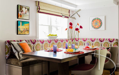
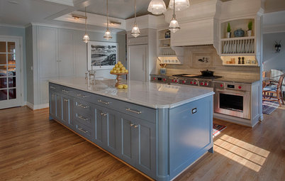
The built-in L-shaped seating is ideal for entertaining a crowd and includes useful electrical outlets. “The family do quite a lot of entertaining, for which the big kitchen-diner is perfect. They always try to eat together at the table or out on the patio in summer,” Hawkins says.
Photo Flip: 91 Kitchen Banquettes to Start Your Morning Right
Photo Flip: 91 Kitchen Banquettes to Start Your Morning Right
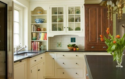
An absence of wall-hung cabinets adds to the sense of space. “There was a large enough area to provide plenty of low-level storage, and there’s a larder too, so high-level units weren’t needed,” Hawkins says.
This area is a comfortable spot to sit and read or to enjoy a glass of wine. “It’s positioned at the edge, where it feels safe, secure and cozy,” Hawkins says. An opening in the wall shows a peek of the formal dining room. The parents can sit here and listen to the children practice their music in the dining room or tell them that dinner is ready. This kind of connection is central to Hawkins’ design.
Wall paint: Prussian, Zoffany
Wall paint: Prussian, Zoffany
The main doors to the garden are between the eating zone and the cooking zone. Bright pillows provide color.
Browse decorative pillows
Browse decorative pillows
The addition helps connect the rest of the house to the garden.
“When you open the front door, you can see all the way through the glazed doors and outside. That was important,” Hawkins says.
“When you open the front door, you can see all the way through the glazed doors and outside. That was important,” Hawkins says.
Many additions are designed to blur the lines between outside and in, but Hawkins’ clients desired a clear separation between the two. “They wanted the new rooms to feel like they were part of the house, not like a lightweight conservatory or glass room tacked on the back,” he says.
The distinction between the interior and the exterior means the best of both worlds. “For a lot of the year, when it is cold and gray outside, the kitchen will feel warm and cozy, not exposed. Then in summer, the doors can be opened wide, and the patio becomes an external room,” he says.
The distinction between the interior and the exterior means the best of both worlds. “For a lot of the year, when it is cold and gray outside, the kitchen will feel warm and cozy, not exposed. Then in summer, the doors can be opened wide, and the patio becomes an external room,” he says.
“The garden is a beautiful space, and a real priority was helping the family make the most of it,” Hawkins says. The view from the garden shows how sympathetic the addition is to the rest of the house. “Being in a conservation area meant that the appearance had to respect the original building. But we would have approached the project in this way in any case.”
Main contractor: SK-U Building Co.
Your turn: Do you live in a period house that you’ve extended or plan to extend? Tell us about your project in the Comments.
More
Read other stories about additions
Find an architect or a building designer on Houzz
Main contractor: SK-U Building Co.
Your turn: Do you live in a period house that you’ve extended or plan to extend? Tell us about your project in the Comments.
More
Read other stories about additions
Find an architect or a building designer on Houzz


Kitchen-Dining Area at a Glance
Who lives here: A family of five
Location: Cambridge, England
Size: 570 square feet (53 square meters)
Architect: Kieran Hawkins of Mailen Design
Hawkins’ clients had lived in their house for about three years before they called him in to extend the ground floor. “They had the chance to really think about their priorities,” he says. “They wanted a space that had lovely proportions and light and suited the family, not one that felt like a showroom.”