


Houzz Tour: Party-Ready Makeover for a Cute Cottage in Vancouver
After living in the same house for 40 years, an owner updates her space with entertaining in mind
Jess McBride
August 24, 2017
Houzz Contributor. Custom decorating professional and content creator for the home design industry with a lifelong passion for color, pattern, and texture of every "stripe"
Houzz Contributor. Custom decorating professional and content creator for the home... More
After decades of living in her coastal cottage near Kitsilano Beach, Vancouver, a gracious host in her 70s decided it was about time her home put on its party shoes. She is the original owner of the 1976 abode, which after so many years was in need of an update anyway. So she called on interior designer Lauren Webb to create a bright, open space conducive to festive or relaxing gatherings with friends.
Photos by Christina Saminoff
House at a Glance
Who lives here: A woman in her 70s
Location: Vancouver, British Columbia
Size: 1,300 square feet (120.8 square meters)
Designer: Lauren Webb of Form Collective
The client said she didn’t want anything too ultramodern, but also nothing too stuffy and traditional either. Beyond these basics, designer Lauren Webb knew that figuring out one’s style can be tricky to nail down in words, so she invited her client to lunch and gave her an exercise: sort among photos of rooms to discover the styles that resonated with her the most.
Webb found that her client gravitated toward transitional style, pointing to rooms with Shaker-style doors, clean lines and a bit of glamour. Functionally, she wanted a living space that was open and comfortable to facilitate her frequent wine and cheese parties with friends.
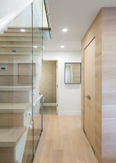
When you enter the home, there’s a closet on the right that hides a structural beam. Since the presence of the beam meant Webb couldn’t open up the space completely by taking the wall down, the designer got creative. For a more open feeling, she expanded the hallway 8 inches and then wrapped the closet in the same material as the floor — a whitewashed and wire-brushed engineered oak in a natural finish — to make it both blend in and also feel like an intentional feature wall.
Find engineered wood floors for your home
Find engineered wood floors for your home
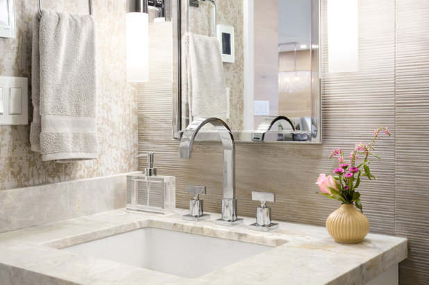
All of the ceilings were re-textured and the doors replaced. One of those doors leads to the powder room just off the entry hall. Its design mimics what’s going on in the entry, with an abstract floral wallpaper playing off the tones in the oak floors, and walls and floors clad in the same material, this time a porcelain tile meant to look like stone — ribbed on the walls and flat on the floors. For the vanity top, Webb minimized waste and expense by using a leftover piece of the quartzite slab used in the kitchen.
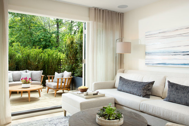
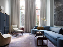
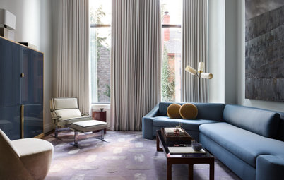
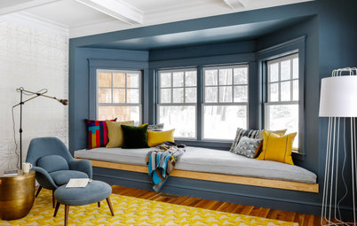
Pre-remodel, the living room had slider doors and heavy curtains, which the homeowner preferred to keep closed most of the time. As a result, the space felt dark and drab. Webb improved the space by installing doors that would open completely to the revamped patio and covered them with floor-to-ceiling, wall-to-wall draperies in a sheer linen fabric that will allow ample light even when drawn.
A local artist provided three pieces for the space and referred the designer to another artist who opened up her studio for the design team to borrow some pieces while they were deciding what to place where. The art was surprisingly affordable, and both homeowner and designer were proud to support local artists.
A local artist provided three pieces for the space and referred the designer to another artist who opened up her studio for the design team to borrow some pieces while they were deciding what to place where. The art was surprisingly affordable, and both homeowner and designer were proud to support local artists.
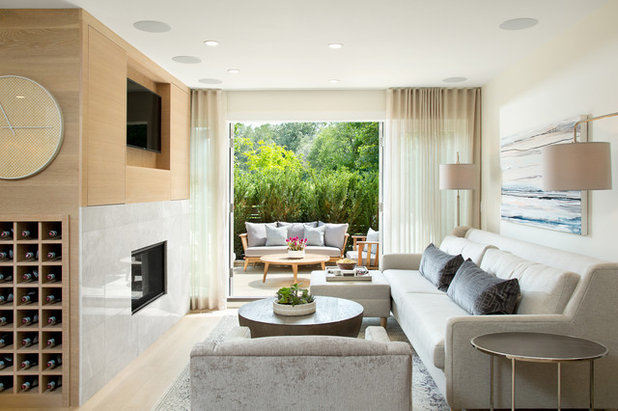
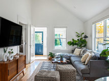
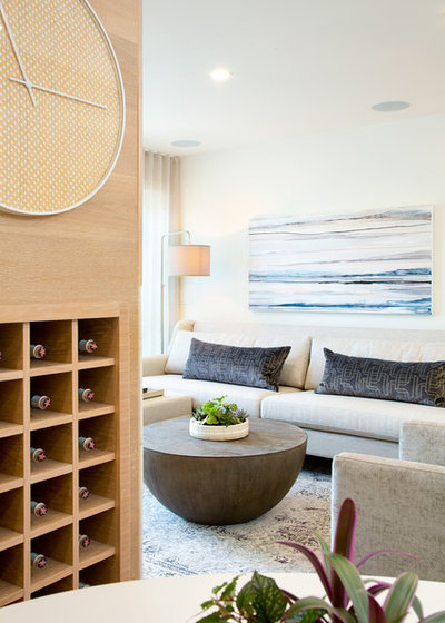
The existing fireplace was very traditional with a huge hearth and mantel and two recessed nooks on either side. On one side was a big, boxy TV and the clutter of components and cables. Webb redesigned the fireplace area, ensuring everything was flush and streamlined, with the TV recessed above the firebox and two doors on either side for storage.
A transitional sofa with a hint of midcentury styling was custom-made to accommodate multiple guests during large gatherings, and a velvet swivel chair adds to a feeling of openness between the living, kitchen and dining areas. This low-maintenance homeowner didn’t want anything too fussy, so the textured sofa fabric is durable but still in line with the home’s elegant finishes, and the rectangular toss pillows don’t need much fluffing.
The client, a wine enthusiast, loves the built-in wine cabinet that provides her easy access to bottles when hosting friends.
The client, a wine enthusiast, loves the built-in wine cabinet that provides her easy access to bottles when hosting friends.
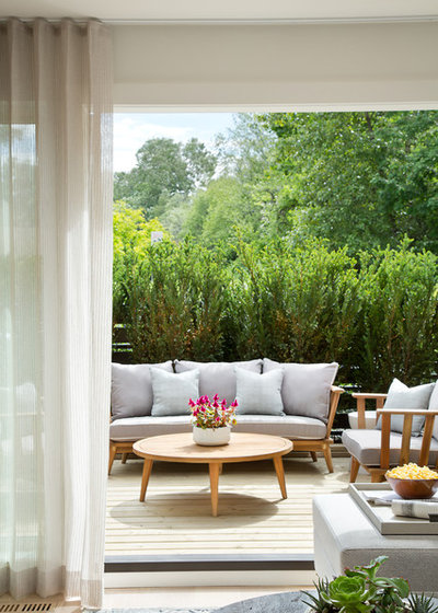
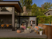
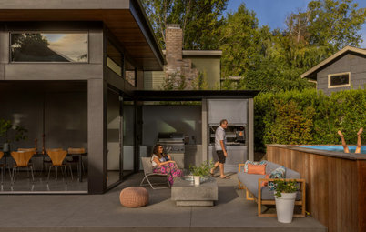
The patio overlooks a busy sidewalk, so Webb and her team had shrubbery planted behind the outdoor sofa for some privacy. She chose these plants because they were narrow and tall but still provided a nice screen.
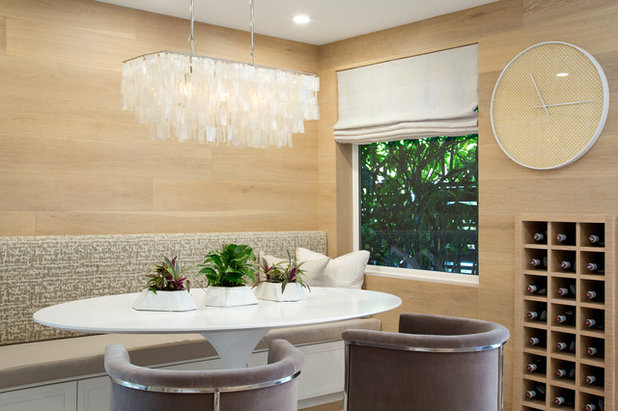
The home may not have a formal dining room, but with a banquette like this one, who needs one? Back when the kitchen was a cramped galley with a small table plunked next to it, this area was a catch-all area for household items that had no home. Now, a generous upholstered dining bench hides seasonal items beneath it, and an elegant capiz shell chandelier casts a welcome glow over the sleek white table and barrel-back chairs.
Browse shell chandeliers
Browse shell chandeliers
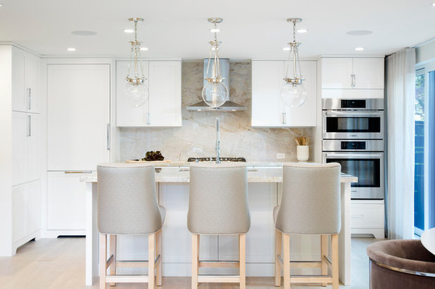
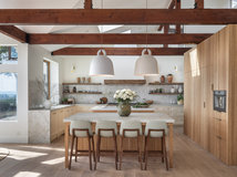
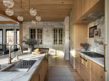
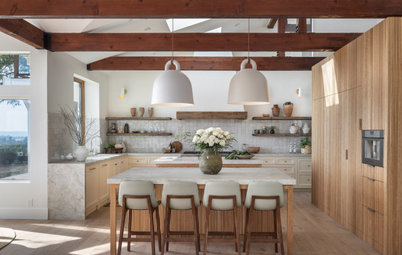
From the first site visit, Webb knew she wanted to get rid of a wall that closed off the kitchen, so she called on an engineer who added a structural beam and post. Once that was done, she played around with layouts. She likes symmetry, so she chose a double wall oven and fridge of a similar width and let them frame the kitchen island, which itself is exactly the same size as the cooktop wall behind it.
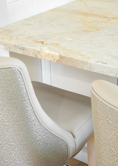
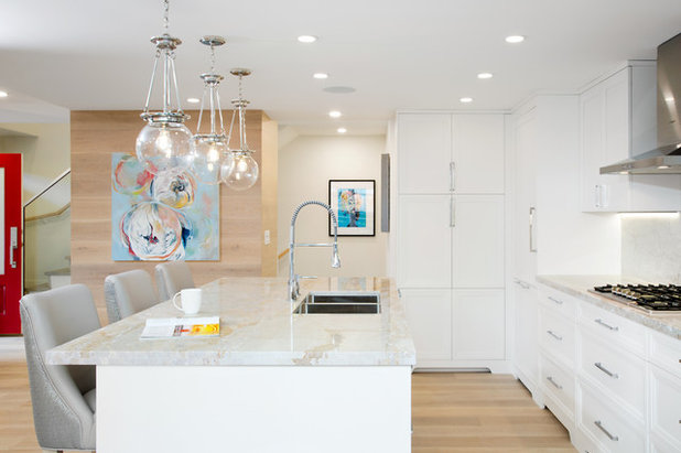
For the countertops, Webb chose a natural Quartzite stone whose rust, white and gray tones are “so right” with all the fabrics they chose. The same stone is on the backsplash, adding a more modern appeal to the space when paired with the traditional-style cabinets.
Both the dining banquette and the bar stools are upholstered in vinyl on the front so they are easy to wipe clean. On the back of the stools is a higher-end fabric with a sheen from The Romo Group’s Zinc line.
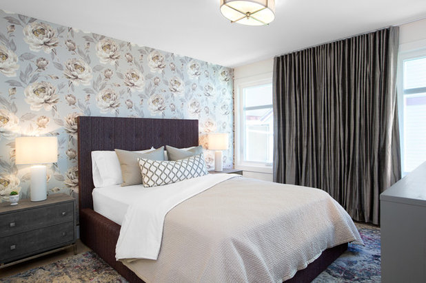
The master bedroom originally had only one small window in the corner, so Webb added another in the opposite corner to bring more light into the space. A ceiling-mounted hospital track allows the draperies to move freely in any direction. Placing them between the two windows provides the illusion of a wall of windows. The floral wallpaper adds some glamour and picks up all the tones used throughout the home. The plum-colored storage bed keeps extra linens and necessities out of sight.
The master bath used to be a mere powder room attached to the master bedroom. By pushing the shared wall into the bedroom, Webb was able to add a shower and double vanity in the bathroom while still leaving plenty of room for a king-size bed and two proper nightstands in the bedroom.
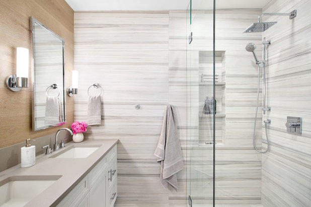
Floor-to-ceiling porcelain tile brings the wow factor as it resembles marble with a nice matte finish in line with the matte countertops. The large-format tile restricts the number of grout lines to a single seam down the center of the room for ease of cleaning and a feeling of spaciousness that makes the room look bigger. The mixture of warm and gray tones plays nicely with the accent wall done in the same engineered oak as in the rest of the home.
Floor-to-ceiling porcelain tile brings the wow factor as it resembles marble with a nice matte finish in line with the matte countertops. The large-format tile restricts the number of grout lines to a single seam down the center of the room for ease of cleaning and a feeling of spaciousness that makes the room look bigger. The mixture of warm and gray tones plays nicely with the accent wall done in the same engineered oak as in the rest of the home.
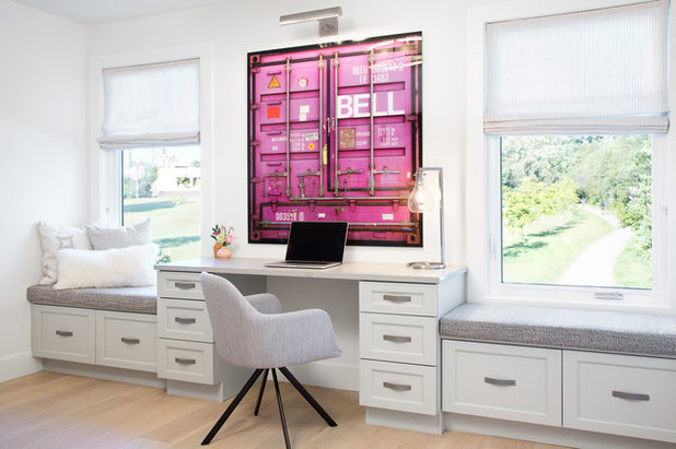
Considered a bedroom in the blueprints, this space serves as an office. Just as she did in the master bedroom, Webb added a second window here to maximize the view and admit more light. Underneath each window is built-in seating with file drawers underneath.
The desk was custom made with leather cabinet pulls and grommet holes cut out for cord management; the quartz countertop is another off-cut from one of the bathroom vanity slabs. The window treatments are the same as those in the living room, a sheer linen with a subtle stripe for added interest.
To find a piece of art for the space, Webb turned to Lumas, a company that prints the work of featured artists in limited-edition runs. This particular print depicts the back of a shipping container, a familiar sight in the port of Vancouver. Webb loves the color and how the piece is unexpected and bold.
Browse more homes by style: Apartments | Barn Homes | Colorful Homes | Contemporary Homes | Eclectic Homes | Farmhouses | Floating Homes | Guesthouses | Homes Around the World | Lofts | Midcentury Homes | Modern Homes | Ranch Homes | Small Homes | Townhouses | Traditional Homes | Transitional Homes | Vacation Homes


We design, build and renovate in the most exquisite of fashions. Our team of revolutionaries is dedicated to... Read More
What are you working on?
Related Products


Related Stories
Contemporary Homes
Houzz Tour: Boston Pied-à-Terre Designed for Evenings
By Becky Harris
A designer found on Houzz infuses a condo with a sultry vibe inspired by supper clubs and luxe boutique hotels
Full Story
Guesthouses
Houzz Tour: Light-Filled 704-Square-Foot Modern Cottage
By Becky Harris
An architect and a designer create a light and airy feel, cozied up by layers of textures
Full Story
Outbuildings
Family Gatherings in Argentina Inspire a Pavilion and Guesthouse
By Becky Harris
A new yard adds room for hosting, swimming and bringing part of one homeowner’s culture to her family’s Seattle home
Full Story
Transitional Homes
Houzz Tour: Organic Style on an Avocado Ranch
By Becky Harris
A designer uses a soft neutral palette, handmade tile and reclaimed wood to update a 1980s contemporary home
Full Story
Transitional Homes
Houzz Tour: Elegant, Earthy Ranch House for an Empty-Nest Couple
Design styles, warm neutral colors and special details blend in a Minnesota ranch-style house with a finished basement
Full Story
Contemporary Homes
Houzz Tour: Colorado Forever Home Is a Family Affair
By Becky Harris
The mountain home was designed for gatherings and to make the most of views of Pikes Peak and surroundings
Full Story
Contemporary Homes
Houzz Tour: Open and Inviting Mountain Home Near Lake Tahoe
By Becky Harris
A designer creates a warmly minimalist California getaway that can stand up to snow and mud
Full Story
Homes Around the World
Houzz Tour: Period Home Gains Color and Character
By Kate Burt
Before-and-after photos show how a bold palette and restored features bring warmth and personality to this English house
Full Story
Modern Homes
Houzz Tour: New Home Gets a Midcentury Modern Makeover
By Julie Sheer
A designer in Boston reworks the kitchen and primary suite and adds style with furnishings, lighting and more
Full Story

Barn Homes
Houzz Tour: Old Barns Become an Airy, Modern-Rustic Home
A barn home in Devon, England, sits lightly on the land and offers simple, relaxing spaces for an extended family
Full Story
In the powder room, what is the color of the ribbed porcelain tile and brand?
In a previous comment re the powder room, I mean to ask what the color of the ribbed porcelain tiles was on the walls, and the brand of tiles.
Really wonderful. But for me the tv would be unusable. I too am in my 70s and would not want a double storied house. No steps for me thank you very much. I would also be most insecure to live there being open to the street without a very secure wall. Bushes don’t do it for me.